Introduction
This is an EasyProgressBar control and also this article discusses how to create a simple progress bar control for the Windows Forms Application using the .NET Framework.
- Supports digital number style [7 Segment]
- Gradient the progress indicator area of the control and its background
- Colorizer support for progress bar (RGBA Changer)
- Supports dynamic properties for end-users
- Shows how you can add design-time support so your custom controls behave properly at design time
- It is also a dockable control. Allows floating and docked modes
- Provides keyboard support to the user for
EasyProgressBar operations - Provides extra events in the system menu
- Serialization support (Loads previous settings or saves current settings)
Contents at a Glance
Anyway, what I am going to cover in this article is as follows:
To Begin
To create controls that provide entirely new functionality or combine existing user interface elements in a unique way, you can derive from an existing control to override and enhance its functionality. In addition to that, owner-drawn controls use GDI+ drawing routines to generate their interfaces from scratch. Because of this, they tend to inherit from a more basic class that's farther down the control hierarchy, like System.Windows.Forms.Control. Owner-drawn controls require the most work, and provide the most flexibility.
From .NET’s point of view, there’s no difference between deriving from the Control class and a higher-level control class like ProgressBar. If you derive directly from the Control class, you are responsible for painting your control by hand in the OnPaint() method but if you derive from a class like ProgressBar, you inherit a fully functioning control, and need to add or customize only the features that interest you. We will use the first one.
The EasyProgressBar control class provides a basic implementation of its base control class but we need to create specific classes, properties, methods and a progress event for our control. To do this, I have implemented custom classes and define an interface and its name is IProgressBar.
public interface IProgressBar
{
int Value { get; set; }
int Minimum { get; set; }
int Maximum { get; set; }
bool IsPaintBorder { get; set; }
bool IsDigitDrawEnabled { get; set; }
bool ShowPercentage { get; set; }
string DisplayFormat { get; set; }
Color BorderColor { get; set; }
EasyProgressBarBorderStyle ControlBorderStyle { get; set; }
event EventHandler ValueChanged;
}
A few attributes can be applied to your custom control class declaration, rather than a specific property. These include two attributes that set the default event and property (as described in the below table).
Basic Control-Class Attributes
| Attribute | Description |
DefaultEvent | When the application programmer double-clicks your control, Visual Studio automatically adds an event handler for the default event. |
DefaultProperty | The DefaultProperty is the property that is highlighted in the Properties window by default the first time the control is selected. A small note, when you derive directly from the Control class and also you cannot hide the "Text" property from the control designer, the Text property will always be active. |
[Designer(typeof(EasyProgressBarDesigner))]
[DefaultEvent("ValueChanged"), DefaultProperty("Value")]
public partial class EasyProgressBar : Control, IProgressBar
{
}
Double Buffering
You can reduce flickering by preventing a control from drawing its background. If you do, your code must begin by painting a background using one of the fill methods from the Graphics class. Otherwise, the original content remains underneath the new content. To disable background painting, all you need to do is override the OnPaintBackground() method for your control and do nothing. In other words, you won’t call the base OnPaintBackground() method.
protected override void OnPaintBackground
(System.Windows.Forms.PaintEventArgs pevent)
{
}
If you are filling a control with a custom background color, you should always follow this step, as it can improve performance dramatically. Otherwise, your control window will flicker noticeably between the default background color and the color you paint every time you redraw the control. In addition to that, instead of overriding the OnPaintBackground() method, you can use the SetStyle() method and set the AllPaintingInWmPaint style to true. This tells the control window to ignore messages asking it to repaint its background.
this.SetStyle(ControlStyles.AllPaintingInWmPaint, true);
Disabling the automatic background painting reduces flicker, but the flicker remains. To remove it completely, you can use a technique known as double buffering.
Setting the DoubleBuffered property to true is equivalent to setting the AllPaintingInWmPaint and OptimizedDoubleBuffer control styles to true. If you perform painting in OnPaintBackground() as well as OnPaint(), you should set the OptimizedDoubleBuffer property to true but not set the DoubleBuffered property. In addition, you might want to set the ResizeRedraw property to true so that the control automatically invalidates itself if the size changes. This is useful if the drawing logic uses calculations that depend on the control’s size. However, use it only if you need it.
We should set the required System.Windows.Forms.ControlStyles flag to true in the constructor of the control class. The following code fragment shows exactly that:
#region Constructor

public EasyProgressBar()
{
    this.SetStyle(ControlStyles.AllPaintingInWmPaint |
	ControlStyles.OptimizedDoubleBuffer |
        ControlStyles.ResizeRedraw | ControlStyles.UserPaint, true);
}

#endregion
The LinearGradientBrush
The LinearGradientBrush allows you to blend two colors in a gradient pattern. You can choose any two colors and then choose to blend layouts for drawing operation. You also can specify the origin point for either side of the gradient. Here’s an example that fills a rectangle with a gradient in my code samples:
protected virtual void DrawBackground(Graphics gr)
{
    using (LinearGradientBrush brush = new LinearGradientBrush
    (Point.Empty, new Point(0, backgroundRectangle.Height),
	backgroundGradient.ColorStart,
        backgroundGradient.ColorEnd))
    {
        if (!backgroundGradient.IsBlendedForBackground)
            gr.FillRectangle(brush, backgroundRectangle);
        else
        {
            Blend bl = new Blend(2);
            bl.Factors = new float[] { 0.3F, 1.0F };
            bl.Positions = new float[] { 0.0F, 1.0F };
            brush.Blend = bl;
            gr.FillRectangle(brush, backgroundRectangle);
        }
    }
}
You can easily override the base virtual paint methods in your inherited control and also you can override the OnValueChanged method event of the base class. I've determined keywords to virtual all of them.
Class Table
Here you can review the class descriptions:
| Class Name | Description |
GradientProgress | We fill the progress rectangle with a specific gradient by using this class member. It includes several kinds of properties for drawing operations. |
GradientProgressConverter | Normally, there's no way to set the subproperties of the GradientProgress class at design time. To solve this problem, we need to create a custom type converter which is a specialized class that derives from the ExpandableObjectConverter. |
GradientProgressEditor | To support a thumbnail view, we need to create a custom type editor. Type editors give you the change to get a little fancy by creating a custom thumbnail of the gradient in the properties window. |
GradientBackground | Our background drawer class by using the class members. It also contains some properties for painting the background operations. |
GradientBackgroundConverter | A custom type converter for a live GradientBackground object that derives from the ExpandableObjectConverter. |
GradientBackgroundEditor | We define a thumbnail view for our BackgroundGradient property in the properties window. |
ColorizerProgress | RGBA (Red, Green, Blue and Alpha) colorizer for our progress bitmap. You can easily change your progress appearance by using this class members. |
ColorizerProgressConverter | A simple ExpandableObjectConverter for ProgressColorizer property. |
ColorizerProgressEditor | To add a drop-down control capability to the ProgressColorizer property, we need to create a new UITypeEditor. |
EasyProgressBarDesigner | To add design-time conveniences, like designer verbs or smart tags and also remove inappropriate events or properties from view (or add design-time-only events, properties and to create dynamic properties for our custom control). To create a basic control designer, begin by deriving a class from ControlDesigner. |
EasyProgressBarActionList | This class has two roles-it configures the collection of DesignerActionItem instances for the smart tag and, when a command or change is made, it performs the corresponding operation on the linked control. |
DropDownProgress | To add RGBA colorizer support for our progress bar, we need to create a user control. So you can easily change your color components from this drop-down control. |
DrawDigitalHelper | Our seven segment drawer class. Draws the given number in the 7-Segment format. |
GradientDigitBox | You can change the background appearance of the DigitBox rectangle by using these class members. |
GradientDigitBoxConverter | A custom type converter class for GradientDigitBox members. |
GradientDigitBoxEditor | A custom type editor class. For creating a custom thumbnail of the gradient in the properties window. |
Control Border Styles
EasyProgressBar Border Styles
| Border Style | Preview |
Flat |  |
Sunken | |
Raised | |
Digit Count Table
Digit Count and Its Side
| Count | Digit Side | Preview |
<center>1</center> | Right | |
<center>2</center> | Left | |
<center>3</center> | Right | |
<center>4</center> | Left | |
<center>5</center> | Right | |
<center>n</center> | - | - |
The ExpandableObjectConverter
Unfortunately, there’s no way to set custom object subproperties at design time.To solve this problem, you need to create a custom type converter, which is a specialized class that can convert a custom object to a string, and then convert the string back to a live custom object. If you don't use a type converter and look in the Properties window, you’ll see a piece of static text that shows the result of calling ToString() on the custom object.
A number of object properties are supported by Windows Forms controls. The best example is Font, which refers to a full-fledged Font object with properties like Bold, Italic, Name, and so on. When you set the Font property in the Properties window, you don’t need to type all this information in a single, correctly formatted string. Instead, you can expand the Font property by clicking the plus (+) box and editing all of the Font subproperties individually.
You can enable the same type of editing with your own custom object types. You actually have two choices—you can use the ExpandableObjectConverter directly, or you can create a custom type converter that derives from the ExpandableObjectConverter. If you use this approach, you’ll have the benefit of the string representation and the ability to expand the property to see subproperties.
The first step is to create a custom class that derives from the base class System.ComponentModel.ExpandableObjectConverter, as shown here:
class ColorizerProgressConverter : ExpandableObjectConverter
{
}
After than, we override the required methods for our use.
TypeConverter Overridable Methods
| Method | Description |
CanConvertFrom() | This method examines a data type, and returns true if the type converter can make the conversion from this data type to the custom data type. |
ConvertFrom() | This method performs the conversion from the supplied data type to the custom data type. |
CanConvertTo() | This method examines a data type, and returns true if the type converter can make the conversion from the custom object to this data type. |
ConvertTo() | This method performs the conversion from the custom data type to the requested data type. |
#region Override Methods
public override bool CanConvertTo
(ITypeDescriptorContext context, Type destinationType)
{
if (destinationType == typeof(string))
return true;
else
return base.CanConvertTo(context, destinationType);
}
public override object ConvertTo(ITypeDescriptorContext context,
System.Globalization.CultureInfo culture, object value, Type destinationType)
{
if (destinationType == typeof(string))
return ToString(value);
else
return base.ConvertTo(context, culture, value, destinationType);
}
public override bool CanConvertFrom(ITypeDescriptorContext context, Type sourceType)
{
if (sourceType == typeof(string))
return true;
else
return base.CanConvertFrom(context, sourceType);
}
public override object ConvertFrom(ITypeDescriptorContext context,
System.Globalization.CultureInfo culture, object value)
{
if (value is string)
return FromString(value);
else
return base.ConvertFrom(context, culture, value);
}
#endregion
Attaching a Type Converter
There are two ways to attach a type converter. The approach you should use in most cases is to link the custom type to the type converter by adding the TypeConverter attribute to the class declaration.
[TypeConverter(typeof(ColorizerProgressConverter))]
public class ColorizerProgress : IProgressColorizer
{ ... }
And another option is to apply the TypeConverter attribute to the property in your custom control.
[Description("You can change the color components of the
progress bitmap[RGBA Colorizer for progress indicator]")]
[TypeConverter(typeof(ColorizerProgressConverter))]
[DesignerSerializationVisibility(DesignerSerializationVisibility.Content)]
[Browsable(true)]
[Category("Gradient")]
public ColorizerProgress ProgressColorizer
{
get { return progressColorizer; }
set
{
try
{
if (!value.Equals(progressColorizer))
{
progressColorizer.ProgressColorizerChanged -=
CONTROL_INVALIDATE_UPDATE;
progressColorizer = value;
progressColorizer.ProgressColorizerChanged +=
new EventHandler(CONTROL_INVALIDATE_UPDATE);
Invalidate();
Update();
}
}
catch (NullReferenceException)
{
MessageBox.Show("Value cannot be null!, please enter a valid value.");
}
}
}
Editing properties of the ColorizerProgress class.
The UITypeEditor
The base UITypeEditor class is found in the System.Drawing.Design namespace. You can inherit from this class to create your custom type editors.
You associate a property with a type editor using the Editor attribute. As with type converters, you can apply the Editor attribute to a class declaration or a property declaration.
To create a custom type editor, you must first create a class that derives from System.Drawing.Design.UITypeEditor. You can then override the four methods shown in the below table.
UITypeEditor Overridable Methods:
| ClassMethod | Description |
EditValue() | Invoked when the property is edited. Generally, this is where you would create a special dialog box for property editing. |
GetEditStyle() | Specifies whether the type editor is a Drop-Down (provides a list of specially drawn choices), Modal (provides a dialog box for property selection), or None (no editing supported). |
GetPaintValueSupported() | Use this to return true if you are providing a PaintValue() implementation. |
PaintValue() | Invoked to paint a graphical thumbnail that represents the value in the Properties window. |
A Drop-Down Type Editor
A drop-down type editor shows a control in a drop-down box underneath the property. The drop-down box is sized to fit the initial size of the control you supply, but it will be resized if it can’t fit due to screen size or window positioning. The best way to prepare the content for the drop-down box is to create a user control. The type editor is then responsible for showing that user control in the drop-down box.
DropDownProgress
The DropDownProgress is a user control. It makes sense to keep it out of the toolbox. You can accomplish this by adding the ToolboxItem attribute to the class declaration, and marking it false:
[ToolboxItem(false)]
partial class DropDownProgress : UserControl
{
}
The real trick in this example is that the user control you create for editing the property needs a way to receive information from the custom control object. To make this easier, you should add a constructor to your editing control that accepts all the information it needs.
Here’s the constructor code and the details for storing the constructor-supplied information:
#region Constructor

public DropDownProgress()
{
    InitializeComponent();
}

public DropDownProgress(object value, IWindowsFormsEditorService editorService)
    : this()
{
    this.editorService = editorService;
    if (value is ColorizerProgress)
    {
        this.colorizer = value as ColorizerProgress;
    }
}

#endregion
Each track bar value can be changed by the user in the drop-down control. So we need to create an event handler for each trackbar control.
private void TRACKBAR_VALUE_CHANGED(object sender, EventArgs e)
{
    if (sender is TrackBar)
    {
        string result = null;
        TrackBar ctrl = (TrackBar)sender;
        if (ctrl.Value == 0)
            result = "Min";
        else if (ctrl.Value == 255)
            result = "Max";

        switch (ctrl.Name)
        {
            case "redTrackBar":
                label1.Text = String.Format("Red: {0}",
			result ?? ctrl.Value.ToString());
                break;
            case "greenTrackBar":
                label2.Text = String.Format("Green: {0}",
			result ?? ctrl.Value.ToString());
                break;
            case "blueTrackBar":
                label3.Text = String.Format("Blue: {0}",
			result ?? ctrl.Value.ToString());
                break;
            default:
                label4.Text = String.Format("Alpha: {0}",
			result ?? ctrl.Value.ToString());
                break;
        }
    }
}
The next step is to develop the type editor that uses this user control. Here’s the class declaration:
class ColorizerProgressEditor : UITypeEditor
{
}
After that, we need to connect this type editor to the ColorizerProgress class using the Editor attribute. The following code snippet shows how you can add this attribute to your appropriate class declaration. As mentioned above, you can also attach this type editor to the appropriate property using the same attribute.
[Editor(typeof(ColorizerProgressEditor), typeof(UITypeEditor))]
public class ColorizerProgress : IProgressColorizer
{ ... }
All you need to do now is fill in the type editor code. First, we choose the drop-down style for our UITypeEditor. After that, we turn down thumbnails. Because; our worker class(ColorizerProgress) does not implement the drawing behaviour for design-time. And finally, in the EditValue() method you get the editor service, create an instance of the DropDownProgress user control, and add it to the Properties window using the IWindowsFormsEditorService.DropDownControl() method, as shown here:
#region Override Methods
public override object EditValue
(ITypeDescriptorContext context, IServiceProvider provider, object value)
{
if (provider != null)
{
IWindowsFormsEditorService editorService =
provider.GetService(typeof(IWindowsFormsEditorService))
as IWindowsFormsEditorService;
if (editorService != null)
{
using (DropDownProgress dropDownProgress =
new DropDownProgress(value, editorService))
{
editorService.DropDownControl(dropDownProgress);
value = dropDownProgress.Colorizer;
}
}
}
return value;
}
public override UITypeEditorEditStyle GetEditStyle(ITypeDescriptorContext context)
{
return UITypeEditorEditStyle.DropDown;
}
public override bool GetPaintValueSupported(ITypeDescriptorContext context)
{
return false;
}
#endregion
Shows the DropDownProgress control in the Properties window.
Painting a Thumbnail
Type editors also give you the chance to get a little fancy by creating a custom thumbnail of the gradient in the Properties window. To add this extra bit of finesse, all you need to do is create a type editor and override the PaintValue() method. Here’s the complete example from the GradientBackgroundEditor class:
#region Override Methods

public override bool GetPaintValueSupported(ITypeDescriptorContext context)
{
    return true;
}

public override void PaintValue(PaintValueEventArgs e)
{
    GradientBackground gradient = e.Value as GradientBackground;
    using (LinearGradientBrush brush = new LinearGradientBrush
    (Point.Empty, new Point(0, e.Bounds.Height),
	gradient.ColorStart, gradient.ColorEnd))
    {
        if (!gradient.IsBlendedForBackground)
            e.Graphics.FillRectangle(brush, e.Bounds);
        else
        {
            Blend bl = new Blend(2);
            bl.Factors = new float[] { 0.3F, 1.0F };
            bl.Positions = new float[] { 0.0F, 1.0F };
            brush.Blend = bl;
            e.Graphics.FillRectangle(brush, e.Bounds);
        }
    }
}

#endregion
RGBA Colorizer
I've created the ColorizerProgress class to change your progress appearance by using these class members. It implements the IProgressColorizer interface.
public interface IProgressColorizer : IDisposable
{
bool IsColorizerEnabled { get; set; }
bool IsTransparencyEnabled { get; set; }
byte Red { get; set; }
byte Green { get; set; }
byte Blue { get; set; }
byte Alpha { get; set; }
}
GDI+ supports facilities for applying color transformations (including the alpha component of colors). Color transformations allow you to create some impressive effects. For example, you might want to make the red component of all colors of an image brighter, or make the image transparent wherever there is blue in the image.
Building custom controls doesn't typically involve color transformations. However, one operation that is useful is that of making an image semitransparent. To achieve this effect, you use the ImageAttributes class, which allows you to modify the functionality of GDI+ and change how colors in an image are manipulated during rendering.
You also use the ColorMatrix class here. This class uses matrix algebra to help achieve the desired effect. GDI+ represents the color of each pixel in a bitmap as a color vector with four elements (alpha, red, green, and blue), and it happens that we could use a 4 X 4 matrix of numeric entries to apply linear transformations (such as color rotation and color scaling) to an image. However, the 4 X 4 matrix would not give us facilities for applying color translations. If we add a "dummy" fifth column and row, we can use the fifth column for translation after doing a linear transformation.
The simplest color matrix is the identity matrix. If you perform a transformation by applying the identity matrix, the result is the same image you started with. In other words, the identity matrix doesn't change anything. For mathematical reasons that we won't go into here, an identity matrix is always a square matrix with ones down the leading diagonal and zeros elsewhere, as shown in the below picture. A good approach when trying out color transformations is to start with the identity matrix, and then make small adjustments until you get the transformation that you desire.
The identity matrix
Performing a transformation to set the alpha component for an entire image is easy. If you leave all the other entries the same, you can change the entry in position [4][4] in the matrix to scale the alpha component of a color. Each entry in the matrix is a single-precision, floatingpoint value, so to set the alpha component to 60%, use the matrix shown in the below picture.
The Alpha scaling matrix
Let's take a look at an example that uses this technique from my DrawProgress(Graphics gr) paint method.
protected virtual void DrawProgress(Graphics gr)
{
using (Bitmap overlay = new Bitmap
(progressRectangle.Width + 2, progressRectangle.Height + 2))
{
using (Graphics bmpGraphics = Graphics.FromImage(overlay))
{
}
float[][] jaggedMatrix = new float[][]
{
new float[]{ progressColorizer.IsColorizerEnabled ?
progressColorizer.Red / 255f : 1.0f , 0.0f , 0.0f , 0.0f , 0.0f },
new float[]{ 0.0f , progressColorizer.IsColorizerEnabled ?
progressColorizer.Green / 255f : 1.0f , 0.0f , 0.0f , 0.0f },
new float[]{ 0.0f , 0.0f , progressColorizer.IsColorizerEnabled ?
progressColorizer.Blue / 255f : 1.0f , 0.0f , 0.0f },
new float[]{ 0.0f , 0.0f , 0.0f ,
progressColorizer.IsTransparencyEnabled ?
progressColorizer.Alpha / 255f : 1.0f , 0.0f },
new float[]{ progressColorizer.IsColorizerEnabled ? 0.2f : 0.0f ,
progressColorizer.IsColorizerEnabled ? 0.2f : 0.0f ,
progressColorizer.IsColorizerEnabled ? 0.2f : 0.0f , 0.0f , 1.0f }
};
ColorMatrix colorMatrix = new ColorMatrix(jaggedMatrix);
using (ImageAttributes attributes = new ImageAttributes())
{
attributes.SetColorMatrix(
colorMatrix,
ColorMatrixFlag.Default,
ColorAdjustType.Bitmap);
gr.DrawImage(overlay, new Rectangle(Point.Empty,
new Size(overlay.Width, overlay.Height)), 0, 0,
overlay.Width, overlay.Height,
GraphicsUnit.Pixel, attributes);
}
}
}
System Menu
Provides extra menu items for docking and alpha operations.
Shortcut Keys
If IsUserInteraction property is enabled, it provides keyboard support to the user for EasyProgressBar operations.
Keyboard Keys
| Keys | Description |
End | Changes to maximum value |
Home | Changes to minimum value |
Left | Decrease the current value on the control |
Right | Increase the current value on the control |
Return/Enter | It changes our control's docking mode |
F1 | Not implemented |
The EasyProgressBarDesigner
Control designers allow you to manage the design-time behavior and the design-time interface (properties and events) exposed by your control. Although control designers are quite complex pieces of the Windows Forms infrastructure, it’s not difficult to customize an existing control designer to add new features.
You can derive a custom control designer to use with your custom controls. Why would you create your own designer?
- To add design-time conveniences, like context menu options and smart tags
- To remove inappropriate events or properties from view (or add design-time-only events, properties and to create dynamic properties)
- To tailor the design-time appearance of the control so that it differs from the runtime appearance (for example, adding a border around an empty panel)
- To add support for controls that contain other controls (like the toolbar) or controls with special design-time needs (like menus)
At design time, the designer infrastructure attaches a designer to each component as it is sited on a form. (If more than one instance of the same component is added to a form, Visual Studio will reuse the same designer for all instances.) Once this connection is established, the control designer has the ability to take part in the interaction between the developer and the control.
To create a basic control designer, begin by deriving a class from ControlDesigner. The following code snippet shows how you can create a control designer for your controls.
public class EasyProgressBarDesigner : ControlDesigner
{
}
You can then add functionality to your control designer by overriding the built-in methods. When you’re finished, you need to link the custom control designer to the appropriate control. To do this, you apply the Designer attribute to the control declaration and specify the appropriate designer type. Here’s an example that links the EasyProgressBarDesigner to the EasyProgressBar control:
[Designer(typeof(EasyProgressBarDesigner))]
public partial class EasyProgressBar : Control, IProgressBar
{ ... }
Designers provide six methods from the IDesignerFilter interface that you can override to filter properties, events, and attributes. These methods are listed in the below table:
IDesignerFilter Methods
| Method | Description |
PostFilterAttributes | Override this method to remove unused or inappropriate attributes |
PostFilterEvents | Override this method to remove unused or inappropriate events |
PostFilterProperties | Override this method to remove unused or inappropriate properties |
PreFilterAttributes | Override this method to add attributes |
PreFilterEvents | Override this method to add events |
PreFilterProperties | Override this method to add properties |
Technically, the filtering methods allow you to modify a System.ComponentModel.TypeDescriptor object that stores the property, attribute, and event information for your custom control. Visual Studio uses the information from this TypeDescriptor to determine what it makes available in the design-time environment.
Here’s an example that removes the inappropriate properties specified in the following code dump.
protected override void PostFilterProperties
	(System.Collections.IDictionary properties)
{
    properties.Remove("Enabled");
    properties.Remove("Padding");
    properties.Remove("RightToLeft");
    properties.Remove("BackgroundImage");
    properties.Remove("BackgroundImageLayout");

    base.PostFilterProperties(properties);
}
Important Note: As a general rule, always call the base method first in the PreFilterXxx() methods and last in the PostFilterXxx() methods. This way, all designer classes are given the proper opportunity to apply their changes. The ControlDesigner and ComponentDesigner use these methods to add properties like Visible, Enabled, Name, and Locked.
Dynamic Properties
To create dynamic properties for our custom controls. We need to override the PreFilterProperties method. In addition to that, we need to change the properties attributes by using the TypeDescriptor.CreateProperty() in the same method. The following code snippet shows how you can apply this behaviour to your custom controls.
protected override void PreFilterProperties
(System.Collections.IDictionary properties)
{
base.PreFilterProperties(properties);
properties["Text"] = TypeDescriptor.CreateProperty(typeof(EasyProgressBar),
(PropertyDescriptor)properties["Text"], BrowsableAttribute.No);
EasyProgressBar progressBar = Control as EasyProgressBar;
if (progressBar != null)
{
if (progressBar.ControlBorderStyle != EasyProgressBarBorderStyle.Flat)
{
properties["BorderColor"] =
TypeDescriptor.CreateProperty(typeof(EasyProgressBar),
(PropertyDescriptor)properties["BorderColor"], BrowsableAttribute.No);
}
if (!progressBar.IsPaintBorder)
{
properties["BorderColor"] =
TypeDescriptor.CreateProperty(typeof(EasyProgressBar),
(PropertyDescriptor)properties["BorderColor"], BrowsableAttribute.No);
properties["ControlBorderStyle"] =
TypeDescriptor.CreateProperty(typeof(EasyProgressBar),
(PropertyDescriptor)properties["ControlBorderStyle"],
BrowsableAttribute.No);
}
if (!progressBar.ShowPercentage)
{
properties["Font"] =
TypeDescriptor.CreateProperty(typeof(EasyProgressBar),
(PropertyDescriptor)properties["Font"], BrowsableAttribute.No);
properties["ForeColor"] =
TypeDescriptor.CreateProperty(typeof(EasyProgressBar),
(PropertyDescriptor)properties["ForeColor"], BrowsableAttribute.No);
properties["DisplayFormat"] =
TypeDescriptor.CreateProperty(typeof(EasyProgressBar),
(PropertyDescriptor)properties["DisplayFormat"],
BrowsableAttribute.No);
}
}
}
You still need to link each custom attribute to the appropriate property using the System.ComponentModel.RefreshProperties attribute in your custom control class. The following code snippet shows how you can add this attribute to your appropriate property declaration and specify the appropriate identifier type.
[RefreshProperties(RefreshProperties.All)]
public bool ShowPercentage
{ get; set; }
For example, when the EasyProgressBar.ShowPercentage property is changed by the user. We show or hide the Font<code>, ForeColor and DisplayFormat properties to the end-user.
Smart Tags
The latest versions of Visual Studio include a new feature for creating a rich design-time experience—smart tags. Smart tags are the pop-up windows that appear next to a control when you click the tiny arrow in the corner.
Smart tags are similar to menus in that they have a list of items. However, these items can be commands (which are rendered like hyperlinks), or other controls like check boxes, drop-down lists, and more. They can also include static descriptive text. In this way, a smart tag can act like a mini Properties window.
The following picture shows an example of the custom smart tag. It allows the developer to set a combination of EasyProgressBar properties.
A sample Smart Tag window
To create this smart tag, you need the following ingredients:
- A collection of DesignerActionItem objects: Each
DesignerActionItem represents a single item in the smart tag. - An action list class: This class has two roles—it configures the collection of
DesignerActionItem instances for the smart tag and, when a command or change is made, it performs the corresponding operation on the linked control. - A control designer: This hooks your action list up to the control so the smart tag appears at design time.
The Action List
Creating a smart tag is conceptually similar to adding designer verbs—you override a method in your control designer, and return a collection of commands you want to support. (This list of commands is called an action list.)
However, smart tags allow many more options than designer verbs, and so the associated code is likely to be more complex. To keep it all under control, it’s a good idea to separate your code by creating a custom class that encapsulates your action list. This custom class should derive from DesignerActionList (in the System.ComponentModel.Design namespace).
Here’s an example that creates an action list that’s intended for use with the EasyProgressBar:
public class EasyProgressBarActionList : DesignerActionList
{
}
You should add a single constructor to the action list that requires the matching control type. You can then store the reference to the control in a member variable. This isn’t required, because the base ActionList class does provide a Component property that provides access to your control. However, by using this approach, you gain the convenience of strongly typed access to your control.
#region Constructor
public EasyProgressBarActionList(EasyProgressBar control)
: base(control)
{
linkedControl = control;
designerService =
(DesignerActionUIService)GetService(typeof(DesignerActionUIService));
this.AutoShow = true;
}
#endregion
To create your smart tag, you need to build a DesignerActionItemCollection that combines your group of DesignerActionItem objects. Order is important in this collection, because Visual Studio will add the DesignerActionItem objects to the smart tag from top to bottom in the order they appear.
To build your action list, you override the DesignerActionList.GetSortedActionItems() method, create the DesignerActionItemCollection, add each DesignerActionItem to it, and then return the collection. Depending on the complexity of your smart tag, this may take several steps.
The first step is to create the headers that divide the smart tag into separate regions. You can then add other items into these categories, as shown here:
public override DesignerActionItemCollection GetSortedActionItems()
{
DesignerActionItemCollection items = new DesignerActionItemCollection();
try
{
items.Add(new DesignerActionHeaderItem("Progress"));
items.Add(new DesignerActionHeaderItem("Appearance"));
items.Add(new DesignerActionPropertyItem("Value", "Value", "Progress",
"Sets, the current progress value of the control."));
items.Add(new DesignerActionMethodItem(this,
"IsColorizerEnabled", "Is Colorizer Enabled: " +
(linkedControl.ProgressColorizer.IsColorizerEnabled ?
"ON" : "OFF"), "Appearance",
"Determines whether the colorizer effect is enabled or not
for progress bitmap.", false));
items.Add(new DesignerActionMethodItem(this,
"IsTransparencyEnabled", "Is Transparency Enabled: " +
(linkedControl.ProgressColorizer.IsTransparencyEnabled ?
"ON" : "OFF"), "Appearance",
"Determines whether the transparency effect is
visible or not for progress bitmap.", false));
items.Add(new DesignerActionHeaderItem("Information"));
items.Add(new DesignerActionTextItem("X: " + linkedControl.Location.X +
", " + "Y: " + linkedControl.Location.Y, "Information"));
items.Add(new DesignerActionTextItem("Width: " + linkedControl.Size.Width +
", " + "Height: " + linkedControl.Size.Height, "Information"));
}
catch (Exception ex)
{
MessageBox.Show("Exception while generating the
action list panel for this EasyProgressBar, " + ex.Message);
}
return items;
}
You still need to connect it to your control. To add this action-list to your control, you need to override the ActionLists property in your custom designer, create a new DesignerActionListCollection, and add the appropriate DesignerActionList object entries. Your control designer handles the action item event, generally by updating the associated control. Notice that the action list isn’t created each time ActionList is called—instead, it’s cached it as private member variable to optimize performance.
public override DesignerActionListCollection ActionLists
{
    get
    {
        if (actionLists == null)
        {
            actionLists = new DesignerActionListCollection();
            actionLists.Add(new EasyProgressBarActionList((EasyProgressBar)Control));
        }

        return actionLists;
    }
}
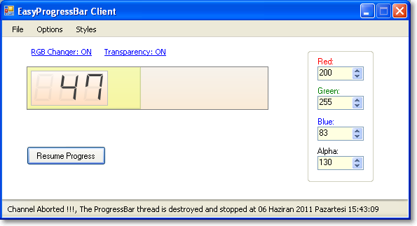
Test Client
I have added start/stop capability to our EasyProgressBar control using a ParameterizedThread. Let's take a look at an example that uses this behaviour with the EasyProgressBar.
private void button1_Click(object sender, EventArgs e)
{
if (!isProgressStarted)
{
easyProgressBar1.ValueChanged += (thrower, ea) =>
{
if (easyProgressBar1.Value == easyProgressBar1.Maximum)
{
isProgressStarted = false;
status.Text = "Progress execution is completed";
button1.Text = "Start New Progress";
}
};
progressThread = new Thread(new ParameterizedThreadStart(ProgressChannel));
progressThread.Name = "ProgressBar thread";
progressThread.IsBackground = true;
ParameterizedThreadClass pThread = new ParameterizedThreadClass
(easyProgressBar1.Minimum, easyProgressBar1.Maximum, easyProgressBar1.Value);
progressThread.Start(pThread);
isProgressStarted = true;
status.Text = String.Format("Channel Started !!!,
The {0} is started at {1:F}", progressThread.Name, DateTime.Now);
button1.Text = "Stop";
}
else
{
if (progressThread.IsAlive)
{
progressThread.Abort();
progressThread.Join();
isProgressStarted = false;
button1.Text = "Resume Progress";
}
}
}
private void ProgressChannel(object instance)
{
if (instance is ParameterizedThreadClass)
{
ParameterizedThreadClass pThread = (ParameterizedThreadClass)instance;
try
{
int startingValue = pThread.ProgressValue ==
pThread.Maximum ? pThread.Minimum : pThread.ProgressValue;
for (int i = startingValue + 1; i <= pThread.Maximum; i++)
{
UpdateProgressBar(i);
Thread.Sleep(50);
}
}
catch (ThreadAbortException)
{
UpdateStatusBar(String.Format("Channel Aborted !!!,
The {0} is destroyed and stopped at {1:F}",
Thread.CurrentThread.Name, DateTime.Now));
}
}
}
References
For more details, please look at the following books:
- Pro .NET 2.0 Windows Forms and Custom Controls in C#, by Matthew MacDonald
- Pro .NET 2.0 Graphics Programming, by Eric White
History
- June 07, 2011 - Updated
- Added more advanced system menu when our control is in float mode
- Added seven segment digital number style
- Added transparency support to the control window
- Added keyboard user interaction
- Added dockable support to the
EasyProgressBar control - Added serialize and deserialize support for data loading and saving (XML and Binary serialization, you can choose one from the
DataSaverAttribute class)
- April 24, 2011 - First release
Since 1998...
MCPD - Enterprise Application Developer
“Hesaplı hareket ettiğini zanneden ve onunla iftihar eyliyen dar kafalar; kurtulmağa, yükselmeğe elverişli hiç bir eser vücüda getirmezler. Kurtuluş ve yükselişi, ancak varlığına dayanan ve mülkü milletin gizli kapalı hazinelerini verimli hale getirmesini bilen, şahsi menfaatini millet menfaati uğruna feda eden, ruhu idealist, dimağı realist şahsiyetlerde aramalıdır.”
Nuri Demirağ, 1947


 General
  News
News  Suggestion
  Question
  Bug
Bug  Answer
  Joke
Joke  Praise
  Rant
Rant  Admin
Admin 


 Submit an article or tip


