Contents
Introduction
In previous Ribbon articles, we've seen a couple types of Ribbon controls: regular buttons and toggle buttons.
We've also seen how to create a menu of commands that is displayed when the user clicks the Application menu button.
The Ribbon has other types of buttons -- drop-down and split buttons -- that show menus when clicked.
Menus also have some visual features that we haven't covered yet. This article will show how to use those new types
of buttons and fancier menus.
As before, the minimum system requirements for building the sample code are Visual Studio 2008, WTL
8.0, and the Windows
7 SDK. If you are running Windows 7 or Server 2008 R2, you have everything you need. If you are using Vista
or Server 2008, you must install service pack 2 and the platform
update for your operating system to use the Ribbon.
The Sample App
Normally, I talk about the sample code at the end of an article, but I'll be using screen shots to illustrate
the controls that I'll be talking about, so we should dive right in to the sample app. The app prints a text message
in the window's client area, and the Ribbon controls let you change the foreground and background colors. Here's
a shot of the Foreground tab:
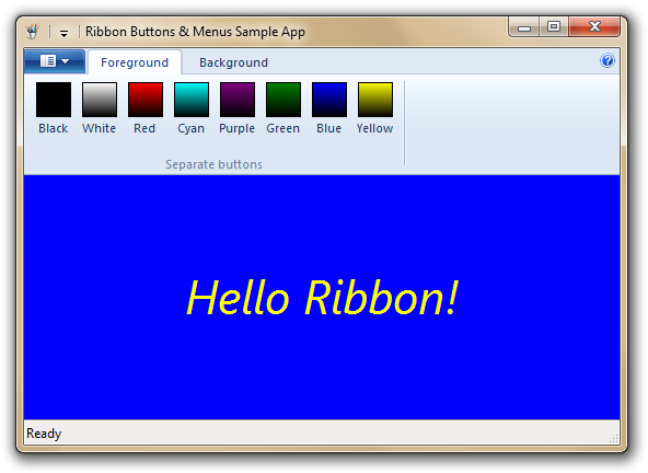
As we go through the article, I'll demonstrate how to arrange those color buttons in a menu.
The Drop-down Button
The first new type of button we'll look at is the drop-down button. Its properties are set the same way
as with a regular button, using a <Command> tag. The difference is that when you click it, the
Ribbon displays a menu.
Let's see how to add a drop-down button to the Foreground tab pictured above. Here is the <Command>
tag for the new button:
<Command Name="cmdFGColorDropdown" Symbol="RIDC_FGCOLOR_DROPDOWN" Keytip="M"
LabelTitle="&List o' colors" TooltipTitle="Color list"
TooltipDescription="Choose a foreground color from this menu" />
That's all standard stuff that we've seen before. Next, we'll add a new group to the tab and put the drop-down
button in that group:
<Tab CommandName="tabForeground">
<Group CommandName="grpFGButtons" SizeDefinition="EightButtons-LastThreeSmall">
</Group>
<Group CommandName="grpFGDropdown" SizeDefinition="OneButton">
<DropDownButton CommandName="cmdFGColorDropdown">
</DropDownButton>
</Group>
</Tab>
Here we see a new XML element, <DropDownButton>, which creates (as you would expect) a drop-down
button in the group. You specify what goes in the menu by adding a child <MenuGroup> tag. In
the <MenuGroup>, you write a control tag, such as <Button> or <ToggleButton>,
for each menu item. You can create a submenu by using a nested <DropDownButton> tag.
Here's an example of a menu that contains the first three foreground color commands:
<Command Name="cmdFgColorBlack" LabelTitle="&Black" />
<Command Name="cmdFgColorWhite" LabelTitle="&White" />
<Command Name="cmdFgColorRed" LabelTitle="&Red" />
<Tab CommandName="tabForeground">
<Group CommandName="grpFGButtons" SizeDefinition="EightButtons-LastThreeSmall">
</Group>
<Group CommandName="grpFGDropdown" SizeDefinition="OneButton">
<DropDownButton CommandName="cmdFGColorDropdown">
<MenuGroup>
<Button CommandName="cmdFgColorBlack" />
<Button CommandName="cmdFgColorWhite" />
<Button CommandName="cmdFgColorRed" />
</MenuGroup>
</DropDownButton>
</Group>
</Tab>
And here's what the menu looks like:

The menu looks similar to the Applications menu, but it defaults to using small icons for the commands. We'll
see how to customize the appearance of the menu in the next section.
There is one shortcut you can take when defining the menu. If you have just one menu group, you can omit the
<MenuGroup> tag and write the menu's contents as children of the <DropDownButton>
tag.
Changing the Menu's Appearance
There are a few ways that you can customize the menu's appearance using features of the <MenuGroup>
tag. First, you can use multiple menu groups to create separators. Here's how to create a menu with all eight color
commands, and a separator between the 4th and 5th commands:
<DropDownButton CommandName="cmdFGColorDropdown">
  <MenuGroup>
    <Button CommandName="cmdFgColorBlack" />
    <Button CommandName="cmdFgColorWhite" />
    <Button CommandName="cmdFgColorRed" />
    <Button CommandName="cmdFgColorCyan" />
  </MenuGroup>
  <MenuGroup>
    <Button CommandName="cmdFgColorPurple" />
    <Button CommandName="cmdFgColorGreen" />
    <Button CommandName="cmdFgColorBlue" />
    <Button CommandName="cmdFgColorYellow" />
  </MenuGroup>
</DropDownButton>
And here's how the menu looks:
<MenuGroup> also has a Class attribute. The Class defaults to "StandardItems",
but if you set it to "MajorItems", the menu will use large icons for the commands in that group. Here's
the result of adding Class="MajorItems" to the first <MenuGroup> tag:
Notice that each command's LabelTitle is now shown in bold. You can add a LabelDescription,
which will be shown beneath the LabelTitle. For example, we could add a LabelDescription
to the Black command:
<Command Name="cmdFgColorBlack" LabelTitle="&Black"
LabelDescription="Set the foreground to #000000" />
And here's how the command looks:
The menu will insert line breaks as necessary. You can insert your own line breaks by putting the XML escape
for a linefeed character -- 
 -- in the LabelDescription, but doing
so conflicts with the menu's own line-breaking:
Finally, you can assign a command to a menu group. When you do this, the Ribbon creates a taller separator that
acts as a header for that section of the menu. The header also shows the LabelTitle of that command.
For example, we can add these commands:
<Command Name="hdrClrMenu1" LabelTitle="Group 1" />
<Command Name="hdrClrMenu2" LabelTitle="Group 2" />
Then add those command names to the <MenuGroup> tags:
<DropDownButton CommandName="cmdFGColorDropdown">
  <MenuGroup Class="MajorItems" CommandName="hdrClrMenu1">
    <Button CommandName="cmdFgColorBlack" />
    <Button CommandName="cmdFgColorWhite" />
    <Button CommandName="cmdFgColorRed" />
    <Button CommandName="cmdFgColorCyan" />
  </MenuGroup>
  <MenuGroup CommandName="hdrClrMenu2">
    <Button CommandName="cmdFgColorPurple" />
    <Button CommandName="cmdFgColorGreen" />
    <Button CommandName="cmdFgColorBlue" />
    <Button CommandName="cmdFgColorYellow" />
  </MenuGroup>
</DropDownButton>
And here's how the menu looks with these new headers:
The Check Box
The next type of control we'll see is the check box. A check box is similar to a toggle button in that
it maintains its own checked state when it is clicked. However, a check box does not have an icon; instead, when
the control is checked, a check mark is drawn beside the item.
A check box starts out unchecked by default. When the control is first shown, the Ribbon will query for the
UI_PKEY_BooleanValue property to determine the initial checked state.
Adding a check box to a menu is done similarly to buttons: you write a <CheckBox> tag as
a child of a <MenuGroup>. Here is an example of how to add a check box to the menu of foreground
colors:
<Command Name="cmdShowColors" LabelTitle="&Show colors" />
<DropDownButton CommandName="cmdFGColorDropdown">
<MenuGroup>
<CheckBox CommandName="cmdShowColors" />
</MenuGroup>
</DropDownButton>
Here's how the check box looks in the checked state:
The sample app shows extra color information when that command is checked. The screen shot also shows the check
box in the QAT, where it appears like a traditional check box.
The Split Button
The other type of button we'll cover is the split button, which has two parts: a button and a drop-down
menu. Clicking the button portion of the split button executes a command, which is called the button item.
Clicking the drop-down arrow portion shows a menu, exactly like a drop-down button.
The sample app demonstrates a split button on the Background tab. As with the Foreground tab,
there are eight buttons for setting the background color, and those commands also appear in the split button's
menu. When the button item command is executed (that is, when you click on the button portion of the split button),
the app resets the colors back to their default values.
Since a split button has two parts, its properties come from two <Command> tags:
<Command Name="cmdBGColorSplit" Symbol="RIDC_BGCOLOR_SPLIT" Keytip="M"
TooltipDescription="Choose a background color from this menu" />
<Command Name="cmdBGSplitButtonItem" Symbol="RIDC_BGCOLOR_SPLITBUTTON_ITEM"
LabelTitle="List &o' colors" TooltipTitle="Color list"
TooltipDescription="Reset colors to their default values" />
Then we use a <SplitButton> tag to add a split button to the group. <SplitButton>
is slightly different from <DropDownButton> because we have to specify the command for the button
item. <SplitButton> has two child tags:
<SplitButton.ButtonItem>: This tag must contain one child tag, either <Button>
or <ToggleButton>, that defines the button item.
<SplitButton.MenuGroups>: This is the container tag for the menu portion of the button.
The menu's contents are specified the same way as with a drop-down button.
As with the drop-down button, if you have just one menu group, you can omit the <SplitButton.MenuGroups>
tag and write the menu's contents as children of the <SplitButton> tag.
Here's the definition of the Background tab and its groups, with the split button in the second group:
<Tab CommandName="tabBackground">
<Group CommandName="grpBGButtons">
</Group>
<Group CommandName="grpBGSplit" SizeDefinition="OneButton">
<SplitButton CommandName="cmdBGColorSplit">
<SplitButton.ButtonItem>
<Button CommandName="cmdBGSplitButtonItem" />
</SplitButton.ButtonItem>
<SplitButton.MenuGroups>
</SplitButton.MenuGroups>
</SplitButton>
</Group>
</Tab>
And here's how the button looks with the menu visible:
Some of the visual aspects of the split button are controlled by the split button's command, and some by the
button item's command:
LabelTitle, LabelDescription, icon, TooltipTitle: Controlled by the
button item.
Keytip: Controlled by the split button.
TooltipDescription: The TooltipDescription text comes from the part of the button
that the cursor is over.
Since only the split button's Keytip is used, there is no way to invoke the button item using the
keyboard. To ensure that the button item is accessible, you can include the button item's command in the menu,
or provide another command that does the same thing as the button item. The sample app uses the latter method;
the Default colors command also resets the colors.
You can put the entire split button in the QAT by right-clicking the drop-down portion and picking Add to
Quick Access Toolbar in the context menu. You can also right-click any menu header or separator. Right-clicking
the button portion of the split button lets you put just the button item in the QAT.
You can disable either of the commands associated with the split button, just like with other controls, but
the effect is different for each command. Disabling the split button's command disables the entire button, while
disabling the button item's command leaves the drop-down portion enabled. The sample app has two buttons that enable
and disable each part of the split button, so you can see for yourself how the button looks and behaves.
Using These Controls in the Application Menu
As we've seen in earlier articles, you define the contents of the application menu with <MenuGroup>
tags. All of the menu group features we've seen here also work in the application menu, but there are two differences
for groups that are children of the <ApplicationMenu> tag:
- The
Class attribute defaults to "MajorItems".
- Items in a group whose
Class is "MajorItems" are not drawn in bold, and the LabelDescription
is not shown.
These differences only affect top-level items in the menu. Submenus, created by nesting a drop-down or split
button, follow the rules we've already seen that apply to those buttons.
If you do nest a split button in the application menu, there are two other differences:
- Both parts of a split button are accessible through the keyboard. The button item's mnemonic comes from its
LabelTitle, not its Keytip, as with other menus. You can assign a mnemonic to the drop-down
portion by setting its LabelTitle to "&" plus the key, for example: "&S".
- When the split button's command is disabled, the button item portion of the control is still accessible. That
means that when you want to disable all parts of a split button, you must disable both of its commands so that
the entire button is disabled, no matter where the button is located.
The sample app shows how to make both parts of a split button accessible:
Other Tidbits
The Help button
You may have noticed in the screen shots that there's a Help button at the far right of the Ribbon. This
is a built-in feature that's easy to set up. To show the Help button, write a <Ribbon.HelpButton>
tag as a child of the <Ribbon> tag:
<Ribbon>
  <Ribbon.HelpButton>
    <HelpButton CommandName="cmdHelp" />
  </Ribbon.HelpButton>
</Ribbon>
In the corresponding <Command> tag, you can set the keytip, tooltip title, and tooltip description.
In all other respects, the Help button acts like any other button.
Dialog launchers
The Office Ribbon has a feature called a dialog launcher, which is a little button at the bottom-right
of a group. In beta versions of Windows 7, the native Ribbon had this feature as well, but it was removed from
the shipping version due to patent-related concerns. (Source: this
post on CodePlex.)
Saving Ribbon settings to the registry
Previous sample apps have saved Ribbon settings to a file in the TEMP directory. Another common
place to store settings is a registry key under HKEY_CURRENT_USER. The sample app saves settings this
way, using the SHOpenRegStream2() function to create a stream for reading or writing to a registry
entry. The code for loading settings looks like this:
void CAppRibbon::LoadRibbonSetings()
{
CComPtr<IStream> pStrm;
pStrm.Attach(SHOpenRegStream2(HKEY_CURRENT_USER, m_sSettingsKey,
m_sSettingsValue, STGM_READ));
if (NULL != pStrm)
m_pRibbon->LoadSettingsFromStream(pStrm);
}
The code for saving settings is similar, but it opens the stream with the STGM_WRITE flag to get
write access.
Conclusion
Drop-down buttons let you organize commands into menus and submenus, instead of putting every command into the
Ribbon as a button. In the next article, we'll look in more detail at the Quick Access Toolbar, how to interact
with it at runtime, and how you can specify commands to appear there by default.
Revision History
September 12, 2011: Article first published


 General
  News
News  Suggestion
  Question
  Bug
Bug  Answer
  Joke
Joke  Praise
  Rant
Rant  Admin
Admin 


 Submit an article or tip


