Introduction
The DataGrid is one of the powerful controls in Silverlight 2.0. It supports many new enhancements to the normal DataGrid.
Using DataGrid in a Silverlight Application
The DataGrid is contained in the System.Windows.Controls namespace. It can be dragged from the tool box to a XAML page. To use the DataGrid, we need to add the following namespace to our page:
xmlns:my="clr-namespace:System.Windows.Controls;assembly=System.Windows.Controls.Data"
(Dragging from the tool box will automatically add this namespace.) Then, the DataGrid object and properties can be used by prefixing the namespace. The following markup will add a DataGrid control to our page.
<my:DataGrid Height="100" Width="100"></my:DataGrid>
Column Types
The DataGrid supports a text box column, check box column, and a template column for customizing content.
- Text box column: The text box column will show content in a text block control in non-editing mode and in a text box control in editing mode.
- Check box column: The check box column renders content in a check box control. It provides an
IsThree state property when set to true. The state of the check box can be Checked, Unchecked, or Indeterminate. - Template column: For custom content/controls on the column, we can use the template column.
CellTemplate and CellEditing template columns can be used for changing content in edit mode.
When the AutogenerateColumns property set to true, the DataGrid will automatically generate a checkbox column for all Boolean values and a text box column for all other types. If a bound property doesn’t have a string or numeric data type, the column rendered will be a text block.
<data:DataGrid.Columns>
    <data:DataGridTextBoxColumn
        Header="Address"
        Width="120"
        DisplayMemberBinding="{Binding Address}" >

    <data:DataGridTextBoxColumn.ElementStyle>
        <Style TargetType="TextBlock">
          <Setter Property="TextWrapping" value="Wrap"/>
        </Style>
    </data:DataGridTextBoxColumn.ElementStyle>
    <data:DataGridTextBoxColumn.EditingElementStyle>
        <Style TargetType="TextBox">
          <Setter Property="Foreground" Value="Blue"/>
        </Style>
    </data:DataGridTextBoxColumn.EditingElementStyle>
    </data:DataGridTextBoxColumn>

    <data:DataGridCheckBoxColumn
        Header="Subscribed?"
        Width="75"
        DisplayMemberBinding="{Binding IsSubscribed}"
        IsThreeState="True" />

</data:DataGrid.Columns>
New Functionalities
Silverlight introduces new properties to enhance the functionalities of the DataGrid.
CanUserResizeColumns: When set to true, the user can change the column width using the mouse, just like MS Excel columns.GridlinesVisibility: The options are All, None, Vertical, or Horizontal.HeaderVisibility: It supports row headers other than column headers. Using this property, we can change the visibility of the row or column headers.RowDetailsVisibility and RowDetailsTemplate: When these properties are set, when a row is selected, the contents in the RowDetailsTemplate will be displayed below the row contents.
<data:DataGrid x:Name="dataGrid3"
    RowDetailsVisibility="VisibleWhenSelected" >
            <data:DataGrid.RowDetailsTemplate>
                <DataTemplate>
                   <TextBlock Text="Address: />
                </DataTemplate>
            </data:DataGrid.RowDetailsTemplate>
</data:DataGrid>
The following is a DataGrid with the address text shown in the Row Details section.

SelectionMode: The selection mode options are SingleFullRow and ExtendedFullRow. When set to ExtendedFullRow, the user can select multiple rows.Opacity: The opacity of the DataGrid can be changed by using this property.
For the complete list of properties, go to MSDN.
Binding
To bind a DataGrid, you can set the ‘ItemsSource’ property. But the data source should implement the IEnumerable interface. The DataGrid columns have the ‘DisplayMemberBinding’ field which can be used for binding to a data field.
<DataGridTextBoxColumn DisplayMemberBinding="{Binding DataFieldName}" >
<my:DataGrid.Columns>
    <my:DataGridTextBoxColumn DisplayMemberBinding="{Binding ID}"
                   IsReadOnly="False"></my:DataGridTextBoxColumn>
    <my:DataGridTemplateColumn>
        <my:DataGridTemplateColumn.CellTemplate>
            <DataTemplate>
                <TextBlock  Text="{Binding FName}" FontSize="10"/>
            </DataTemplate>
        </my:DataGridTemplateColumn.CellTemplate>
    </my:DataGridTemplateColumn>
    <my:DataGridTextBoxColumn DisplayMemberBinding="{Binding LName}"
                   IsReadOnly="False" ></my:DataGridTextBoxColumn>
</my:DataGrid.Columns>
Binding to a DataGrid in code-behind:
private void BindToGrid()
{
Employee[] empObj = new Employee[5];
empObj[0] = new Employee("EmpFName1", "EmpLName1", "1");
empObj[1] = new Employee("EmpFName2", "EmpLName2", "2");
empObj[2] = new Employee("EmpFName3", "EmpLName3", "3");
empObj[3] = new Employee("EmpFName4", "EmpLName4", "4");
empObj[4] = new Employee("EmpFName5", "EmpLName5", "5");
dgSample.ItemsSource = empObj;
}
In the example, the DataGrid ‘dgSample’ is bound to an array of ‘Employee’ objects.
public class Employee
{
    public Employee(string FName, string LName, string ID)
    {
        this.FName = FName;this.LName = LName;this.ID = ID;
    }
    public string ID
    {
        get;set;
    }
    public string FName
    {
        get;set;
    }
    public string LName
    {
        get;set;
    }
}
Applying Style
The DataGrid provides the Style, ColumnHeaderStyle, RowHeaderStyle, RowStyle, and CellStyle properties. Any style object can be set to these styles.
<DataGrid x:Name="dataGrid1"
    Style="{StaticResource DataGridStyle}"
    ColumnHeaderStyle="{StaticResource  ColumnHeaderStyle}"
    RowHeaderStyle="{StaticResource RowHeaderStyle}"
    RowStyle="{StaticResource RowStyle}" >
    <DataGrid.Columns>
        <DataGridTextBoxColumn
            DisplayMemberBinding="{Binding DataFieldName}"
            CellStyle="{StaticResource CellStyle}" />
    </DataGrid.Columns>
</DataGrid>
For an overview on styling in Silverlight, see: Styling and Templating Overview.
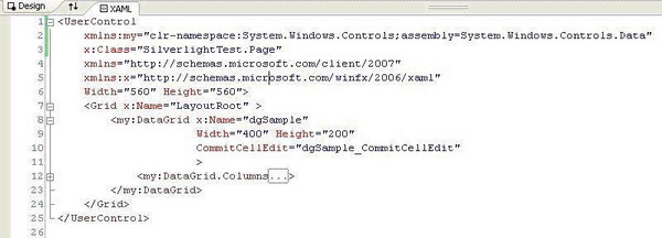
Editable a DataGrid
DataGrid columns have an ‘IsReadOnly’ property. When set to false, the cell is an editable one. To get the changed values and for updating the data source, the DataGrid provides the following events:
BeginningCellEditCommitCellEditCommittingCellEditCommittingRowEditCurrentCellChanged
One can use two way binding to reduce code. But, in most cases, we may need to catch the above events.
private void dgSample_CommitCellEdit(object sender, DataGridCellEventArgs e)
{
string strChangedText = ((TextBlock)e.Element).Text;
}
Sorting and Paging
The DataGrid doesn’t have an in-built mechanism for sorting and paging. But, these functionalities can be easily achieved by manipulating the data source appropriately.
You can find one such implementation here.
I have 3 years of IT experience.
Doing : C#, ASP.NET,VB,SQL Server, Oracle
Currently working in Technopark, Kerala,India


 General
  News
News  Suggestion
  Question
  Bug
Bug  Answer
  Joke
Joke  Praise
  Rant
Rant  Admin
Admin 


 Submit an article or tip

