Introduction
Adorners are great and sometimes you want to quickly put some adorners up with ease. All samples today
usually include custom building adorners with code, or some other class.
This article explains a simpler way of attaching adorners by using a behavior class. The attached example was created with Expression Blend 4.0 but you can open it in Visual Studio 2010.
All code described here is in the attached project.
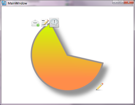
Find the final screen below. Adorners are composed of visual elements via the DataTemplate.
Using the code
The code is quite simple. First you need to ensure the item you want to adorn contains an Adorner layer, otherwise CaAdornerBehavior will throw a null exception.
Use an AdornerDecorator to add the adorner layer. The XAML sample follows:
<Grid x:Name="LayoutRoot">
    <AdornerDecorator Width="250" Height="250">
        <ed:Arc x:Name="arc">
                     : : : : :
                     : : : : :
        </ed:Arc>
    </AdornerDecorator>
</Grid>
Copy the file CaAdornerBehavior.cs to your project folder and include in the project. This file will compile as a behavior. It will appear in Blend behavior assets:

Here, we’ll go over the Blend designer to integrate the behavior properties.
- Notice the behavior part of the
Arc object. This associates the behavior with Arc.
Using the designer, you can associate the behavior with other objects. - The behavior contains two event properties:
ShowAdornerCommand and HideAdornerCommand. These bindings allow the user
to control showing or hiding the template adorner. - Notice the
AdornerTemplate property. Here the behavior accepts the DataTemplate that will be shown as the adorner. The DataTemplate is internally hosted
as a ContentTemplate of a ContentControl in the Behavior. - The Adorner
DataTemplate. It is a standard DataTemplate so you can include any visual element.
XAML code
The Adorner DataTemplate is very straightforward. It includes some icons aligned accordingly.
<Window.Resources>
<DropShadowEffect x:Key="BlurEffectStyle" …/>
<DataTemplate x:Key="AdornerDataTemplate">
<Grid>
<StackPanel Orientation="Horizontal">
<Image Height="32" Width="32"
Source="Mail-add.png"/>
<Image Height="32"
Source="Paper-pencil.png" Width="32"/>
<Button Style="{DynamicResource SimpleButton}"
Width="32" Height="32">
<Image Height="Auto"
Source="Exclamation.png"
Stretch="Fill"/>
</Button>
</StackPanel>
<Image Source="Pencil.png"
Width="32" Height="32"
VerticalAlignment="Bottom"
HorizontalAlignment="Right"/>
</Grid>
</DataTemplate>
</Window.Resources>
Using the adorner behavior is also very straightforward.
<Custom:Interaction.Behaviors>
     <CaControlTestApp:CaAdornerBehavior
            AdornerTemplate="{DynamicResource AdornerDataTemplate}">

            <Custom:Interaction.Triggers>

                  <Custom:EventTrigger SourceName="arc"
                                       EventName="MouseEnter">
                       <Custom:InvokeCommandAction
                                 CommandName="ShowAdornerCommand"/>
                  </Custom:EventTrigger>

                  <Custom:EventTrigger SourceName="arc"
                                       EventName="MouseLeave">
                       <Custom:InvokeCommandAction
                                  CommandName="HideAdornerCommand"/>
                        </Custom:EventTrigger>
                  </Custom:Interaction.Triggers>

      </CaControlTestApp:CaAdornerBehavior>
</Custom:Interaction.Behaviors>
Notice that we have event triggers to show/hide the adorner to the parent's MouseEvents. You can use any other trigger to show it. A DataTrigger, and others, will also work.
History
- 19 Oct 2011: First version.
- 18 Nov 2011: Sample code updated. The behavior class was not properly binding. This was fixed to bind to the adorned UI element data context.
20+ yrs Leading and Developing Microsoft products in the Financial Industry.
My main background is VC++, server and client development.
Currently focused in WPF/XAML, Windows 8 and Windows Azure Server technologies.


 General
  News
News  Suggestion
  Question
  Bug
Bug  Answer
  Joke
Joke  Praise
  Rant
Rant  Admin
Admin 


 Submit an article or tip


