Introduction
Microsoft Excel has a very useful auto-filter function. With this function enabled on a column, the user is able to select filters from a drop-down list which, when selected, are applied to the column. This article describes how to add similar filter functionality to the WPF ListView control.
Background
Before the arrival of WPF, control customisation was a tricky and somewhat messy task. With WinForms, a small amount of customisation can be performed if the control exposes events allowing the developer to tweak certain aspects of style prior to rendering. With other controls, the Paint method can be overridden to perform additional rendering after the control has rendered itself. However, any significant changes in how the control appeared will probably require the developer to take responsibility for rendering the entire control (owner draw). In summary, control customisation with WinForms feels like hacking!
With WPF, the situation is much better, the mechanisms that controls use to render themselves are much more visible to the developer. The use of various templates (control and data) allows the developer to perform anything, from a minor tweak to the appearance of a control, to a complete visual overhaul, with ease. The important difference between WPF and WinForms is that with WPF, the control rendering process is immediately accessible; with WinForms, it is hidden.
Step One: Where to Start
I wanted this control to not only provide filter functionality, but also to allow the user to sort by clicking on the column heading. Rather than re-inventing the wheel, I found a sortable ListView on Joel Rumerman's blog which provided a suitable starting point for my control.
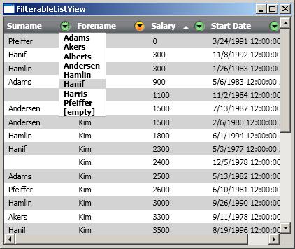
The image below shows this control in action, with the list sorted by Forename:

I created a sub-class of SortableListView, FilterableListView, as the starting point for this control.
Step Two: Adding the Controls
Unfortunately, the background section to this article paints a rosy picture of WPF which is not altogether true. Some controls are harder to customise than others, with the ListView being one of the trickier ones.
The main problem with the ListView control is that while the XAML to insert this control is quite simple, as illustrated below, it actually hides quite a lot of complexity. If you browse the visual tree for the ListView with a debugger tool such as Mole, you will see that the ListView is composed of many visual elements, many of which you would like to style.
<ListView>
<ListView.View>
<GridView>
<GridViewColumn Header=â€Column Header“/>
</GridView>
</ListView.View>
</ListView>
There are a number of great blog posts which describe how to style the various visual aspects of the ListView, including Styling the ListView, which describes how to style the ItemContainer which (as you might expect!) contains the items in the list, the CellTemplate for each GridViewColumn, the ColumnHeaderContainerStyle, and more. The basic principle being that the ListView exposes the templates and styles of the visual elements which it constructs as properties of the ListView itself. The hard part is knowing which of these properties to use in order to achieve the effect you are after.
Back to the subject of creating an auto-filter, the image below shows the controls that I wanted to add. A button which, when it is clicked, reveals a popup window that contains a list of items to filter by.
To achieve the above, it is the contents of the column header which we need to modify rather than the visual style of the entire header itself. Therefore, the data template of the column header is the correct place to add these controls. The XAML below illustrates how this is done.
<DataTemplate x:Key="FilterGridHeaderTemplate">
<StackPanel Orientation="Horizontal">
<TextBlock HorizontalAlignment="Center"
VerticalAlignment="Center" Text="{Binding}"/>
<Label Name="sortIndicator"
VerticalAlignment="Center"
Style="{StaticResource HeaderTemplateTransparent}"/>
<Button ContentTemplate="{StaticResource filterButtonInactiveTemplate}"
Name="filterButton"
Command="{x:Static c:FilterableListView.ShowFilter}"/>
<Popup StaysOpen="false"
Name="filterPopup" Placement="Bottom"
PlacementTarget="{Binding ElementName=filterButton}">
<ListView x:Name="filterList"
ItemsSource="{Binding}" BorderThickness="1"
ItemContainerStyle="{StaticResource ListItemRolloverHighlight}">
<ListView.View>
<GridView>
<GridView.ColumnHeaderContainerStyle>
<Style TargetType="GridViewColumnHeader">
<Setter Property="Visibility" Value="Hidden" />
<Setter Property="Height" Value="0" />
</Style>
</GridView.ColumnHeaderContainerStyle>
<GridViewColumn DisplayMemberBinding="{Binding Path=ItemView}"/>
</GridView>
</ListView.View>
</ListView>
</Popup>
</StackPanel>
</DataTemplate>
If you have read the blog post referenced above, you will know that each GridViewColumn has a HeaderTemplate property which can be used to provide a data template for the column header. We could simply specify that when a developer uses the FilterableListView that they set the HeaderTemplate for each column accordingly; however, it makes the control much more useable if the above template automatically becomes the data template for the column header.
In order to do this, we programmatically assign the HeaderTemplate property in the OnInitialised method of our ListView, as follows:
protected override void OnInitialized(EventArgs e)
{
base.OnInitialized(e);
Uri uri = new Uri("/Controls/FiterListViewDictionary.xaml", UriKind.Relative);
dictionary = Application.LoadComponent(uri) as ResourceDictionary;
GridView gridView = this.View as GridView;
if (gridView != null)
{
foreach (GridViewColumn gridViewColumn in gridView.Columns)
{
gridViewColumn.HeaderTemplate =
(DataTemplate)dictionary["FilterGridHeaderTemplate"];
}
}
}
Step Three: Displaying the Popup
When placing components within a Window, event handling is a straightforward process of connecting events to handlers in the code-behind. However, in this case, our data template is specified within a resource dictionary. It might seem surprising at first, but there is no way that you can directly connect the click event to the code! The problem is described in more detail in the following blog post: Commands and Controls in WPF, with the solution being to use commands, giving us much looser coupling between the view (XAML) and the controller (code-behind).
In listing 2, you can see that the filter button issues a ShowFilter command; this is a RoutedEvent that will tunnel and bubble through the visual tree. The FilterableListView has a command binding that allows it to handle this event.
When the FilterableListView handles the ShowFilter command, it needs to determine the following:
- The name of the property that should be filtered.
- Which popup window is associated with this button.
The easiest way of discovering this information is to navigate the visual tree, first up to the column header, to obtain the name of the property to filter, then down from the header to locate the associated popup window. The VisualTreeHelper class provides a number of static utility methods for navigating the tree, which Andrew Whiddett has wrapped up in a WPFHelper class which enhances this functionality, allowing you to search the visual tree for classes that match certain criteria (name, type, etc.).
public FilterableListView()
{
CommandBindings.Add(new CommandBinding(ShowFilter, ShowFilterCommand));
}
private void ShowFilterCommand(object sender, ExecutedRoutedEventArgs e)
{
Button button = e.OriginalSource as Button;
GridViewColumnHeader header = (GridViewColumnHeader)
Helpers.FindElementOfTypeUp(button, typeof(GridViewColumnHeader));
Popup popup = (Popup)Helpers.FindElementOfType(header, typeof(Popup));
if (popup != null)
{
SortableGridViewColumn column = (SortableGridViewColumn)header.Column;
String propertyName = column.SortPropertyName;
filterList.Clear();
PropertyDescriptor filterPropDesc =
TypeDescriptor.GetProperties(typeof(Employee))[propertyName];
foreach (Object item in Items)
{
object value = filterPropDesc.GetValue(employee);
if (value != null)
{
FilterItem filterItem = new FilterItem(value as IComparable);
if(!filterList.Contains(filterItem))
{
filterList.Add(filterItem);
}
}
}
filterList.Sort();
popup.DataContext = filterList;
popup.IsOpen = true;
ListView listView = (ListView)popup.Child;
listView.SelectionChanged += SelectionChangedHandler;
}
}
Step Four: Applying the Filter
The final step is simply to handle the SelectionChange event from the filter ListView, constructing the appropriate filters and applying them to the Items in the list. When using a FilterableList view which has a filter set on one of the columns and you wish to apply a filter to one of the other columns, you would expect that the drop down only displays the items that are present as a result of the first filter. In other words, the filters are AND-ed together. Interestingly, this functionality comes for free! This is because we populated the drop-down filter list by iterating over the Items property of our ListView. Items derives from System.Windows.Data.CollectionView which, as the name suggests, is a view on the bound data which is the effect of applying grouping, sorting, filtering etc.
Items.Filter = delegate(object item)
{
bool match = true;
foreach (KeyValuePair<String, FilterStruct> filter in currentFilters)
{
FilterStruct filter = filter.value;
PropertyDescriptor filterPropDesc =
TypeDescriptor.GetProperties(typeof(Employee))[filter.property];
object itemValue = filterPropDesc.GetValue((Employee)item);
if (itemValue != null)
{
if (!itemValue.Equals(filter.value.Item))
match = false;
}
else
{
if (filter.value.Item != null)
match = false;
}
}
return match;
};
Using the Control in Practice
Using the FilterableListView is as simple as using a regular ListView. The only difference is the addition of an extra property SortPropertyName, which is the property which is sorted / filtered for a specific column.
<slogic:FilterableListView ItemsSource="{Binding}">
    <ListView.View>
        <GridView>
            <slogic:SortableGridViewColumn Header="Surname"
               SortPropertyName="LastName"
               DisplayMemberBinding="{Binding Path=LastName}"/>
            <slogic:SortableGridViewColumn Header="Forename"
               SortPropertyName="FirstName"
               DisplayMemberBinding="{Binding Path=FirstName}" />
            <slogic:SortableGridViewColumn Header="Salary"
               SortPropertyName="Salary"
               DisplayMemberBinding="{Binding Path=Salary}" />
            <slogic:SortableGridViewColumn Header="Start Date"
               SortPropertyName="StartDate"
               DisplayMemberBinding="{Binding Path=StartDate}" />
        </GridView>
    </ListView.View>
</slogic:FilterableListView>
The FilterableListView does, however, suffer from the same problem as the ListView. The control is composed of a number of other controls which the developer does not explicitly construct within their XAML code. FilterableListView uses the same approach as ListView; it exposes the properties of the visual elements it includes to the developer via dependency properties. The FilterButtonActive and FilterButtonInactive properties can be used to style the drop-down button. (Note: I have not exposed all the potential properties that one might be interested in, I leave this as an exercise for the reader!)
The following image shows a couple of examples of the FilterableListView in action. One using its default style, the other with styles applied to the column header, buttons, and ListView item containers.
Conclusion
This article demonstrates how to enhance the functionality of the provided ListView control to add an auto-filter to the column headings. The WPF ListView control feels a little inaccessible at first; however, it is not much harder to customise than the other controls within the WPF libraries.
History
- 08/07/2008 - Initial article upload.


 General
  News
News  Suggestion
  Question
  Bug
Bug  Answer
  Joke
Joke  Praise
  Rant
Rant  Admin
Admin 


 Submit an article or tip


 ,
, 
