Introduction
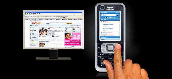
Nowadays, many more people are going to develop their websites specially designed for mobile devices.
The reason for doing so is simple. The Website owner can reach a dedicated mass that are always having a specific search. Mobiles are handy, people are always connected and now we even don't forget to carry them as we don't forget our purse!
Mobile Web pages are slightly different than standard Web pages. Mobile Web pages will have smaller content and smaller images. An idle mobile Web page should be rendered on any mobile device in less than 2 seconds. So we should always limit the Webpage to a smaller size.
Key Point
The Website should be displayed on mostly all GPRS enabled mobile phones, PDAs and all 1G, 2G and 3G mobile devices. This is a real challenge as you will not find a common solution for all the devices. I had Googled a lot for a common solution, but to my disappointment I could not find a common one for all. And this is the fact which led me to write this article.
What Changes are Required in Order to Convert a Normal Web Page into a Mobile Web Page?
There are two things which are important for a mobile browser. You should set both of them.
- DOCTYPE
A DOCTYPE (Document Type Declaration) instructs the validator which version of the (X)HTML your Web page is using. You must write it to the very first line of your Web page. It helps to validate your markup and CSS.
<!DOCTYPE html PUBLIC "-//W3C//DTD XHTML 1.0 Transitional//EN"
	"http://www.w3.org/TR/xhtml1/DTD/xhtml1-transitional.dtd">
- Content Type
The content type of a mobile Web page can be any of the following:
- application/vnd.wap.xhtml+xml
- application/xhtml+xml
Which one is correct from a or b depends on the mobile device. Some devices support a, some supports b and many of them supports both. The best way is to write a function which checks the Request Headers and then set the content type accordingly. I have presented that function below:
public void setContentTypeDynamically(HttpRequest Request, HttpResponse Response)
{
if(Request.Headers["Accept"].ToString().IndexOf
("application/vnd.wap.xhtml+xml") != -1)
Response.ContentType = "application/vnd.wap.xhtml+xml";
else if (Request.Headers["Accept"].ToString().IndexOf
("application/xhtml+xml") != -1)
Response.ContentType = "application/xhtml+xml";
else
Response.ContentType = "text/html";
}
The function is fairly easy to understand. It reads the value of server variable Request.Headers["Accept"] and sets the ContentType of response object accordingly. Here the order to check the ContentType is important, as many modern mobile browsers may support all of them!
Images are Special. Render them According to the Screen Size of a Mobile Device.
The general width of a mobile device was 255 pixels. But this has changed dramatically as mobile manufactures are producing N number of models with various screen sizes. You can check the screen size of a mobile device from X-Wap-Profile XML file. I have discussed the X-Wap-Profile in another point below.
The best way for image displaying is - Store a single image of 255 pixels in database and then resize it on ISS according to the requested screen width and height.
For example: Motorola L7 has 176 x 200 screen size (Width x Height), BlackBerry8800 has 320 x 240 screen size and Nokia2630 has 128 x 160 screen size. For the perfect view of the image, it must be resized on IIS accordingly and then you should point the correct URL to the image tag.
To ease the process, I have created a table in database. This reads the “X-Wap-Profile” on first request and stores model name of the mobile, URL of the X-Wap-Profile, screen width, screen height, supports 3gp, mp4, etc. information in the database table.
I don't go to read the 'X-Wap-Profile' each time a request comes for a Web page. Instead I do this only for the first time a new mobile is requested. On first request, all the device info is stored in the database table and for all the subsequent requests, I can look for height and width of a screen directly in my database. This will lessen the efforts of requesting the “X-Wap-Profile” each time and can serve a Web page faster to the client.
Note: The code to read the image from database and to resize the image is beyond the scope of this article. Please search The Code Project for this!
Single Domain, Two Different Web Sites
Sometimes, you may have only a single domain registered and you want two different Websites pointing towards the same domain name.
Let’s understand this with an example. You have a domain something like http://www.yourwebsitename.com. You will develop two different websites: Website ‘A’ fully dedicated for normal desktop browser and website ‘B’ with mobile Web pages which are smaller in size and specially designed for mobile browsers.
Now, if http://www.yourwebsitename.com is requested from a desktop browser, you want to show the home page of your normal website ‘A’ and if the request comes from any GPRS enabled mobile device, you will want to show them the home page of your mobile page Website ‘B’.
Why You Want the Same Domain Name for Both of the Websites?
The answer is simple:
- You get the benefit of SEO on both of the pages.
- The same brand value and customer credit can be received on both of the sites.
- Marketing and Advertisement can be shared between both of the websites.
- You may also have the domain http://www.yourwebsitename.mobi but this makes more sense to show a user mobile home page rather than a normal Web page, if it is requested from a mobile device.
Code to Detect a Mobile Browser
Following is the code which solves the above issue. I have created a function which checks for the ‘X-Wap-Profile’. If it is found, then I redirect them to my mobile Web pages, else I redirect the request to normal Web pages.
bool IsMobi = false;
if (Request.Headers["X-Wap-Profile"] != null)
{
if (Request.Headers["X-Wap-Profile"].ToString().Length > 0)
{
IsMobi = true;
Response.Redirect("index.aspx", true);
}
Else
{
Response.Redirect("web/index.aspx", true);
}
}
What are Request.Headers?
HTTP request headers allow the client to provide information about itself to the server. They give additional details about the nature of the request like its content type, Accept-Charset, Accept-Encoding, Accept-Language, etc.
What is ‘X-Wap-Profile’?
When you request a mobile browser, it sends much more information back to the server. One of them is the link to the ‘X-Wap-Profile’.
- X-Wap-Profile: http://gsm.lge.com/html/gsm/LG-KG220.xml
X-Wap-Profile is an XML file which provides all the detailed information about a mobile device. You can find the screen size of the mobile device, supported audio and Video types, Model name of the device and many more things.
This XML file is provided by the phone manufacturer for the use of the outer world.
Will Only This Code Do For All GPRS Enabled Mobile Devices?
The answer is NO. But the trick is not much harder than above. Some mobile device don't have the attribute X-Wap-Profile. Instead, they may have any of the following:
- X-Wap-Profile
- X-Wap-Profile:
- Profile
- Profile:
Moreover, in my experience some Samsung and LG devices also have different writing style of the same attribute as shown below:
- X-Wap-Profile
- x-wap-profile
- X-WAP-PROFILE
The best way is to check all of them in a single function and according to value of IsMobi boolean variable, redirect the user to a relevant Web page.
Some Tips and Tricks
Put the mobile pages in parent folder and normal Web page in a child folder.
This will avoid any redirection if a request comes from any mobile device. It can save your valuable CPU cycles. It will also help you to give a faster response to the user. No user can wait for more than two seconds for rendering of a page. An ideal mobile page should be rendered on any mobile device in less than 2 seconds.
- Iphone is a special device and I want my Website to render as a normal desktop Web page on Iphone. What should I do for this?
In this case, you will check the name ‘iphone’ OR ‘ipod’ from the User Agent. If it is found, then you will need to set the Viewport attribute in a metatag. In the below example, I have to take a literal named ‘iphone’ in the Header section of the page like this.
<head id="Head1" runat="server">
        <asp:literal id="iphone" runat="server"></asp:literal>
</head>
And in the code behind, I check it as shown below:
if (Request.UserAgent.ToLower().Contains("iphone"))
{
iphone.Text = "<meta name=\"viewport\" content=\"width =
device-width height = device-height \" />";
}
else if (Request.UserAgent.ToLower().Contains("ipod"))
{
iphone.Text = "<meta name=\"viewport\" content=\"width =
device-width height = device-height \" />";
}
Conclusion
In my experience, I have tested the above code on more than 200 mobile devices and it has worked fine.
I have not included a demo project as the code shown above is very simple to understand and apply. Feel free to contact me if you have any questions in understanding the concept.
History
- 1st November, 2008: Initial post
Mahesh has worked on Asp.net and mobile technologies for last 4.6 years.
He has worked with mobile WAP site for more than a year.
The ideas presented here have been tested on more than 200 mobile devices. The logic presented here have got success on mostly all type of legacy to latest mobile devices including Sony, Nokia, Motorola, Samsung, Iphone and Gphone


 General
  News
News  Suggestion
  Question
  Bug
Bug  Answer
  Joke
Joke  Praise
  Rant
Rant  Admin
Admin 


 Submit an article or tip


![Rose | [Rose]](https://codeproject.global.ssl.fastly.net/script/Forums/Images/rose.gif)
