Introduction
In Windows Forms allocation user interface is defined by their absolute coordinates concerning a nested control (parent). The anchoring of coordinates and the sizes along with docking adds the possibility to change the sizes and position depending on the sizes of a parent element. However, there are certain moments in Windows Forms where without additional programming we probably can't solve anything, for example button arranging should be strictly on the centre of parental content area. And though in .NET versions 2.0 have appeared new components (like FlowLayoutPanel and TableLayoutPanel which allow to have many solutions using layout elements of the user interface), flexibility and convenience, as that given by technology WPF they cannot provide. Formally providing layout of elements of management on the basis of coordinates, WPF offers completely stream layout independent of coordinates. On a number with new model of layout, WPF realises also a new model of content which allows to place any elements of user's handle in each other. Even such magnificent variants, as for example text boxes placed in buttons, along with text labels and images, are realised naturally and easily, without additional code writing. Allocation of units in a WPF-window is very similar to imposition of HTML-documents.
All the elements of content model are inheriting by content from class System.Windows.Controls.ContentControl and layout elements from class System.Windows.Controls.Panel. Both ContentControl and Panel are descendants of class System.Windows.FrameworkElement which is the basic class for all elements of the user interface in WPF. Appointment of layout elements consists in arranging of the elements according to certain rules. Elements of content model usually bear functional loading, and can store in itself only one child element of any class. Any layout element which comprises other elements, including layout can be such child element. System.Windows.Window is a class of WPF window, which is a typical example of content model. As well as any other element of content model, this class can have only one element, for example System.Windows.Controls. The Grid is the most functional class of layout container in WPF. Another example is the class of content model named System.Windows.Controls. Button is the usual button which can store in itself layout class System.Windows.Controls.StackPanel which in turn stores in itself the image along with a text label for the button and operates arranging of these elements on the button. Along with elements of content model, layout elements can comprise other layout elements. In this aspect WPF is the basic highlight, which allows to create the user interface of the desktop application, like designing the Internet sites. The hierarchy of all layout classes and classes of content model can be examinated in MSDN. In given article the most widespread classes and interesting examples are considered. For work with the presented examples, the environment of working is required Visual Studio 2008, it is possible to use also Express Edition which is accessible to acquaintance to http://www.microsoft.com/express address. As the programming language in examples it is used C#, but it will not make any difficulty to translate an initial code of examples on any other language of platform.NET.
Let's begin consideration with the layout classes intended for arranging of the children elements. All of them are defined in namespace System.Windows.Controls, except the last - UniformGrid which is defined in namespace System.Windows.Controls.Primitives:
StackPanelWrapPanelDockPanelCanvasInkCanvasGridUniformGrid
There is also one more layout element (System.Windows.Controls.VirtualizingPanel) which will not be considered. Its assignment is to minimise an overhead charge connected with list elements, for example ListBox which is binding to the data.
The StackPanel
Places children elements abreast, starting from top to down by default. Elements take the necessary height to display its content, and on width they are stretched till the sizes of the panel. Property Orientation can change a placing direction. Admissible values are defined by listing System.Windows.Controls.Orientation: Horizontal one is for alignment across and Vertical one is for alignment on a vertical (by default). When alignment is on horizontal, children elements are stretched on height. Not located elements can fall outside the limits of the StackPanel size and will be truncated in that case by the form, but not under the content. Use example:
<Window x:Class="WpfApplication1.Window1"
     xmlns="http://schemas.microsoft.com/winfx/2006/xaml/presentation"
     xmlns:x="http://schemas.microsoft.com/winfx/2006/xaml"
     Title="Тестовый пример" SizeToContent="WidthAndHeight">
  <StackPanel>
    <StackPanel Orientation="Horizontal" Margin="5" HorizontalAlignment="Right">
      <Label>День:</Label>
      <TextBox MinWidth="125"></TextBox>
    </StackPanel>
    <StackPanel Orientation="Horizontal" Margin="5" HorizontalAlignment="Right">
      <Label>Месяц:</Label>
      <TextBox MinWidth="125"></TextBox>
    </StackPanel>
    <StackPanel Orientation="Horizontal" Margin="5" HorizontalAlignment="Right">
      <Label>Год:</Label>
      <TextBox MinWidth="125"></TextBox>
    </StackPanel>
    <Button HorizontalAlignment="Right" Margin="3" Padding="2">Сохранить</Button>
  </StackPanel>
</Window>
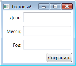
Usually, the StackPanel is used with other, more powerful layout elements, for example The Grid.
The WrapPanel
Stacks the units as the StackPanel does, but not located children elements "are wrapped" on new line at horizontal alignment or on a new column on the vertical. At empty seat exhaustion the remained and not located elements are truncated. By default property Orientation has the value Horizontal and children elements in difference from the StackPanel are arranging in a line. The example is considered in a sample of a following layout element.
The DockPanel
Aligns elements on all accessible area like docking in Windows Forms. By means of attached property Dock children elements set the preferences on arranging from listing System.Windows.Controls.Dock. Property LastChildFill specifies that the last child element occupies all remained area. Use example:
<Window x:Class="WpfApplication1.Window2"
     xmlns="http://schemas.microsoft.com/winfx/2006/xaml/presentation"
     xmlns:x="http://schemas.microsoft.com/winfx/2006/xaml"
     Title="Тестовый пример" Width="300" Height="300">
  <DockPanel LastChildFill="True">
    <TextBlock DockPanel.Dock="Bottom" Background="Aqua">Низ формы</TextBlock>
    <TextBox DockPanel.Dock="Right" Background="Brown">Текст справа</TextBox>
    <WrapPanel DockPanel.Dock="Top" Background="DimGray">
      <Button Margin="3">Кнопка 1</Button>
      <Button Margin="3">Кнопка 2</Button>
      <Button Margin="3">Кнопка 3</Button>
      <Button Margin="3">Кнопка 4</Button>
      <Button Margin="3">Кнопка 5</Button>
    </WrapPanel>
    <TextBox DockPanel.Dock="Left" Background="Beige">Текст слева</TextBox>
    <Button>Кнопка в центре</Button>
  </DockPanel>
</Window>

Pay attention on the WrapPanel for which not located buttons have been transferred on a new number. If to stretch the form on width, so that the buttons from the lower row will be transferred to the first row of the element WrapPanel on a vacant place. If to compress the form, the WrapPanel can increase the size on height to find room already for three numbers of buttons and etc. We may notice also that an upper edge of text boxing on the right is higher than the upper edge of text boxing on the left. Such behaviour is defined by position of text boxing in a collection of children elements, it means the DockPanel begins to dock the elements in their sequence in the collection. In our example the text boxing on the left is described after the WrapPanel which has already filled the top part of the form.
The Canvas
Places the children elements using exact coordinates. It is the unique layout element that has such behaviour. To position an element on the Canvas it is necessary to establish attached properties Canvas.Left and Canvas.Top. It is alternatively possible to take advantage of properties Canvas.Right and Canvas.Bottom, but not together with above described Canvas.Left and Canvas.Top. Actually, the Canvas has no layout logic, but simply stuff children elements on the specified coordinates in a sequence. If one element "runs" into another to change a sequence it is possible by means of attached property Canvas.ZIndex. Not located elements are truncated. Use example:
<Window x:Class="WpfApplication1.Window3"
     xmlns="http://schemas.microsoft.com/winfx/2006/xaml/presentation"
     xmlns:x="http://schemas.microsoft.com/winfx/2006/xaml"
     Title="Тестовый пример" Width="250" Height="120">
  <Canvas>
    <Button Canvas.Left="10" Canvas.Top="10">10, 10</Button>
    <Button Canvas.Left="70" Canvas.Top="70" Width="90">70, 70</Button>
    <Button Canvas.Left="96" Canvas.Top="30" Height="50">96, 30</Button>
    <Button Canvas.Left="60" Canvas.Top="10" Width="50" Height="35">60, 10</Button>
  </Canvas>
</Window>
The InkCanvas
The InkCanvas it is very similar to the Canvas, but it is inherited directly from FrameworkElement. In difference from the Canvas, it is used not only for storage of elements, but also and for strokes in collection Strokes, made with a tool (stylus or the mouse). It is unified enough and seldom used component of user interface intended for work with a certain similarity of hand-written notes and notes. We will not examine it in detail.
The Grid
It is the most functional layout element, any configuration which can be made with another elements is possible to be done via the Grid as well, the exception makes only the WrapPanel. The Grid is so universal that in addition of new WPF window in the project, Visual Studio uses it. The essence of the Grid layout consists in distribution of children elements on cells of a grid of the structure defined in advance. For this purpose, the Grid has two collections — RowDefinitions for instructions of structure of lines and ColumnDefinitions for instructions of structure of columns. Each child element, through attached properties Grid.Row and Grid.Column specifies the preferences on a placement in cells of the Grid. If to lower tasks of these properties by default the child element will take place in the left top cell. Numbering of cells starts from zero. In one cell it is possible to place some children elements(in that case the last element will block the previous), exactly the same it is possible to leave a cell totally empty. Additional two attached properties Grid.RowSpan and Grid.ColumnSpan allow children elements to occupy some adjacent cells of a grid. In this plan, layout element the Grid is similar to HTML tables. Use example:
<Window x:Class="WpfApplication1.Window9"
     xmlns="http://schemas.microsoft.com/winfx/2006/xaml/presentation"
     xmlns:x="http://schemas.microsoft.com/winfx/2006/xaml"
     Title="Тестовый пример" SizeToContent="WidthAndHeight">
  <Grid>
    <Grid.RowDefinitions>
      <RowDefinition />
      <RowDefinition />
      <RowDefinition />
    </Grid.RowDefinitions>
    <Grid.ColumnDefinitions>
      <ColumnDefinition />
      <ColumnDefinition />
      <ColumnDefinition />
      <ColumnDefinition />
    </Grid.ColumnDefinitions>
    <Button>Кнопка 1</Button>
    <Button Grid.Column="1">Кнопка 2</Button>
    <Button Grid.Column="2" Grid.Row="1">Кнопка 3</Button>
    <Button Grid.Column="3">Кнопка 4</Button>
    <Button Grid.Row="1" Grid.ColumnSpan="2" Grid.RowSpan="2">Кнопка 5</Button>
    <Button Grid.Column="3" Grid.Row="2">Кнопка 6</Button>
  </Grid>
</Window>
For a possibility to change the sizes of cells directly in an application operating time, class System has been specially developed for layout element Grid.Windows.Controls.GridSplitter. This class represents the dividing strips placed in cells of a Grid which can be moved by means of the mouse.
<Window x:Class="WpfApplication1.Window10"
     xmlns="http://schemas.microsoft.com/winfx/2006/xaml/presentation"
     xmlns:x="http://schemas.microsoft.com/winfx/2006/xaml"
     Title="Тестовый пример" Width="250" Height="250">
  <Grid>
    <Grid.RowDefinitions>
      <RowDefinition />
      <RowDefinition />
    </Grid.RowDefinitions>
    <Grid.ColumnDefinitions>
      <ColumnDefinition MinWidth="100" />
      <ColumnDefinition Width="Auto" />
      <ColumnDefinition MinWidth="100" />
    </Grid.ColumnDefinitions>
    <Button>Кнопка 1</Button>
    <Button Grid.Column="2">Кнопка 2</Button>
    <Button Grid.Row="1">Кнопка 3</Button>
    <Button Grid.Column="2" Grid.Row="1">Кнопка 4</Button>
    <GridSplitter Grid.Column="1" Grid.RowSpan="2"
      Width="3" VerticalAlignment="Stretch" HorizontalAlignment="Center" />
  </Grid>
</Window>
Before use GridSplitter, it is necessary to adjust it in a special way. First, it is necessary to set to it the suitable sizes as by default it is so small that is quite difficult to select it by the mouse. Secondly, it is necessary to define properties VerticalAlignment and HorizontalAlignment, depending on what direction it will change the sizes of the Grid cells. In the following example it will be shawn change of the sizes on width. As for change of the sizes of cells on height, it is necessary to change the places between values of properties VerticalAlignment and HorizontalAlignment.
Usually element the Grid is used as a basic layout element, that define arranging in cells by means of other layout elements. For completeness of a statement we will result one more simple example when the Grid is used:
<Window x:Class="WpfApplication1.Window11"
     xmlns="http://schemas.microsoft.com/winfx/2006/xaml/presentation"
     xmlns:x="http://schemas.microsoft.com/winfx/2006/xaml"
     Title="Тестовый пример" SizeToContent="WidthAndHeight">
  <Grid>
    <Grid.RowDefinitions>
      <RowDefinition />
      <RowDefinition />
      <RowDefinition />
      <RowDefinition />
    </Grid.RowDefinitions>
    <Grid.ColumnDefinitions>
      <ColumnDefinition />
      <ColumnDefinition />
    </Grid.ColumnDefinitions>
    <Label HorizontalAlignment="Right">Имя:</Label>
    <Label HorizontalAlignment="Right" Grid.Row="1">Фамилия:</Label>
    <Label HorizontalAlignment="Right" Grid.Row="2">Дата рождения:</Label>
    <TextBox Grid.Column="1" MinWidth="96" Margin="3"></TextBox>
    <TextBox Grid.Column="1" Grid.Row="1" MinWidth="96" Margin="3"></TextBox>
    <TextBox Grid.Column="1" Grid.Row="2" MinWidth="96" Margin="3"></TextBox>
    <StackPanel Orientation="Horizontal" Grid.Column="1" Grid.Row="3" Margin="3">
      <Button Margin="0, 10, 0, 10">Сохранить</Button>
      <Button Margin="10, 10, 0, 10">Отмена</Button>
    </StackPanel>
  </Grid>
</Window>
The UniformGrid
Functions like the Grid, but does not require predefinition of rows and columns. Instead of this, properties Rows and Columns are installed for definition of cells. The sizes of all generated cells are totally identical to each other. There are no attached properties, allowing to set to children elements the preferable cells. Also there is no possibility to specify the empty ones. All children elements are arranged in cells on a order, from the left to the right and from top to down. The UniformGrid approaches for net layout, for example for the game "sapper" or "sea fight". Use example:
<Window x:Class="WpfApplication1.Window4"
     xmlns="http://schemas.microsoft.com/winfx/2006/xaml/presentation"
     xmlns:x="http://schemas.microsoft.com/winfx/2006/xaml"
     Title="Тестовый пример" SizeToContent="WidthAndHeight">
  <UniformGrid Rows="2" Columns="4">
    <Button Width="65">Кнопка 1</Button>
    <Button>... 2</Button>
    <Button>... 3</Button>
    <Button>... 4</Button>
    <Button>... 5</Button>
    <Button>... 6</Button>
    <Button>... 7</Button>
    <Button>... 8</Button>
  </UniformGrid>
</Window>
As it is possible to notice, though in difference from the first button, all subsequent ones need a smaller size for its content, all children elements have accepted the identical sizes.
Detailed Layout
Layout process is carried out into two stages. At the first stage the layout element measuring the sizes of the children elements requests their preferred sizes. It is not necessary that each child element will be receiving the preferred sizes if the layout element possesses insufficient place for it, the children elements will be reduced in size or as a last resort truncated when imagine. At the second stage the layout element arranges the content placing children elements in appropriate places.
Though layout models are defined in a greater degree by selected layout element, children elements also make certain impact. For example, in the examples considered earlier, the Grid children elements inform the preferences on placement in cells of a Grid and the quantity of occupied cells by using connected properties Grid.Column, Grid.Row, Grid.ColumnSpan and Grid.RowSpan. In addition to connected properties dependent on the layout element, all derived classes of FrameworkElement class which is the ancestor of all elements of user interface in WPF, possess the common properties influencing layout system:
- HorizontalAlignment
Defines alignment across a child element inside layout container when there is a free space. Admissible values are taken from listing System.Windows.HorizontalAlignment: Left, Center, Right or Stretch.
- VerticalAlignment
Defines alignment on a vertical of a child element inside layout container when there is a free space. Admissible values are taken from listing System.Windows.VerticalAlignment: Top, Center, Bottom, Stretch.
- Margin
Sets the free space around an element. This property is structure of System copy.Windows.Thickness by means it is possible to define separately the free space from top, bottom, right and left edges.
- Width и Height
These properties allow to specify the size of a child element.
- MaxWidth и MaxHeight
Properties define the maximum sizes, where layout element can increase the child one.
- MinWidth и MinHeight
Properties define the minimum sizes, where layout element can reduce the child one.
Layout elements, like the StackPanel, also are the children of FrameworkElement class and inherit the properties listed in the table by means of which define the preferences on arranging. By default many layout elements in HorizontalAlignment and VerticalAlignment properties have value Stretch that force them to occupy all available space.
The Content Property of ContentControl
Having considered layout elements, we will smoothly pass to elements of content model. I remind that in difference from layout elements which realise various mechanisms of arranging of the children elements, elements of ContentControl usually realise certain functionality of user interface, for example buttons. They store only one child object in property Content, but any layout element carrying out alignment of the children elements can be this object. Thus it is possible to draw the button having a picture and a text inscription on the surface.
Depending on what object is stored in property Content of ContentControl, there is its image concerning all rules. If in the specified property there is an object which is not the successor of class System.Windows.UIElement, the control element calls method ToString() of the stored object in order to receive character string and displays it subsequently. Otherwise, the stored object is displayed by calling its UIElement. OnRender() method that generates the graphics representation displayed WPF as required. Besides it, ContentControl has a HasContent property inherited from ContentControl class that returns true if there is content in a control. That it to be shown as proof, we will consider the following example:
<Window x:Class="WpfApplication1.Window5"
     xmlns="http://schemas.microsoft.com/winfx/2006/xaml/presentation"
     xmlns:x="http://schemas.microsoft.com/winfx/2006/xaml"
     Title="Тестовый пример" SizeToContent="WidthAndHeight">
  <StackPanel>
    <Button Click="Button_Click" Margin="5">Нажми меня</Button>
    <Button x:Name="btnTest" Margin="5" Padding="5">Тестовая кнопка</Button>
    <Button Margin="5" Padding="5">
      <StackPanel Orientation="Horizontal">
        <TextBlock VerticalAlignment="Center">Кнопка</TextBlock>
        <Image Source="Bitmap1.bmp" Margin="5" />
        <TextBlock VerticalAlignment="Bottom">с картинкой</TextBlock>
      </StackPanel>
    </Button>
  </StackPanel>
</Window>
The C# code:
namespace WpfApplication1
{
public partial class Window5 : Window
{
public Window5()
{
InitializeComponent();
}
private void Button_Click(object sender, RoutedEventArgs e)
{
this.btnTest.Content = new ButtonTest();
}
}
class ButtonTest
{
public override string ToString()
{
return "Перехват метода ToString() на " + base.ToString();
}
}
}
We see here three buttons. The first one stores text string in property Content - «Press me», which is displayed by calling ToString() method. In order to be assured, the event stub is fixed to it, clicking on it create a copy of ButtonTest class with reassigned ToString() method and assign Content property to the second button. The result indeed we may observe on the next figure.
And at last the layout element StackPanel is stored in property Content of the third button with two text boxes and one image. Pay attention that to create content on any element of content model, it is possible in any difficult form and any variety of enclosures. We will not show exotic examples, like the button in the button, the reader can do such experiments by his own.
It is necessary to notice that elements of ContentControl has also the ContentTemplate property that is used to define a template informing an element how it is necessary to display the object which is stored in property Content and not being descendant of UIElement. All the explanation is showed in an example:
<Window x:Class="WpfApplication1.Window6"
     xmlns="http://schemas.microsoft.com/winfx/2006/xaml/presentation"
     xmlns:x="http://schemas.microsoft.com/winfx/2006/xaml"
     Title="Тестовый пример" Width="250"
     Height="100" Loaded="Window_Loaded">
  <Button x:Name="btnTest" Margin="5" Padding="5">
    <Button.ContentTemplate>
      <DataTemplate>
        <Grid>
          <Grid.ColumnDefinitions>
            <ColumnDefinition/>
            <ColumnDefinition/>
          </Grid.ColumnDefinitions>
          <Image Source="Bitmap1.bmp" Margin="5" />
          <StackPanel Grid.Column="1">
            <TextBlock Text="{Binding Path=Name}" />
            <TextBlock Text="{Binding Path=DateBirth}" />
          </StackPanel>
        </Grid>
      </DataTemplate>
    </Button.ContentTemplate>
  </Button>
</Window>
The C# code:
namespace WpfApplication1
{
public partial class Window6 : Window
{
public Window6()
{
InitializeComponent();
}
private void Window_Loaded(object sender, RoutedEventArgs e)
{
this.btnTest.Content = new ButtonTest2();
}
}
class ButtonTest2
{
public ButtonTest2()
{
this.Name = "Иванов Иван Иванович";
this.DateBirth = DateTime.Now;
}
public string Name {get; set;}
public DateTime DateBirth { get; set; }
}
}
So, at form loading, we keep in property Content of the button a copy of a text class which is displayed not through a call of ToString() method as it was earlier, but according to a template stored in property ContentTemplate. The template can be built on the basis of any difficult layout elements, thus do not forget that not located content is truncated, as in our case.
Among elements of content model it is allocated separately System.Windows.Controls.ScrollViewer. It is the unique component that provides scrolling of content in WPF. In order to get scrolling support, you need to wrap the content you want to scroll inside a ScrollViewer, thus not located elements will not be truncated. We will change a bit the previous example to show a truncation prevention on the button:
<Window x:Class="WpfApplication1.Window7"
     xmlns="http://schemas.microsoft.com/winfx/2006/xaml/presentation"
     xmlns:x="http://schemas.microsoft.com/winfx/2006/xaml"
     Title="Тестовый пример" Width="200"
     Height="150" Loaded="Window_Loaded">
  <Button x:Name="btnTest" Margin="5" Padding="5">
    <Button.ContentTemplate>
      <DataTemplate>
        <ScrollViewer HorizontalScrollBarVisibility="Auto"
                  VerticalScrollBarVisibility="Auto">
          <Grid>
            <Grid.ColumnDefinitions>
              <ColumnDefinition/>
              <ColumnDefinition/>
            </Grid.ColumnDefinitions>
            <Image Source="Bitmap1.bmp" Margin="5" />
            <StackPanel Grid.Column="1">
              <TextBlock Text="{Binding Path=Name}" />
              <TextBlock Text="{Binding Path=DateBirth}" />
            </StackPanel>
          </Grid>
        </ScrollViewer>
      </DataTemplate>
    </Button.ContentTemplate>
  </Button>
</Window>
As we see, now on the button there are scrollbars if the content can not be introduced completely in the restricted area. The element ScrollViewer possesses the possibility to scroll the content using the program path. For this purpose, it realises some methods: LineUp(), LineDown(), PageUp(), PageDown(), LineLeft(), LineRight(), PageLeft(), PageRight(), ScrollToEnd(), ScrollToHome(), ScrollToLeftEnd(), ScrollToRightEnd() and ScrollToHorizontalOffset(). The methods names speak for themselves and the functional assigned introduced in them is intuitively understood.
One of strengths of layout element - the StackPanel is a realisation of interface IScrollInfo that defines a set of methods responsible for content scrolling if the element is placed in ScrollViewer. It seems that StackPanel is a unique layout element that realises interface IScrollInfo which functionality joins property ScrollViewer.CanContentScrool. In the following example, at a click of the mouse on a scrolling strip, scrolling the StackPanel will occur on one element for time, that means the StackPanel can inform ScrollViewer element how to scroll content:
<Window x:Class="WpfApplication1.Window8"
     xmlns="http://schemas.microsoft.com/winfx/2006/xaml/presentation"
     xmlns:x="http://schemas.microsoft.com/winfx/2006/xaml"
     Title="Тестовый пример" Width="200" Height="150">
  <ScrollViewer CanContentScroll="True" Padding="5">
    <StackPanel>
      <Button>Кнопка 1</Button>
      <Button>Кнопка 2</Button>
      <Button>Кнопка 3</Button>
      <Button>Кнопка 4</Button>
      <Button>Кнопка 5</Button>
      <Button>Кнопка 6</Button>
      <Button>Кнопка 7</Button>
      <Button>Кнопка 8</Button>
    </StackPanel>
  </ScrollViewer>
</Window>
Among the elements of content model there are two more interesting classes: Expander and so-called decorator Border (both from namespace System.Windows.Controls). The first is visualised in the form of the turned off areas, the second draws a frame around the content. And the last one considered will be a very exotic element of content model - decorator ViewBox. Its assignment is simple enough — any content stored in decorator ViewBox is scaled so that completely will go in it. Other elements of content model are quite trivial, for example labels, tooltips, panels of tool buttons and another ones, known elements since Windows Forms exist, individual acquaintance with them will not get difficulties for the the reader.
The literature
MacDonald, Matthew. Pro WPF: Windows Presentation Foundation in.NET 3.0, 2007. ISBN-13 (pbk): 978-1-59059-782-8. ISBN-10 (pbk): 1-59059-782-6.
This member has not yet provided a Biography. Assume it's interesting and varied, and probably something to do with programming.


 General
  News
News  Suggestion
  Question
  Bug
Bug  Answer
  Joke
Joke  Praise
  Rant
Rant  Admin
Admin 


 Submit an article or tip

