Introduction
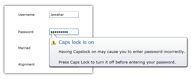
We used to see a Notification tool tip in Windows 7/Vista to inform something
about particular context. For example, Capslock warning will be given through a
balloon tip on Passwordbox, if capslock has ON. Or sometimes low battery
information will be displayed on the Taskbar.
The unique feature of this control will be that it can be placed on any Framework Element in Silverlight.
Background
Using the code
The base class for Notification control is Content Control. The content can be of anything like a string, image, etc. The control
will be displayed on any FrameworkElement in Silverlight. A popup is used to host the actual control and the popup will be placed on particular element based on its position.
The generic template XAML goes like this:
<Style TargetType="local:Balloon">
    <Setter Property="FontSize" Value="13"/>
    <Setter Property="Template">
        <Setter.Value>
            <ControlTemplate TargetType="local:Balloon">
                <Grid>
                    <Grid.Effect>
                        <DropShadowEffect ShadowDepth="2" Direction="315"/>
                    </Grid.Effect>
                    <Grid.RowDefinitions>
                        <RowDefinition Height="*"/>
                        <RowDefinition Height="Auto"/>
                        <RowDefinition Height="Auto"/>
                    </Grid.RowDefinitions>
                    <Border Grid.Row="1" BorderBrush="Gray" BorderThickness="1"
                            CornerRadius="5"
                            Margin="{Binding Alignment,
                            Converter={StaticResource Converter},
                            RelativeSource={RelativeSource TemplatedParent},
                            ConverterParameter=MainMargin}">
                        <Border.Background>
                            <LinearGradientBrush EndPoint="0.5,1" StartPoint="0.5,0">
                                <GradientStop Color="#FFE7E8F1" Offset="1"/>
                                <GradientStop Color="White"/>
                                <GradientStop Color="#FFF3F4F6" Offset="0.472"/>
                            </LinearGradientBrush>
                        </Border.Background>
                        <Grid>
                            <Grid.ColumnDefinitions>
                                <ColumnDefinition Width="Auto"/>
                                <ColumnDefinition Width="*"/>
                            </Grid.ColumnDefinitions>
                            <Grid.RowDefinitions>
                                <RowDefinition Height="Auto"/>
                                <RowDefinition Height="*"/>
                            </Grid.RowDefinitions>
                            <Image Source="{TemplateBinding Icon}" Margin="5"/>
                            <TextBlock Margin="5" Grid.Column="1"
                                       Foreground="#FF28489F"
                                       Text="{TemplateBinding Header}" FontSize="16"
                                       VerticalAlignment="Center"/>
                            <ContentPresenter Margin="5" Grid.Column="1" Grid.Row="1"/>
                        </Grid>
                    </Border>

                    <Path Data="M306.375,133.125L306.375,100.875L335.75,133.25"
                          Stroke="Gray" Height="20"
                          Fill="White"
                          Margin="{Binding Alignment,
                          Converter={StaticResource Converter},
                          RelativeSource={RelativeSource TemplatedParent},
                          ConverterParameter=Margin}"
                          StrokeThickness="1" Stretch="Uniform"
                          Visibility="{Binding Alignment,
                          Converter={StaticResource Converter},
                          RelativeSource={RelativeSource TemplatedParent},
                          ConverterParameter=bottom}" VerticalAlignment="Center"
                          HorizontalAlignment="{Binding Alignment,
                          Converter={StaticResource Converter},
                          RelativeSource={RelativeSource TemplatedParent},
                          ConverterParameter=Alignment}"/>

                    <Path Data="M306.375,133.125L306.375,100.875L335.75,133.25"
                          Stroke="Gray"
                          Height="20" Fill="#FFE7E8F1" Margin="{Binding Alignment,
                          Converter={StaticResource Converter},
                          RelativeSource={RelativeSource TemplatedParent},
                          ConverterParameter=Margin}"
                          StrokeThickness="1" Stretch="Uniform" Grid.Row="2"
                          Visibility="{Binding Alignment,
                          Converter={StaticResource Converter},
                          RelativeSource={RelativeSource TemplatedParent},
                          ConverterParameter=top}" VerticalAlignment="Center"
                          RenderTransformOrigin="0.5, 0.5"
                          HorizontalAlignment="{Binding Alignment,
                          Converter={StaticResource Converter},
                          RelativeSource={RelativeSource TemplatedParent},
                          ConverterParameter=Alignment}">
                        <Path.RenderTransform>
                            <ScaleTransform ScaleY="-1"/>
                        </Path.RenderTransform>
                    </Path>
                </Grid>
            </ControlTemplate>
        </Setter.Value>
    </Setter>
</Style>
Balloon Alignment
To position the Popup on particular location in the control, the co-ordinates related to Browser needs to be find out. This can be done using GeneralTransform.
The Alignment property in the control helps change the place where popup needs to be hosted.
It can be of one among the following,
public enum BalloonAlignment
{
    TopLeft,

    TopRight,

    BottomLeft,

    BottomRight
}
Ballon Tooltip Service
An attached property of type DependencyObject should be added to a static class, which can be used to set balloon on any DependecyObject.
The object can be textBox, Checkbox, Combobox, etc.
public static class BalloonTooltipService
{
public static Balloon GetBalloonTooltip(DependencyObject obj)
{
return (Balloon)obj.GetValue(BalloonTooltipProperty);
}
public static void SetBalloonTooltip(DependencyObject obj, Balloon value)
{
obj.SetValue(BalloonTooltipProperty, value);
}
public static readonly DependencyProperty BalloonTooltipProperty =
DependencyProperty.RegisterAttached("BalloonTooltip",
typeof(Balloon), typeof(BalloonTooltipService), new PropertyMetadata(null,
new PropertyChangedCallback(OnBalloonToolTipChanged)));
private static void OnBalloonToolTipChanged(DependencyObject sender,
DependencyPropertyChangedEventArgs args)
{
var element = sender as FrameworkElement;
Balloon tooltip = args.NewValue as Balloon;
if (tooltip != null)
{
tooltip.DataContext = element.DataContext;
tooltip.Target = element;
}
}
}

Application Usage
The control can be used in application to show some usefull information about the particular context. Following code shows how to set balloon using BallonTooltipService.
<CheckBox VerticalAlignment="Center" Width="100"  Margin="3" GotFocus="OnFocus">
     <balloon:BalloonTooltipService.BalloonTooltip>
            <balloon:Balloon x:Name="balloon1" Header="Checkbox Notification"
                 HorizontalAlignment="Center" Alignment="{Binding Path=SelectedValue}"
                 VerticalAlignment="Center" Icon="WarningHS.png">
                 <balloon:Balloon.Content>
                     <Grid>
                       <TextBlock TextWrapping="Wrap"
                       Text="Balloon can be placed on any Framework Element."/>
                     </Grid>
                 </balloon:Balloon.Content>
            </balloon:Balloon>
     </balloon:BalloonTooltipService.BalloonTooltip>
</CheckBox>
Jawahar working as a Senior Development Engineer in Aditi Technologies,Bangalore, India. Specialist in all XAML frameworks. Very passionate on UX Design and Development. Skilled in Expression Blend, Design, WPF, Silverlight, Windows Phone 7/8, Windows 8. Good knowledge in Entity Framework, SQLite and SQL Server also. Also had good experience with PRISM, MVVM, Caliiburn Micro and other design patterns.
He developed few products for Syncfusion Inc. Also working on some freelancing projects. Worked as a lead developer of Metro Studio from Syncfusion Inc.
An active freelancer. http://xamlfactory.elance.com
http://about.me/jawahars
http://wpfplayground.com/


 General
  News
News  Suggestion
  Question
  Bug
Bug  Answer
  Joke
Joke  Praise
  Rant
Rant  Admin
Admin 


 Submit an article or tip

