Introduction
While developing our client side software at Whitebox Security, we came across the need for a control which allows for selecting items from an available list. More specifically, the requirements were:
- Display currently selected items
- Display available items for selection, i.e. available items that have not been selected.
- Allow for adding items to the selected items.
- Allow for removing items from the selected items.
- The user will be able to conveniently find available items.
- It is a logical error if an item is in the current items list but not in the available list. In such a case, a visual indication will be given.
- As a result of using the control, the available items list does not change. On the other hand, the current (selected) items list does change.
I was expecting for such a control to exist, and was surprised not to find one.
Background
To use the control, you should have basic WPF knowledge.
If you want to understand how the control is written or customize it, you should be familiar with:
Requirements
The project was written in Visual Studio 2008, and built on .NET 3.5 SP1.
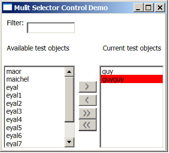
The Control
The main parts are the available items list and the current items list. Each list has a title. The available items list has a text filter. The arrow buttons are pretty self explanatory, add an item remove an item, add all items and remove all items.
Using the Control
Following is an XAML definition of the demo control:
<local:MultiSelectControl
    x:Name="ListControl"
    Style="{StaticResource MultiSelectControlStyle}"
    CurrentTitle="Current test objects"
    AvailableTitle="Available test objects"
    AvailableItems="{Binding MyTestAvailableItems}"
    CurrentItems="{Binding MyTestCurrentItems, Mode=TwoWay}"
    FilterMemberPath="Data"
    >
    <local:MultiSelectControl.ObjectsTemplate>
        <DataTemplate>
        <TextBlock
            Text="{Binding Data}"
            />
        </DataTemplate>
    </local:MultiSelectControl.ObjectsTemplate>

</local:MultiSelectControl>
MyTestAvailableItems and MyTestCurrentItems are observable collections of type <TestObjectModel>. This class has a "Data" property and implements the Equals method.
As you can see, the definition is pretty straightforward. The custom dependency properties that should be set on the control are:
CurrentTitle: The title text to be displayed above the current items list AvailableTitle: Same as above for available items list CurrentItems: The items used as an ItemsSource for the current ListBox. It is recommended to use an ObservableCollection of some [Object], where the [Object] implements INotifyPropertyChanged and Equals. The current items should be a subset of the available items. Notice the binding mode is set to TwoWay. This allows for changes in the controls' current items list to propagate to the user supplied current items list. AvailableItems: Same as above, for available items. The available items list should be a superset of the current items. FilterMemberPath: Sets a path to a value on the source object to serve as the visual representation of the object for filtering. ObjectsTemplate: A DataTemplate used to display the available and current items in the listboxes.
The Structure of the Control
<Style x:Key="MultiSelectControlStyle" TargetType="{x:Type local:MultiSelectControl}">
      <Setter Property="Template">
          <Setter.Value>
              <ControlTemplate TargetType="{x:Type local:MultiSelectControl}">
                  <Border
                      BorderBrush="{TemplateBinding BorderBrush}"
                      BorderThickness="{TemplateBinding BorderThickness}"
                      Background="{TemplateBinding Background}"
                      CornerRadius="3"
                      SnapsToDevicePixels="true">
                      <Grid
                          Margin="3"
                          Name="TemplateGridPanel"
                          DataContext="{Binding RelativeSource=
              {RelativeSource TemplatedParent}}">
                          <Grid.RowDefinitions>
                              <RowDefinition Height="*"/>
                              <RowDefinition Height="*"/>
                              <RowDefinition Height="136"/>
                          </Grid.RowDefinitions>

                          <Grid.ColumnDefinitions>
                              <ColumnDefinition Width="Auto"/>
                              <ColumnDefinition Width="40"/>
                              <ColumnDefinition Width="Auto"/>
                          </Grid.ColumnDefinitions>
                           <StackPanel
                              Orientation="Horizontal"
                              Grid.Row="0"
                              Grid.Column="0"
                             >
                              <Label HorizontalAlignment="Left">
                                  Filter:
                              </Label>
                               <TextBox
                                  Name="FilterTextBox"
                                  Height="Auto"
                                  VerticalAlignment="Center"
                                  TextChanged="FilterTextBox_TextChanged"
                                  MinWidth="80"
                              />
                          </StackPanel>
                           <Label
                              Grid.Row="1"
                              Grid.Column="0"
                              HorizontalAlignment="Left"
                              Content="{TemplateBinding AvailableTitle}"
                              />
                          <Label
                              Grid.Row="1"
                              Grid.Column="2"
                              HorizontalAlignment="Left"
                              Content="{TemplateBinding CurrentTitle}"
                              />
                          <ListBox
                              Grid.Row="2"
                              Grid.Column="0"
                              SelectionMode="Extended"
                              x:Name="PART_AvailableListBox"
                              ItemsSource="{Binding AvailableItems}"
                              ItemTemplate="{TemplateBinding ObjectsTemplate}">
                              <ListBox.ItemContainerStyle>
                                  <Style TargetType="{x:Type ListBoxItem}">
                                      <EventSetter Event="MouseDoubleClick"
                  Handler="AvailableListBoxItem_DoubleClick" />
                                  </Style>
                               </ListBox.ItemContainerStyle>
                          </ListBox>
                          <ListBox
                              Grid.Row="2"
                              Grid.Column="2"
                              SelectionMode="Extended"
                              x:Name="PART_CurrentListBox"
                              ItemsSource="{Binding CurrentItems, Mode=TwoWay}"
                              ItemTemplate="{TemplateBinding ObjectsTemplate}">
                              <ListBox.ItemContainerStyle>
                                  <Style TargetType="{x:Type ListBoxItem}">
                                      <EventSetter Event="MouseDoubleClick"
                  Handler="CurrentListBoxItem_DoubleClick" />
                                  </Style>
                              </ListBox.ItemContainerStyle>
                          </ListBox>
                          <StackPanel
                              Orientation="Vertical"
                              VerticalAlignment="Center"
                              Grid.Row="2"
                              Grid.Column="1">

                              <Button
                                  Style="{DynamicResource Button_General_UI}"
                                  Click="RightArrow_Click"
                                  Margin="5,0,5,3">
                                  <Image HorizontalAlignment="Center"
              Source="/Graphics/ButtonArrow_Right.png"
              Stretch="None"/>
                              </Button>

                              <Button
                                  Style="{DynamicResource Button_General_UI}"
                                  Click="LeftArrow_Click"
                                  Margin="5,0,5,3">
                                  <Image  Margin="-2,0,0,0"
              HorizontalAlignment="Center"
              Source="/Graphics/ButtonArrow_Left.png"
              Stretch="None"/>
                               </Button>
                               <Button Style="{DynamicResource Button_General_UI}"
                                  Click="DoubleRightArrow_Click"
                                  Margin="5,0,5,0">
                                   <Grid Margin="-1,0,0,0">
                                      <Grid.ColumnDefinitions>
                                          <ColumnDefinition Width="Auto"/>
                                          <ColumnDefinition Width="Auto"/>
                                      </Grid.ColumnDefinitions>
                                      <Image Grid.Column="0"
                  HorizontalAlignment="Center"
                  Source="/Graphics/ButtonArrow_Right.png"
                  Stretch="None"/>
                                      <Image Grid.Column="1"
                  HorizontalAlignment="Center"
                  Source="/Graphics/ButtonArrow_Right.png"
                  Stretch="None"/>
                                   </Grid>
                              </Button>
                               <Button
                                  Style="{DynamicResource Button_General_UI}"
                                  Click="DoubleLeftArrow_Click"
                                  Margin="5,0,5,3">

                                      <Grid Margin="-3,0,0,0">
                                      <Grid.ColumnDefinitions>
                                          <ColumnDefinition Width="Auto"/>
                                          <ColumnDefinition Width="Auto"/>
                                      </Grid.ColumnDefinitions>
                                        <Image Grid.Column="0"
                  HorizontalAlignment="Center"
                  Source="/Graphics/ButtonArrow_Left.png"
                  Stretch="None"/>
                                        <Image Grid.Column="1"
                  HorizontalAlignment="Center"
                  Source="/Graphics/ButtonArrow_Left.png"
                  Stretch="None"/>
                                     </Grid>
                              </Button>

                          </StackPanel>
                      </Grid>
                  </Border>
             </ControlTemplate>
          </Setter.Value>
      </Setter>
  </Style>
The layout of the control is pretty basic. The interesting points are the ItemsSource property of the current and available Listboxes which are bound to the CurrentItems and AvailableItems DPs supplied by the user. The ItemsTemplate is bound to the one provided by the user in the ObjectsTemplate DP. An EventSetter is set on the double click event of the Listboxes, so that double clicking on an item would cause it to change to the opposite list.
The Code Behind
Here is the code for handling the event of left arrow button click:
void LeftArrow_Click(object sender, RoutedEventArgs e){
IList currentSelectedItems =
new List<object>((IEnumerable<object>)this.CurrentListBox.SelectedItems);
IList currentListItems = this.CurrentItems as IList;
if (null != currentListItems){
foreach (object obj in currentSelectedItems) {
currentListItems.Remove(obj);
}
}
this.AvailableItemsCollectionView.Refresh();
}
The left arrow removes the selected items from the current items list.
This is implemented by iterating over the selected items and removing them from the selected items list.
Notice that they will be displayed in the available items list. This is not because they are added to that list, but because of a filter that displays in the available items listbox only items which are not in the current items list.
This is the reason for calling the refresh method on the available items collection view.
A click on the double arrow does pretty much the same, just for all items in the list.
In the same manner, the right arrow button adds items to the current items list, and refreshes the available items list. The current items list is automatically refreshed because presumably an observable collection is used.
A double click on any of the items in one of the lists is equivalent to selecting that item and pressing the right/left arrow buttons. Therefore, the event handler simply delegates the handling to the appropriate method:
private void AvailableListBoxItem_DoubleClick(object sender, MouseButtonEventArgs e) {
    this.RightArrow_Click(sender, e);
    e.Handled = true;
}
Two filters are used in the code. The first is for the text filter on the available items list:
private bool FilterOutText(object item) {
if (String.IsNullOrEmpty(this.FilterText))
return true;
if (null == item){
return false;
}
string str = "";
if (String.IsNullOrEmpty(this.FilterMemberPath)) {
str = item.ToString();
}
else {
object value =
this.getPropertyValue(item, this.FilterMemberPath, BindingFlags.Public);
if (null != value) {
str = value.ToString();
}
}
if (String.IsNullOrEmpty(str))
return false;
int index = str.IndexOf(
FilterText,
0,
StringComparison.InvariantCultureIgnoreCase
);
return index > -1;
}
The text that represents the item is determined according to the FilterMemberPath DP, with reflection. If this DP is not defined, then the object's ToString() method result is used. The filter text is taken from the text of the filter's TextBox.
The method used for reflection is straightforward:
private object getPropertyValue(
object source,
string propertyName,
BindingFlags flags
) {
object value = null;
PropertyInfo pInfo =
source.GetType().GetProperty(
propertyName,
flags |
BindingFlags.Instance
);
if (pInfo != null) {
value =
pInfo.GetValue(
source,
null
);
}
return value;
}
The second filter is also applied on the available items list:
public bool FilterOutCurrentItems(object item){
ICollection currentItems = this.CurrentItems as ICollection;
if (null != currentItems) {
foreach (object obj in currentItems) {
if (obj.Equals(item)) {
return false;
}
}
return true;
}
else{
return false;
}
}
The filter filters out an item, if it exists in current items collection. Notice that the given object must implement the Equals method in a meaningful way.
Because using two filters on one list in WPF is not intuitive, I combine the two filters into one filter which is the actual one used:
private bool FilterOutTextAndCurrentItems(object item) {
bool ans;
ans = this.FilterOutText(item);
return (ans && this.FilterOutCurrentItems(item));
}
Once the control is loaded, I check if there are items in the current items list which are not in the available items list. If so, I give a visual indication - a red background and a tooltip:
 private void CheckCurrentItemsError() {
    IList availableListItems = this.AvailableItems as IList;
    IList currentListItems = this.CurrentItems as IList;
    foreach (object obj in currentListItems) {
        if (!availableListItems.Contains(obj)) {
            ItemContainerGenerator ig =
                    this.CurrentListBox.ItemContainerGenerator;
            ListBoxItem lbi = ig.ContainerFromItem(obj) as ListBoxItem;
            if (null != lbi) {
                lbi.Background = Brushes.Red;
                lbi.ToolTip = "Item does not appear in Available list";
            }
        }
    }
}
What Do You Think?
Let me know if this article was useful and what you think.
History
- 21st May, 2009: Initial post
- 24th May, 2009: Article updated
SandboxModel is the developer of the Project Team Builder™ (PTB™). The PTB™ is a project management tool, designed to improve project results.
The PTB™ for Training solution is used for improving the project management skills of students, project managers and project teams. Trainees get a chance to simulate the management of real projects, in a safe controlled environment. Learning by doing provides many advantages over other methods of learning.
Learn more about using the PTB™ for Training at http://www.sandboxmodel.com/Training_PTB.html
The PTB™ Analytics solution enhances decision making. It allows project managers to perform "what-if" analysis and to see the impact of their decisions in a safe, simulated environment. This enables risk management and mitigation.
Learn more about using the PTB™ Analytics to make better decisions at http://www.sandboxmodel.com/DSS_PTB.html


 General
  News
News  Suggestion
  Question
  Bug
Bug  Answer
  Joke
Joke  Praise
  Rant
Rant  Admin
Admin 


 Submit an article or tip


