Introduction
Star Rating Controls are very common and ubiquitous in today's websites. They can be found on websites like amazon.com, netflix.com, and even codeproject.com.
These controls allow users to rate an item on amazon, a movie on Netflix, or in case of codeproject - an article, such as the one you are currently reading.
Have you wondered how they work? Most of them are based on image sprites and some css magic. Do a search in your favorite search engine to see what I mean.
I think its time now to move onto controls that use SVG instead of image sprites. Most commonly used browsers today have full support for SVG.
If your browser doesn't - why are you still using it? What are the advantages of a SVG based control? A SVG based control can be highly configurable as I will show you in this article.
Do you want 5 stars or 10 stars? Do you want the stars to be colored yellow or red? The SVG control I am going to describe here allows you to easily configure these settings
and customize the control to your requirements.
Background
It would be good for the reader to have some basic familiarity with JavaScript, HTML, and possibly SVG. I have tested the examples on IE9 and Chrome.
Using the Code
Let's jump right in. Download star_rating_demo.zip and unzip it - you should see four files in the unzipped folder: star_rating.js, demo.html, demo2.html,
demo3.html.
All the code for the control is in one file star_rating.js. I am going to illustrate how you can use the control via 3 examples.
Example #1 demo.html
The entire code for this example is in the file demo.html and is copied below:
<!doctype html>
<html>
<head>
</head>
<body>
    <div id="my_widget"
        class="rating_widget"
        number_of_stars="5"
        initial_value="0"
        default_color="#ccc"
        initial_value_color="#ff0"
        final_value_color="#f00"
        captions="Poor, Didn't like it, OK, Good, Excellent!"
        onclick="clickHandler"
    ></div>
<script src="star_rating.js">
</script>
<script>
    function clickHandler(sender, args)
    {
        alert('your rating: ' + args);
    }
</script>
</body>
</html>
Because of technical limitations, it is not possible to show working examples in this article. Instead screenshots will be provided.
To see working examples, simply navigate to this page.
Screenshot of demo.html viewed in a web browser:
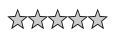
To see the full working example and what it can do, open demo.html in a web browser. You will see 5 stars colored grey (look for default_color="#ccc"
in code above). If you mouse over the stars, they will change color to red (look for final_value_color="#f00" in code above),
and you will also see corresponding text displayed (Poor, Didn't like it, OK, Good, Excellent!). If you click, the control will freeze,
and the clickHandler function will get called. The rating is passed to the function as the args
parameter. Look for the class="rating_widget" applied on the div - this is what causes the control to appear inside the div.
Example #2 demo2.html:
In this example we want to start out with a control that has 10 stars and has an initial rating of 7.
Also I am going to illustrate another method of creating the control (this time in javascript, as opposed to markup in Example #1)
<!doctype html>
<html>
<head>
</head>
<body>
<script src="star_rating.js">
</script>
<script>
var widget = new rating_widget(
{
number_of_stars: 10,
initial_value: 7,
default_color: 'rgb(200,200,200)',
initial_value_color: 'rgb(255,255,0)',
final_value_color: 'rgb(255,0,0)',
captions: '1,2,3,4,5,6,7,8,9,10',
parentNode: document.body,
onclick: function(sender, args)
{
alert('your rating: ' + args);
}
});
</script>
</body>
</html>
Screenshot of demo2.html viewed in a web browser:

By changing the input parameters' values to the constructor of rating_widget,
you can configure the control to your requirements - easily change colors, number of stars, and caption.
Example #3 demo 3.html:
In this final example, we will display a static control - one that does not allow the user to change the rating:
<!doctype html>
<html>
<head>
</head>
<body>
    <div id="my_widget"
        class="rating_widget"
        number_of_stars="5"
        initial_value="3.5"
        default_color="#ccc"
        initial_value_color="#ff0"
        final_value_color="#f00"
        disabled="true"
    ></div>
<script src="star_rating.js">
</script>
</body>
</html>
Screenshot of demo3.html viewed in a web browser:

Setting disabled="true" disables user from changing the rating of the control.
How it works
Let us now understand the inner workings of the control. Let us begin with this code inside star_rating.js
document.body.onload = function()
{
    var array = document.getElementsByClassName('rating_widget');
    for(var i = 0; i < array.length; i++)
    {
        var e = array[i];
        var widget = new rating_widget(
        {
            number_of_stars: e.getAttribute('number_of_stars') ? e.getAttribute('number_of_stars') : 5,
            initial_value: e.getAttribute('initial_value') ? e.getAttribute('initial_value') : 0,
            default_color: parseColor(e.getAttribute('default_color'), 'rgb(200,200,200)'),
            initial_value_color: parseColor(e.getAttribute('initial_value_color'), 'rgb(255,255,0)'),
            final_value_color: parseColor(e.getAttribute('final_value_color'), 'rgb(255,0,0)'),
            captions: e.getAttribute('captions'),
            captions_class_name: e.getAttribute('captions_class_name'),
            onclick: e.getAttribute('onclick'),
            disabled: e.getAttribute('disabled'),
            parentNode: e
        });
    }
};
The above function will be executed when the body of the html document is loaded. We get all the elements in the html document to which the class rating_widget
has been applied, and store them into the variable array. Then we iterate through these elements, and create a star rating control for each element.
The number of stars defaults to 5 unless there is an attribute number_of_stars on the element defining the number of stars you want in the control.
initial_value is the initial rating you want to apply to the control. This would be 0 for an item that has never been rated before,
but non-zero to reflect past ratings of the item. Interact with the control to understand what default_color, initial_value_color,
and final_value_color mean. captions is an array of strings corresponding to the different ratings.
You can control the appearance of the captions by styling them with CSS, and passing the CSS class name in the variable captions_class_name.
onclick defines the function you want to be called when user clicks on the control. disabled if set to true disables the control
in the sense that it loses its interactivity and freezes. This is useful when you want to use the control to display a rating, but don't want to allow users
to be able to change the rating - e.g., if a user is not logged in. The parent node of the control is specified via parentNode: e.
Let us now dig deeper into the rating_widget function. The interesting part is in following code inside rating_widget:
for(var i = 0; i < n; i++)
{
    var star = document.createElementNS(svgns, "path");
    star.setAttributeNS(null, "d", coordinates);
    star.setAttributeNS(null, "transform", transform(0.3947432, 0, 0, 0.414816, 20*i, 1.159472));
    star.setAttributeNS(null, "style", style);
    svg_root.appendChild(star);
    var box = bbox(star);
    if (!disabled)
    {
        if (box) {    attachEventHandlers(box, boxes);    }
        else     {    attachEventHandlers(star, stars);    }
    }
    stars.push(star);
    boxes.push(box);
}
initial_state();
n is the number of stars we want to display. The SVG path to draw a star is stored in the variable coordinates.
To draw multiple stars, we use the same coordinates over and over again, but apply a translation to them. 20*i is the x-component of the translation
and is the crucial piece. The line thickness, its style - whether solid, dashed etc. is defined in the variable style.
The function bbox calculates bounding box of the star. If the calculation is successful, we attach mouse event handlers
to the bounding box of the star, else we attach handlers to the star itself. See this post for more details. The mouse event handlers is what gives interactivity to the control. The function initial_state initializes
the control to the initial_value passed in the constructor.
Step through the code in the debugger to understand and investigate more as to how it works.
Conclusion
In this article I described a star rating control that uses SVG instead of image sprites and CSS. The control is highly configurable and number of stars,
their color, and caption text can be easily changed. The control can be embedded in HTML markup (Examples #1, and #3), or can be dynamically instantiated
in JavaScript (Example #2). I hope it is useful to some.
History
- 4/20/2012 - Initial post.


 General
  News
News  Suggestion
  Question
  Bug
Bug  Answer
  Joke
Joke  Praise
  Rant
Rant  Admin
Admin 


 Submit an article or tip

