Introduction
I really like WPF. It's the best layout technology I've seen yet out of Microsoft. But most of the time I want my controls to take up all of the available space, and that leaves me two choices of built-in panels. First there's DockPanel, which doesn't work if I want to distribute the space between more than one control (and its requirement that the stretched control be the last child can lead to some strange XAML). Then there's the Grid, which can do it all, but its requirement that you define all of your rows and columns up front seems too verbose to me, especially if I only want a single row or column.
Having decided to implement my own Panel, I returned to my first love: wxWidgets. wxWidgets uses Sizers for layout, and in particular there are two that are relatively simple yet allow you to do most things you'd want to do: wxBoxSizer and wxFlexGridSizer.
BoxSizer
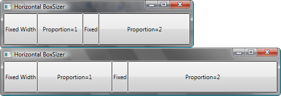
The concept of the BoxSizer class (based on wxBoxSizer) is pretty simple. It's very similar to a StackPanel in that it lines up its children in the Orientation direction and lets them be as big as they want in the other direction. However, it also provides a Proportion attached property for its children. All of the leftover space in the Orientation direction is divided up among the children that have a non-zero proportion. For simplicity in this article, we'll develop a sizer with fixed Orientation (Horizontal), but the download uses an Orientation property just like the StackPanel class.
The Proportion Attached Property
An attached property allows us to essentially add properties to other classes. We'll need one of these so our children can tell us what proportion they want to have. The first step is to register the attached property. This involves telling the framework what the type of the property is, what our type is, and what the default value is. We can also tell the framework that it needs to re-evaluate the layout when the property changes.
public static readonly DependencyProperty ProportionProperty =
    DependencyProperty.RegisterAttached
	("Proportion", typeof(double), typeof(HorizontalBoxSizer),
        new FrameworkPropertyMetadata
	(0.0, FrameworkPropertyMetadataOptions.AffectsArrange |
            FrameworkPropertyMetadataOptions.AffectsMeasure |
            FrameworkPropertyMetadataOptions.AffectsRender |
            FrameworkPropertyMetadataOptions.AffectsParentArrange |
            FrameworkPropertyMetadataOptions.AffectsParentMeasure));
The second thing we need to do is provide some standard convenience functions:
public static double GetProportion(DependencyObject obj)
{
    return (double)obj.GetValue(ProportionProperty);
}

public static void SetProportion(DependencyObject obj, double value)
{
    obj.SetValue(ProportionProperty, value);
}
Measure Once
The measurement pass is the first part of the layout. Here we're told how big we're allowed to be and we must return how big we want to be. We're also responsible for recursively calling Measure on all of our children. Note that the actual function we want to override is MeasureOverride, not Measure itself. This lets the base class's MeasureCore method take care of stuff like margins for us, which is a pretty good deal. For our horizontal BoxSizer, the implementation is very simple. We just need to find the tallest child and use its height; the width will be as large as allowed.
The trick in this function is dealing with infinity. First of all, since we will allow the children to be as wide as they want we need to pass double.PositiveInfinity as their available width. If we just naïvely pass the same available width we're given some controls with their own stretch logic (like Image) aren't going to size right. This means that our availableSize may contain infinity, but we are forbidden from having infinity in the Size we return from the function, so we need some strategy for dealing with this. Finally, we also want to avoid returning a size that's larger than the available size; if we do, our control will extend beyond the area it's supposed to occupy.
protected override Size MeasureOverride(Size availableSize)
{
    Size SizeForChildren = new Size(double.PositiveInfinity, availableSize.Height);
    double TotalWidth = 0;
    double MaxHeight = 0;
    foreach (UIElement Child in InternalChildren)
    {
        Child.Measure(SizeForChildren);
        TotalWidth += Child.DesiredSize.Width;
        MaxHeight = Math.Max(MaxHeight, Child.DesiredSize.Height);
    }
    TotalWidth = Math.Min(TotalWidth, availableSize.Width);
    return new Size()
    {
        Width = TotalWidth,
        Height = double.IsInfinity(availableSize.Height) ?
				MaxHeight : availableSize.Height
    };
}
One other thing to note here is that we're using the InternalChildren property instead of the Children property because MSDN says we should.
Arrange It All
The arrange pass is the second part of the layout. Now we're told what our actual size should be and we must tell our children how large they will actually be, as well as their actual location, by calling their Arrange method. Our first implementation here isn't too complicated. We just need to figure out how much space the fixed-size children need and divvy up the remaining space between the variable-size children.
protected override Size ArrangeOverride(Size finalSize)
{
double TotalProportion = 0;
double FixedWidth = 0;
foreach (UIElement Child in InternalChildren)
{
double ChildProportion = GetProportion(Child);
if (ChildProportion == 0)
{
FixedWidth += Child.DesiredSize.Width;
}
else
{
TotalProportion += ChildProportion;
}
}
double VariableWidth = Math.Max(finalSize.Width - FixedWidth, 0);
double CurrentPos = 0;
foreach (UIElement Child in InternalChildren)
{
double ChildProportion = GetProportion(Child);
double ChildWidth;
if (ChildProportion == 0)
{
ChildWidth = Child.DesiredSize.Width;
}
else
{
ChildWidth = ChildProportion / TotalProportion * VariableWidth;
}
Child.Arrange(new Rect(CurrentPos, 0, ChildWidth, finalSize.Height));
CurrentPos += ChildWidth;
}
return finalSize;
}
But now let's make our sizer more general-purpose. Instead of just stretching everything to be the same height, let's use the VerticalAlignment property to allow a child to specify how it wants to be treated vertically the same way a StackPanel does. There's nothing complicated about this, but there is a slight catch: VerticalAlignment is a property of the FrameworkElement class, but our children are contained in a collection of UIElements, so a cast is required. (FrameworkElement derives from UIElement.)
double VerticalPos = 0;
double ChildHeight = finalSize.Height;
FrameworkElement ChildElement = Child as FrameworkElement;
if (ChildElement != null)
{
    if (ChildElement.VerticalAlignment != VerticalAlignment.Stretch)
    {
        ChildHeight = Child.DesiredSize.Height;
    }
    switch (ChildElement.VerticalAlignment)
    {
        case VerticalAlignment.Top:
        case VerticalAlignment.Stretch:
            VerticalPos = 0;
            break;
        case VerticalAlignment.Bottom:
            VerticalPos = finalSize.Height - ChildHeight;
            break;
        case VerticalAlignment.Center:
            VerticalPos = (finalSize.Height - ChildHeight) / 2;
            break;
    }
}
Child.Arrange(new Rect(CurrentPos, VerticalPos, ChildWidth, ChildHeight));
FlexGridSizer
The built-in Grid panel has some decent resizing with its star semantics, but we have to specify widths for the other columns instead of having them automatically adapt to their contents. Having to define ColumnDefinitions and RowDefinitions is also going to be overly verbose if we're not defining sizes. So let's make a FlexGridSizer class that will adapt to the size of its contents. This is inspired by, but not exactly identical to, the wxFlexGridSizer in wxWidgets.
I won't go over the implementation in this article, as the concepts are very similar to how we built our BoxSizer. Only now we're doing layout in two directions. So instead here's an example of how the FlexGridSizer is used:

And the XAML:
<Window x:Class="wxl.FlexGridSizerDemo"
    xmlns="http://schemas.microsoft.com/winfx/2006/xaml/presentation"
    xmlns:x="http://schemas.microsoft.com/winfx/2006/xaml"
    xmlns:wxl="clr-namespace:wxl"
    Title="FlexGridSizer Demo" Width="200" SizeToContent="Height">
    <wxl:FlexGridSizer Margin="2">
        <Label wxl:FlexGridSizer.Row="0">First Name</Label>
        <TextBox wxl:FlexGridSizer.Row="0"
	wxl:FlexGridSizer.Column="1" wxl:FlexGridSizer.HorizontalProportion="1" />
        <Label wxl:FlexGridSizer.Row="1">Last Name</Label>
        <TextBox wxl:FlexGridSizer.Row="1" wxl:FlexGridSizer.Column="1" />
        <Label wxl:FlexGridSizer.Row="2">Location</Label>
        <TextBox wxl:FlexGridSizer.Row="2" wxl:FlexGridSizer.Column="1" />
        <Label wxl:FlexGridSizer.Row="3">User Icon</Label>
        <TextBox wxl:FlexGridSizer.Row="3" wxl:FlexGridSizer.Column="1" />
        <Button wxl:FlexGridSizer.Row="3"
		wxl:FlexGridSizer.Column="2" Padding="3">. . .</Button>
    </wxl:FlexGridSizer>
</Window>
Now you may be asking yourself, "Can't I get the same effect with a plain old Grid?" Well yes, you can. Let's look at the XAML:
<Window x:Class="wxl.GridDemo"
    xmlns="http://schemas.microsoft.com/winfx/2006/xaml/presentation"
    xmlns:x="http://schemas.microsoft.com/winfx/2006/xaml"
    Title="Grid Demo" Width="200" SizeToContent="Height">
    <Grid Margin="2">
        <Grid.ColumnDefinitions>
            <ColumnDefinition Width="Auto"/>
            <ColumnDefinition Width="*"/>
            <ColumnDefinition Width="Auto"/>
        </Grid.ColumnDefinitions>
        <Grid.RowDefinitions>
            <RowDefinition />
            <RowDefinition />
            <RowDefinition />
            <RowDefinition />
        </Grid.RowDefinitions>
        <Label Grid.Row="0">First Name</Label>
        <TextBox Grid.Row="0" Grid.Column="1" />
        <Label Grid.Row="1">Last Name</Label>
        <TextBox Grid.Row="1" Grid.Column="1" />
        <Label Grid.Row="2">Location</Label>
        <TextBox Grid.Row="2" Grid.Column="1" />
        <Label Grid.Row="3">User Icon</Label>
        <TextBox Grid.Row="3" Grid.Column="1" />
        <Button Grid.Row="3" Grid.Column="2" Padding="3">. . .</Button>
    </Grid>
</Window>
Basically we have more lines of XAML, though they're shorter. Although having the rows and columns defined up front will help you keep straight complicated grids, I like being able to dispense with these "boilerplate" definitions for simple grids.
The End Result
This zip file (10.07 KB) contains the code for the BoxSizer and FlexGridSizer discussed above.
Credit Where Credit's Due
There are a lot of resources on the web for implementing your own Panel, but the two I found two particularly useful:
I'd also like to thank CodeProject for hosting this and providing many resources I've found helpful, and the wxWidgets project for providing the inspiration for these classes, as well as teaching me a lot about programming through their samples and their community.
Revision History
- July 2
- July 3
- Updated to more accurately describe the capabilities of the built-in
Grid class, thanks to Reinhard Ostermeier's comment
This member has not yet provided a Biography. Assume it's interesting and varied, and probably something to do with programming.


 General
  News
News  Suggestion
  Question
  Bug
Bug  Answer
  Joke
Joke  Praise
  Rant
Rant  Admin
Admin 


 Submit an article or tip


