Introduction
I began this project with a desire to build a color picker which met three requirements:
- a large display area for showing the current color,
- ability to adjust each component of both the HSV and RGB color models independently, and
- make the relationships between the various color components clear and intuitive so that when you adjust one, you know ahead of time what the effect will be.
I specifically wanted to get away from the color "swatch" that is so common.
Background
I have always been frustrated by most color pickers. The display of the current color is always way too small to get a good idea of what the color will actually look like in my application. The color swatch that is so common is frustrating because it is difficult to find the right color or to make adjustments along one axis without drift along the other. Also, while many offer the ability to adjust the RGB components independently, and a few even allow adjusting HSV (Hue, Saturation, and Value) or HSL (Hue, Saturation, and Luminosity) values independently (Microsoft Word 2007, for example, though it has a very tiny display area for the current color), the relationship between the values still seems less intuitive or clear than it could be. The reason for this, I believe, is that it isn't made obvious how changing one component value will affect the resulting overall color, or how the different color models in use - usually HSV or HSL and RGB - relate to one another. One good way of dealing with this, I think, is to have sliders for each of the component values from both color models and to paint the background of each slider with a gradient brush that shows what the overall color would be if that slider were to be moved to any position along its range. This is what my version of the ubiquitous Color Picker does.
I first encountered the idea of using a linear gradient brush for the slider backgrounds in this article which describes a ColorSlider control that paints its background with a linear gradient brush, and has a SelectedColor property obtained by sampling the color of the slider's background at the point corresponding to its Value property. It's a fun idea, and I even played with it by setting up three sliders - the SelectedColor of one slider defining one end of the color gradient of the next. This is a fun idea, but it just wasn't practical for what I wanted to do.
I found the approach I would take reading the code for the color picker that comes with the Windows SDK, found here. It not only uses a slider for the Hue with a background created using a linear gradient brush, it does something so simple I couldn't believe I didn't think of it myself (sometimes the obvious is easy to miss...) The idea is this: Map the slider's value directly to the value of the color component it controls. That's it. The SDK sample uses a color swatch for adjusting the Saturation and Value components of the HSV color model, which is generated with a combination of linear gradient brushes, something I didn't want to duplicate, but which was instructive.
The Control
The control's interface is simple; it exposes a single dependency property named CurrentColor and a corresponding RoutedEvent: CorrentColorChanged. Through the magic of WPF automatic conversion, it is possible to two-way bind CurrentColor to a string, as well as a Color value, which is nice. The only limitation I have found with using it is as the content of a popup - because WPF grants a popup window a limited kind of focus, it is not possible to activate the text boxes for editing values directly, when the control is inside a popup. (If anyone has a workaround for this problem, I would be interested.)
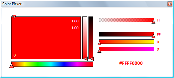
There are seven sliders: three for the HSV (Hue, Saturation, Value) color model, and four for ARGB (Alpha, Red, Green, Blue). As discussed above, the backgrounds of the sliders are generated with Linear Gradient brushes. The really neat feature is that the backgrounds are kept in sync with the current color in such a manner that the background of each slider shows what the resulting color will be if that slider is moved. This turns out to be really interesting because it shows the relationship not only between values within the two color models, but how the models themselves relate to each other. Very instructive. Lastly, all the values, including the hexadecimal color value itself, can be set directly, with a text box.

After implementing the slider backgrounds, I began to think of the control as a tool, and to that end, I added a few nice features:
- Select a color from a display of the standard system colors (
System.Windows.Media.Colors). - Set the control's background to equal the current color, or switch the background and current color, making it easy to see how two colors look together or how the text of one color looks in a specific background.
- Support Ctrl-C and Ctrl-V to copy and paste the current color in hexadecimal notation.
- Through a context menu, obtain a list of equidistant colors from the color range currently shown in each of the sliders.
The Code
The control is implemented as a custom control in WPF, meaning that it derives from System.Windows.Control and that it is a "lookless" control - 100% of its default visual appearance can be replaced without altering the code. It makes use of the theme system for applying the visual look. The default theme is implemented in the file generic.xaml, a file which is automatically generated when you create an item of type Custom Control in Visual Studio. (Note: For this project, I used Visual Studio 2010 Beta 2.)
In addition to the main control, there is a hierarchy of controls deriving from Windows.Controls.Slider which define the color sliders' behavior. The base class, which is abstract, is ColorSlider. ColorSlider derives directly from Slider. ColorSlider is responsible for ensuring that the Slider's background brush is a LinearGradientBrush and exposes helper methods for creating the brush and setting the gradient colors. These methods are virtual so that the Hue slider, which alone has more than two gradient stops in its background, can override the behavior to suit its needs. Below is the default implementation for creating the brush; note that it takes into account whether the slider is oriented horizontally or vertically and whether its IsDirectionReversed property is true.
protected virtual LinearGradientBrush CreateGradientBrush()
{
LinearGradientBrush brush = new LinearGradientBrush();
brush.ColorInterpolationMode = ColorInterpolationMode.ScRgbLinearInterpolation;
if (this.Orientation == Orientation.Horizontal)
{
if (!this.IsDirectionReversed)
{
brush.StartPoint = new Point(0, 0.5);
brush.EndPoint = new Point(1, 0.5);
}
else
{
brush.StartPoint = new Point(1, 0.5);
brush.EndPoint = new Point(0, 0.5);
}
}
else
{
if (!this.IsDirectionReversed)
{
brush.StartPoint = new Point(0.5, 1);
brush.EndPoint = new Point(0.5, 0);
}
else
{
brush.StartPoint = new Point(0.5, 0);
brush.EndPoint = new Point(0.5, 1);
}
}
brush.GradientStops.Add(new GradientStop(Colors.Black, 0));
brush.GradientStops.Add(new GradientStop(Colors.Black, 1));
return brush;
}
ColorSlider's other responsibility is to create the lists of colors which are displayed when its context menu opens, from which the user can select a value indicating the number of discrete colors, evenly distributed from the slider's entire range, which he would like pasted into the clipboard. This requires the ability to determine the color at an arbitrary point along the primary axis of the linear gradient brush. With the understanding that the individual color component values are linearly distributed between any two adjacent gradient stops (which makes sense, given that Linear is in the brush's name):
private Color GetColorAtSliderPosition(double sliderPosition)
{
LinearGradientBrush brush = this.LinearGradientBrush;
double normalized = (sliderPosition - Minimum) / (Maximum - Minimum);
GradientStop gs0 = null;
GradientStop gs1 = null;
for(int i = 1; i < brush.GradientStops.Count; i++)
{
if (brush.GradientStops[i].Offset >= normalized)
{
gs0 = brush.GradientStops[i - 1];
gs1 = brush.GradientStops[i];
break;
}
}
float adjusted = (float)((normalized - gs0.Offset) /
(gs1.Offset - gs0.Offset));
byte A = (byte)((gs1.Color.A - gs0.Color.A) * adjusted + gs0.Color.A);
byte R = (byte)((gs1.Color.R - gs0.Color.R) * adjusted + gs0.Color.R);
byte G = (byte)((gs1.Color.G - gs0.Color.G) * adjusted + gs0.Color.G);
byte B = (byte)((gs1.Color.B - gs0.Color.B) * adjusted + gs0.Color.B);
return Color.FromArgb(A, R, G, B);
}
Continuing with the color slider class hierarchy, deriving from ColorSlider are RgbSlider and HsvSlider. RgbSlider serves as the base class for the four RGB based sliders; it sets its Minimum and Maximum properties to 0 and 255, respectively. HsvSlider is the base class for the HSV based sliders, it's range is 0 - 1. (The odd ball is the Hue slider, which requires a range of 0 to 360.) Each of these classes defines an abstract method UpdateBackground. UpdateBackground is called on all seven sliders anytime CurrentColor changes. Both implementations of UpdateBackground take a single parameter holding the value of the color which serves as the basis for the background's color range. The difference between the two is the type of the color object. For the RGB version, this is the standard WPF Color type. The HSV version of UpdateBackground takes an instance of a class called HsvColor, which wraps the three HSV values (Hue, Saturation, and Value), and has methods for converting between the two color models. (The conversion methods are copied directly from the Color Picker sample in the Windows SDK.)
Updating the background of a color slider based on the currently selected color is straightforward. Since each slider controls one of the three values in (either) color model, all that is required is to hold constant the values that the slider does not control while varying the one value that it does control.
It was necessary to add one additional dependency property to the RgbSlider control, a string to hold the hexadecimal notation of the slider's value. The reason for this property is for binding to a text box, to allow the user to edit the hex value directly. While it is possible to format the display of a bound value as hex using the Binding object's StringFormat property, that is a one-way conversion only. The default method for converting strings to numbers does not allow Hexadecimal notation.
I decided to go ahead and define the slider classes which are specific to each of the individual color component values, even though there is really only ever a single instance of each. Deriving from RgbSlider are AlphaSlider, RedSlider, GreenSlider, and BlueSlider, and deriving from HsvSlider are HueSlider, SaturationSlider, and ValueSlider. Each of these is responsible for painting its own background, which is about it (other than HueSlider, which needs to set its own minimum and maximum and create its own linear gradient brush).
That's pretty much it for the class structure. Here's a quick overview of how it all works together:
The action starts in the overridden method ColorPicker.OnApplyTemplate(). First off, it gets handles to each of the seven color sliders along with the Selector which houses the list of standard colors. Note that all necessary checks are in place so that none of the objects is required. The Selector is the only one of the objects that are defined in XAML which requires a specific name in order for the code to find it. Since the color sliders are all strongly typed, they can easily be found in the visual tree. Once the sliders' handles have been assigned, their backgrounds are updated with the current color, their values are set, and finally, a separate handler is added to each slider's OnValueChanged event.
The control is now ready for input, which can come from one of three sources: the user drags a slider, the user enters a value in a textbox, or the control's CurrentColor property is updated by its host. As far as ColorPicker is concerned, it doesn't matter how a slider's value is changed - by sliding, or by entering a value in a text box which is bound to the slider's value - all that matters is the value changes. ColorPicker is informed of the event via the event handler which is assigned to the slider, and what it does depends on whether the slider that changed was of the HSV group or the RGB group - the new color is obtained from the slider value of this group. In both cases, CurrentColor is updated, the backgrounds (with their linear gradient brushes) are updated, and the values of the sliders in the Other group are updated.
If CurrentColor is updated from outside via the control's host, the process is the same, except that all slider values need to be updated and CurrentColor is given.
One of the problems that come up when CurrentColor is changed is the potential for an infinite recursion. When CurrentColor changes, the slider values are changed, then in the slider event handlers, CurrentColor is updated, which causes the slider values to be set again. It turns out the easiest and surest way to handle this is simply to remove the event handlers from the sliders before updating their values.
The XAML
Following the pattern set up by Visual Studio when creating a Custom Control project item, the entire visual aspect of the ColorPicker is defined inside a style - more particularly, the style's Template property:
<Style TargetType="{x:Type local:ColorPicker}">
     <Setter Property="Padding" Value="10" />
     <Setter Property="Template">
         <Setter.Value>
             <ControlTemplate TargetType="{x:Type local:ColorPicker}">
            .
            .
Adding a ColorSlider is no different than adding any other slider. Note the context menu. The slider's context menu allows the user to copy to the clipboard a list of colors that are evenly distributed along the slider's background. Each menu item represents a different number of colors, and displays an array of Color objects. The style for that is interesting because it not only re-templates ContextMenu but also defines an ItemTemplate for displaying the Color array, including text that is formatted with the Binding object's StringFormat property. The item template contains a list box which itself is re-templated so that its contents are laid out horizontally.
<local:SaturationSlider x:Name="saturationSlider"
                            Orientation="Vertical"
                            IsDirectionReversed="True"
                            IsMoveToPointEnabled="True">
    <Slider.ContextMenu>
        <ContextMenu Style="{StaticResource ColorRangeContextMenuStyle}" />
    </Slider.ContextMenu>
</local:SaturationSlider>

<Style x:Key="ColorRangeContextMenuStyle" TargetType="ContextMenu">
    <Setter Property="Template">
        <Setter.Value>
            <ControlTemplate TargetType="{x:Type ContextMenu}">
                <Border BorderThickness="2" BorderBrush="Black"
                        Background="{Binding RelativeSource={RelativeSource
                                    Mode=FindAncestor,
                                    AncestorType=local:ColorPicker},
                                    Path=Background}">
                    <DockPanel LastChildFill="True">
                        <TextBlock Margin="5"
                            DockPanel.Dock="Top"
                            Text="Copy Color Range" />
                        <ItemsPresenter
                            SnapsToDevicePixels=
                              "{TemplateBinding SnapsToDevicePixels}" />

                    </DockPanel>
                </Border>
            </ControlTemplate>
        </Setter.Value>
    </Setter>
    <Setter Property="ItemTemplate">
        <Setter.Value>
            <DataTemplate>
                <StackPanel Orientation="Horizontal">
                    <ItemsControl ItemsSource="{Binding}">
                        <ItemsControl.Template>
                            <ControlTemplate>
                                <Border>
                                    <StackPanel
                                      Orientation="Horizontal"
                                      IsItemsHost="True" />
                                </Border>
                            </ControlTemplate>
                        </ItemsControl.Template>
                        <ItemsControl.ItemTemplate>
                            <DataTemplate>
                                <Border Width="10" Height="10">
                                    <Border.Background>
                                        <SolidColorBrush Color="{Binding}" />
                                    </Border.Background>
                                </Border>
                            </DataTemplate>
                        </ItemsControl.ItemTemplate>
                    </ItemsControl>
                    <TextBlock Margin="3,0,0,0"
                      Text="{Binding Count, StringFormat={}({0})}" />
                </StackPanel>
            </DataTemplate>
        </Setter.Value>
    </Setter>
</Style>
The Sliders' visual appearance is also defined in styles. All the RGB sliders share the same style, while the HSV sliders for saturation and value share a style. HueSlider is defined alone. The thumbs are interesting. You might have noticed in the pictures that arrow pointers slide all the way from min to max, with the arrow's body hanging out past the bounds of the control itself. This is possible simply by setting the Margin property to a negative value.
<Thumb Margin="0,-7,-3,-7"
          Foreground="Black"
          HorizontalAlignment="Right"
          ToolTip="{TemplateBinding Value}">
Finally, using ColorPicker itself in XAML is as simple as this:
<Grid>
    <picker:ColorPicker CurrentColor="Blue"/>
</Grid>
That's it! I hope that you enjoyed this article and like the color picker. It was a fun project that taught me a lot about WPF and about how the different color variables from the two color models relate to one another.
Addendum
After writing this article, I discovered that the color picker in Paint.Net (a fine program) has sliders for all seven color values, and their backgrounds are painted with gradients that are updated as the current color changes, etc. Plus, it includes a color wheel. However, it is all so tiny that you can barely see any of its pieces!
History
- 3rd November, 2009: Initial post
- 14th November, 2009: Updated source code (bug fix)
- 29th November, 2009: Updated demo
This member has not yet provided a Biography. Assume it's interesting and varied, and probably something to do with programming.


 General
  News
News  Suggestion
  Question
  Bug
Bug  Answer
  Joke
Joke  Praise
  Rant
Rant  Admin
Admin 


 Submit an article or tip


