Introduction
Sometime back I had a need to add checkboxes to tree control items. So what? Tree control has the facility to enable check boxes and what else
did I need? I needed it in a different way.
- I wanted to be able to
add check boxes to specific items only.
- Be able to add/remove checkboxes dynamically.
- Be able to enable/disable items.
Apart from the above features, I have added
a few more features which I thought would be really helpful.
- Multiple selection of tree control items using rubber band selection
- Drag-n-Drop of multiple selected items on a target.
- Specifying whether an item can be considered as a valid target for a drop operation.
- Restricting renaming
feature for items, if needed.
- Specifying whether an item is a valid target for
a drop operation.
- Facility to attach a menu with each tree item.
Background
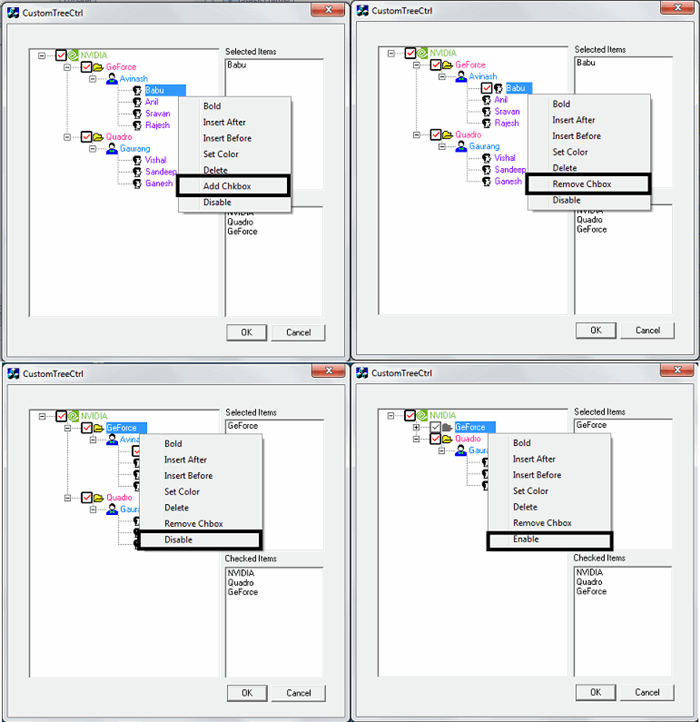
Add checkbox to a specific item
CTreeControl has the facility to add checkboxes for items but enabling the style creates a checkbox for all items. I wanted to
add checkboxes only for specified items.
There are several custom controls over the net which implement the above. They
mostly imitate the checkbox items using images. There will be a checkbox like image used to imitate the check box. Clicking on the image will toggle the state of the check box [using
two images: Check image and Uncheck image].
I found that the above implementation may not satisfy me because I wanted to have images [if the item belongs to a company then
the logo of the company has to be with the item] associated with an item along with
a check box. If the checkbox is going to be imitated using an image, then how do
I represent the image of the item?
The solution can be, combine the image of the item [e.g., 16x16 ] with the checkbox image [16/16] -> [32x16]. We can generate the combined images for all items and that can be added to the image list.
But in my case, not all items
were going to have a checkbox. So some images may not have a combined image [in this case the image will be 16x16] and some may have [image will be 32x16]. But the imagelist does not support variable sizes for images.
Solution
To overcome the
issue of having a variable size image list, I created combined images for all items irrespective of whether the item has
a checkbox or not.
- For a checkbox item, the combined image [checkbox image + item image] is created and added.
- For
an item which doesn't have a checkbox, an empty image is created and combined to the item image so that the image will be of size 32x16.
Add/Remove checkbox dynamically
How
do we add checkboxes during runtime?
Solution
Before that I would like to go through the various images used to represent
the various states of an item. I consider the same image of the item to represent its selected state as well. I mean I don't have
a separate image to represent the selected state. With this assumption, each item can have
six images associated with it. Let's see what they are:
- Normal image: Image used to represent an item which is collapsed and does not have the checkbox [
 ].
]. - Expanded image: To represent an item which is expanded
and does not have check box [].
- Checkbox ON and Collapsed: To represent an item which
is collapsed and has the check box with checked state [].
- Checkbox OFF and Collapsed: To represent an item which
is collapsed and has the check box with unchecked state [] .
- Checkbox ON and Expanded: To represent an item which is expanded and has the check box with checked state [].
- Checkbox OFF and Expanded: To represent an item which
is expanded and has the check box with unchecked state [].
All six images represent an enabled item. These images are prepared whenever an item is inserted into
the tree and added to the image list. While enabling the checkbox, set the index of the combined image [checkbox + item image] from the image list.
Enable/Disable an item dynamically
Now the question is how to enable/disable the tree control items dynamically.
Solution
While disabling the item, a new bitmap is prepared by graying out the current image of the item by keeping the transparency and addig to the image list like []. This image is added to the image list and the index is set as
the image of the tree control.
This is the overall picture of how things are done! The details are given while presenting the code.
Implementation details
We
delve into more explanation of how things are done while going through the code. I have derived a tree control called
CCustomTreeCtrl from CTreeCtrl. I have a dialog on which the tree control is placed. This dialog has
two edit boxes to list out the selected items and checked items. So whenever there is a change in the list of selected items/checked items, it is informed by the tree control to the dialog and
the dialog populates the edit boxes. I'll explain the overview of the important functions and
the message handler here. The code contains detailed comments for all functions. We will see more about
CCustomTreeCtrl now.
How to insert an item?
Let's see first how an item can be inserted into a tree. As we can define the various properties of the item while inserting, like item color, bold font, valid target for drop operation, item has checkbox
or not, restricting the renaming feature, etc., we need to have a custom insert structure.
typedef struct __CUSTOMITEMDATA
{
UINT m_uNormalImage; UINT m_uNormalMaskImage; UINT m_uExpandedImage; UINT m_uExpandedMaskImage; COLORREF m_cMaskColor;
bool m_bEditable; bool m_bDropTarget; bool m_bChecked; bool m_bCheckState; COLORREF m_cItemColor; bool m_bIsBold; UINT m_uMenuID; bool m_bEnable; bool m_bExpStateBefDisable;
int m_iNormalIndex;
int m_iExpandedIndex;
int m_iCheckedNormalIndex; int m_iUnCheckedNormalIndex;
int m_iCheckedExpandedIndex; int m_iUnCheckedExpandedIndex;
int m_iDisableIndex;
}CUSTOMITEMDATA,*PCUSTOMITEMDATA;
The above structure keeps all the information about the item. So while inserting the item, instead of using
TVITEMINSERTSTRUCT, an instance of CUSTOMINSERTSTRUCT
is created, filled, and passed. This structure internally holds a CUSTOMITEMDATA. The instance of
CUSTOMITEMDATA is associated with the item using the SetItemData method.
Let's see some of the members:
m_uNormalImage: Specifies the bitmap ID to represent the normal state of an item.m_uExpandedImage: Specifies the bitmap ID to represent the expanded state of an item.m_cMaskColor: Which color of the bitmap has to be drawn transparently. I used the color (0,128,128 ) which is the default background color you get when you create an icon.
m_bEditable: True if the item can be renamed, false otherwise.m_bDropTarget: True if the item can be considered as a valid target for
a drop operation, false otherwise.m_bChecked: True if the item has a checkbox, false otherwise.m_bCheckState: True if the checkbox is ON, false otherwise. This flag is valid only if
m_bChecked is true.m_cItemColor: Color of the item label.m_bIsBold: True if the font of the item label is bold, false otherwise.m_uMenuID: Resource ID of the menu to be displayed when the item is right clicked.m_bEnable: True if the item is to be enabled, false otherwise.
CUSTOMINSERTSTRUCT tvIS;
tvIS.m_tvIS.hParent = hRoot; tvIS.m_tvIS.hInsertAfter = TVI_FIRST;
tvIS.m_tvIS.item.mask = TVIF_IMAGE | TVIF_TEXT | TVIF_SELECTEDIMAGE;
tvIS.m_tvIS.item.pszText = (LPSTR)( (pProj->m_sTitle).operator LPCTSTR());
PCUSTOMITEMDATA pCustomData = new CUSTOMITEMDATA;
pCustomData->m_uNormalImage = IDB_BITMAP_FOLDER_16;
pCustomData->m_uExpandedImage = IDB_BITMAP_FOLDER_OPEN_16;
pCustomData->m_bEditable = true;
pCustomData->m_bChecked = true;
pCustomData->m_bCheckState = true;
pCustomData->m_cItemColor = RGB(255,40,148);
pCustomData->m_uMenuID = IDR_CONTEXT_MENU;
tvIS.m_pCustomData = pCustomData;
pProj->m_pCustomData = pCustomData;
HTREEITEM hPRoject = m_ctrlTree.InsertItem(&tvIS);
As I said already for each item, 6 images will be generated and based on the state requested by the user [which is filled in the
CUSTOMITEMDATA instance], the index of the image is set.
Creating the combined image is simple. Say I have
a checkbox which is of size 16x16 and the item image is of size 16x16. I create an image of size 32x16 and copy the checkbox and item image into it and add the same to the image list.
How to handle
the LButton down message?
As the combined image has both checkbox and item image in a single bitmap, how
do we differentiate a click on a checkbox and a click on an item image? A click on the checkbox should toggle its state and click on
an item image should toggle the expand state.
When the user clicks on an image, we have to find out whether the click happened on the left half of the image [click on the checkbox ] or on the right half. If it is on the left half, then the
TVN_STATEICON_CLICKED message is generated and sent to tree itself.
The message handler of TVN_STATEICON_CLICKED changes the image of the item based on the checkbox state and notifies the parent about the list of checked items'
TVN_ITEM_CHECK_TOGGLE message. The WPARAM of this message holds the list of items which are checked.
If the mouse click happens on the right half of the image or on the item's label, then the item has to be selected by calling the default
lbuttondown handler of CTreeCtrl.
There is also another chance that the click can happen outside the tree items. In this case, rubber band selection is started.
void CCustomTreeCtrl::OnLButtonDown(UINT nFlags, CPoint point)
{
TV_HITTESTINFO tvHitInfo;
tvHitInfo.pt = point;
HTREEITEM hClickedItem = HitTest(&tvHitInfo );
m_bAllowExpand = true;
if( hClickedItem )
{
PCUSTOMITEMDATA pCustData = (PCUSTOMITEMDATA) GetItemData(hClickedItem);
if( pCustData && pCustData->m_bChecked && pCustData->m_bEnable )
{
if( tvHitInfo.flags & TVHT_ONITEMICON )
{
CPoint pt = point;
ClientToScreen(&pt );
CRect fullRect;
GetItemRect( hClickedItem,&fullRect,FALSE );
ClientToScreen( &fullRect );
CRect labelRect;
GetItemRect( hClickedItem,&labelRect,TRUE );
ClientToScreen( &labelRect );
CRect imgRect;
imgRect.left = fullRect.left;
imgRect.top = fullRect.top;
imgRect.right = imgRect.left + ( labelRect.left - fullRect.left );
imgRect.bottom = fullRect.bottom;
int imgW,imgH;
ImageList_GetIconSize( m_pImgList->GetSafeHandle(),&imgW,&imgH);
imgRect.right -= imgW/2;
if( imgRect.PtInRect( pt ) )
{
m_bAllowExpand = false;
CUSTNMHDR chdr;
chdr.m_hdr.hwndFrom = m_hWnd;
chdr.m_hdr.idFrom = ::GetDlgCtrlID(m_hWnd);
chdr.m_hdr.code = TVN_STATEICON_CLICKED;
chdr.m_hItem = hClickedItem;
chdr.m_data = (PCUSTOMITEMDATA) GetItemData(hClickedItem);
SendMessage(TVN_STATEICON_CLICKED, (WPARAM)&chdr, (LPARAM)chdr.m_hdr.idFrom );
return;
}
}
}
}
if( !(tvHitInfo.flags & TVHT_ONITEM) && !(tvHitInfo.flags & TVHT_ONITEMBUTTON) )
{
if( GetEditControl( ) )
{
CTreeCtrl::OnLButtonDown(nFlags, point);
return;
}
m_bIsBandingON = true;
m_startPt = m_endPt = point;
int i = 0;
for( ; i < m_vecSelectedItems.size(); i++ )
{
HTREEITEM hItem = m_vecSelectedItems[i];
SetItemState( m_vecSelectedItems[i],~TVIS_SELECTED,TVIS_SELECTED );
}
SelectItem( NULL );
CollectSelectedItems();
GetParent()->SendMessage( TREE_SELCHANGED,(WPARAM)(&m_vecSelectedItems),NULL );
SetCapture();
return;
}
SetCapture();
Invalidate();
CTreeCtrl::OnLButtonDown(nFlags, point);
}
Handling the RButtonDown message
Right button click can happen at:
- An Item:
- Item is selected already: Show only the context menu of the right clicked item.
- Item which is not selected: Discard all the selected items and select only the right clicked item and show the context menu associated with it.
- Outside the items: Not handled right now.
Note: The command of the menu shown during the right click of the menu is
specific to the right clicked item. I mean if there are three items selected and
a right click is done on one of the selected items, the menu command is applied to the right clicked item only and not for
all the selected items. My requirement was like that and it can be changed to work on all selected items, if needed.
void CCustomTreeCtrl::OnRButtonDown(UINT nFlags, CPoint point)
{
TV_HITTESTINFO tvHitInfo;
tvHitInfo.pt = point;
m_hRClickItem = NULL;
m_hRClickItem = HitTest(&tvHitInfo );
if( m_hRClickItem )
{
if( GetItemState( m_hRClickItem,TVIS_SELECTED ) & TVIS_SELECTED )
{
}
else
{
int iSelItemCtr = 0;
for( ; iSelItemCtr < m_vecSelectedItems.size( ); iSelItemCtr++ )
{
SetItemState(m_vecSelectedItems[iSelItemCtr],~TVIS_SELECTED,TVIS_SELECTED );
}
SelectItem(NULL);
SetItemState(m_hRClickItem,TVIS_SELECTED,TVIS_SELECTED );
m_vecSelectedItems.clear( );
m_vecSelectedItems.push_back( m_hRClickItem );
GetParent()->SendMessage( TVN_SELECTION_CHANGED,(WPARAM)(&m_vecSelectedItems),NULL );
}
}
}
Handling mouse move message
- Drag mode ON: If the drag mode is ON, then a drag image list is prepared based on the selected items and shown at the mouse position. We know that
CTreeCtrl::CreateDragImage is used to create the drag image of an item. But this tree control allows you to drag multiple tree items,
and we have to prepare our own drag image list. Refer to the function GetImageListForDrag which is being prepared at
OnBeginDrag which is the handler for TVN_BEGINDRAG.
The TVN_BEGINDRAG message is handled by the tree control itself by
a message reflection mechanism. If the mouse is on an item, store the item as target for the drop operation. - Rubber band
mode ON: When rubber band mode is ON, a rectangle is drawn by using a point stored during the left mouse button down and the current mouse point.
void CCustomTreeCtrl::OnMouseMove(UINT nFlags, CPoint point)
{
if( m_bIsDragging )
{
m_hDragTargetItem = NULL;
if( m_pDragImageList )
{
m_pDragImageList->DragMove(point);
m_pDragImageList->DragShowNolock(false );
UINT flags;
m_hDragTargetItem = HitTest( point,&flags );
PCUSTOMITEMDATA pTargetData = NULL;
::SetCursor( m_defaultCursor);
if( m_hDragTargetItem )
{
pTargetData = (PCUSTOMITEMDATA) GetItemData(m_hDragTargetItem);
if( m_hDragSourceItem == m_hDragTargetItem )
{
::SetCursor( m_noCursor );
}
if( !pTargetData->m_bDropTarget )
::SetCursor( m_noCursor );
}
if( m_hDragTargetItem )
{
SelectDropTarget( m_hDragTargetItem );
if( pTargetData )
if( pTargetData->m_bEnable )
Expand( m_hDragTargetItem,TVE_EXPAND);
m_pDragImageList->DragShowNolock(true );
}
}
}
else if( m_bIsBandingON )
{
CClientDC dc(this);
InvertRectangle( &dc,m_startPt,m_endPt );
InvertRectangle( &dc,m_startPt,point );
m_endPt = point;
}
CTreeCtrl::OnMouseMove(nFlags, point);
}
Handling LButtonUp message
- If Drag mode is ON, then check for valid dragged items and valid target items [updated during the mouse move]. If both dragged items and target item is there, then check whether the target item is a valid target for drop operation by checking the
m_bDropTarget member of the PCUSTOMDATA associated with the target item. If so, then copy all the dragged items under the target item. - If Ruuber band mode is ON, then find out all the items under the rectangle and select them.
Handling TVN_BEGINDRAG message
As mentioned earlier, this
handler prepares the drag image for the list of selected items. This message is handled by the tree itself by
a message reflection mechanism.
Handling TVN_BEGINLABELEDIT message
This message
is handled by the tree itself by a message reflection mechanism. This handler checks whether label
editing is allowed for this item by checking the
m_bEditable of CUSTOMITEMDATA associated with the item. Label editing is not allowed for disabled items.
Handling TVN_ITEMEXPANDING message
Expansion is allowed only if the item is enabled and
a click happens on the item image and not on the check box [if the item has a check box].
If expansion is allowed, then get the image representing the expanded state of the item and set it to the item.
Handling TVN_SELCHANGING and TVN_SELCHANGED messages
These handlers basically handle the extended selection using CTRL key and arrow keys.
Handling the ON_WM_PAINT message
Basically we are doing custom drawing for all items. Why not the default drawing? Because each item has its own color, boldness of text, etc. So we handle the drawing of items. Apart from that we do one more thing to
add a better appeal and look for the item. Do you remember, if the item does not have
a check box then we are appending an empty bitmap so that the size of the image used in the image list is
the same. This empty image will give the following look if you do the default drawing:
Can you see the space between the item image and the label? I'm painting a rectangle with the appropriate background color to hide the default drawing and adjust the rectangle used to draw the label by offsetting
the left side, to get the following output:
I'm using a function called IteateItems which is basically used to iterate all the items of the tree and for each item,
it calls the callback function passed to IterateItems. I'll be using IterateItems at many places like
for finding out the items inside the rubber band rectangle, while drawing all the items,
while finding out the list of selected items, etc.
This function takes the callback function to be called for each item, starts
an item from where the iteration is to be started, end item for the iteration,
and any specific info for the callback function as parameters. This function internally calls
ScanItem which is called recursively until the end item for the iteration is reached.
void CCustomTreeCtrl::IterateItems( ScanCallBackFunc func,
HTREEITEM hIterStart ,
HTREEITEM hIterEnd,
void* pInfo
)
{
HTREEITEM hStart = GetRootItem();
if( !hIterStart )
hIterStart = hStart;
m_bContinueScan = true;
m_bStartFound = false;
ScanItems( func,hStart,hIterStart,hIterEnd,pInfo );
}Scope for improvement
I found there are some issues with the code which can be fixed in future versions.
- For example, if you drag multiple images, the drag image shows the stacked view instead of the tree view.
This is because I'm just stacking all the images of the items in a bigger bitmap and adding to the drag image list like this:
- When you do rubber band selection, the rubber band rectangle should completely enclose the item vertically to get selected. I mean the top and bottom rectangle of the item should lie within the rubber band rectangle. Otherwise the item won't be selected.
- Still, there can be many issues which I may not have noticed.
Practical application
This tree control can be used for various
purposes like listing out an entire directory structure where checked items represent folders with Read only
permission and disabled items represent hidden folders/files. Or to represent a company and its ongoing projects and members associated with projects, as demonstrated in this example.
A checkbox can be given to a billable project and the disabled items can represent the projects which are dropped, or a person who is no more active in the project,
etc.
I'm working as Senior software Engineer since 7 years and interested in MFC and COM programming.


 General
  News
News  Suggestion
  Question
  Bug
Bug  Answer
  Joke
Joke  Praise
  Rant
Rant  Admin
Admin 


 Submit an article or tip


 . I'll do it and update at the earliest...