Introduction
Ever wanted to switch all controls on your screen to read-only at the flip of a switch? This article explains two similar methods to achieve this. The first solution will use a custom dependency property while the second solution will use a custom attached dependency property.
Background
Searching for information on this topic, I came across several answers on how to create a global read-only "switch". They all pretty much say to use a dependency property, but show little or no code on how to achieve this. This article will show code and explain how to implement this simple feature. The code is in VB.NET but can be converted to C# very easily using one of the code convertor sites.
Explaining the Code - Solution 1
I created a simple WPF (MVVM type) project to demonstrate the code. I removed a lot of the MVVM framework to keep the code simple. I did include Josh Smith's relay command in order to handle the inactivation of the menu item. (Explained below).
The project contains a main window control with a menu bar, a contentcontrol and a button to switch between 2 usercontrols. The first usercontrol contains several textboxes that you will be able to toggle the read-only status by clicking on a menu item. The second user control contains a button and no textboxes to show how the read-only switch is reset for each new usercontrol and shows how to inactivate the menu item since it has no effect on this usercontrol without textboxes.
Create a Custom Dependency Property
First, we need to create a custom dependency property for the main window. This will be a Boolean property which we can link to the read-only property of our controls.
Public Shared ReadOnly DPIsReadOnlyProperty As DependencyProperty = _
DependencyProperty.Register("DPIsReadOnly", GetType(Boolean), _
GetType(Window), New PropertyMetadata(True))
Public Property DPIsReadOnly() As Boolean
Get
Return CBool(GetValue(DPIsReadOnlyProperty))
End Get
Set(ByVal value As Boolean)
SetValue(DPIsReadOnlyProperty, value)
End Set
End Property
The dependency property is declared as a shared readonly property of type DependencyProperty. The object is created by registering the property. To register your property, you need to supply a few parameters.
The first is a string name for your property "DPIsReadOnly". This is the name of your dependency property and the name should be the same name as your variable definition without the word property on the end.
The next parameter is the type of your property (Boolean).
Third is the type of the property owner. Our property will be a dependency of the main window so our owner is of type "window".
The fourth parameter is a PropertyMetaData object, that among other things will hold the default value of our property. It is set to true so that when our application runs, all controls are set to read-only. If we change this value to false, all controls will be editable when the program starts.
After we declare the property, we wrap it in a standard property get/set declaration to access it. Do not add any additional code to the getter or setter in this property because it will not always be executed. When XAML accesses your property, it calls the getvalue and setvalue directly bypassing your code. You can read more about it in the documentation for dependency properties along with additional metadata options.
Bind to a Menu Item
Now that we have our dependency property, we can bind it to a menu item to toggle the value from true to false. It will be true when the project starts because of the default value we set above in the PropertyMetaData object.
Here is the XAML for our menu item in the main window:
<MenuItem Name="ToolsMenu"
                   Header="_Tools">
             <MenuItem Header="_Lock Screen Input"
                       Command="{Binding Path=InactivateCommand}"
                       IsCheckable="True"
                       IsChecked="{Binding Path=DPIsReadOnly,
                                 RelativeSource={RelativeSource
                                 Mode=FindAncestor, AncestorType=Window},
                                 Mode=TwoWay}">
                 <MenuItem.Icon>
                     <Image Source="/Images/Unlocked.png"
                            Width="15"
                            Height="15" />
                 </MenuItem.Icon>
             </MenuItem></MenuItem>
The IsCheckable property is set to true so we can visually see the toggle of our property.
The IsChecked property is where we bind the value to our dependency property. We set the path to our custom dependency property (DPIsReadOnly) and the relative source to search for our "window" where we defined our dependency property.
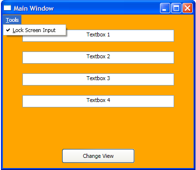
The IsChecked property will show a check-mark next to our menu-item when the value is true. (See image at top of article). Since our dependency property was set to a default value of true, the menu item will be checked when we start the project. When the value is false, the check-mark is cleared allowing us to then display a menu-item icon. I set this icon to an unlocked image (Unlocked.png) in the XAML above to show that the controls are now able to be edited.

Apply It To Your Input Controls
We currently have a custom dependency property for our window and a mechanism to toggle this property between true and false. Now, we need to attach this property to our textboxes (or any UIElement that has a readonly property). We do the last step with a style in our XAML for our usercontrol.
<UserControl x:Class="UserControl1"
             xmlns="http://schemas.microsoft.com/winfx/2006/xaml/presentation"
             xmlns:x="http://schemas.microsoft.com/winfx/2006/xaml"
             xmlns:local="clr-namespace:GlobalReadOnly">

    <UserControl.Resources>
        <Style x:Key="BaseStyle1"
               TargetType="TextBox">
            <Setter Property="IsReadOnly"
                    Value="{Binding Path=DPIsReadOnly,
                             RelativeSource={RelativeSource
                             Mode=FindAncestor,
                             AncestorType=Window}}" />
        </Style>

        <Style x:Key="GridTextStyle1"
               TargetType="TextBox"
               BasedOn="{StaticResource BaseStyle1}">
            <Setter Property="Margin"
                    Value="40,10,40,10" />
            <Setter Property="TextAlignment"
                    Value="Center" />
            <Setter Property="Height"
                    Value="25" />
        </Style>
    </UserControl.Resources>

    <Grid>
        <ItemsControl ItemsSource="{Binding Path=BoxNames1}">
            <ItemsControl.ItemsPanel>
                <ItemsPanelTemplate>
                    <StackPanel Orientation="Vertical"></StackPanel>
                </ItemsPanelTemplate>
            </ItemsControl.ItemsPanel>

            <ItemsControl.ItemTemplate>
                <DataTemplate>
                    <TextBox Text="{Binding .}" Style="{StaticResource GridTextStyle1}" />
                </DataTemplate>
            </ItemsControl.ItemTemplate>

        </ItemsControl>
    </Grid>
</UserControl>
Here, we have several options. This is all just normal WPF and setting styles. I created a "BaseStyle1" style to bind the value of our dependency property to the readonly property of our textbox. Again, I use a relativesource to search for our "window" to find the custom dependency property.
Additional properties for the textbox are set in the "GridTextStyle1" style. This style uses the BasedOn attribute to link this style to the style that implements the readonly binding to the dependency property.
<Style x:Key="GridTextStyle1"
            TargetType="TextBox"
            BasedOn="{StaticResource BaseStyle1}">
The textboxes in the itemscontrol are set to this style and inherit the readonly binding.
<TextBox Text="{Binding .}" Style="{StaticResource GridTextStyle1}" />
This allows many styles to be based on the basestyle. You can place all this logic in one style if you like. You can also omit the key value in the base style and the styles setting on the textboxes and have that style default to all textboxes.
This style could also be placed in your application.xaml resources to apply to all textboxes in your application. Again, you can apply your readonly style in any of the numerous ways that WPF allows.
Reset Value When Changing Usercontrols
The button on the bottom of the main window changes the display by switching viewmodels which changing the usercontrol shown based on a datatemplate in the mainresources.xaml file (See detail code file).
To simplify matters for this program, I attached an event handler to the click event of the button. When the event fires, since we have set up our getters and setters for our custom dependency property, we only need to set its value in a simple property assignment. This will also toggle the value of our menu item.
Private Sub Button_Click(ByVal sender As System.Object, ByVal e As System.Windows.RoutedEventArgs)
DPIsReadOnly = True
End Sub
To eliminate this code behind, you could also use a messenger system to send a message from the viewmodel to reset the readonly state and have the main window "Listen" for the message to change the property.
Inactivate Menu When Not Needed
When you switch to a user-control screen that does not use the read-only property, it is a good idea to inactivate the menu item. To inactivate the menu item, I used the standard relay command structure, basic to most MVVM programming. The menu item is bound to a command on the viewmodel and its CanExecute property is set to true to activate and false to inactivate. This is accomplished with the use of Josh Smith's relay command. (See Josh Smith's articles for an excellent explanation of his relay command).
<MenuItem Header="_Lock Screen Input"
        Command="{Binding Path=InactivateCommand}"
        IsCheckable="True"
        IsChecked="{Binding Path=DPIsReadOnly,
                  RelativeSource={RelativeSource
                  Mode=FindAncestor, AncestorType=Window},
                  Mode=TwoWay}">
The viewmodel will set its value in its constructor:
MyBase.ReadOnlyMenuIsActive = False
and the base viewmodel "commandviewmodel" will inactivate the menu item based on the return value of the CanInactivate function.
Public ReadOnly Property InactivateCommand() As ICommand
    Get
        Return New RelayCommand(AddressOf Me.Inactivate, AddressOf Me.CanInactivate)
    End Get
End Property
Public Function CanInactivate() As Boolean
    Return ReadOnlyMenuIsActive
End Function
Private Sub Inactivate()
End Sub

Private m_ReadOnlyMenuIsActive As Boolean
Public Property ReadOnlyMenuIsActive() As Boolean
    Get
        Return m_ReadOnlyMenuIsActive
    End Get
    Set(ByVal value As Boolean)
        m_ReadOnlyMenuIsActive = value
        OnPropertyChanged(New PropertyChangedEventArgs("ReadOnlyMenuIsActive"))
    End Set
End Property
Explaining the Code - Solution 2
The second example will show how to achieve the same results by using a custom attached dependency property. Most of the code is the same, but I will highlight the areas that are different. To show how an attached dependency property can be added to any element, we will attach it to the grid on the main window instead of the window itself.
Create a Custom Attached Dependency Property
First, we need to define our custom attached dependency property. The attached property declaration is similar to the dependency property but uses the RegisterAttached method instead.
Namespace myapp
Public Class MyAttachedProperty
Public Shared ReadOnly ADPIsReadOnlyProperty As DependencyProperty = _
DependencyProperty.RegisterAttached( _
"ADPIsReadOnly", _
GetType(Boolean), GetType(UIElement), ADPFlags)
Shared ADPFlags As FrameworkPropertyMetadata = New FrameworkPropertyMetadata(True, _
(FrameworkPropertyMetadataOptions.BindsTwoWayByDefault Or _
FrameworkPropertyMetadataOptions.Inherits), _
New PropertyChangedCallback(AddressOf ADPIsReadOnlyChanged))
Public Shared Sub SetADPIsReadOnly(ByVal element As UIElement, ByVal value As Boolean)
element.SetValue(ADPIsReadOnlyProperty, value)
End Sub
Public Shared Function GetADPIsReadOnly(ByVal element As UIElement) As Boolean
Return DirectCast(element.GetValue(ADPIsReadOnlyProperty), Boolean)
End Function
Private Shared Sub ADPIsReadOnlyChanged(ByVal sender As DependencyObject, _
ByVal args As DependencyPropertyChangedEventArgs)
sender.SetValue(ADPIsReadOnlyProperty, args.NewValue)
End Sub
End Class
End Namespace
Since an attached property can be set on any dependency object, we do not create the same property getters/setters. Instead, you need to create a pair of shared methods to get and set the property value. The shared methods should be named GetYourPropertyName and SetYourPropertyName.
The RegisterAttached method needs several parameters supplied.
The first is a string name for your property "ADPIsReadOnly". This is the name of your attached dependency property and the name should be the same name as your variable definition without the word property on the end.
The next parameter is the type of your property (Boolean) .
Third is the type of the property owner. We want to be able to use this property on any control so our owner type is set to "UIElement".
The fourth parameter (optional) is a FrameworkPropertyMetadata object. This object can hold several pieces of information for your property. Here, in addition to setting the default value, I set a few properties to illustrate how to apply this object. A complete listing of properties can be found in the documentation for attached dependency properties along with additional FrameworkPropertyMetadata options.
Attach the Property
Now that we have our attached dependency property, we need to "attach" it to a dependency object in our main window. First, we must add a namespace reference in our main window so our attached dependency property class can be found.
xmlns:ap="clr-namespace:GlobalReadOnly.myapp">
Then, we can simply add our property to the grid definition and assign the value we want to it.
<Grid Name="Apgrid"
       ap:MyAttachedProperty.ADPIsReadOnly="True"
       Background="Orange">
Notice that a name value has been added to the grid. This is needed to retrieve this element when we want to reset its value below.
Bind to a Menu Item
Our binding to the menu item is the same as before except that since we attached our property to the grid in the main window we need to change the ancestor type to "Grid".
<MenuItem Name="ToolsMenu"
                         Header="_Tools">
                   <MenuItem Header="_Lock Screen Input"
                             Name="LockScreen"
                             Command="{Binding Path=InactivateCommand}"
                             IsCheckable="True"
                             IsChecked="{Binding Path=ADPIsReadOnly,
                               RelativeSource={RelativeSource Mode=FindAncestor,
                               AncestorType=Grid},
                                       Mode=TwoWay}">

                       <MenuItem.Icon>
                           <Image Source="/Images/Unlocked.png"
                                  Width="15"
                                  Height="15" />
                       </MenuItem.Icon>
                   </MenuItem>
               </MenuItem>
Apply It To Your Input Controls
The styles are also the same as before except for the relativesource for our binding. We need to change the Ancestor type to "Grid" like we did above with the menu item binding.
The textboxes that we apply this style to resides in its own grid on the usercontrol. To have our binding find the grid on the main window instead, we need to set the "AncestorLevel" to 2 so it will bypass the grid on the usercontrol.
<Style x:Key="BaseStyle2"
             TargetType="TextBox">
         <Setter Property="IsReadOnly"
                  Value="{Binding Path=ADPIsReadOnly,
                           RelativeSource={RelativeSource
                           Mode=FindAncestor,
                           AncestorType=Grid, AncestorLevel=2}}" />
      </Style>
Again, you can apply your readonly style in any of the numerous ways that WPF allows.
Reset Value When Changing Usercontrols
To reset the value for the attached dependency property, we need a reference to the object that contains it. This is why we added the "Name" property to the grid in the main window. We can now use this name and set the value of the attached dependency property.
myapp.MyAttachedProperty.SetADPIsReadOnly(Apgrid, True)
Using the Code
In the application.xaml.vb file, in the source code, the first line contains a constant "startwindow". If set to 1, it will display the main window for the Dependency Property demo. Change this constant to 2 and the main window for the Attached Dependency Property demo will display.
Friend Const startWindow As Integer = 1


 General
  News
News  Suggestion
  Question
  Bug
Bug  Answer
  Joke
Joke  Praise
  Rant
Rant  Admin
Admin 


 Submit an article or tip


