Process
The first thing we need to do is identify the behavior of the Outlook XP tool bar. We start by a look over the whole control, then follow with a close look at the deepest controls, like the buttons, and work up to the Outlook bar itself. Because we already know how we are going to implement the main part of this (VivantList), the key is to work from the small end, but always have a general idea of what we're aiming for.
(Note: For this project, I am not going to program mouse dragging to rearrange the order of items in the bar.)
First, we notice there are two modes to this bar which closely resembles Explorer’s list view’s ‘Large Icons’, and ‘List’ modes. This should be easy enough to take care of later and it provides no problems on this level, so we continue looking. At a glance, it appears that buttons can be used with their FlatStyle = Flat. However, closer observation shows that the button lights up if the mouse is just over the text label. This will take some fancy footwork to use the Button control, because there are no public functions to pass mouse events to the System.Window.Forms.Button control. There are a number of things you can do here, but I like to keep things ‘.NET friendly’, so I’m going to find another solution.

At this point, I decide to write my own button. Microsoft provided a friendly way to write your own button. There is a public class:
System.Windows.Forms.ButtonBase
This class is useful for writing your own button, because it provides a lot of the default behavior. In addition, you can inherit from this class and still view the control in the form designer. I am sure you’re all familiar with what Visual Studio .NET 2003 does when you inherit from a System.Windows.Forms.Control like a Panel or TreeView. Just in case you’re not familiar with the problem, the form designer will not display the control for editing… and it causes some other strange problems… I will go into why this is so, some other time.
Despite all this, I found the ButtonBase class to be cumbersome. In about thirty minutes, I whipped up a control to serve my needs, which inherits from the UserControl class.
using System;
using System.Collections;
using System.ComponentModel;
using System.Drawing;
using System.Data;
using System.Windows.Forms;
namespace DemoOutLookBar
{
public class CustomButton :System.Windows.Forms.UserControl
{
private System.ComponentModel.Container components = null;
private System.Drawing.Icon m_Icon;
private bool m_MouseIsOver = false;
private bool m_MouseIsDown = false;
public CustomButton()
{
InitializeComponent();
this.SetStyle(System.Windows.Forms.ControlStyles.DoubleBuffer, true);
this.SetStyle(
System.Windows.Forms.ControlStyles.SupportsTransparentBackColor,
true);
this.SetStyle(
System.Windows.Forms.ControlStyles.AllPaintingInWmPaint, true);
this.UpdateStyles();
}
protected override void Dispose( bool disposing )
{
if( disposing )
{
if(components != null)
{
components.Dispose();
}
}
base.Dispose( disposing );
}
#region Component Designer generated code
private void InitializeComponent()
{
this.Name = "CustomButton";
this.Size = new System.Drawing.Size(96, 96);
}
#endregion
public void PerformOnMouseEnter(EventArgs e)
{
this.OnMouseEnter(e);
}
public void PerformOnMouseLeave(EventArgs e)
{
this.OnMouseLeave(e);
}
public void PerformOnMouseDown(MouseEventArgs e)
{
this.OnMouseDown(e);
}
public void PerformOnMouseUp(MouseEventArgs e)
{
this.OnMouseUp(e);
}
public void PerformOnLeave(EventArgs e)
{
this.OnLeave(e);
}
public void PerformClick(EventArgs e)
{
this.OnClick(e);
}
protected override void OnMouseEnter(EventArgs e)
{
m_MouseIsOver = true;
base.OnMouseEnter (e);
this.Refresh();
}
protected override void OnMouseLeave(EventArgs e)
{
m_MouseIsOver = false;
base.OnMouseLeave (e);
this.Refresh();
}
protected override void OnMouseDown(MouseEventArgs e)
{
m_MouseIsDown = true;
base.OnMouseDown (e);
this.Refresh();
}
protected override void OnMouseUp(MouseEventArgs e)
{
m_MouseIsDown = false;
base.OnMouseUp (e);
this.Refresh();
}
protected override void OnLeave(EventArgs e)
{
m_MouseIsDown = false;
base.OnLeave (e);
this.Refresh();
}
protected override void OnPaint(PaintEventArgs e)
{
if (m_Icon != null)
{
e.Graphics.DrawIcon(m_Icon, new
System.Drawing.Rectangle(2, 2,
this.ClientRectangle.Width - 3,
this.ClientRectangle.Height - 3));
}
if (m_MouseIsOver)
{
e.Graphics.DrawRectangle(new
System.Drawing.Pen(Color.FromArgb(10, 36, 106)),
0,0,this.ClientRectangle.Width - 1,
this.ClientRectangle.Height - 1);
e.Graphics.FillRectangle(new
SolidBrush(Color.FromArgb(75, 10, 36, 140)),
1,1,this.ClientRectangle.Width - 2,
this.ClientRectangle.Height - 2);
if(m_MouseIsDown)
e.Graphics.FillRectangle(new
SolidBrush(Color.FromArgb(50, 10, 36,140)),
1,1,this.ClientRectangle.Width - 2,
this.ClientRectangle.Height - 2);
}
base.OnPaint (e);
}
public System.Drawing.Icon Icon
{
get
{
return m_Icon;
}
set
{
m_Icon = value;
}
}
}
}
As you can see, this control will function like the Outlook flat buttons, but also has public functions to artificially fire some mouse functions. Side note: some colors were measured and some were approximated by comparison. To use our custom button, we will simply capture the Click event just like a System.Windows.Forms.Button.
Now that we know we can replicate our basic behavior, let’s take a closer look at the Outlook bar. Measuring in Adobe Photoshop, I found that the large icons were 32 X 32 pixels with a 36 X 36 pixel box going around them. Upon measuring the small icons, we find a small discrepancy. The icons are 16 X 16 pixels, but the button itself is only 19 X 20 pixels! There is a line of pixels missing on the right side of the button. I am choosing to correct for this by making the small buttons 20 X 20 pixels. I do not know if this was a mistake on the part of Microsoft or not, but this will be our first deviation from the original goal in this project.
Now we are faced with a choice. We know that we need to display two types of rows in our list. We know there will not be two rows of separate types on the list at once (not that this would be a problem). Finally, we know that in its heart, it is a control designed to emulate the list view control. We must now decide if we are going to design two separate row controls that inherit from VivantRow, or create one control that inherits from VivantRow that changes its layout based on its mode. Well, because of the final reason above, I decided to create one row control with modes. This way, the list can easily have modes like a Microsoft list view control. This means, all layout code must be done by hand, so for my ease, I made two layout functions. I start my new row control and place a label and a custom button on it.
private void LayoutList()
{
    this.SuspendLayout();
    this.customButton1.Anchor = ((System.Windows.Forms.AnchorStyles)
      (System.Windows.Forms.AnchorStyles.Top |
      System.Windows.Forms.AnchorStyles.Left));
    this.customButton1.Location = new System.Drawing.Point(5, 3);
    this.customButton1.Size = new System.Drawing.Size(20, 20);

    this.label1.Location = new System.Drawing.Point(25, 0);
    this.label1.Size = new
      System.Drawing.Size(this.ClientSize.Width - 25 , 28);
    this.label1.TextAlign =
      System.Drawing.ContentAlignment.MiddleLeft;

    this.Size = new
      System.Drawing.Size(this.Parent.ClientSize.Width, 28);
    this.RowHeight = 28;
    this.ResumeLayout(false);
}
private void LayoutLargeIcon()
{
    this.SuspendLayout();
    this.customButton1.Anchor = ((System.Windows.Forms.AnchorStyles)
      (System.Windows.Forms.AnchorStyles.Top));
    this.customButton1.Location = new
      System.Drawing.Point((this.ClientSize.Width/2) - (18 + 1), 6);
    this.customButton1.Size = new System.Drawing.Size(36, 36);

    this.label1.Location = new System.Drawing.Point(0, 46);
    this.label1.Size = new System.Drawing.Size(this.ClientSize.Width , 16);
    this.label1.TextAlign = System.Drawing.ContentAlignment.TopCenter;

    this.Size = new System.Drawing.Size(this.Parent.ClientSize.Width, 66);
    this.RowHeight = 66;
    this.ResumeLayout(false);
}
Next, we add a mode property that calls a function to perform the layout if the mode changed.
private void LayoutRows(ViewMode Vmode)
{
    switch (Vmode)
    {
        case (ViewMode.Large_Icons):
            LayoutLargeIcon();
            break;
        case(ViewMode.List):
            LayoutList();
            break;
    }
    this.Update();
}
public ViewMode Mode
{
    get
    {
        return m_Mode;
    }
    set
    {
            m_Mode = value;
            LayoutRows(m_Mode);
    }
}
Now that the row control is done, we move on to the sliding panels or tabs. For this, I took VivantWrapper, trimmed it down to minimum, and then added a button along the top. I called this control OutLookWrapper. I also dropped a couple of buttons down that will take care of scrolling. We’ll get back to them later.
After some thought, I decided to make the control that holds these OutLookWrappers a VivantList. What we’ll do is make each one a row, and size it down to the size of the button when someone clicks on the button on another Outlook wrapper. I had originally planed something like this, combined with some tab control code I wrote a while back. But, I think a VivantList will work better here. So, we make OutLookWrapper inherit from VivantRow, and add a wrapper for the whole bar control.
This is where I had stopped before. I made some time to finish this up ahead of schedule. A lot of code related to scrolling made things complex. Now, given that there are still a few minor bugs, I am going to leave that up to you to look over if you’re interested. However, I may explain it once it works completely.
Structure
From here, we are going to look at the overall structure. Once this structure is assembled, the rest is just debugging and testing. That said, I am going to jump from structure to the final product.
Now that we have a visual representation of our structure, let’s look at some of the classes:
Final Product
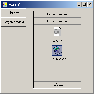
So, now that we have it all together, let’s see how to use it.
- Place an
OutLookBar on a form with the Forms Designer.
- Create a new
OutLookWrapper:
OutLookWrapper m_OLW = new OutLookWrapper();
- Set the text of the
OutLookWrapper:
m_OLW.Text = "ListView";
- Create
OutLookRows to fill the OutLookWrapper:
- Create a function that you wish to be executed when the icon is clicked on.
private void ClikedBlank()
{
    MessageBox.Show("You Clicked Blank!!!");
}
- Create your new
OutLookRow.
OutLookRow m_OLR = new OutLookRow();
- Set the icon for your
OutLookRow.
m_OLR.Icon = new Icon("..\\..\\Icon1.ico");
- Set the text for your
OutLookRow.
m_OLR.Text = "Blank";
- Pass in the Action function for your
OutLookRow.
m_OLR.SetAction( new ButtonClicked(ClikedBlank));
-
Add your OutLookRow to your OutLookWrapper.
m_OLW.AddRow(m_OLR);
- Set the mode of your
OutLookWrapper:
m_OLW.Mode = ViewMode.List;
- Add your
OutLookWrapper to your OutLookBar:
this.outLookBar1.AddRow(m_OLW.Mode);
And that's it!
I recommend you embed your icons into your program, rather than reading them from file as I have done above. For more information on a simple way to do this, see: Understanding Embedded Resources in Visual Studio .NET by James T. Johnson.
To see more, I recommend you download the sample project.
Future Plans
- Add mouse wheel support.
- Debug scroll buttons.
- Maybe, add mouse dragging.
- Test using background images on
OutLookWrapper.
History
- 11/14/04 - Initial upload.
- 11/18/04 - Completed article and uploaded working control.
Final Words
Please, feel free to post any feedback you might have. Even if I don’t directly respond to it, I will read it. The feedback I get will guide the development of this or any project I do. Thanks.


 General
  News
News  Suggestion
  Question
  Bug
Bug  Answer
  Joke
Joke  Praise
  Rant
Rant  Admin
Admin 


 Submit an article or tip


