Introduction
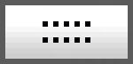
Recently I needed a scroll bar that looked and acted like the one
in Windows Media Player:

The closest one I could find was the CSkinHorizontalScrollbar
class in
Greg Ellis's article, but it did not support colors. So I created
XScrollBar, which has following features:
- Support for both horizontal and vertical
scroll bars
- Optional color displayed on thumb and
in channel
- Optional gripper displayed on thumb
- Hand cursor is displayed when mouse
hovers over thumb
- Thumb color (if enabled) is changed
to "hot color" when mouse hovers over thumb
- Hot/pressed states displayed for arrow buttons
- Thumb changes to hot state when control
has focus
- Responds to both mouse and keyboard input
- Clicking in channel moves thumb
to that spot (which is more intuitive than behavior
of standard
CScrollBar)
- Left and right arrow buttons move
thumb by one unit
- Scroll messages (WM_HSCROLL) are sent to
owner window
- The scroll bar and its components
should be sized according to the size of a specified rect
CXScrollBar In Action
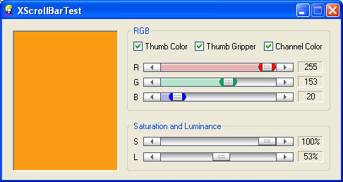
To demonstrate new scroll bar, I decided to create an RGB color tool,
which would benefit from having colors displayed on scroll bars:
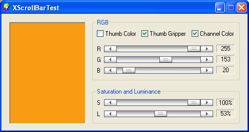
Turning off thumb color also turns off channel color:
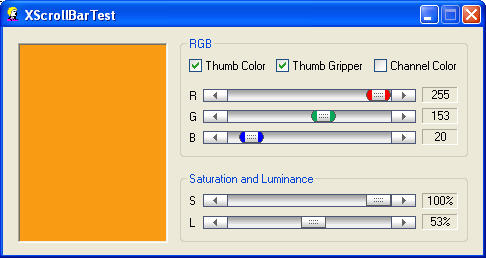
You can also turn off channel color by itself:
The thumb gripper can also be disabled:

Using CXScrollBar
Use of XScrollBar will usually be in dialogs,
but you can create XScrollBar anywhere by using one
of the two Create functions.
CreateFromWindow()
Here is how the CreateFromWindow() function is used in the demo
app:
VERIFY(m_HorizontalScrollBar1.CreateFromWindow(
SBS_HORZ | WS_CHILD | WS_VISIBLE | WS_TABSTOP,
this, GetDlgItem(IDC_SCROLL1_RECT_HORZ)->m_hWnd, IDC_SCROLL1_HORZ));
After creating the XScrollBar control, the demo app then
sets its range, color, and gripper options:
    m_HorizontalScrollBar1.SetScrollRange(0, 255)
                          .SetThumbColor(RGB(255,0,0))
                          .EnableThumbGripper(m_bThumbGripper);
Setting thumb color also has effect of enabling display of
thumb color. The channel color is enabled by default, and will be displayed
if thumb color is enabled.
CreateFromRect()
In case it is not convenient to create a placeholder window, you can also
create XScrollBar control by specifying rect:
Implementation Notes
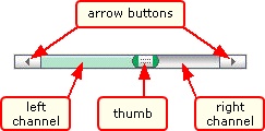
XScrollBar Component Structure
The diagram below shows the components of an XScollBar,
and the nomenclature that will be used in this article:
As you probably guessed, the XScrollBar is drawn in five steps
(six, if you count the border). The drawing takes place
in DrawHorizontal() function.
Drawing the XScrollBar: Step 1 - Left Arrow Button
The left arrow button bitmap looks like
this (the orange border is not part of the bitmap):

One thing to note is that arrow bitmaps and thumb bitmap are assumed to
be all the same size, which simplifies some calculations. The size of the
thumb bitmap (m_nBitmapWidth, m_nBitmapHeight) is set in the
CreateFromStatic() function.
Knowing that width of the left arrow bitmap = width of the thumb
bitmap, we can write
    CRect rectLeftArrow(m_rectClient.left, m_rectClient.top,
        m_rectClient.left + m_nBitmapWidth, m_rectClient.bottom);
StretchBlt() is then called to copy the left arrow bitmap into
the memory DC, and a border is drawn around the left arrow. Note that the
bitmaps do not include a border, because StretchBlt()
may decide to duplicate the row that contains the border, and you will
end up with a thick line on the bottom.
Drawing the XScrollBar: Steps 2 & 3 - Channel
Next we draw channel. In case a color is being displayed in the channel,
it must be drawn in two parts. Because we modify the bitmap to add color,
we draw the right channel (the part without color) first.
The channel bitmap is one pixel wide and looks like
this (the orange border is not part of the bitmap):

Earlier, we set the channel position and width from the thumb width:
    int nChannelStart = m_rectClient.left + m_nBitmapWidth;
    int nChannelWidth = m_rectClient.Width() - 2*m_nBitmapWidth;
Now we use these values to define the rect for the right channel:
    CRect rectChannelRight(m_rectThumb.left + m_nBitmapWidth/2, m_rectClient.top,
    nChannelStart + nChannelWidth, m_rectClient.bottom);
StretchBlt() is then called to copy the right channel bitmap into
the memory DC.
If a thumb color and channel color (both are required) are desired,
then we must modify the channel bitmap to add color. But what color to use?
Here is where Christian Rodemeyer's CColor class comes in.
We use CColor to convert the RGB thumb color to HLS,
and then lighten the color by adjusting the HLS values. Finally, we
convert back to RGB, and this is new channel color.
if (m_bChannelColor && m_bThumbColor)
{
COLORREF rgb1, rgb2, rgb3;
GetChannelColors(rgb1, rgb2, rgb3);
BITMAP bm;
bmpChannel.GetBitmap(&bm);
bitmapDC.SetPixel(0, 0, rgb1);
bitmapDC.SetPixel(0, 1, rgb2);
for (int y = 2; y < (bm.bmHeight); y++)
bitmapDC.SetPixel(0, y, rgb3);
}
and here is GetChannelColors():
void CXScrollBar::GetChannelColors(COLORREF& rgb1,
COLORREF& rgb2,
COLORREF& rgb3)
{
CColor color;
color.SetRGB(GetRValue(m_ThumbColor),
GetGValue(m_ThumbColor),
GetBValue(m_ThumbColor));
color.ToHLS();
float fLuminance = color.GetLuminance();
fLuminance = 0.8f;
float fSaturation = color.GetSaturation();
fSaturation = 0.5f * fSaturation;
float fHue = color.GetHue();
color.SetHLS(fHue, fLuminance, fSaturation);
color.ToRGB();
rgb3 = RGB(color.GetRed(), color.GetGreen(), color.GetBlue());
fLuminance = .87f;
color.SetHLS(fHue, fLuminance, fSaturation);
color.ToRGB();
rgb2 = RGB(color.GetRed(), color.GetGreen(), color.GetBlue());
fLuminance = .92f;
color.SetHLS(fHue, fLuminance, fSaturation);
color.ToRGB();
rgb1 = RGB(color.GetRed(), color.GetGreen(), color.GetBlue());
}
We can now define the rect for the left channel:
    CRect rectChannelLeft(nChannelStart, m_rectClient.top,
        m_rectThumb.left + m_nBitmapWidth/2, m_rectClient.bottom);
StretchBlt() is then called to copy the left channel bitmap into
the memory DC
Drawing the XScrollBar: Step 4 - Right Arrow Button
The right arrow button bitmap looks like
this (the orange border is not part of the bitmap):

The right arrow button is drawn much like the left arrow button.
Drawing the XScrollBar: Step 5 - Thumb
The thumb bitmap (for a thumb with no color) looks like this:
For a thumb with color it looks like:

The thumb bitmaps are modified before being drawn to the memory DC.
For a thumb with no color, the only modification that may be necessary
is to replace the thumb gripper pixels with pixels taken
from the surrounding area on the thumb, thus making the gripper disappear
(how this is done will be explained below).
For a thumb with color, in addition to the gripper pixels, it is
also necessary to make the corner pixels transparent (i.e., same
color as channel). and to add the selected thumb color (or hover color).
All these changes are accomplished by using four "special" RGB color values:
| RGB Value |
Use |
| RGB(0, 0, 1) |
Thumb color (or hover color) |
| RGB(0, 0, 2) |
Gripper |
| RGB(0, 0, 3) |
Transparent left color |
| RGB(0, 0, 4) |
Transparent right color |
These colors are used in the thumb bitmaps as shown here:
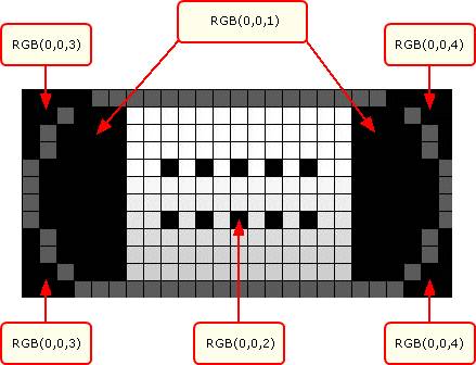
Note that the thumb with no color only has the
RGB(0, 0, 2) color.
Here is the code that performs these pixel replacements:
CClientDC dc(this);
CDC bitmapDC;
bitmapDC.CreateCompatibleDC(&dc);
CBitmap *pOldBitmap = bitmapDC.SelectObject(&m_bmpThumbHot);
ColorThumb(&bitmapDC, m_ThumbHoverColor);
bitmapDC.SelectObject(&m_bmpThumb);
ColorThumb(&bitmapDC, m_ThumbColor);
and here is ColorThumb():
void CXScrollBar::ColorThumb(CDC *pDC, COLORREF rgbThumb)
{
COLORREF rgbPrev = 0;
for (int x = 0; x < m_nBitmapWidth; x++)
{
for (int y = 0; y < m_nBitmapHeight; y++)
{
COLORREF rgb = pDC->GetPixel(x, y);
if (m_bThumbColor && (rgb == THUMB_MASK_COLOR))
{
pDC->SetPixel(x, y, rgbThumb);
}
else if (rgb == THUMB_GRIPPER_MASK_COLOR)
{
if (m_bThumbGripper)
pDC->SetPixel(x, y, THUMB_GRIPPER_COLOR);
else
pDC->SetPixel(x, y, rgbPrev);
}
rgbPrev = rgb;
}
}
}
This technique for coloring the thumb and channel works for True Color
(24-bit). Lower resolutions may require you to use other RGB values
for the four "special" RGB thumb colors, and it may also require
that you limit the color used in the channel.
Mouse Hover
A final thing to take care of is when the mouse hovers over the thumb.
In this case, the thumb color will be changed to the hover color
(as seen in the above code),
and the cursor will be changed to a hand:
This is handled in the OnSetCursor() function.
How To Use
To integrate XScrollBar into your app, you first need
to add following files to your project:
- XScrollBar.cpp
- XScrollBar.h
- Color.cpp
- Color.h
- memdc.h
Next copy the bitmap files
to the project's res directory, and add the bitmaps to the .rc file.
I find it easiest just to edit the .rc file manually:
IDB_HORIZONTAL_SCROLLBAR_LEFTARROW BITMAP DISCARDABLE "res\\HorizontalScrollBarLeftArrow.bmp"
IDB_HORIZONTAL_SCROLLBAR_RIGHTARROW BITMAP DISCARDABLE "res\\HorizontalScrollBarRightArrow.bmp"
IDB_HORIZONTAL_SCROLLBAR_CHANNEL BITMAP DISCARDABLE "res\\HorizontalScrollBarChannel.bmp"
IDB_HORIZONTAL_SCROLLBAR_THUMB BITMAP DISCARDABLE "res\\HorizontalScrollBarThumb.bmp"
IDB_HORIZONTAL_SCROLLBAR_THUMB_NO_COLOR BITMAP DISCARDABLE "res\\HorizontalScrollBarThumbNoColor.bmp"
IDB_VERTICAL_SCROLLBAR_UPARROW BITMAP DISCARDABLE "res\\VerticalScrollBarUpArrow.bmp"
IDB_VERTICAL_SCROLLBAR_DOWNARROW BITMAP DISCARDABLE "res\\VerticalScrollBarDownArrow.bmp"
IDB_VERTICAL_SCROLLBAR_CHANNEL BITMAP DISCARDABLE "res\\VerticalScrollBarChannel.bmp"
IDB_VERTICAL_SCROLLBAR_THUMB BITMAP DISCARDABLE "res\\VerticalScrollBarThumb.bmp"
IDB_VERTICAL_SCROLLBAR_THUMB_NO_COLOR BITMAP DISCARDABLE "res\\VerticalScrollBarThumbNoColor.bmp"
And add the bitmap IDs to
resource.h:
#define IDB_HORIZONTAL_SCROLLBAR_LEFTARROW        201
#define IDB_HORIZONTAL_SCROLLBAR_RIGHTARROW       202
#define IDB_HORIZONTAL_SCROLLBAR_CHANNEL          203
#define IDB_HORIZONTAL_SCROLLBAR_THUMB            204
#define IDB_HORIZONTAL_SCROLLBAR_THUMB_NO_COLOR   205
#define IDB_VERTICAL_SCROLLBAR_UPARROW            206
#define IDB_VERTICAL_SCROLLBAR_DOWNARROW          207
#define IDB_VERTICAL_SCROLLBAR_CHANNEL            208
#define IDB_VERTICAL_SCROLLBAR_THUMB              209
#define IDB_VERTICAL_SCROLLBAR_THUMB_NO_COLOR     210
Of course, you should verify the numerical IDs are unique.
Future Enhancements
- Add "scroll tip".
- Add option to flip vertical orientation.
Acknowledgments
-
Thanks to Greg Ellis for his
CSkinHorizontalScrollbar class,
which I used as the starting point for CXScrollBar.
-
Thanks to Steve Mayfield for supplying the code for
vertical scroll bars.
-
Thanks to Christian Rodemeyer for his
CColor class.
-
I used
HPS PixelColor to capture screen colors and inspect
the scroll bar on the screen.
-
I used Impict, which ships with
Help & Manual,
to annotate the images.
Revision History
Version 1.2 - 2008 August 29
- Optimized bitmap loading
- Changed to CWnd
- Added hot state to arrows and thumb (no color)
- Added pressed state to arrows
- Focus shown by hot state of thumb
- Added CreateFromWindow() and CreateFromRect() functions
- Removed CreateFromStatic()
- Added GetScrollRange()
- Added keyboard input
Version 1.1 - 2004 September 21
- Update with Steve Mayfield's vertical scroll bar implementation.
Version 1.0 - 2004 September 9
Usage
This software is released into the public domain. You are free to use
it in any way you like, except that you may not sell this source code.
If you modify it or extend it, please to consider
posting new code here for everyone to share. This software is provided
"as is" with no expressed or implied warranty. I accept no liability
for any damage or loss of business that this software may cause.

