Contents
Introduction
"Custom Draw" is a feature shared by all of Microsoft's common controls, which allows you to interject your own code while the control is drawing itself. In this way, you can customize the appearance of the control, altering it to suit your needs and tastes.
There have been a number of great articles on custom draw, in the context of various different controls. One of the best is Michael Dunn's "Neat Stuff to do in List Controls Using Custom Draw", which illustrates how to tame an unruly custom draw interface to customize the appearance of a CListCtrl (which is a common listview control). Other examples and a good explanation can be found at MSDN, beginning with the article "Customizing a Control's Appearance Using Custom Draw".
"Custom Draw" is not the same thing as "Owner Draw". Custom draw notifications are sent out automatically (it's up to you to catch the notifications and process them correctly), whereas for "owner draw", you need to set a style flag (such as LVS_OWNERDRAWFIXED for a list-view control) before the control will send you a WM_DRAWITEM message. In custom draw, the control pretty much draws itself completely, and your code customizes its appearance only here-and-there, whereas for owner draw, you must draw everything, usually in an OnDrawItem handler, even if you want to make the most trivial change. Custom draw is available only for the common controls (like Header controls, List-view controls, Rebar controls, Toolbar controls, ToolTip controls, Trackbar controls, and Tree-view controls) but is not available for the standard (and older) Windows controls (like button controls, combo box controls, list box controls, progress bar controls, static controls, and tab controls); owner draw, on the other hand, is available for all controls.
You can think of custom draw as a kind of "light-weight" owner draw (Michael Dunn's words), where the control does most of the work, and you modify just a bit of it. In the hierarchy of things, if you like the way a control looks and how it functions, then use the control "as is"; if you like most of the way the control looks and how it functions, then use custom draw; if you don't like the way a control looks but you like how it functions, then use Owner draw; and if you don't like the way it looks or the way it functions, then write your own custom control.
The code shown here was written using VC++ version 6.0, SP5, on WinXP, and version 5.80 of the common control DLL. However, all code was tested on Win95, Win98 and Win2000, and worked properly on all of these systems. Moreover, the functionality demonstrated here is fairly basic, so you should have no difficulty getting it to work on your setup. You will, however, need a Platform SDK dated at least February 2003, which at the time of this writing (December, 2004) is the most current Platform SDK. See MSDN's "Platform SDK: Introduction" for details on getting the Platform SDK. If you don't have the most current version, downloaded executables will still run, but you won't be able to compile the projects.
Finally, I apologize for the length of the article. I didn't set out to write something this long, but it kept growing as I was writing it. If you're only interested reading about the final result shown above, then skip to "An Even More Complicated Example: Highlighting and Drawing in the Trackbar Channel".
A Simple Example
I had just started to work on the color selection dialog shown above, when I fielded a question from someone who was using a CSliderCtrl to designate margins (header and footer, left and right) in a document. He ended up with a view that looked like this, where four CSliderCtrls were used to show margins. Incidentally, even though these controls look like sliders, and MFC encapsulates them in the CSliderCtrl class, in official Microsoft parlance, they're known as "trackbar controls"; we'll call them "slider controls" or CSliderCtrls or "trackbar controls" interchangeably:

It suddenly occurred to me that for both this application, and (more importantly) for my color selector dialog, it would be great to give the user some color-based feedback on what exactly was being controlled. Something like this, where each trackbar used a differently colored thumb to show which of the margins was being controlled:
This turned out to be remarkably easy to code. I derived a class from CSliderCtrl and then added a message handler for a reflected NM_CUSTOMDRAW notification message. VC++ 6.0 will do this for you automatically from Class Wizard or from Class View: click to add a message handler and then select =NM_CUSTOMDRAW; the "=" equal sign is important since it tells VC++ to add a reflected handler into the control's class rather than into the parent's class. You can also do this manually by adding a ON_NOTIFY_REFLECT macro into the control's message map, followed by adding a prototype function to the header file and the actual function body to the .cpp file (which is what the Class Wizard does for you automatically). See MSDN's "TN062: Message Reflection for Windows Controls" for details on message reflection. I then added a simple function called SetColor(COLORREF cr) to set the color of the thumb. Here's the code for the entire class, and given its short length, you can see why I said it was "remarkably easy". We'll discuss the code a bit more below:
#include "stdafx.h"
#include "TrackTest.h"
#include "XSliderCtrl.h"
#ifdef _DEBUG
#define new DEBUG_NEW
#undef THIS_FILE
static char THIS_FILE[] = __FILE__;
#endif
CXSliderCtrl::CXSliderCtrl()
{
}
CXSliderCtrl::~CXSliderCtrl()
{
}
BEGIN_MESSAGE_MAP(CXSliderCtrl, CSliderCtrl)
ON_NOTIFY_REFLECT( NM_CUSTOMDRAW, OnCustomDraw )
END_MESSAGE_MAP()
void CXSliderCtrl::SetColor(COLORREF cr)
{
m_crThumb = cr;
m_Brush.CreateSolidBrush( cr );
m_Pen.CreatePen( PS_SOLID, 1, RGB(128,128,128) );
}
afx_msg void CXSliderCtrl::OnCustomDraw ( NMHDR * pNotifyStruct, LRESULT* result )
{
NMCUSTOMDRAW nmcd = *(LPNMCUSTOMDRAW)pNotifyStruct;
if ( nmcd.dwDrawStage == CDDS_PREPAINT )
{
*result = CDRF_NOTIFYITEMDRAW ;
return;
}
else if ( nmcd.dwDrawStage == CDDS_ITEMPREPAINT )
{
if ( nmcd.dwItemSpec == TBCD_THUMB )
{
CDC* pDC = CDC::FromHandle( nmcd.hdc );
pDC->SelectObject( m_Brush );
pDC->SelectObject( m_Pen );
pDC->Ellipse( &(nmcd.rc) );
pDC->Detach();
*result = CDRF_SKIPDEFAULT;
}
}
}
So, what's going on here?
First, the key to taming custom draw is to respond to the very first NM_CUSTOMDRAW notification sent by the control. Basically, at the beginning of every drawing cycle, the control will send out a NM_CUSTOMDRAW notification. If the notification is ignored (which it is 99.9% of the time), then the control will not send any further NM_CUSTOMDRAW notifications (until the beginning of the next drawing cycle) and will simply draw the control by itself with a standard appearance.
On the other hand, if you return
CDRF_NOTIFYITEMDRAW, then the control will continue sending out
NM_CUSTOMDRAW notifications during each stage of drawing. More specifically, a common control draws itself in stages (much like you yourself might have programmed it), and one item (or, part) at a time. The trackbar control, for example, draws itself in three separate items: the channel that the trackbar control's thumb marker slides along (identified by the
TBCD_CHANNEL identifier), the trackbar control's thumb marker (which is the portion of the control that the user drags and is identified by the
TBCD_THUMB identifier), and the increment tick marks that appear along the edge of the trackbar control (identified by the
TBCD_TICS identifier). In this case, we're interested in changing the way the thumb looks, so we return
CDRF_NOTIFYITEMDRAW during the
CDDS_PREPAINT stage, so that we will continue to receive
NM_CUSTOMDRAW notifications during subsequent stages of drawing. We then wait until we receive a
NM_CUSTOMDRAW notification indicating that the pre-paint stage has been reached for drawing of the thumb. At that point, we step in and interject our own drawing code. Rather than letting the control draw its own thumb, we draw a colored ellipse in the rectangle that the thumb would have occupied, and then return a value of
CDRF_SKIPDEFAULT to tell the control not to do any further drawing by itself (which otherwise would have resulted in the standard thumb being drawn over top of ours).
All the information we need to perform drawing is contained in the NMCUSTOMDRAW structure that's passed into the OnCustomDraw message handler as the first parameter. (See footnote 1.) Here's what the NMCUSTOMDRAW structure looks like, as taken from MSDN's "NMCUSTOMDRAW Structure":
typedef struct tagNMCUSTOMDRAWINFO {
    NMHDR hdr;
    DWORD dwDrawStage;
    HDC hdc;
    RECT rc;
    DWORD_PTR dwItemSpec;
    UINT uItemState;
    LPARAM lItemlParam;
} NMCUSTOMDRAW, *LPNMCUSTOMDRAW;
Here's what each field means:
| Member Name | Meaning |
hdr | NMHDR structure that contains additional information about this notification message. |
dwDrawStage | Current drawing stage. This is either a global value of the form CDDS_xxxxx indicating the drawing stage of the overall control (pre-erase, post-paint etc.), or an item-specific value of the form CDDS_ITEMxxxxx indicating the drawing stage of each item in the control (like the pre-erase stage of the TBCD_THUMB item, or the post-paint stage of the TBCD_CHANNEL item). |
hdc | Handle to the control's device context. Use this HDC to perform any GDI functions. |
rc | RECT structure that describes the bounding rectangle of the area being drawn. |
dwItemSpec | Item identifier which in the case of a trackbar control is one of the TBCD_CHANNEL, TBCD_THUMB, or TBCD_TICS identifiers. |
uItemState | Current item state. This value is a combination of values of the form CDIS_xxxxx indicating the state of the item (like checked or grayed or focused or selected). |
lItemlParam | Application-defined item data, which is a feature of all common controls. |
We therefore have a HDC device context that we can draw into, as well as a RECT which tells us where to draw. Incidentally, the NMCUSTOMDRAW structure also tells us the drawing stage and the item being drawn, which I didn't mention in the above discussion (so I'm guilty of "cart before the horse" explanations <g>).
A More Complicated Example: User Feedback During Dragging
Including a Step-by-Step Guide For Creating Your Custom-Draw CSliderCtrl
As far as I'm concerned, this is a nice amount of customization for very little code, and I hope you're encouraged to continue a bit further.
The first thing I noticed in using the control was that the thumb didn't "light up" while the user was dragging it. By comparison, the thumb of a standard control lights up while dragging:
| |
| On a standard trackbar control, the thumb is "lit" while dragging | With the above code, the thumb is not "lit" while dragging |
It also seemed arbitrary to draw the border of the thumb with a dark gray color under all circumstances. Although it looks fine when the thumb's color is relatively dark (as in the dark-blue thumb shown above), it doesn't look that good when the thumb's color is lighter:
|
| Dark gray border is too dark around lighter-colored thumbs |
The first problem is solved by detecting when the user is dragging the thumb (using the uItemState member of the NMCUSTOMDRAW structure -- see above) and drawing the thumb with a patterned brush instead of a solid brush. The bit-pattern for the patterned brush can be created using a tool posted by ucc801 entitled " cool GDI pattern brush tool with C++ source code".
The second problem can be solved with three very-slick color-coordinate functions that I found in the "Shell Lightweight Utility Functions" under the heading of Shell Color Palette Handling Functions. The functions are ColorAdjustLuma, ColorHLSToRGB, and ColorRGBToHLS, and are described by MSDN as follows:
ColorAdjustLuma | Changes the luminance of a RGB value. Hue and saturation are not affected |
ColorHLSToRGB | Converts colors from hue-luminance-saturation (HLS) to RGB format |
ColorRGBToHLS | Converts colors from RGB to hue-luminance-saturation (HLS) format |
Basically, these functions convert between standard RGB color space and HLS (Hue-Luminance-Saturation) color space, and also adjust luminance independently of adjusting hue and saturation. As a brief background, RGB is just one of many different possible color spaces (or, color coordinate systems). Some other examples of color spaces include CIELab, CIELUV, Jch, HLS, and CIEXYZ. Each has its advantages and disadvantages. RGB is great when dealing with a color display since each coordinate matches the red or green or blue color element at each pixel on the display. But it's terrible when you're trying to "think" about color in an intuitive or perceptually visual way. (For an example, see footnote 2.) The reason is that RGB is not a very good perceptual color space, whereas there are other color spaces that are. HLS is one example of a perceptual color space (although there are color spaces that might be better). In HLS space, if you want a brighter/lighter color, simply increase the luminance (the "L" value). Do you want a more vivid color that's closer to a pure color and less gray? Increase the saturation (the "S" value). Want a color that's shifted on the rainbow so that it's more violet or more red? Increase or decrease the hue angle (the "H" value). It's much more intuitive, and closer to the way we think about color.
We can use the above three RGB-to-HLS color functions (actually, we only need the first) to create lighter and darker colors easily, and we do so here to create a highlight color that we use for our patterned brush, and a shadow color that we use for the border of our thumb.
Step-by-Step Guide To Writing a Custom Draw CSliderCtrl
Let's write the code together, this time for a dialog (rather than a view, as in the first example). The steps here are for VC++ version 6.0, but you should see similarities if you use other IDEs.
Create a new dialog-based project which I'll call "HiliteSlider", and accept all the defaults. From Class Wizard, add a new class derived from CSliderCtrl which I'll call CCDSliderCtrl. While still in the Class Wizard, from the "Message Maps" tab, add a new handler for the =NM_CUSTOMDRAW message, for which I'll accept (nearly) the default name of OnCustomDraw. After you add the function, click "OK" to close the Class Wizard. Leave the function empty for now; we'll fill in this skeleton later.
You should be looking at a template for the main dialog's resource (switch to it if you're not). Get rid of the "TODO: Place controls here" reminder, and from the Controls toolbox, insert a trackbar control. Accept the default resource ID of IDC_SLIDER1 and change the styles to a vertically-oriented trackbar. Your dialog resource should look like this:
Open the Class Wizard again, and go to the "Member Variables" tab for the main dialog class. Double-click on IDC_SLIDER1 to add a member variable. Give a name to the variable, select "Control" (not "value") as the category, and click the drop-down box to select your CCDSliderCtrl class:
Click "OK" everywhere to accept the new variable and to close the Class Wizard. You'll need to add the .h header file for the CCDSliderCtrl class to the main dialog's header file (as the Class Wizard's warning tells you). Open the header file of the CHiliteSliderDlg class (which should be named HiliteSliderDlg.h) and add the line:
#include "CDSliderCtrl.h"
towards the top. At this point, the project will compile and run if you want, but there's more work to do.
Add the following five protected member variables to the CCDSliderCtrl class:
| Variable Type | Variable Names |
COLORREF | m_crPrimary, m_crShadow, m_crHilite |
CBrush | m_normalBrush, m_focusBrush |
Add a public SetPrimaryColor member function with the following code, which derives highlight and shadow colors, and which creates a solid brush and a patterned brush:
void CCDSliderCtrl::SetPrimaryColor(COLORREF cr)
{
m_crPrimary = cr;
m_crHilite = ::ColorAdjustLuma( cr, 500, TRUE );
m_crShadow = ::ColorAdjustLuma( cr, -333, TRUE );
if ( m_normalBrush.m_hObject )
m_normalBrush.DeleteObject();
m_normalBrush.CreateSolidBrush( cr );
WORD bitsBrush1[8] = { 0x0055,0x00aa,0x0055,0x00aa,0x0055,0x00aa,0x0055,0x00aa };
CBitmap bm;
bm.CreateBitmap( 8, 8, 1, 1, bitsBrush1);
LOGBRUSH logBrush;
logBrush.lbStyle = BS_PATTERN;
logBrush.lbHatch = (int) bm.GetSafeHandle();
logBrush.lbColor = 0;
if ( m_focusBrush.m_hObject )
m_focusBrush.DeleteObject();
m_focusBrush.CreateBrushIndirect(&logBrush);
}
This uses the ColorAdjustLumina function from the shell light-weight API, as described above, so we need to include its header file and link to the .lib file. Insert the following towards the top of the CDSliderCtrl.cpp file:
#include <shlwapi.h>
#pragma comment( lib, "shlwapi.lib" )
We're almost done. All that's left is to insert the custom draw code, which of course is the object of this whole exercise. Insert the following code into the skeleton that the Class Wizard has already created for us:
void CCDSliderCtrl::OnCustomDraw(NMHDR* pNMHDR, LRESULT* pResult)
{
NMCUSTOMDRAW nmcd = *(LPNMCUSTOMDRAW)pNMHDR;
*pResult = 0;
if ( nmcd.dwDrawStage == CDDS_PREPAINT )
{
*pResult = CDRF_NOTIFYITEMDRAW ;
return;
}
else if ( nmcd.dwDrawStage == CDDS_ITEMPREPAINT )
{
if ( nmcd.dwItemSpec == TBCD_THUMB )
{
CDC* pDC = CDC::FromHandle( nmcd.hdc );
int iSaveDC = pDC->SaveDC();
CBrush* pB = &m_normalBrush;
if ( nmcd.uItemState && CDIS_FOCUS )
{
pB = &m_focusBrush;
pDC->SetBrushOrg( nmcd.rc.right%8, nmcd.rc.top%8 );
pDC->SetBkColor( m_crPrimary );
pDC->SetTextColor( m_crHilite );
}
pDC->SelectObject( *pB );
CPen penShadow;
penShadow.CreatePen( PS_SOLID, 1, m_crShadow );
pDC->SelectObject( penShadow );
pDC->Ellipse( &(nmcd.rc) );
pDC->RestoreDC( iSaveDC );
pDC->Detach();
*pResult = CDRF_SKIPDEFAULT;
}
}
}
As before, this code intercepts the NM_CUSTOMDRAW notification and returns CDRF_NOTIFYITEMDRAW so that we get subsequent NM_CUSTOMDRAW notifications. We ignore all of them until we get a notification that indicates that the thumb is ready to be drawn (i.e., nmcd.dwItemSpec == TBCD_THUMB). Initially, we select a solid brush with which to draw the thumb, but if the user has selected the thumb for dragging (i.e., nmcd.uItemState && CDIS_FOCUS), then we switch to the patterned brush, setting its origin correctly. We then draw the ellipse with whatever brush we have decided to use, and return CDRF_SKIPDEFAULT to tell the control not to draw over what we just drew. Very simple <g>.
For the very last step, insert the following code in OnInitDialog so as to select the primary color of the thumb:
BOOL CHiliteSliderDlg::OnInitDialog()
{
CDialog::OnInitDialog();
m_ctlSlider.SetPrimaryColor( RGB( 167, 50, 205 ) );
return TRUE;
}
which sets the primary color to a dark orchid, purple-violet-like color. Compile and run, and you'll get the following dialog. Notice that the thumb is now bordered by a nicely-complementary shadow color, similar to (but darker than) the primary color. Also notice that the thumb now "lights up" when dragged by the user:
CCDSliderCtrl is so simple, you might not want to use it in your other projects, and so I'm not explaining here how to use it in another project. But I am giving an explanation for the final version of the custom drawn slider (see the next section), so if you do in fact want to use CCDSliderCtrl's source code in your project, see the explanation below in the "How To Use" section. The instructions for use are similar.
Drawing the Thumb With a Different Shape
Drawing the thumb with an elliptical shape as shown above is fine, but there are some situations where you might like a shape more similar to that of the standard control's thumb. In the standard trackbar control, the thumb is rectangular when tick marks are drawn on both sides, and the thumb is pointy-rectangular when the tick marks are on the left or right:
For me, I prefer a diamond-shaped thumb, regardless of the tick mark configuration. The diamond is easy to draw using the following code:
void CCDSliderCtrlDiamond::OnCustomDraw(NMHDR* pNMHDR, LRESULT* pResult)
{
NMCUSTOMDRAW nmcd = *(LPNMCUSTOMDRAW)pNMHDR;
else if ( nmcd.dwDrawStage == CDDS_ITEMPREPAINT )
{
if ( nmcd.dwItemSpec == TBCD_THUMB )
{
int xx, yy, dx, dy, cx, cy;
xx = nmcd.rc.left;
yy = nmcd.rc.top;
dx = 2;
dy = 2;
cx = nmcd.rc.right - xx - 1;
cy = nmcd.rc.bottom - yy - 1;
POINT pts[8] = { {xx+dx, yy},
{xx, yy+dy},
{xx, yy+cy-dy},
{xx+dx, yy+cy},
{xx+cx-dx, yy+cy},
{xx+cx, yy+cy-dy},
{xx+cx, yy+dy},
{xx+cx-dx, yy} };
pDC->Polygon( pts, 8 );
pDC->RestoreDC( iSaveDC );
pDC->Detach();
*pResult = CDRF_SKIPDEFAULT;
}
}
}
This code produces a thumb with a diamond shape that looks good regardless of whether the slider is oriented vertically or horizontally. Here, the primary color for the slider was set to RGB( 20, 179, 97 ), which is similar to spring green (using the CCDSliderCtrl::SetPrimaryColor function):
Although the source for the diamond-shaped thumb is given in the above downloadable, the code to produce this shape is also included in the main downloadable above. To get a diamond instead of an ellipse, go to the header file for the main dialog (i.e., the HiliteSliderDlg.h file), and change the commenting so as to select the desired shape for the thumb, by changing this:
CCDSliderCtrl m_ctlSlider;
to this:
CCDSliderCtrlDiamond m_ctlSlider;
An Even More Complicated Example: Highlighting and Drawing in the Trackbar Channel
For my Color Selector dialog, I wanted the slider controls to have two extra doo-dads: a color-coded (and properly highlighted) trackbar channel, and a pair of colored dots respectively positioned at the extreme ends of the channel. The first was intended to emphasize the connected-ness between the trackbar control and the color channel that it controlled. The second was intended to emphasize the direction that the control should be moved in order to increase or decrease the value of the color channel. (See footnote 3.) Here's what I mean:
This means, it's time to draw on a new item: the channel that the trackbar control's thumb marker slides along (identified by the TBCD_CHANNEL identifier), whereas up until now, we have only been drawing on the thumb itself. The drawing itself is an exercise in GDI functionality which we'll address in a moment.
It also means it's time to re-examine the code structure by which we trap on the few NM_CUSTOMDRAW notifications that we're interested in, and ignore the dozens of others that the control send us. In our earlier example, since we were drawing only on the thumb, our simple if-then-else structure was enough to find the NM_CUSTOMDRAW notifications that we wanted. But the control sends out literally dozens of them, one per drawing stage for each item in the control (i.e., the thumb, channel and tick marks), and one per drawing stage for the overall control itself. I like to think of the various NM_CUSTOMDRAW notifications as being sent in a matrix from which we need to filter out only the few notifications that we want and ignore the rest. Here's a table to show what I mean, and to show the NM_CUSTOMDRAW notifications that we've trapped on so far, as well as those that we need to trap on in order to get the two new features we want:
| Item Name → | Overall Control | Channel
TBCD_CHANNEL | Thumb
TBCD_THUMB | Tick Marks
TBCD_TICS |
| Drawing Stage ↓ |
Pre-Paint
CDDS_PREPAINT (for overall control) or
CDDS_ITEMPREPAINT (for each item) | So far, we have returned CDRF_NOTIFYITEMDRAW to continue receiving NM_CUSTOMDRAW notifications. We must now also return CDRF_NOTIFYPOSTPAINT to get a post-paint notification for the whole control, to allow us to draw colored dots. | Now, we need to trap here and return CDRF_DODEFAULT | CDRF_NOTIFYPOSTPAINT to allow the channel to draw itself and then give us the opportunity to draw over it, to add our highlights, in the CDDS_ITEMPOSTPAINT stage. | So far, we have trapped on this stage/item combo only, to draw the thumb the way we want, and then returned CDRF_SKIPDEFAULT to skip any default drawing by the control. | |
Pre-Erase:
CDDS_PREERASE (for overall control) or
CDDS_ITEMPREERASE (for each item) | | | | |
Post-Erase
CDDS_POSTERASE (for overall control) or
CDDS_ITEMPOSTERASE (for each item) | | | | |
Post-Paint
CDDS_POSTPAINT (for overall control) or
CDDS_ITEMPOSTPAINT (for each item) | Draw the colored dots now and return CDRF_SKIPDEFAULT | Color-code the channel's rectangle with highlight and shadowed colors, and return CDRF_SKIPDEFAULT | | |
Possible item states (uItemState): | CDIS_CHECKED, CDIS_DEFAULT, CDIS_DISABLED, CDIS_FOCUS, CDIS_GRAYED, CDIS_HOT, CDIS_INDETERMINATE, CDIS_MARKED, CDIS_SELECTED, or CDIS_SHOWKEYBOARDCUES |
| Possible return values: | CDRF_DODEFAULT, CDRF_NOTIFYITEMDRAW, CDRF_NOTIFYPOSTERASE, CDRF_NOTIFYPOSTPAINT, CDRF_NOTIFYSUBITEMDRAW, CDRF_NEWFONT, or CDRF_SKIPDEFAULT |
With so many possibilities, the code would quickly become unwieldy if we maintained our reliance on the if-then-else construct. I decided to change to a switch-case construct, which allows me to visualize the above table (and the possible NM_CUSTOMDRAW notifications) more easily.
As for the drawing itself, like I said, it's an exercise in GDI drawing functionality. The colored-dot indicators are generally easy, but since the CSliderCtrl can be oriented in any of four different directions (i.e., vertical or horizontal, and top/left or bottom/right), we need to test for each of the four directions so that we can draw the dots in the correct locations. Here's an excerpt, which positions the bounding rectangles for the upper and lower dots (which in the code are respectively called rrcFirst and rrcLast). After the rectangles are positioned, then we simply draw circles in them using the desired pen and brush:
if ( dwStyle & TBS_VERT )
{
if ( dwStyle & TBS_LEFT )
{
rrcFirst = CRect( rClient.right-cx, 1, rClient.right-1, cx );
rrcLast = CRect( rClient.right-cx, rClient.bottom-cx, rClient.right-1,
rClient.bottom-1 );
}
else
{
rrcFirst = CRect( 1, 1, cx, cx );
rrcLast = CRect( 1, rClient.bottom-cx, cx, rClient.bottom-1 );
}
}
else
{
if ( dwStyle & TBS_TOP )
{
rrcFirst = CRect( 1, rClient.bottom-cx, cx, rClient.bottom-1 );
rrcLast = CRect( rClient.right-cx, rClient.bottom-cx, rClient.right-1,
rClient.bottom-1 );
}
else
{
rrcFirst = CRect( 1, 1, cx, cx );
rrcLast = CRect( rClient.right-cx, 1, rClient.right-1, cx );
}
}
The color-coding of the channel's rectangle is meant to mimic the highlighting given to the channel by the control itself. Here's a close-up of the channel, shown side-by-side with the highlighting given by the control itself and with the highlighting we are seeking to achieve:
This kind of highlighting is precisely what the function CDC::Draw3dRect() is designed for. To use it in our OnCustomDraw() function, we need only provide a few extra colors (such as a mid-shadow color) derived from the control's primary color. The drawing code turns out to be easy:
{
    CDC* pDC = CDC::FromHandle( nmcd.hdc );
    RECT rrc = {nmcd.rc.left+1, nmcd.rc.top+1, nmcd.rc.right-1, nmcd.rc.bottom-1};
    pDC->Draw3dRect( &rrc, m_crMidShadow, m_crHilite );
    pDC->Detach();
}
Putting it all together, we have the following OnCustomDraw() function (which for reasons that escape me now, I actually named OnReflectedCustomDraw()). Note that the function lists all possible draw stages and all possible drawing items, in several switch-case statements, as a skeleton for future expansion. You can see the above-discussed drawing code:
void CCustomDrawSliderCtrl::OnReflectedCustomDraw(NMHDR* pNMHDR, LRESULT* pResult)
{
NMCUSTOMDRAW nmcd = *(LPNMCUSTOMDRAW)pNMHDR;
UINT drawStage = nmcd.dwDrawStage;
UINT itemSpec = nmcd.dwItemSpec;
switch ( drawStage )
{
case CDDS_PREPAINT:
*pResult = CDRF_NOTIFYITEMDRAW | CDRF_NOTIFYPOSTPAINT ;
break;
case CDDS_PREERASE:
case CDDS_POSTERASE:
case CDDS_ITEMPREERASE:
case CDDS_ITEMPOSTERASE:
*pResult = CDRF_DODEFAULT;
break;
case CDDS_ITEMPREPAINT:
switch ( itemSpec )
{
case TBCD_CHANNEL:
*pResult = CDRF_DODEFAULT| CDRF_NOTIFYPOSTPAINT;
break;
case TBCD_TICS:
*pResult = CDRF_DODEFAULT;
break;
case TBCD_THUMB:
{
CDC* pDC = CDC::FromHandle( nmcd.hdc );
int iSaveDC = pDC->SaveDC();
CBrush* pB = &m_normalBrush;
CPen pen( PS_SOLID, 1, m_crShadow );
if ( nmcd.uItemState && CDIS_FOCUS )
{
pB = &m_focusBrush;
pDC->SetBrushOrg( nmcd.rc.right%8, nmcd.rc.top%8 );
pDC->SetBkColor( m_crPrimary );
pDC->SetTextColor( m_crHilite );
}
pDC->SelectObject( pB );
pDC->SelectObject( &pen );
pDC->Ellipse( &(nmcd.rc) );
pDC->RestoreDC( iSaveDC );
pDC->Detach();
}
*pResult = CDRF_SKIPDEFAULT;
break;
default:
ASSERT( FALSE );
};
break;
case CDDS_ITEMPOSTPAINT:
switch ( itemSpec )
{
case TBCD_CHANNEL:
{
CDC* pDC = CDC::FromHandle( nmcd.hdc );
RECT rrc = {nmcd.rc.left+1, nmcd.rc.top+1, nmcd.rc.right-1,
nmcd.rc.bottom-1};
pDC->Draw3dRect( &rrc, m_crMidShadow, m_crHilite );
pDC->Detach();
}
*pResult = CDRF_SKIPDEFAULT;
break;
case TBCD_TICS:
*pResult = CDRF_DODEFAULT;
break;
case TBCD_THUMB:
*pResult = CDRF_DODEFAULT ;
break;
default:
ASSERT( FALSE );
};
break;
case CDDS_POSTPAINT:
{
CDC* pDC = CDC::FromHandle( nmcd.hdc );
CBrush bWhite( RGB(255, 255, 255) );
CBrush bDark( m_crDarkerShadow );
CPen p(PS_SOLID, 1, m_crPrimary);
CRect rClient;
GetClientRect( &rClient );
DWORD dwStyle = GetStyle();
int cx = 8;
CRect rrcFirst;( 1, 1, cx, cx );
CRect rrcLast;
if ( dwStyle & TBS_VERT )
{
if ( dwStyle & TBS_LEFT )
{
rrcFirst = CRect( rClient.right-cx, 1, rClient.right-1, cx );
rrcLast = CRect( rClient.right-cx, rClient.bottom-cx,
rClient.right-1, rClient.bottom-1 );
}
else
{
rrcFirst = CRect( 1, 1, cx, cx );
rrcLast = CRect( 1, rClient.bottom-cx, cx, rClient.bottom-1 );
}
}
else
{
if ( dwStyle & TBS_TOP )
{
rrcFirst = CRect( 1, rClient.bottom-cx, cx, rClient.bottom-1 );
rrcLast = CRect( rClient.right-cx, rClient.bottom-cx,
rClient.right-1, rClient.bottom-1 );
}
else
{
rrcFirst = CRect( 1, 1, cx, cx );
rrcLast = CRect( rClient.right-cx, 1, rClient.right-1, cx );
}
}
int iSave = pDC->SaveDC();
pDC->SelectObject( &bWhite );
pDC->SelectObject( &p );
pDC->Ellipse( &rrcFirst );
pDC->SelectObject( &bDark );
pDC->Ellipse( &rrcLast );
pDC->RestoreDC( iSave );
pDC->Detach();
}
*pResult = CDRF_SKIPDEFAULT;
break;
default:
ASSERT( FALSE );
};
}
The result is as shown in the beginning of the article, which I am repeating here. The control looks good and works fine even if the control is created with a TBS_ENABLESELRANGE style, and the control is sent a TBM_SETSEL message so as to restrict the range of the thumb to within some sub-range of the entire control.
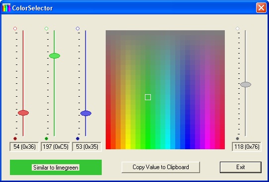
I created this helper application to help me select colors for use in other applications where I needed/wanted some pale but recognizable colors for highlighting purposes. To use it, find a color you like, and then drag the Luminance slider towards lighter colors. The RGB-to-HLS functions described above (see "Shell Color Palette Handling Functions") are used to ensure that the hue and saturation are changed as little as possible during the change to lighter luminance values, so as to preserve as much of the color of your target as possible. The color patch at the lower left shows the currently-selected color, and also shows the name of the most similar one of the 139 named Web colors. Finally, the "Copy Value To Clipboard" button copies a C-style RGB macro statement to the clipboard that can be pasted into your code. It's all very useful to me, anyway <g>.
How To Use The Control In Your Project
These instructions are for use with VC++ version 6.0, but it should be easy to use them with other versions like .NET.
To use the control in your project, download the source and header files (i.e., CustomDrawSliderCtrl.cpp and CustomDrawSliderCtrl.h) to a convenient folder, and then include both of them in your project ("Project"->"Add To Project"=>"Files...").
Create your dialog resource template and add a standard slider control using the Controls toolbar:
At this point, you should be able to use ClassWizard to add a variable of type CCustomDrawSliderCtrl. However, I have found that the ClassWizard doesn't enroll the new class unless you force it to re-build the class database, which is stored in a file whose extension is ".clw" in you project's folder. To force ClassWizard to re-build the class database, open your project's workspace with Explorer and find the file whose extension is ".clw". Delete it. (Trust me, but if you don't, rename it to an extension like ".clw~1".) Now, open ClassWizard, and you'll get a message saying that the ".clw" file doesn't exist, and asking if you would like to re-build it from your source files. Of course, you should select "Yes". From the resulting dialog, select "Add All" and then make certain that you add CustomDrawSliderCtrl.cpp and CustomDrawSliderCtrl.h from whatever folder you stored them to.
Now, with the ClassWizard open, add a "control"-style variable of CCustomDrawSliderCtrl, as described above in the section entitled "Step-by-Step Guide To Writing a Custom Draw CSliderCtrl". ClassWizard will warn you to add a #include to the header file, which you should do now before you forget.
And that's all there is to it. Your project should compile fine right now.
Possible Future Work
There's more that can be done, of course, and I certainly haven't exhausted the ideas for customizing the appearance of the trackbar control.
One thing we did not discuss at all is the tick marks. Work can be done here to alter the appearance of these marks. For example, it should be possible to display tick marks as colored circles with colors of increasing saturation, or as circles whose diameters slowly increase to reflect the range of the control.
As I'm writing this, I also noticed a newsgroup post which mentioned that the trackbar control doesn't really change its appearance when it's disabled. That would be easy to change using custom draw.
There are many possibilities, and I urge you try them out and post your findings here.
Bibliography
Here, in one place, is a list of all the articles and links mentioned in the article:
Footnotes
- It's actually a bit more complicated than that, since the message handler really only gets a
NMHDR structure, but there's no need to discuss the complications here; read the MSDN article mentioned in the bibliography.
- Here's a quick quiz: How do you make RGB=(30, 144, 255), which is a bright "Dodger Blue" into a more purplish color like "Dark Violet"? You might expect that you have to increase red. But would you expect that you also have to decrease green? The answer is RGB=(148, 0, 211) (interestingly, you also have to decrease blue).
- Plus, I think these features make the control look better and more balanced visually. When we take the time to customize the appearance of a control, we're usually doing so to improve the user interface and to make it more intuitive for the user. But let's face it: sometimes, we're merely window-dressing the control simply because we think it looks good -- and what's wrong with a little of that <g>!
Mike O'Neill is a patent attorney in Southern California, where he specializes in computer and software-related patents. He programs as a hobby, and in a vain attempt to keep up with and understand the technology of his clients.


 General
  News
News  Suggestion
  Question
  Bug
Bug  Answer
  Joke
Joke  Praise
  Rant
Rant  Admin
Admin 


 Submit an article or tip


 perfect!!!!!