Introduction
IconPanel is a .NET custom control that displays "tool" items in a
expandable/collapsible panel similar to the Notification area of the Taskbar in
all recent version of the Microsoft Operating Systems.
The major features of the control are:
- Ability to expand or collapse the control
- Optional animation of expand/collapse
- Optional fade in and/or out of tool items during animation
- Ability to disable and/or hide tool items
- Supports both vertical and horizontal orientations
- Dynamic layout configuration as tool items change
- Balloon tooltips and Context Menus for the panel and tool items
- 4 look & feel styles { Custom, Classic, Windows XP, Longhorn }
- Full designer integration
Background
Some of the applications that I write need to be highly extensible, allowing
components to "plug-in" and "plug-out" as necessary. In addition, screen
real-estate can be quite scarce and while our users are domain
experts, they are not always technology savy. Using this style of control
(perhaps in the status bar of the main application) helps us solve a few basic
problems:
- It provides an area where plug-ins can come and go based on the application
context
- It allows more efficient use of screen real-estate and at the same time it can
also hide non-essential information from non-power users
- and (let's face it) these controls look and feel 'cool'
The 'ME' Design Philosophy
Before going into more depth on what the IconPanel control provides and how to
use it, it is important to explain the authors overall intentions regarding the
implementation and general release of this version of the control so that you
can better understand how you might extend it and/or incorporate it into your
applications.
While this control is fully functional, fully documented, and fully tested
(within the limitations of the demonstration application provided), it is
designed using the ME philosophy; it was designed by me,
implemented by me, for purposes that are potentially only useful to me,
and with Minimal Effort. Within that context I want to make
it clear that I am not in anyway qualifying the the quality of the code or the
control (which I believe to be more than satisfactory), only the controls
suitability for any particular purpose. This is not a disclaimer, just the
authors way of letting you know up-front that this control is a 95%'er,
and if you want to use this version in your application you may need to provide
the additional 5% to make it fit your particular purpose. Having said all that
(and if I haven't scared you away), then if you are willing to live with the
basic architecture I chose for this control you should find that adding your 5%
is a relatively simple exercise.
Using the IconPanel Control
As with any custom control, the basic mechanics for using it are:
- Add the debug
version of the assembly containing IconPanel to a panel on your Toolbox in Dev.
Studio
- Drag and Drop the IconPanel item onto your form or custom control
A key aspect regarding adding the control to the Toolbox is that it must be the debug
version because the designer support is not compiled into the release version
as it is intended to be a run-time re-distributable.
Once an instance of the IconPanel is added to the form, select it and view its
properties. The following properties control the most significant behavior
and look and feel of an IconPanel control:
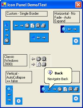
Style - Style provides an enumeration with the following
possible values: { Custom, Classic, WindowsXP, Longhorn }. Which of these you
choose has a significant impact on both behavior and look & feel
- Custom allows you to fully define the behavior and look & feel
- Classic emulates the look and feel of Windows 2000 (and Windows NT with the
TaskBar from IE 4.0?) but does not provide the ability to expand/collapse the
IconPanel. Classic overrides certain settings such as BorderStyle and BackColor
- WindowsXP provides a look and feel similar to the default out-of-the-box
Windows XP taskbar. This style overrides certain user-settings and provides a
few additional properties not used by other styles
- Longhorn provides a look and feel similar to the default out-of-the- box
Longhorn taskbar. This style overrides certain user-settings and has custom
behaviors
Again, the look and feel is similar, not exact. I simply wanted to get the
flavor of the different Microsoft implementations and in no way did I feel like
I needed to be a slave to the exact look and feel. Two obvious examples are
that my animation algorithm is completely different from that used by both
WindowsXP and Longhorn. I like their animation, I like my animation. You decide
what you like and if its different from mine feel free to augment/change it.l
Another example is that the Longhorn implementation is more of a look and
feel "flavor" and the number of differences between my implementation and the
actual is quite significant. Once again, I leave it as an exercise to the
reader to implement something more exact (but please share it with the
rest of us!)
Orientation - This property tells the IconPanel which
direction it should be oriented and allows one of the following: {Auto,
Vertical, Horizontal }
- Auto tells the IconPanel to "figure it out." This is the best setting if the
orientation may need to change on the fly (e.g., the IconPanel is re-sized in
more than 1 dimension). The algorithm is quite simple, giving a preference to
Horizontal orientation, but selecting Vertical in the obvious cases. The
"algorithm" for selecting an appropriate orientation can be overridden by a
derived control.
- Vertical - The control is vertically oriented and the drawing code and
expand/collapse images must reflect this
- Horizontal - The control is horizontally oriented and the drawing code and
expand/collapse images must reflect this
Items - This property defines the collection of tool items
that may appear in the IconPanel
Items have a number of properties that define its name, description, images (1
per state), whether it is enabled, visible, etc. While you can easily define
tool items in the designer using the standard collection editor, for more
dynamic scenarios you should be prepared to create these on-the-fly. Of course
you can always pre-define every possible tool and simply change the visibility
(or disable them) as the context of the application changes. Choose whatever
works for your application.
Other Properties of primary interest are:
- ExpandRate
- Initial rate of animation when expanding. Default value 50 (0 for no
animation on expand)
- CollapseRate
- Initial rate of animation when collapsing. Default value 50 (0 for no
animation on collapse)
- AnimationFade
- Enumeration specifying whether to fade tool items In (expand), Out
(collapse), Both, or None during expand/collapse animation
- MaxExpandedItems
- Maximum # of items to show in the IconPanel when expanded. Allows some
control over the maximum size of the IconPanel when expanded
- ContextMenu
- Defines the context menu used when the mouse is right clicked in the panel
(i.e., in the control but not on a tool item)
- CustomVerticalImages & CustomHorizontalImages
specify the images used for the expand/collapse items when using the custom
style
The IconPanel Implementation Strategy
My overall implementation strategy (i.e., architecture and design) and key
decisions for the implementation of IconPanel are:
- derive from UserControl
- implement tool items as light-weight items (i.e., they are not controls)
- maintain a cached bitmap representation of the current view of the IconPanel
- maintain a separate list of items that actually *appear* in the IconPanel (as
opposed to the item collection)
- Handle all the mouse processing for tool items (required since tool items are
not controls and hence don't get mouse messages)
- Borrow as much as possible from previous code I have written. Mostly from a
prior CodeProject article
Full Featured XP-Style Collapsible Panel
- Use Balloon style help (without any abstraction layer) and borrowed the
FMSBalloonTip.cs implementation provided by
ramshri in his article
Balloon Tips Galore!
One could easily argue that my approach is not the correct or most flexible
approach. For example, one might choose to implement IconPanel by deriving from
panel, then allowing actual controls (Button, Label, etc.) into the panel and
using various styles of form layout to automatically arrange the items in the
panel. As an added bonus, the IconPanel would not need to provide any special
mouse handling as the individual controls could provide it themselves. Overall,
this approach might lead to a more powerful control with additional end-user
features and benefits. It just so happens in this case that it was easier for
me to develop it to do exactly what I needed it to do.
If you can live with the architecture then you should find it fairly easy to
extend and I've made a reasonable effort to document it knowing that it's only
a 95'er and you'll need to be able to get in and tweak it.
Summary
As always, I wrote this one for the fun of it and I hope you find some use for
it. If you want to look at the implementation of the control just check out
IconPanel.cs in the source zip. There are a bunch of support files there, most
of them related to designer time stuff that really are used directly by the
IconPanel itself. The source also includes an NDoc configuration file to
generate documentation.
If you have any questions regarding the implementation drop me a line and i'll
do my best to get back to you.
History
- Version 1.0 - Initial Release
I have been bumming around doing Software development for 22+ years. A bit of everything, including a most enjoyable stint at NuMega Technologies where I (and 2-3 other amazing developers) wrote SoftICE/95, SoftICE for Windows NT 3.0 and 3.5. I also developed the MACH5 technology behind the TrueTime profiler. During my time there I was fortunate enough to have the office next to Matt Pietrek and saw 1st hand the demands and difficulties of writing about software and software development. Still, I spent 2 years as a monthly columnist writing about Java technologies.
As of this time, I just write a lot of code, mostly C#, but some C++/ATL/COM, Assembler, and the occasional VB6/VB.NET. I focus mainly on UI because I spent so much time in the bowels of the OS that it just plain bores me.


 General
  News
News  Suggestion
  Question
  Bug
Bug  Answer
  Joke
Joke  Praise
  Rant
Rant  Admin
Admin 


 Submit an article or tip


