Introduction
GridThemes is a collection of classes for ASP.NET 2.0 which allows for the application of conditional formatting to one or more GridView controls using declarative constructs. Typically, a developer would trap a grid's RowDataBound event to apply conditional formatting. With GridThemes however, a page designer may set a single property to change this grid:

to this:
or this:
The framework is useful when conditional cell-by-cell formatting is necessary, or to apply such formatting consistently throughout a project. It is also useful when AutoGenerateColumns is applied on a GridView and column formatting is otherwise unavailable.
The GridThemes assembly combines:
- A custom
BuildProvider; the builder identifies files configured for GridThemes in the App_Code folder. It interprets their declarative tags specifying conditions and formatting instructions, and generates programming methods that may respond to a GridView's RowDataBound event. - A custom implementation of
IExtenderProvider; the extender control, when present on a web form, adds the GridTheme property to all GridView controls on the form. - A custom subclass of
UITypeEditor; the editor lists all GridThemes constructed by the builder for assignment to the GridTheme property.
Working together, these custom classes allow for the conditional cell-by-cell formatting of GridViews in a declarative and reusable fashion.
Using the code
The following list summarizes the steps to use GridThemes:
- Configure your ASP.NET application
- Create and store GridTheme definition files in the App_Code folder
- Add a
GridThemeExtender control to your GridView's .aspx page - Assign the desired theme name to the
GridView's newly extended GridTheme property
Configuration
To configure an application to use GridThemes, copy the assembly GridThemes.dll to your project's bin directory. Then activate the build provider by adding the following entry to the <buildProviders> section of your web.config file:
<system.web>
  <compilation debug="false">

    <buildProviders>
      <add extension=".gt"
           type="UNLV.IAP.GridThemes.GridThemesBuildProvider, GridThemes"/>
    </buildProviders>

  </compilation>
</system.web>
This entry associates the GridThemes custom builder with files in the App_Code folder having .gt extensions. You may substitute a different extension if you wish.
Create GridTheme definition files
A GridTheme file follows a straightforward XML format for defining conditions and formatting instructions. The file (or files) should be saved in the App_Code folder with the extension as configured above.
Basics: <Theme>, <Apply>
The parent tag for each individual theme is the <Theme> tag. A conditional theme file may contain one or more instances of <Theme>, each requiring a unique id attribute, and optionally a title attribute. If title is supplied, it is used by the extender when listing themes; otherwise, the id is used.
The <Apply> tag is used to assign formatting to individual cells within the GridView's table. Attributes in the <Apply> tag are interpreted as properties of a TableCell object, similar to how cell formatting is applied declaratively in an .aspx page. In the example below, cells are right-aligned, bolded, with a light blue background color.
<Theme id="exampleTheme" title="Example Theme">
    <Apply horizontalAlign="right" font-bold="true" backColor="lightBlue" />
</Theme>
Attribute names in the <Apply> tag may also follow the syntax propertyExpression, where property is a valid TableCell property name. These "expression" attributes are interpreted as code expressions in the syntax of the project language rather than literal values. In this example, the <Apply> instruction adds a line number to the given cell's text by specifying an expression for the Text property. RowIndex and CellText are special variables, described later in the article.
<Theme id="exampleTheme" title="Example Theme">
    <Apply textExpression='string.Format("{0}.  {1}", RowIndex, CellText)' />
</Theme>
Formatting based on row types: <DataRow>, <Header>, <Footer>
Row type tags include <DataRow>, <Header>, and <Footer>. These tags encapsulate conditions and formatting instructions for the given row type. The following example specifies different formatting for header and datarow cells:
<Theme id="exampleTheme" title="Example Theme">

  <Header>
    <Apply backColor="DarkRed" foreColor="White" />
  </Header>

  <DataRow>
    <Apply backColor="White" foreColor="Black" />
  </DataRow>

</Theme>
Conditional formatting: <If>, <Else>, <ElseApply>
To define cell-by-cell conditions, use the <If> tag. <If> requires a test attribute which specifies a condition in the syntax of the project language. Nested <Apply> tags supply formatting instructions if the condition evaluates to true. Nested <ElseApply> tags supply formatting instructions if the condition evaluates to false. Nested <Else> tags are also supported, allowing for additional levels of <If> and <Apply> tags when the condition evaluates to false.
The following examples demonstrate ways to use <If> and nested tags. The first shows a simple <If> with a formatting instruction to apply if the current cell value is negative (IsNegative is a special variable, described later in the article):
<If test='IsNegative'>
    <Apply ForeColor='Red' />
</If>
This example sets the text color to blue if the cell value is not negative:
<If test='IsNegative'>
    <Apply ForeColor='Red' />
    <ElseApply ForeColor='Blue' />
</If>
This shows the same formatting instructions using the <Else> tag rather than <ElseApply>:
<If test='IsNegative'>
    <Apply ForeColor='Red' />
    <Else>
        <Apply ForeColor='Blue' />
    </Else>
</If>
The next example determines if the cell value is numeric, and right-aligns the text if so. The width for numeric cells is also set to 90 pixels. If the cell value is not numeric, the width is set to 200 pixels. If numeric, a nested <If> then determines if the cell value is negative and changes the color accordingly.
<If test='IsNumeric'>
    <Apply HorizontalAlign='Right' Width='90px' />
    <If test='IsNegative'>
        <Apply ForeColor='Red' />
        <Else>
            <Apply ForeColor='Blue' />
        </Else>
    </If>

    <ElseApply Width='200px' />
</If>
More complex conditions may be expressed in the syntax of the project language. For example, the following C# syntax sets the background colors for alternating columns to gray:
<If test='CellIndex % 2 == 1'>
    <Apply BackColor='Gray' />
    <ElseApply BackColor='White' />
</If>
The same condition in a VB.NET project would look like this:
<If test='CellIndex mod 2 = 1'>
    <Apply BackColor='Gray' />
    <ElseApply BackColor='White' />
</If>
If using greater-than or less-than symbols, make sure to use the XML-friendly < and > entity references. In this example, cell values greater than 100 are formatted as bold:
<If test='CellValue > 100'>
<Apply Font-Bold='True' />
</If>
This final condition example shows using the <If> tag in context within a <Theme>. It also demonstrates the use of a nested <If> tag. Any non-numeric cell with "n/a" for the text will appear as "0" with this theme applied. Note the use of == as the equality operator, with C# assumed as the project language. If the project language were VB.NET, a single = sign would indicate equality in the condition test.
<Theme id="numerics" title="Example: numeric values">

  <DataRow>
    <If test='IsNumeric' >
      <Apply horizontalAlign='Right' />
      <Else>
        <If test='CellText == "n/a" '>
            <Apply Text="0" horizontalAlign='Right' />
            <ElseApply horizontalAlign='Left' />
        </If>
      </Else>
    </If>
  </DataRow>

</Theme>
Special variables
A number of variables are predefined, and may be used in condition testing or property expressions. They are as follows:
CellText
| The value of a given cell interpreted as a string
|
CellValue
| The numeric value of a given cell, interpreted as a double
|
CellIndex
| The 0-based index value of the current cell
|
RowIndex
| The 0-based index value of the current row
|
IsNumeric
| true if the value in the cell is numeric; false if not
|
IsNegative
| true if the value in the cell is numeric and less than zero; false if not
|
IsPositive
| true if the value in the cell is numeric and greater than zero; false if not
|
IsZero
| true if the value in the cell is numeric and equal to zero; false if not
|
IsNotNumeric
| true if the text in the cell is not numeric; false if the cell is numeric
|
IsNotNegative
| true if the value in the cell is numeric and greater than or equal to zero; false otherwise
|
IsNotPositive
| true if the value in the cell is numeric and less than or equal to zero; false otherwise
|
IsNotZero
| true if the value in the cell is numeric and not equal to zero; false otherwise
|
GroupText
| Used in <Group> tags to indicate the text value of the current category
|
GroupIndex
| Used in <Group> tags to indicate the 0-based index value of the current group
|
RowIndexWithinGroup
| Used in <Group> tags to indicate the 0-based index value of the current row within the current group; this value is reset to 0 with the first row of each group
|
In this example, IsNumeric, IsNegative, and CellIndex are used to create a theme where alternating columns are highlighted in different background colors, numbers are right-aligned, and negative numbers displayed in red. The project language is assumed to be C#.
<Theme id="ifs" title="Working with If conditions">
<DataRow>
<If test='CellIndex % 2 == 0'>
<Apply backColor='LightGray' />
<ElseApply backColor='White' />
</If>
<If test='IsNumeric' >
<Apply horizontalAlign='Right' />
<If test='IsNegative' >
<Apply foreColor='Red' />
</If>
</If>
</DataRow>
</Theme>
Category grouping: <Group>, <AlternateFormat>
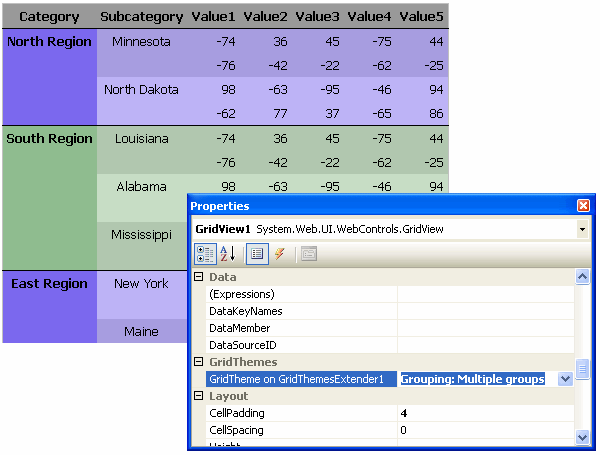
One additional feature of the GridThemes framework is the ability to interpret blocks of rows as groups, based on repeating values among DataRows for a given column. The <Group> tag may be used to identify such a collection of rows, with a required column attribute providing the 0-based index number of the category column. The data source should already be sorted based on this column prior to data-binding, as a change in category text signals a new group to the builder. The <Group> tag may have the optional suppressRepeating attribute, which, if present and set to true, indicates that the category text should display only once, in the first row of the given group.
This example shows a theme in which repeated values in the first grid column are suppressed:
<Theme id="groups" title="Working with Groups">

    <Group column='0' suppressRepeating='true' />

</Theme>
One or more blocks of formatting may be defined for groups by nesting one or more <AlternateFormat> tags within the <Group>. As the name implies, formatting for each group alternates among all listed <AlternateFormat> instructions, and each <AlternateFormat> block may contain any combination of <Apply>, <If>, <Else>, and <ElseApply> tags. In this example, the background of each group alternates between light blue and light green colors:
<Theme id="groups" title="Working with Groups">

    <Group column='0' suppressRepeating='true'>

      <AlternateFormat>
          <Apply backColor='lightBlue' />
      </AlternateFormat>

      <AlternateFormat>
          <Apply backColor='lightGreen' />
      </AlternateFormat>

    </Group>

</Theme>
The special variables GroupText, GroupIndex, and RowIndexWithinGroup are available for conditions and expressions within <Group> tags. Building on the previous example, the following adds group numbering to the group category text (C# assumed):
<Theme id="groups" title="Working with Groups">
<Group column='0' suppressRepeating='true'>
<AlternateFormat>
<Apply backColor='lightBlue' />
</AlternateFormat>
<AlternateFormat>
<Apply backColor='lightGreen' />
</AlternateFormat>
<If test='CellIndex == 0 && RowIndexWithinGroup == 0' >
<Apply textExpression='string.Format("{0}. {1}", GroupText)' />
</If>
</Group>
</Theme>
For a VB.NET user, the same <If> condition is as follows:
. . .
      <If test='CellIndex = 0 And RowIndexWithinGroup = 0' >
          <Apply textExpression='string.Format("{0}. {1}", GroupText)' />
      </If>
. . .
There are several additional examples of theme definitions in the sample project that accompanies this article. You may download the sample project using the link at the top of the article.
Add a GridThemeExtender control to your .aspx page
Once the GridTheme builder is configured with the appropriate entry in web.config, and one or more theme files are defined and saved in App_Code, you may rebuild your project. Upon building, the custom GridThemesBuildProvider interprets the conditions and formatting instructions in each <Theme> it finds and generates source code methods in the language of the project. These methods are all constructed to follow the appropriate signature defined by the delegate GridViewRowEventHandler, making them capable of responding to a GridView.RowDataBound event. The builder also adorns each GridTheme method with the GridThemesAttribute custom attribute. This attribute assists the GridThemesManager static class, which has the responsibility of listing available GridThemes for selection.
The custom GridThemeExtender control implements IExtenderProvider, adding a single property named GridTheme to GridView controls. Add the GridThemeExtender control to your toolbox as you would with any other control, then drag an instance onto a web form. All GridView controls on the form will receive the new GridTheme property.
Assign a GridTheme to a GridView control
The GridThemes assembly includes a custom GridThemesEditor class, a subclass of UITypeEditor, allowing for the design-time selection of a GridTheme. Clicking the dropdown of the extended GridTheme property displays the list of available themes generated by the GridThemesBuildProvider.
In setting this property, a page designer is, in effect, assigning one of the previously compiled GridTheme methods as the handler for that grid's RowDataBound event.
Points of interest
One of the biggest challenges in the making of this library resided in my choice to use TableCell property names as attributes of the <Apply> tag. My goal was to keep the declarative formatting syntax in a GridTheme similar to the declarative attribute syntax found in common .aspx pages. In researching how the page parser generically handles such property assignments, I used Lutz Roeder's .NET Reflector [^] and came across the undocumented GenerateExpressionForValue() method of the internal System.Web.Compilation.CodeDomUtility class. This method uses reflection to determine how to translate a property value assignment to a CodeDOM expression, and is used by ASP.NET when generating the code for Page subclasses. I borrowed this method's structure for my own builder method GetValueExpressionForAssignment(), which is used for a similar purpose when interpreting the attributes of <Apply> tags.
Summary
The GridThemes assembly combines a custom BuildProvider, IExtenderProvider, and UITypeEditor, offering a framework for page designers to apply complex conditional cell-by-cell formatting by setting a single GridView extended property. GridTheme files, placed in the App_Code folder, consist of conditions and formatting instructions in the form of XML tags, and are compiled as RowDataBound event handlers by the custom builder. The custom extender control makes the GridTheme property available to all GridViews on a page, with the custom editor responsible for listing available GridThemes by title in the Properties window. Together, these classes offer a declarative means for applying conditional grid formatting consistently throughout a project.
History
- 25 Feb 2007 - Update to fix a problem where rendered code for themes in VB.NET projects would cause compilation problems under certain circumstances. The problem did not occur under C# projects. Added a VB.NET demo project to the downloads along with the C# demo. Also added the new GridThemesManager method
AssignThemeToGridView which simplifies the process of assigning a theme programmatically rather than declaratively through the extender. - 28 Nov 2006 - Original Posting
With a background in education, music, application development, institutional research, data governance, and business intelligence, I work for the University of Nevada, Las Vegas helping to derive useful information from institutional data. It's an old picture, but one of my favorites.


 General
  News
News  Suggestion
  Question
  Bug
Bug  Answer
  Joke
Joke  Praise
  Rant
Rant  Admin
Admin 


 Submit an article or tip


 ;P;P;P;P;Pmaster-hand