Click here to Skip to main content
15,886,055 members
Articles / Desktop Programming / WPF

Office Communicator in C# WPF

Rate me:
Please Sign up or sign in to vote.
4.83/5 (3 votes)
25 Apr 2014CPOL3 min read 20.9K   792   16   5
Office communicator in C# WPF

Introduction

In this article, I will try to implement Microsoft Office Communicator in WPF. I will code the core basic functionality of communicator/messenger and will implement rest of the features in an upcoming article or post if time permits. I will implement this using MVVM. This will give you an idea of how to do things in the WPF world such as: Data & Control template of container control, styling, grouping\sub grouping of container control’s items, sort records in container controls, Expander styles, Control template of Toggle Button, live search some records in container control like Listview, etc.

Functionality wise, this will be really helpful if you ever use Microsoft Office Communicator. I will try to explain a bit of every area with codes. The complete code is in the attachment.

Here you can see the final output. You can group on the basis of statuses (online/offline) or locations by clicking the toolbar button. I set the default grouping according to status. For every record, you can see the name, location and time of last login. For online users, I color coded it to green and for offline users I used black. In the display option, you can select to view with or without a picture (default is with picture).

Image 1

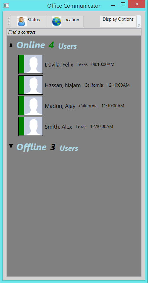
Default view, grouping based on the status (online\offline)

Image 2

Grouping based on the location. Apply when click the toolbar button “Location”.

Here is the name view only (with no picture). Apply when you click “Display Options” menu button.

Image 3

Here is the class which does searching in container control. All you have to do is pass the view of your container (in my case Listview) and the text you want to search.

C#
public class RecordSearch
    {
        public RecordSearch(ICollectionView filteredView, TextBox textBox)
        {
            string filterText = "";
            filteredView.Filter = delegate(object obj)
            {
                if (string.IsNullOrEmpty(filterText))
                    return true;

                User user = obj as User;
                if (user == null)
                    return false;
               
                int index = user.Name.IndexOf(filterText, 0, StringComparison.InvariantCultureIgnoreCase);
                return index > -1;
            };

            textBox.TextChanged += delegate
            {
                filterText = textBox.Text;
                filteredView.Refresh();
            };
        }
    }

Call the constructor with the view and the text to search like this:

C#
ICollectionView localview = CollectionViewSource.GetDefaultView(lvUsers.ItemsSource);
new RecordSearch(localview, this.txtSearch);      

In the screenshot below, you can see ‘Find a contact’ after the toolbar and before the contacts. When you type some word(s), it will do search base on the available records. Search will change with every character.

Image 4

Sorting on container’s item can be done simply by creating the SortDescription property and then adding it to the CollectionView. You can do multiple sorting as well. Here is the code which will do the sorting part.

C#
//sorting
System.ComponentModel.SortDescription sortDescription = 
    new System.ComponentModel.SortDescription("Presence", 
        System.ComponentModel.ListSortDirection.Ascending);
System.ComponentModel.SortDescription sortDescription2 = 
    new System.ComponentModel.SortDescription("Name", System.ComponentModel.ListSortDirection.Ascending);
view.SortDescriptions.Add(sortDescription);
view.SortDescriptions.Add(sortDescription2);

Same thing with grouping, create the PropertyGroupDescription and add it to the CollectionView.

C#
groupDescription = new PropertyGroupDescription("Presence");
view.GroupDescriptions.Add(groupDescription);

Below is the code of control template for toggle button. If you notice, I try to use the same kind of toggle button which Microsoft uses in many places in Windows itself. As you can see, it has different VisualStates like Normal or MouseOver and storyboard which apply when you expand\collapse, etc.

XML
<ControlTemplate x:Key="ExpanderToggleButton"
                         TargetType="{x:Type ToggleButton}">
            <Border x:Name="Border"
                    CornerRadius="2,0,0,0"
                    BorderThickness="0,0,1,0">
                <Border.Background>
                    <LinearGradientBrush EndPoint="0.5,1"
                                         StartPoint="0.5,0">
                        <!--if we want solid area around toggle button-->
                        <!--<GradientStop Color="White" />
                    <GradientStop Color="Black"
                                  Offset="1" />-->
                        <GradientStop />
                        <GradientStop Offset="1" />
                    </LinearGradientBrush>
                </Border.Background>
                <VisualStateManager.VisualStateGroups>
                    <VisualStateGroup x:Name="CommonStates">
                        <VisualState x:Name="Normal" />
                        <VisualState x:Name="MouseOver">
                            <Storyboard>
                                <ColorAnimationUsingKeyFrames Storyboard.TargetName="Border"
                                                              Storyboard.TargetProperty="(Panel.Background).
                (GradientBrush.GradientStops)[1].(GradientStop.Color)">
                                    <EasingColorKeyFrame KeyTime="0"
                                                         Value="Gray" />
                                </ColorAnimationUsingKeyFrames>
                            </Storyboard>
                        </VisualState>
                        <VisualState x:Name="Pressed">
                            <Storyboard>
                                <ColorAnimationUsingKeyFrames Storyboard.TargetName="Border"
                                                              Storyboard.TargetProperty="(Panel.Background).
                (GradientBrush.GradientStops)[1].(GradientStop.Color)">
                                    <EasingColorKeyFrame KeyTime="0"
                                                         Value="Gray" />
                                </ColorAnimationUsingKeyFrames>
                            </Storyboard>
                        </VisualState>
                        <VisualState x:Name="Disabled">
                            <Storyboard>
                                <ColorAnimationUsingKeyFrames Storyboard.TargetName="Border"
                                                              Storyboard.TargetProperty="(Panel.Background).
                (GradientBrush.GradientStops)[1].(GradientStop.Color)">
                                    <EasingColorKeyFrame KeyTime="0"
                                                         Value="Gray" />
                                </ColorAnimationUsingKeyFrames>
                                <ColorAnimationUsingKeyFrames Storyboard.TargetName="Border"
                                                              Storyboard.TargetProperty="(Border.BorderBrush).
                (GradientBrush.GradientStops)[1].(GradientStop.Color)">
                                    <EasingColorKeyFrame KeyTime="0"
                                                         Value="Gray" />
                                </ColorAnimationUsingKeyFrames>
                            </Storyboard>
                        </VisualState>
                    </VisualStateGroup>
                    <VisualStateGroup x:Name="CheckStates">
                        <VisualState x:Name="Checked">
                            <Storyboard>
                                <ObjectAnimationUsingKeyFrames Storyboard.TargetProperty="(UIElement.Visibility)"
                                                               Storyboard.TargetName="CollapsedArrow">
                                    <DiscreteObjectKeyFrame KeyTime="0"
                                                            Value="{x:Static Visibility.Hidden}" />
                                </ObjectAnimationUsingKeyFrames>
                                <ObjectAnimationUsingKeyFrames Storyboard.TargetProperty="(UIElement.Visibility)"
                                                               Storyboard.TargetName="ExpandededArrow">
                                    <DiscreteObjectKeyFrame KeyTime="0"
                                                            Value="{x:Static Visibility.Visible}" />
                                </ObjectAnimationUsingKeyFrames>
                            </Storyboard>
                        </VisualState>
                        <VisualState x:Name="Unchecked" />
                        <VisualState x:Name="Indeterminate" />
                    </VisualStateGroup>
                </VisualStateManager.VisualStateGroups>
                <Grid>
                    <Path x:Name="CollapsedArrow"
                          HorizontalAlignment="Center"
                          VerticalAlignment="Center"
                          Data="M 0 0 L 5 12 L 10 0 Z">
                        <Path.Fill>
                            <SolidColorBrush Color="Black" />
                        </Path.Fill>
                    </Path>
                    <Path x:Name="ExpandededArrow"
                          HorizontalAlignment="Center"
                          VerticalAlignment="Center"
                          Visibility="Collapsed"
                          Data="M 0 14 L 4 0 L 8 14 Z">
                        <Path.Fill>
                            <SolidColorBrush Color="Black" />
                        </Path.Fill>
                    </Path>
                </Grid>
            </Border>
        </ControlTemplate>

DataTemplate is quite simple. It will use the basic functionality of IValueConverter. In the implementation of Convert(), I am just checking whether this person is online or offline so that I can adjust the color accordingly.

XML
<DataTemplate x:Key="PresenceItemDataTemplate">
            <StackPanel Orientation="Horizontal">

                <!--Just to move little bit away from edge-->
                <Rectangle HorizontalAlignment="Right"
                           Stretch="UniformToFill"
                           Width="20">

                </Rectangle>

                <Border BorderThickness="1"
                        BorderBrush="#FF000000"
                        VerticalAlignment="Top"
                        Visibility="{Binding Path=IsChecked, ElementName=PictureView, 
                        Converter={StaticResource BooleanToVisibilityConverter}}">
                    
                    <StackPanel Orientation="Horizontal">
                        <Rectangle Visibility="{Binding Path=IsChecked, ElementName=PictureView, 
                        Converter={StaticResource BooleanToVisibilityConverter}}"
                                   Width="15"
                                   Height="50"
                                   Stretch="UniformToFill">
                            <Rectangle.Fill>
                                <Binding Path="Presence"
                                         Converter="{StaticResource presenceStatusConverter}" />
                            </Rectangle.Fill>
                        </Rectangle>

                        <Image Source="{Binding Path=Image}"
                               Width="50"
                               Height="50"
                               Stretch="UniformToFill"
                               HorizontalAlignment="Left"
                               Visibility="{Binding Path=IsChecked, ElementName=PictureView, 
                               Converter={StaticResource BooleanToVisibilityConverter}}" />
                        
                    </StackPanel>
                </Border>

                <Rectangle HorizontalAlignment="Right"
                           Visibility="{Binding Path=IsChecked, ElementName=NameView, 
                           Converter={StaticResource BooleanToVisibilityConverter}}"
                           Width="12"
                           Height="12"
                           Stretch="UniformToFill">
                    <Rectangle.Fill>
                        <Binding Path="Presence"
                                 Converter="{StaticResource presenceStatusConverter}" />
                    </Rectangle.Fill>
                </Rectangle>

                <Label Content="{Binding Path=Name}"
                       FontSize="15"
                       VerticalContentAlignment ="Center" />
                <Label Content="{Binding Path=Location}"
                       FontSize="12"
                       VerticalContentAlignment="Center" />
                <Label Content="{Binding Path=Time}"
                       FontSize="12"
                       VerticalContentAlignment="Center" />
            </StackPanel>
        </DataTemplate>

Another important area of work is how to implement group style of container control’s items in XAML. This has to apply to different parts\section of data in container. I try to implement this as simply as possible. Using again IValueConverter with DataTrigger to display “User” or “Users” based on how many records are in a group at a time. Here is the code for this:

XML
<ListView Name="lvUsers"
                  Grid.Row="2"
                  ItemTemplate="{StaticResource PresenceItemDataTemplate}" Background="Gray">            
                        
            <ListView.GroupStyle>
                <GroupStyle>
                    <GroupStyle.ContainerStyle>
                        <Style TargetType="{x:Type GroupItem}">
                            <Setter Property="Template">
                                <Setter.Value>
                                    <ControlTemplate>
                                        <!--<Expander IsExpanded="True">-->
                                        <Expander>
                                            <Expander.Style>
                                                <Style TargetType="Expander">
                                                    <Style.Triggers>
                                                        <DataTrigger Binding="{Binding Path=Name}"
                                                                     Value="Online">
                                                            <Setter Property="IsExpanded"
                                                                    Value="True"></Setter>
                                                        </DataTrigger>
                                                    </Style.Triggers>

                                                    <Setter Property="Template">
                                                        <Setter.Value>
                                                            <ControlTemplate TargetType="{x:Type Expander}">
                                                                <Grid>
                                                                    <Grid.RowDefinitions>
                                                                        <RowDefinition Height="Auto" />
                                                                        <RowDefinition x:Name="ContentRow"
                                                                                       Height="0" />
                                                                    </Grid.RowDefinitions>
                                                                    <Border x:Name="Border"
                                                                            Grid.Row="0"
                                                                            BorderThickness="1"
                                                                            CornerRadius="2,2,0,0">
                                                                        <Grid>
                                                                            <Grid.ColumnDefinitions>
                                                                                <ColumnDefinition Width="20" />
                                                                                <ColumnDefinition Width="*" />
                                                                            </Grid.ColumnDefinitions>
                                                                            <ToggleButton OverridesDefaultStyle="True"
                                                                                          Template="{StaticResource ExpanderToggleButton}"
                                                                                          IsChecked=
                                                                                          "{Binding IsExpanded, 
                                                                                          Mode=TwoWay, 
                                                                                          RelativeSource={RelativeSource TemplatedParent}}">
                                                                            </ToggleButton>
                                                                            <ContentPresenter Grid.Column="1"
                                                                                              Margin="4"
                                                                                              ContentSource="Header"
                                                                                              RecognizesAccessKey="True" />
                                                                        </Grid>
                                                                    </Border>
                                                                    <Border x:Name="Content"
                                                                            Grid.Row="1"
                                                                            BorderThickness="1,0,1,1"
                                                                            CornerRadius="0,0,2,2">
                                                                        <ContentPresenter Margin="4" />
                                                                    </Border>
                                                                </Grid>
                                                                <ControlTemplate.Triggers>
                                                                    <Trigger Property="IsExpanded"
                                                                             Value="True">
                                                                        <Setter TargetName="ContentRow"
                                                                                Property="Height"
                                                                                Value="{Binding DesiredHeight, ElementName=Content}" />
                                                                    </Trigger>
                                                                </ControlTemplate.Triggers>
                                                            </ControlTemplate>
                                                        </Setter.Value>
                                                    </Setter>
                                                    
                                                </Style>
                                            </Expander.Style>
                                            <Expander.Header>
                                                <StackPanel Orientation="Horizontal">
                                                    
                                                    <TextBlock Text="{Binding Name}"
                                                               FontWeight="Bold"
                                                               Foreground="LightBlue"
                                                               FontStyle="Italic"
                                                               FontSize="25"
                                                               VerticalAlignment="Bottom" />
                                                    
                                                    <TextBlock Text="{Binding ItemCount}"
                                                               FontSize="25"
                                                               FontWeight="Bold"
                                                               FontStyle="Italic"                                                               
                                                               Margin="10,0,0,0"
                                                               FontStretch="Normal"
                                                               VerticalAlignment="Bottom">
                                                        <TextBlock.Style>
                                                            <Style TargetType="TextBlock">
                                                                <Style.Triggers>
                                                                    <DataTrigger Binding="{Binding Path=Name}"
                                                                                 Value="Online">
                                                                        <Setter Property="Foreground"
                                                                                Value="Green"></Setter>
                                                                    </DataTrigger>
                                                                    <DataTrigger Binding="{Binding Path=Name}"
                                                                                 Value="Offline">
                                                                        <Setter Property="Foreground"
                                                                                Value="Black"></Setter>
                                                                    </DataTrigger>
                                                                </Style.Triggers>
                                                            </Style>
                                                        </TextBlock.Style>
                                                    </TextBlock>
                                                    
                                                    <TextBlock FontSize="20"
                                                               Foreground="LightBlue"
                                                               FontStyle="Italic"                                                               
                                                               FontWeight="Bold"
                                                               FontStretch="Normal"
                                                               VerticalAlignment="Bottom">
                                                        <TextBlock.Style>
                                                            <Style TargetType="TextBlock">
                                                                <Style.Triggers>
                                                                    <DataTrigger Binding=
                                                                    "{Binding Path=ItemCount, 
                                                                    Converter={StaticResource presenceCountConverter}}"
                                                                                 Value="True">
                                                                        <Setter Property="Text"
                                                                                Value="  Users"></Setter>
                                                                    </DataTrigger>
                                                                    <DataTrigger Binding=
                                                                    "{Binding Path=ItemCount, 
                                                                    Converter={StaticResource presenceCountConverter}}"
                                                                                 Value="False">
                                                                        <Setter Property="Text"
                                                                                Value="  User"></Setter>
                                                                    </DataTrigger>
                                                                </Style.Triggers>
                                                            </Style>
                                                        </TextBlock.Style>
                                                    </TextBlock>
                                                    
                                                </StackPanel>
                                            </Expander.Header>
                                            <ItemsPresenter />
                                        </Expander>
                                    </ControlTemplate>
                                </Setter.Value>
                            </Setter>
                        </Style>
                    </GroupStyle.ContainerStyle>
                </GroupStyle>
            </ListView.GroupStyle>
           
        </ListView>

Because of the power of WPF, this was pretty easy to implement. If I had implemented this in WinForms, I’m sure it would’ve required me to work twice as hard. Feel free to use the entire code or part of it wherever it is applicable or useful in your project.

License

This article, along with any associated source code and files, is licensed under The Code Project Open License (CPOL)


Comments and Discussions

 
Questionuseful Pin
Member 107880471-May-14 4:01
Member 107880471-May-14 4:01 
Very useful and thorough.
QuestionSearch is taking up primary thread and is done on each key press Pin
FahadAsh27-Apr-14 16:40
FahadAsh27-Apr-14 16:40 
QuestionNo images Pin
Neil Richard Daniell27-Apr-14 15:03
Neil Richard Daniell27-Apr-14 15:03 
AnswerRe: No images Pin
Najam ul Hassan27-Apr-14 15:17
Najam ul Hassan27-Apr-14 15:17 
GeneralMy vote of 5 Pin
Anurag Gandhi25-Apr-14 19:15
professionalAnurag Gandhi25-Apr-14 19:15 

General General    News News    Suggestion Suggestion    Question Question    Bug Bug    Answer Answer    Joke Joke    Praise Praise    Rant Rant    Admin Admin   

Use Ctrl+Left/Right to switch messages, Ctrl+Up/Down to switch threads, Ctrl+Shift+Left/Right to switch pages.