Introduction
To customize the look and feel of a Windows Forms application, we don't have many options. Especially if we need to use a control for binary options, we always stick to the traditional checkboxes. This control will better help to meet the requirement of using a new control wherever we need a control to represent the binary decision value like "yes" or "no"
Here I'm going to describe the creation of a custom control to represent binary decision with some custom properties and unique UI layer.
What's Supported?
Since customization is the prior focus behind the creation of this control, we can customize almost every element of this ToggleButton. The main properties related to the appearance of the control has been listed below.
- Toggle Style
- Toggle State
- Customized Text
- Customized Color
These properties and its impact in the control will be described followed by the control creation.
Control Drawing
ToggleButton has been inherited from the Control class of System.Windows.Forms and overrides its OnPaint method to draw the required styles. Since there are different styles supported, the control drawing has been taken care based on the selected style.
protected override void OnPaint(PaintEventArgs e)
        {
            controlBounds = e.ClipRectangle;
            e.Graphics.ResetClip();
            switch (ToggleStyle)
            {
                case ToggleButtonStyle.Android:
                    contentRectangle = e.ClipRectangle;
                    this.BackColor = Color.FromArgb(32, 32, 32);
                    DrawAndroidStyle(e);
                    break;
                case ToggleButtonStyle.Windows:
                    contentRectangle = new Rectangle(e.ClipRectangle.X, e.ClipRectangle.Y, this.Width - 1, this.Height - 1);
                    DrawWindowsStyle(e);
                    break;
                case ToggleButtonStyle.IOS:
                    contentRectangle = new Rectangle(0, 0, this.Width, this.Height);
                    DrawIOSStyle(e);
                    break;
                case ToggleButtonStyle.Custom:
                    contentRectangle = new Rectangle(2, 2, this.Width - 3, this.Height - 3);
                    DrawCustomStyle(e);
                    break;
                case ToggleButtonStyle.Metallic:
                    DrawMetallicStyle(e);
                    break;
            }
            base.OnPaint(e);
        }
For each toggle styles, the control's client rectangle will be modified and the region for drawing will be updated. Once the style has been changed, the existing style's regions and graphics path will be reset in order to paint with the new parameters.
For example, let's consider the Android style. The control's region and the points where it should be painted are calculated by the function AndroidPoints() which has been then filled with default / user selected color.
private void DrawAndroidStyle(PaintEventArgs e)
{
...........
using (SolidBrush sb = new SolidBrush(clr))
{
e.Graphics.FillPolygon(sb, AndroidPoints());
}
...........
}
private Point[] AndroidPoints()
{
p1 = new Point(padx, contentRectangle.Y);
if (padx == 0)
p2 = new Point(padx, contentRectangle.Bottom);
else
p2 = new Point(padx - SlidingAngle, contentRectangle.Bottom);
p4 = new Point(p1.X + (contentRectangle.Width / 2), contentRectangle.Y);
p3 = new Point(p4.X - SlidingAngle, contentRectangle.Bottom);
if (p4.X == contentRectangle.Right)
p3 = new Point(p4.X, contentRectangle.Bottom);
andPoints[0] = p1;
andPoints[1] = p2;
andPoints[2] = p3;
andPoints[3] = p4;
return andPoints;
}
Similar to the above, for each toggle styles, the control's region and drawing has been modified.
Mouse Interactions
Since this control's main usage relies with the user's mouse interaction on toggling states, it is needed to handle the painting with respect to the mouse gestures to indicate that the state has been changed / toggled.
So in order to achieve this, the OnMouseMove and OnMouseDown events were handled in order to update the drawing of control when a Mouse Button is pressed and moved at the same time.
protected override void OnMouseDown(MouseEventArgs e)
        {
            base.OnMouseDown(e);
            if (!this.DesignMode)
            {
                isMouseDown = true;
                downpos = e.Location;
            }
            this.Invalidate();
        }

protected override void OnMouseDown(MouseEventArgs e)
        {
            base.OnMouseDown(e);
            if (!this.DesignMode)
            {
                isMouseDown = true;
                downpos = e.Location;
            }
            this.Invalidate();
        }

        protected override void OnMouseMove(MouseEventArgs e)
       {
           if (e.Button == MouseButtons.Left && !this.DesignMode)
            {
                sliderPoint = e.Location;
                isMouseMoved = true;
                if (this.ToggleStyle == ToggleButtonStyle.Android)
                {

                    padx = e.X;
                    if (padx <= contentRectangle.Left + SlidingAngle)
                    {
                        padx = contentRectangle.Left;
                        this.ToggleState = ToggleButtonState.OFF;
                    }

                    if (padx >= contentRectangle.Right - (contentRectangle.Width / 2))
                    {
                        padx = contentRectangle.Right - (contentRectangle.Width / 2);
                        this.ToggleState = ToggleButtonState.ON;
                    }
                }
            }
        }
Using Code
To use this control in an application, either drag and drop from toolbox would work or else just follow the simple steps of code.
ToggleButton  toggleButton1 = new ToggleButton();
this.toggleButton1.ToggleStyle = ToggleButton.ToggleButtonStyle.Android;
this.Controls.Add(this.toggleButton1);
Customization Properties
Toggle Style
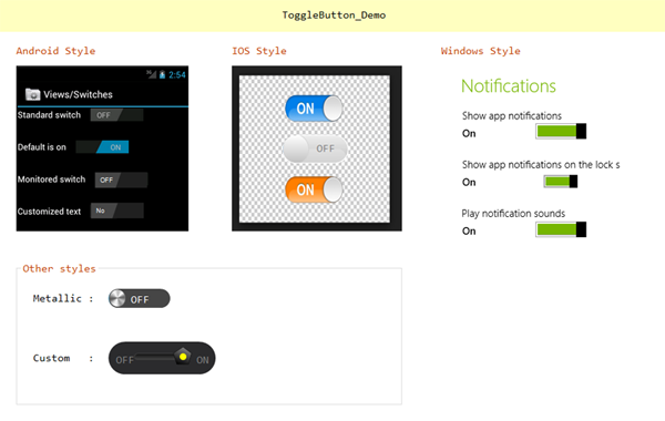
Togglebutton supports five styles, namely Android, Windows, iOS, Metallic and Custom. By default, the control uses the Android style appearance, we can change the styles through the ToggleStyle property.
this.toggleButton1.ToggleStyle = ToggleButton.ToggleButtonStyle.Windows;
Toggle State
You can change the toggle state of the button using the property 'ToggleState' which is similar to the CheckedState in the traditional checkbox.
this.toggleButton1.ToggleState = ToggleButton.ToggleButtonState.OFF;

this.toggleButton1.ToggleState = ToggleButton.ToggleButtonState.ON;
Customized Text
We can modify the default text value for the toggle states too, through the 'ActiveText' and 'InActiveText' properties. By default, it uses 'ON' and 'OFF' as default values.
this.toggleButton1.ActiveText = "Yes";

this.toggleButton1.ActiveText = "No";
Customized Color
Similar to the text values, we can also change the color for the active and inactive colors for the control.
this.toggleButton1.ActiveColor = Color.Red

this.toggleButton1.InActiveColor = Color.Blue
Conclusion
With the above approach used in OnPaint() function, we can create and apply new styles to this ToggleButton. :)
This member has not yet provided a Biography. Assume it's interesting and varied, and probably something to do with programming.


 General
  News
News  Suggestion
  Question
  Bug
Bug  Answer
  Joke
Joke  Praise
  Rant
Rant  Admin
Admin 


 Submit an article or tip


