

Designing complex applications is a challenging undertaking. Building applications that have both the depth to support complicated tasks and the intuitiveness to make it clear how to get that work done is a tremendous challenge. We spend a full day on this topic in our Application Design for Web and Desktop course, but we could easily spend a month to catalogue every type of problem we’ve encountered in our user-research studies.
Making general recommendations about common application-design problems is difficult, because so many of the problems we observe are domain-specific. This was true 11 years ago, when the first version of this article was written, and remains so today.
Thus, our first recommendation is to do user research with your target audience:
- Begin with task analysis and field studies to understand your users’ needs and workflows.
- Prototype and test low-fidelity ideas to rough out the essential structure of your app and its features, without committing many resources towards ideas that you will revise or abandon as you learn from your users.
- Design iteratively, and test each change with a small number of users. The more iterations, the better your application will be.
Despite the domain-specific nature of most app usability problems, here are 10 common mistakes that we frequently see across industries. Five of these issues (#1, 2, 3, 4, and 6) were also included in the original article —which goes to show how durable usability guidelines are. All 10 of the original guidelines are still true, but 5 mistakes are (thankfully) less commonplace than they once were; they were replaced by another 5 problems (#5, 7, 8, 9, and 10).
Here is our current list of the top 10 application-design mistakes that are both egregious and commonplace. Let’s hope that when we write then next version of this article in another 11 years, most of these will be far less common.
1. Poor Feedback
One of the most basic guidelines for improving an application’s usability is to provide clear feedback:
- Show users the system's current state.
- Tell users how their commands and actions have been interpreted.
- Tell users what's happening.
Apps that keep quiet leave users guessing. Often, they guess wrong.
Good feedback tells users a lot of things — for example, has the button they clicked been correctly interpreted by the system as a “click” and will the system now do something? What is currently selected or active?
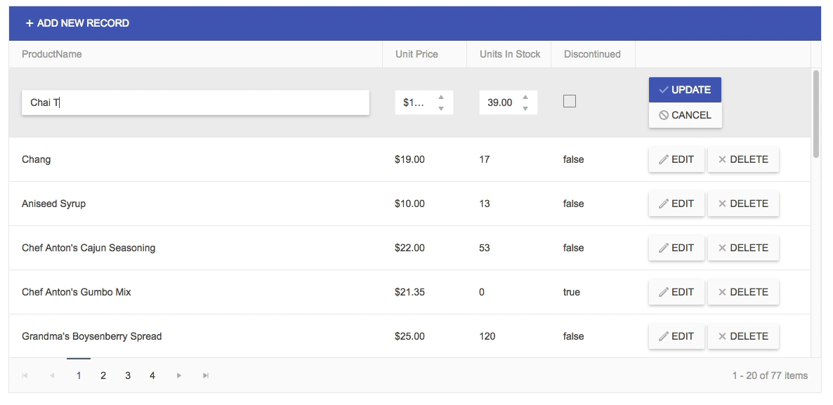
One of the scenarios where feedback becomes important is when the application is put into an edit mode to modify existing information. It’s important that users have a clear understanding of what is currently editable, as applications will differ in the scope of the edit mode — for example, some applications will incorporate tables of data where a single cell or row is editable, others will make the entire table editable. Proper, clear feedback can convey to users the scope of the edit; good feedback can be implemented in a variety of ways, from using a different background to identify the current editable area to changing the buttons associated with editing to clearly show their function
1.a. Out to Lunch Without a Progress Indicator
A variant on lack of feedback is when a system fails to notify users that it's taking a long time to complete an action. Users often think that the application is broken or they start clicking on other targets.
If you can't meet the recommended response-time limits, say so, and keep users informed about what's going on with a progress indicator:
- If a command takes between 2 and 10 seconds, show a wait animation such as a “spinner.”This type of progress indicator tells users to hold their horses and not click on anything else until the normal cursor returns.
- If a command takes more than 10 seconds, put up an explicit progress bar, preferably as a percent-done indicator (unless you truly can't predict how much work is left until the operation is done).
2. Inconsistency
Remember the double-D rule: differences are difficult. When users have expectations for how something will behave or where they can access it, deviations from those expectations cause confusion, frustration, and increased cognitive load as people attempt to puzzle out the problem. Human minds crave consistency.
There are a few types of inconsistency that are especially common in complex applications and cause even seasoned users to be utterly confused:
- Different words or commands for the same action
- Placing controls for the same feature in many different places
- Controls that seem similar to one another (from the user’s point of view) but are accessed in different places (e.g. one is accessed in a toolbar, another a menu, and a third deep in a Preferences dialog)
- Similar workflow patterns which require interacting with very different sections of the interface
- Inconsistent rules for legit input data: sometimes an entry is allowed, and at other times it’s marked as invalid, without any feedback as to why this is happening
- A feature is sometimes available, and sometimes not for mysterious reasons that are not made explicit
- UI elements or controls that move around, violating spatial consistency
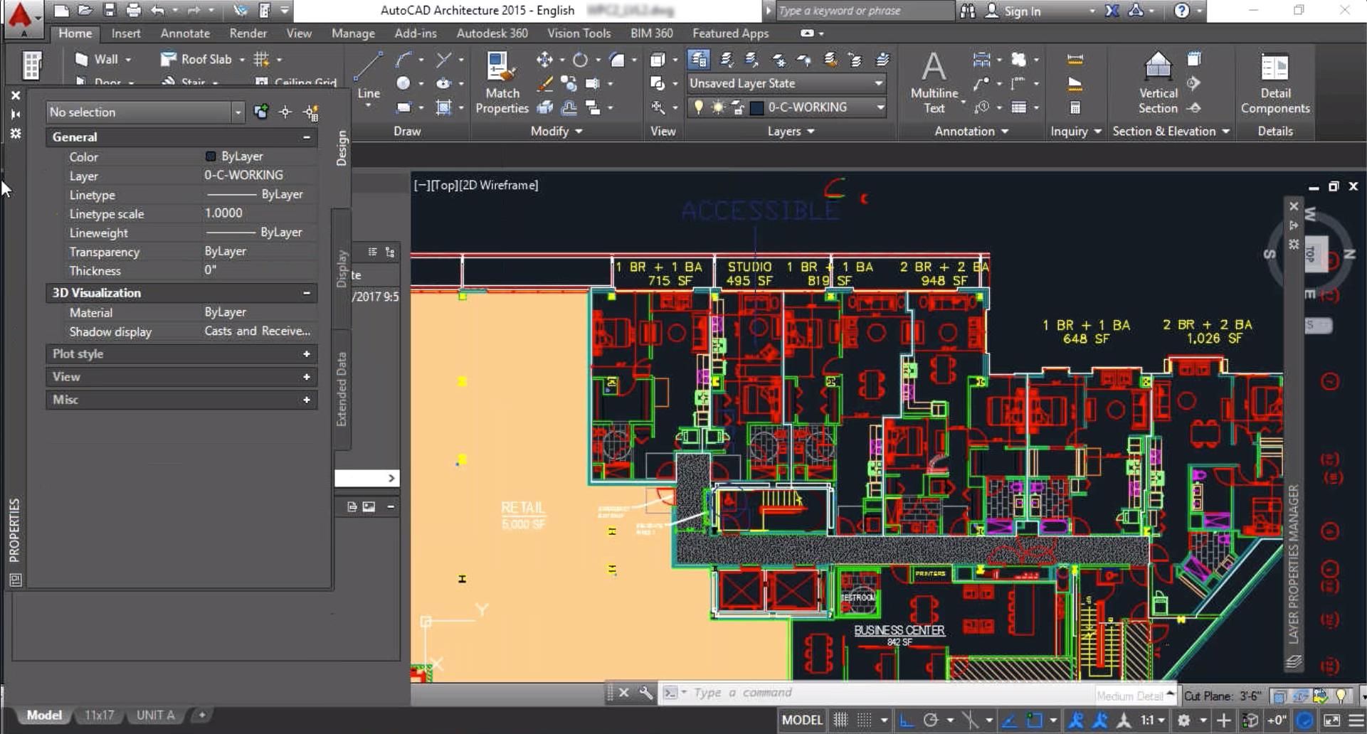
An architect in our study who had many years of experience using AutoCAD struggled to understand when she could or couldn’t “dock” various floating panels to keep them pinned to one side of the screen. In the same session, she tried multiple times to get a floating panel to dock to the left side, to no avail. It turned out that, due to a hidden parameter setting, this particular panel could not be docked, but this constraint was not made explicit to the user. The hidden setting was intended to give power users the ability to customize the interface to an incredible degree, but, due to poor feedback, our study participant couldn’t figure out why docking sometimes worked and sometimes didn’t. This type of inconsistency is a major source of frustration even to experienced users.
3. Bad Error Messages
Error messages are a special form of feedback: they tell users that something has gone wrong. We've known the guidelines for error messages for almost 30 years, and yet many applications still violate them.
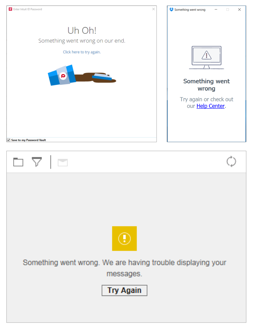
The most common guideline violation is when an error message simply says something is wrong, without explaining why and how the user can fix the problem. Such messages leave users stranded.
This problem has worsened over the years, largely due to web apps: Users are shown a Something went wrong. Try again. error message, with no details about the cause of the error or how it can be repaired. At least the native desktop applications of yesteryear used to tell people (often in technical lingo that lay users had no hope to make sense of) what the issue was.
Informative error messages not only help users fix their current problems, but they can also serve as a teachable moment. Although people won't invest time in reading and learning about your app’s features, they will make the effort to understand an error situation if you explain it clearly, because they want to overcome the error.
4. No Default Values
Defaults help users in many ways. Most importantly, defaults can:
- speed up the interaction by freeing users from having to specify a value if the default is acceptable
- teach by providing an example of the type of answer that is appropriate for the question
- direct novice users toward a safe or common outcome, by letting them accept the default if they don't know what else to do
Default values can save significant user effort in repetitive tasks, such as filling in the same form many times. Identifying key values for form fields can increase productivity and reduce frustration. Your analytics can help you understand if there is a most commonly chosen option for a specific field.
In particular, dropdown menus benefit from a meaningful default. Many apps provide Select one (i.e. no value selected at all) as the default choice, forcing every user to interact with the dropdown and select a value. If you preselect one choice (ideally the most common), at least some users will not have to interact with that dropdown at all.
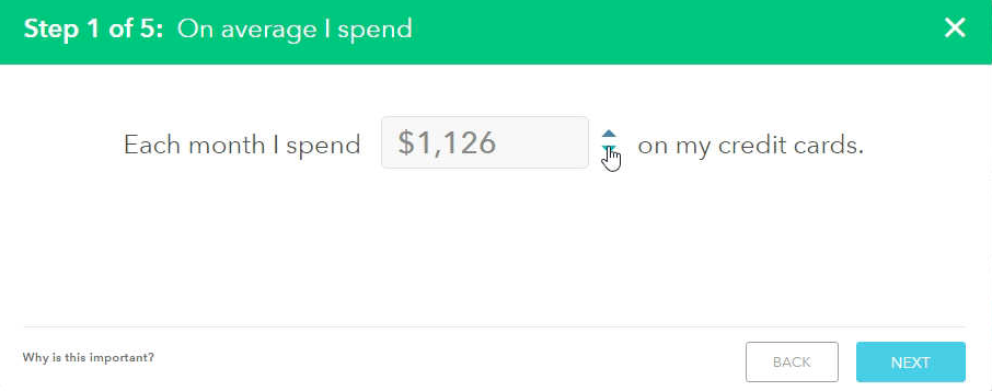
With numeric form fields, if users deviate very little from a common default (e.g., for Quantity fields), you can use a stepper to allow them to adjust the number without typing (but still allow users to type a different value if desired). Steppers have two benefits: they reduce interaction cost and give a reasonable starting point for new users who are still learning the system.
5. Unlabeled icons
It’s really rare for icons to stand on their own, with most users able to understand them immediately. Even icons that might seem universal (such as the hamburger menu) are not as familiar to users as most UX practitioners would expect. It gets much worse if your application has icons that are unique; the likelihood that users will understand what these unique icons mean is very low. Remember Jakob’s law: "users spend most of their time on other websites.” This means that most icons, unless they have a text label next to them, will be difficult or impossible for users to understand.
Pairing icons with a text label has four benefits:
- It increases the size of the target (which, according to Fitts’ Law, reduces how long it takes for users to access the control).
- It decreases the time to recognize the command: two memory cues (icon and text) are better than one.
- Related to the previous, it can also facilitate learning of the interface (by establishing multiple associations with the same command).
- It can help users visually differentiate between several commands placed next to one another.
6. Hard-to-Acquire Targets
In human–computer interaction, anything that can be clicked (or tapped) on is called a target: all active UI elements are targets. For users to acquire a target, they must be able to (1) identify the target; (2) click on it reliably. Both of these aspects cause problems in modern app interfaces.
6a. Weak Signifiers
"Affordance" means what you can do to an object. For example, a checkbox affords turning on and off, and a slider affords moving up or down. Signifiers are the visual elements that help you to understand the affordances just by looking at the object, before you start using it (or feeling it, if it's a physical device rather than an on-screen UI element). These concepts are discussed in Don Norman's book The Design of Everyday Things.
Signifiers are especially important in UI design, because all screen pixels afford clicking — even though nothing usually happens if you click. There are so many visible things on a computer screen that users don't have time for a mine-sweeping game, clicking around hoping to find something actionable. (Exception: young children sometimes like to explore screens by clicking around.)
In modern applications, one of the worst offenders are ultra flat designs. Many flat designs have weak signifiers for targets: people cannot easily tell text from buttons because buttons lack traditional 3D clues.
Common symptoms of weak signifiers are:
- Users say, "What do I do here?"
- Users don't go near a feature that would help them.
- A profusion of screen text tries to overcome these two problems. (Even worse are verbose, multistage instructions that disappear after you perform the first of several actions.)
6b. Tiny Click Targets
An associated problem here is click targets that are so small that users miss and click outside the active area. Even if they originally perceived the associated signifier correctly, users often change their mind and start believing that something isn't actionable because they think they clicked it and nothing happened.
(Small click zones are a particular problem for old users and users with motor skill disabilities.)
7. Overuse of Modals
Many applications use modal windows to implement interactions with data — editing an existing item, adding a new item, deleting, or even reading additional details about an item. Modals appear on top of the current page and the background content is usually dimmed (under the assumption that dimming will reduce distractions and help users focus on the task at hand). Unfortunately, this design choice reduces context for users by covering up information that they may wish to refer to while filling out the form. (Note that, even if the covered-up window does not contain information needed for the editing, users often attempt to leverage the work they’ve done previously, by copying and pasting previous inputs, or even simply using other entries as templates for how to think about the current task.)
8. Meaningless Information
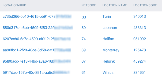
Long strings of letters and digits, such as automatically generated IDs in a database are frequently used to uniquely identify an item in an application. These strings are completely meaningless to users, but they are often prominently displayed as the first column of a table, forcing people to scan past that first column to find the information that they care about. While these meaningless indices are important on the back end, they should not be the primary piece of information that users must refer to. Especially in high–information-density screens, provide some human-readable information as the main anchor point and push the IDs to a less prominent position.
Egregious uses of coded information often appear in medical applications, CRM systems (where users often have to select a code for each sales interaction with their customers), accounting software, and enterprise applications. In all these apps, information that is meaningful to humans is summarized by a short code, in an attempt to make it more compact. A short code may fit in a small area better than a whole sentence, but places a much higher cognitive load on users. They will need to translate the coded information to make sense of it, and our working memory is limited to begin with. Even highly trained professionals cannot remember every possible code, and it still takes them a lot of effort to do this mental translation.
9. Junk-Drawer Menus
If your application has hundreds or even thousands of features, you have to put controls for those features somewhere, and furthermore, you need to prioritize and organize them so users can easily find and quickly access the most important ones. One consequence of this constraint is often an overflow menu: the most commonly used actions are displayed in a toolbar, and a final item labeled More actions, or Tools, or worst of all … hosts everything else that did not fit.
These menu labels have low information scent and are nothing more than a junk drawer: a place to put all the stuff you can’t otherwise categorize, but don’t want to throw away. They often come about because the team has a list of required features but doesn’t know where to put them, or in legacy applications, it cannot remove old, seldom used features. The problem with an overflow menu is that, just like with the junk drawer in your house, no one else can know what you might have put in it. In other words, it limits both discoverability and findability of features, since most users won’t have any reason to go looking in those menus.
10. Proximity of Destructive and Confirmation Actions
Placing actions such as Save next to actions that destroy work such as Discard is a commonplace design decision that causes much grief for users. While logically this placement often makes sense (for example, Save and Delete are related, in that they decide the fate of an item), it also makes it easy to click the wrong button or icon — especially when users are rushing, completing repetitive actions, or have motor difficulties. This type of unintentional substitution of one action for another is called a slip
Summary
Applications are hugely domain-specific, so a usable, efficient, and pleasant application for one industry might be an unmitigated disaster in another. Creating a usable application requires researching with your users to identify their workflows, their needed features, and their mental models and expectations.
However, the 10 application mistakes outlined here represent common themes that we observe in studies across a range of industries, including creative, financial, enterprise, healthcare, engineering, and more.
For more guidelines on application design, take our full-day course on Application Design for Web and Desktop.

