Introduction
DropDownPanel is a control inherited from System.Windows.Forms.Panel class. I developed this to build up a complete and beautiful options page for applications. A lot of time was spent to achieve high performances, memory saving and complete absence of flickering.
Features
The main features and functionalities of DropDownPanel are:
- It works exactly like a
Panel.
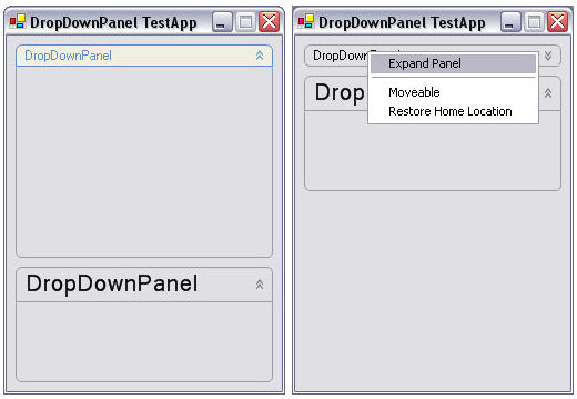
- It can be collapsed and expanded.
- It can be moved by dragging its header.
- It can show a small context menu (on the header) to manage its functionalities.
- It has some cool customizing possibilities.
- It fits system colors.
Note: All the properties of DropDownPanel can be set directly in Visual Studio Properties window, because all the ‘simple’ properties are correctly interpreted by the IDE, whilst for the other ones I have created a specific UITypeEditor, compatible with Visual Studio. Please see this image:

How to use DropDownPanel
First, you have to add a reference to DropDownPanel.dll. You can add to the Visual Studio toolbox a new Item, in order to use the component in visual mode. To do this, switch to design mode, right-click on the ‘Components’ toolbox, choose ‘Add/Remove Items…’, browse to the DLL and select it. After this, you can drag-drop DropDownPanels to your Forms. On selecting a DropDownPanel on your Form, the Properties page will be displayed. At the bottom you can find all the custom properties.
Public properties
The public properties exposed by DropDownPanel are:
AutoCollapseDelay: specifies the delay (in milliseconds) after which the DropDownPanel collapses automatically. Negative values disable this feature.
EnableHeaderMenu: specifies if the ContextMenu in the Header is displayed when the user right-clicks on it. This menu contains some useful items to set behavioral data (try the demo App).
ExpandAnimationSpeed: specifies the speed for the expand/collapse animation. There are four values available, High, Medium, Low and NoAnimation.
Expanded: specifies the status of the DropDownPanel. If true, the Panel is expanded (in design mode some refresh problems may occur on modifying this property; I hope to fix them as soon as possible).
HeaderFont: the Font to use for the Header text.
HeaderHeight: the header height (in pixels). Ranging from 16-48.
HeaderIconNormal: an optional Bitmap to set, will be drawn on the left of the Header text when this is in normal state. The width is arbitrary, but the height must be less than HeaderHeight – 4 pixels.
HeaderIconOver: an optional Bitmap to set, will be drawn on the left of the Header text when this is in HotTrack (mouse is over it) state. The width is arbitrary, but the height must be less than HeaderHeight – 4 pixels.
HeaderText: the text to be shown in the header. It is like the title.
HomeLocation: the location where the Panel will be moved when RestoreHomeLocation() is called. This value is automatically modified when you set the DropDownPanel’s location in the editor.
HotTrackStyle: the Header’s behavior, applied when the user moves the mouse pointer on it. Available values are: None (no reaction), FillingOnly (the header is colored with the SystemBrushes.ControlLight color), LinesOnly (the header’s lines and text are colored with the SystemBrushes.HotTrack color) and Both (both the Fillings and Lines are colored as before).
ManageControls: if true, the controls added with the AddManagedControl() method will be moved up and down automatically when the DropDownPanel collapses/expands. I’m sorry but the controls must be added via code and not from the designer… The controls can be removed with RemoveManagedControl().
Moveable: specifies if the DropDownPanel can be moved by the user (by dragging its header).
RoundedCorners: specifies if the DropDownPanel will be drawn with rounded corners or not.
Public methods
The public methods exposed by DropDownPanel are:
AddManagedControl(): adds a control to the ManagedControls list.
RemoveManagedControl(): removes a control from the ManagedControls list.
RestoreHomeLocation(): restores the HomeLocation of the DropDownPanel.
SwitchStatus(): switches the status of the DropDownPanel. If it was expanded, this method will collapse it, and vice versa.
Events
When the DropDownPanel finishes its collapsing or expanding operations, a StatusChanged event is raised. The definitions of the event, the delegate and the DropDownPanelEventArgs are:
public delegate void DropDownPanelEventHandler(object sender,
                                      DropDownPanelEventArgs e);
public event DropDownPanelEventHandler StatusChanged;
protected virtual void OnStatusChanged(DropDownPanelEventArgs e){
    if(StatusChanged != null) {
        StatusChanged(this, e);
    }
}

public class DropDownPanelEventArgs : System.EventArgs {

    private bool expanded;

    public DropDownPanelEventArgs(bool expanded) {
        this.expanded = expanded;
    }

    public bool PanelExpanded {
        get {
            return expanded;
        }
    }
}
The event is raised in case of changes in code status or by user action, without differences. The events are raised as follows:
OnStatusChanged(new DropDownPanelEventArgs(expanded));
Architecture
The DropDownPanel directly extends the System.Windows.Forms.Panel class. The header is a FlickerFreePanel, which extends the same Panel class and adds a new constructor, which sets the ControlStyle property in order to prevent flickering:
public FlickerFreePanel() {
SetStyle(ControlStyles.DoubleBuffer, true);
SetStyle(ControlStyles.UserPaint, true);
SetStyle(ControlStyles.AllPaintingInWmPaint,
true);
}
The same operation is performed for the DropDownPanel too. With this stuff, the DropDownPanel results are completely flicker-free. The lines and the text are drawn using some GraphicsPath objects and the system colors available in System.Drawing.SystemBrushes class.
Notes about UITypeEditor
In order to allow properties modification in Visual Studio Property pages, you have to consider some issues:
- Properties must be structured as .NET properties (
get, set).
- Data types such as numbers (all formats), string, Point, Size, bool, etc. are correctly presented by VS without any other operation.
- All complex data types must be ‘wrapped’ manually.
The easiest way to implement a custom property is to use enum data type. I report here the example of the HotTrackStyle property. The enum is defined as follows:
public enum HotTrackStyle {
    Both, LineOnly, FillingOnly, None
}
To edit this property from VS, you have to add to the code the following [Editor()] statement (please note the using clauses).
using System.ComponentModel;
using System.ComponentModel.Design;
using System.Windows.Forms.Design;
using System.Drawing.Design;
[Editor(typeof(HotTrackStyleEditor),
typeof(UITypeEditor))]
public HotTrackStyle HotTrackStyle {
}
After this, you have to implement the HotTrackStyleEditor class.
public class HotTrackStyleEditor : UITypeEditor {
public ListBox lstValues;
public IWindowsFormsEditorService wfes;
public override UITypeEditorEditStyle GetEditStyle(
ITypeDescriptorContext context) {
if(context != null && context.Instance != null) {
return UITypeEditorEditStyle.DropDown;
}
return base.GetEditStyle(context);
}
public override object EditValue(ITypeDescriptorContext context,
IServiceProvider provider, object value) {
if(context == null || context.Instance == null) {
return value;
}
wfes = (IWindowsFormsEditorService)provider.GetService(
typeof(IWindowsFormsEditorService));
if(wfes == null) {
return value;
}
lstValues = new ListBox();
lstValues.BorderStyle = BorderStyle.None;
lstValues.Items.Add("Both");
lstValues.Items.Add("LinesOnly");
lstValues.Items.Add("FillingOnly");
lstValues.Items.Add("None");
lstValues.SelectedIndex = (int)value;
lstValues.MouseUp += new MouseEventHandler(lstValues_MouseUp);
wfes.DropDownControl(lstValues);
int val = lstValues.SelectedIndex;
lstValues.Dispose();
lstValues = null;
switch(val) {
case 0:
return HotTrackStyle.Both;
case 1:
return HotTrackStyle.LinesOnly;
case 2:
return HotTrackStyle.FillingOnly;
case 3:
return HotTrackStyle.None;
}
return HotTrackStyle.Both;
}
private void lstValues_MouseUp(object sender,
System.Windows.Forms.MouseEventArgs e) {
if(wfes != null) {
wfes.CloseDropDown();
}
}
}
Conclusions
The DropDownPanel is a simple but (in my opinion ;) powerful control. You can use it for options pages or for whatever you want. Comments and suggestions are always welcome!
Next steps
I have to fix the Expanded property problems (in Design Mode): these are neither nice nor so heavy. I hope I will find a way to include in the Visual Studio property page the list of ManagedControls (simply until now I had no time, but I hope it is possible).


 General
  News
News  Suggestion
  Question
  Bug
Bug  Answer
  Joke
Joke  Praise
  Rant
Rant  Admin
Admin 


 Submit an article or tip


 For example - Egoistic Mode - when the control moves apart controls surrounding it..