Introduction
The modern world has a large amount of different form-factors of devices. It is a bad way to ignore this fact. All true websites should adapt their layout depending on the screen of the current device. To solve this problem you can use a responsive layout approach. Responsive layout allows you to adapt your markup for the current screen resolution and size.
The bad news is IE for Windows RT ignores standard media-queries for responsive layout. Actually, IE doesn't switch to a condensed view when a website is snapped.
This article will help you to solve this issue.
Responsive layout
The main idea of responsive layout is using fluid blocks and switch CSS-styles for different resolutions. To switch CSS-styles for different screen resolutions we can use CSS media-queries.
CSS media-queries work with the width of the body element. So we can define styles which will be applied when the width of the body element is specified in the selector:
@media only screen and (max-width : 600px)
{
}
After defining all the necessary selectors, we can style our page in the responsive manner.

To allow mobile devices to use media queries we should add a viewport meta-tag:
<meta name="viewport" content="width=device-width, initial-scale=1.0, maximum-scale=1.0">
The page will adapt to each screen now.
The problem
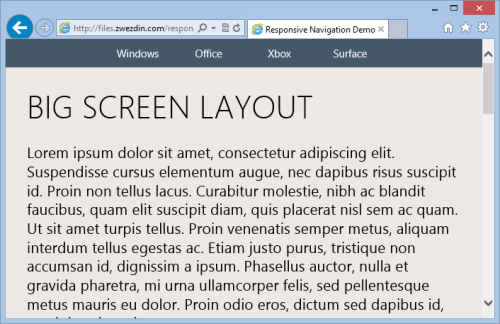
The problem is the layout of our page in Internet Explorer at Windows RT. If we try to open this page in IE and snap it, we will see something like this:
This means that IE ignores the viewport tag in snapped mode. The page rendered as if it was on the big screen. The snapped mode is very useful in Windows RT, so we cannot ignore it. It would be convenient to change the page layout in snapped mode as in native Windows RT applications.
To do it, we can use small tricks - we need to define the body width explicitly in a CSS media-query by using a special Microsoft selector:
@media only screen and (max-width : 320px)
{
    @-ms-viewport
    {
        width: 320px;
    }
}
In this case, IE in Windows RT will adapt the page width to the screen and we will see the true page layout:
Conclusion
Snapped windows is a killer feature in Windows RT. With snapped windows we can do a few tasks in parallel more conveniently.
There is a small trick to adapt our pages to snapped mode. Let's just do it!
Links


 General
  News
News  Suggestion
  Question
  Bug
Bug  Answer
  Joke
Joke  Praise
  Rant
Rant  Admin
Admin 


 Submit an article or tip


