Introduction
This project started out simple enough, build a collapsible web control to display content. Along the way, I kept expanding it and learning more about how to build and control web controls in the Visual Studio .NET IDE. I was most curious about adding design-time support, not only properties, but in the HTML view of the form. Although the control still has a few deficiencies, I believe it is a good learning tool for others to expand on.
Overview
The control itself is very simple, a table containing two rows, one for the header display and the other for the content. The header has two columns, one for an icon to indicate the collapsed or expanded state and the other for either an image or text.
Expanded

Collapsed

Building the control
There really isn’t anything special about creating this control. As we can see, it is derived from System.Web.UI.WebControls and also INamingContainer.
public class ExpandingDiv : WebControl, INamingContainer
By overriding the CreateChildControls() method, we can render the control as necessary. Since there are numerous examples of custom control building available. I won't go into too much detail.
protected override void CreateChildControls()
{
if( m_strExpandedIcon == string.Empty
|| m_strCollaspedIcon == string.Empty )
throw new Exception("Expanded and collapsed icon must be defined");
Controls.Clear();
Table table = new Table();
table.Attributes.Add("border", Border.ToString());
table.Attributes.Add("CellPadding",
CellPadding.ToString());
table.Attributes.Add("CellSpacing",
CellSpacing.ToString());
table.Width = Width;
Controls.Add(table);
TableRow rowHeader = CreateHeaderRow();
table.Rows.Add(rowHeader);
if( m_ItemTemplate != null )
{
CreateTemplateRow(ref table);
string strParams = string.Format("Expand('{0}_{1}',
'{0}_{2}')", UniqueID, CONTENT_ID, ICON_ID);
rowHeader.Cells[0].Attributes.Add("OnClick", strParams);
rowHeader.Cells[0].Attributes.Add("OnMouseOver",
"this.style.cursor='pointer'") ;
}
RegisterScript();
}
Item Template
What is displayed in the control below the header is controlled by using an ItemTemplate. To provide the maximum flexibility, anything in this template is rendered literally into the table.
<ItemTemplate>
 <font size="4">Content will go here</font>
</ItemTemplate>
private void CreateTemplateRow(ref Table table)
{
 ExpandingDivItem item = new ExpandingDivItem();
 m_ItemTemplate.InstantiateIn(item.Cells[0]);
 item.ID = CONTENT_ID;

 table.Rows.Add(item);
}
Designer Support
To get the control to show as something other than a grey block in the web form designer, we must create a class derived from System.Web.UI.Design.ControlDesigner and associate it with the class we want displayed.
public sealed class ExpandingDivDesigner : ControlDesigner
The designer is associated with the class by adding the DesignerAttribute.
[DesignerAttribute(typeof(ExpandingDivDesigner),
       typeof(IDesigner))]
public class ExpandingDiv : WebControl, INamingContainer
The ControlDesigner class has several methods and properties that can be useful, however we are only interested in two for this example; GetDesignTimeHtml() and GetErrorDesignTimeHtml().
GetDesignTimeHtml() is overridden to control how the control is rendered on the web form while in design mode. As you can guess by the name, what needs to be returned is standard HTML tags. In this case, I have used a StringBuilder to capture the tags and attributes, and return them. The Component property of the ControlDesigner class gives us access to the properties of the control we are designing, and by casting it to the correct class, ((ExpandingDiv)Component), we can apply these properties to the design time HTML.
public override string GetDesignTimeHtml()
{
    try
     {
        System.Text.StringBuilder sb = new
        System.Text.StringBuilder();
        sb.AppendFormat("<table border={0} cellpadding={1}
            cellspacing={2} width={3}>",
            ((ExpandingDiv)Component).Border,
            ((ExpandingDiv)Component).CellPadding,
            ((ExpandingDiv)Component).CellSpacing,
            ((ExpandingDiv)Component).Width);
        if( ((ExpandingDiv)Component).HeaderBackgroundColor !=
            System.Drawing.Color.Empty )
        sb.AppendFormat("<tr bgcolor={0} class={1}>",
        System.Drawing.ColorTranslator.ToHtml(((ExpandingDiv)
            Component).HeaderBackgroundColor),
            ((ExpandingDiv)Component).HeaderCssClass);
        else
            sb.Append("<tr>");

        if(((ExpandingDiv)Component).ExpandedIcon == string.Empty )
            throw new Exception("Expanded Icon not defined");

        sb.AppendFormat("<td align={1} width=1><img src='{0}'></td>",
            ((ExpandingDiv)Component).ExpandedIcon,
            ((ExpandingDiv)Component).HeaderAlignment);


        if(((ExpandingDiv)Component).HeaderImage != null )
            sb.AppendFormat("<td><img src='{0}'></td>",
            ((ExpandingDiv)Component).HeaderImage);
        else if(((ExpandingDiv)Component).HeaderText !=
            string.Empty )
        sb.AppendFormat("<td>{0}</td>",
            ((ExpandingDiv)Component).HeaderText );
        sb.Append("</tr>");
        if( ((ExpandingDiv)Component).ItemTemplate != null )
        {
            Literal literal = new Literal();
            ((ExpandingDiv)Component).ItemTemplate.InstantiateIn(literal);
            sb.AppendFormat("<tr><td colspan=2>{0}</td></tr>",
                literal.Text);
        }
        sb.Append("</table>");
        return sb.ToString();
    }
    catch(Exception ex)
    {
        return GetErrorDesignTimeHtml(ex);
    }
}
If any exceptions occur during the rendering of the control in the designer, they are handled by overriding the, you guessed it, GetErrorDesignTimeHtml. In this case, we are only returning a simple string describing the exception. The CreatePlaceHolderDesignTimeHtml() can also be overridden to provide a custom rendering.
protected override string GetErrorDesignTimeHtml(Exception e)
{
 return CreatePlaceHolderDesignTimeHtml(e.Message);
}
Design-Time HTML
Everything so far is fine as long as we are using the properties window to change the appearance of our control. But what happens when we switch to HTML view? With standard controls, such as asp:label or asp:button, you can get a list of available attributes, in the form of a drop down, when hitting the space bar while in the opening tag of the control.
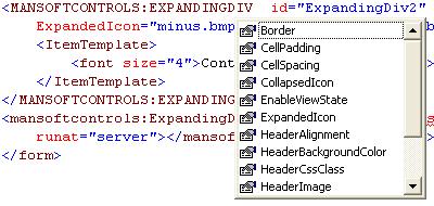
If you type in an attribute that is not supported by the control, it shows up with a red squiggly underline, informing you of the error of your ways. The question is, how does the editor know of the attributes that may or may not be supported by your control?
The answer is, it doesn’t, until you tell it.
Control Schemas
The supported attributes of a control, either custom or prepackaged, are controlled through the use of a schema file. Looking in the folder [VS.NET]\Common7\Packages\schemas\xml, you will see the file asp.xsd. This file contains all of the definitions for the build in ASP.NET control that ships with VS.NET.
<xsd:complexType name="ImageDef"
vs:noambientcontentmodel="true">
<xsd:attribute name="AlternateText" type="xsd:string" />
<xsd:attribute name="Enabled" type="xsd:boolean"
vs:readonly="true" />
<xsd:attribute name="ImageAlign" type="ImageAlign" />
<xsd:attribute name="ImageUrl" type="xsd:anyURI" />
<xsd:attribute name="BorderWidth" type="ui4" />
<xsd:attribute name="BorderColor" type="xsd:string"
vs:builder="color" />
<xsd:attribute name="BorderStyle" type="BorderStyle" />
<xsd:attributeGroup ref="WebControlAttributes" />
</xsd:complexType>
To make the control useful in the HTML designer, you must create a similar schema file and place it in the same folder. Notice that you must include every attribute you wish to support, including the ID and RunAt attributes. Details about the schema annotations can be found here.
<xsd:complexType name="ExpandingDivDef"
vs:noambientcontentmodel="true">
 <xsd:choice>
<xsd:element name="ItemTemplate" type="TemplateDef"
form="unqualified"
vs:blockformatted="true" />
 </xsd:choice>
 <xsd:attribute name="ID" type="xsd:string" />
 <xsd:attribute name="Runat">
  <xsd:simpleType>
   <xsd:restriction base="xsd:string">
    <xsd:enumeration value="server" />
   </xsd:restriction>
  </xsd:simpleType>
 </xsd:attribute>
<xsd:attribute name="HeaderBackgroundColor"
   type="xsd:string" vs:builder="color" />
 <xsd:attribute name="HeaderImage" type="xsd:anyURI" />
 <xsd:attribute name="HeaderText" type="xsd:string" />
 <xsd:attribute name="HeaderAlignment"
       type="HorizontalAlign" />
 <xsd:attribute name="HeaderCssClass" type="xsd:string" />
 <xsd:attribute name="CollapsedIcon" type="xsd:anyURI" />
 <xsd:attribute name="ExpandedIcon" type="xsd:anyURI" />
 <xsd:attribute name="Border" type="xsd:ui4" />
 <xsd:attribute name="CellSpacing" type="xsd:ui4" />
 <xsd:attribute name="CellPadding" type="xsd:ui4" />
 <xsd:attribute name="Width" type="xsd:string" />
 <xsd:attribute name="EnableViewState"
       type="xsd:boolean" />
 <xsd:attributeGroup ref="Header" />
</xsd:complexType>
One more step is necessary to complete the HTML designer support. Although the schema file exists, you must add a xmlns attribute to the body tag before the attributes for the control attributes will be recognized in the editor.
<body MS_POSITIONING="GridLayout"
xmlns:MANSoftControls="urn:http://www.teoulmoon.com/mansoft/schemas">
I have yet to find out how to make this an automatic step, so for now, it must be done manually.
Conclusion
As stated previously, the control itself is very simple; the focus was on adding design-time support. There are few areas I did not cover, but this article should be sufficient for a starting point for those wanting to add more to their custom controls.


 General
  News
News  Suggestion
  Question
  Bug
Bug  Answer
  Joke
Joke  Praise
  Rant
Rant  Admin
Admin 


 Submit an article or tip


