Introduction
After reading Pete Brown in his post on 2nd August announcing the new RibbonUI feature in his post, Announcing:Microsoft Ribbon for WPF, I thought why not try this cool control set myself. So on this note, I tried the control set that Microsoft just introduced and created an application. It is time to introduce with the new control, so that it would be easier for you to start working with it.
Ribbon Bar that was introduced with Office 2007 has lately been very popular for the latest UI development. Microsoft has replaced the old Menu based application tool with more flexible and easy to learn Ribbon strips in many of its applications. So it is time for other developers to use it in their own applications. The Ribbon UI feature that was released recently bridges this to us.
In this article, I am going to introduce the Ribbon Control in WPF. If you are not familiar with WPF, please read the WPF Article Series.
What is Ribbon?
Ribbon is a sort of Toolbar or rather Command Bar which arranges different Command buttons, galleries, etc. in Tabs at the top of the application Window. The controls in the Tabs can further be grouped and also introduces Contextual Tabs, etc. So in short, Ribbon replaces toolbar and menu controls that are there with windows and gives a solid look on the application UI.
This is the default Ribbon Template that comes when you first create your application and also gives you a better idea on how the new RibbonWindow looks like.
How to Start?
Now to start creating your first application, you need:
- Visual Studio 2010. You can install Visual Studio trial from here. Or you can try Visual Studio 2010 Express from here.
- After you install Visual Studio 2010, you need to install Microsoft Ribbon for WPF from here. You can also install this in VS 2008. In that case, you need to take reference to the DLL explicitly.
- After you install, launch Visual Studio 2010 and select WPF Ribbon Application from Visual Studio Project Templates.

Add new RibbonApplication from VS templates
- After you select the project template, your default application will be created. It automatically creates you a Ribbon control UI with a few sample buttons as shown below:
You will see the sample application from template
- The RibbonControlsLibrary.dll is already referenced and the Window is actually inherited from
RibbonWindow which includes customized title bar and status bar. - So it's time to get started.
Features of Ribbon UI
Let's address each of the features of RibbonUI so that you could apply them while creating your own Ribbon Based Applications.
Application Menu: Each Ribbon Application should have one Application Menu associated with it. The application menu is composed of a series of Dropdown Buttons that display menu items.
The left side of the ApplicationMenu contains MenuItems, each of which may contain its Submenu as well. The right hand side contains the RecentItems represented by ApplicationMenu.RecentItems.
Quick Access Toolbar: Every Ribbon control has Quick access toolbar which are small buttons that allow you to access frequently used commands. The quick access toolbar is present in the Title bar of the window.
Super ToolTip: WPF Ribbon bar introduces enhanced tooltip to describe your command in the best way possible. We call it superTooltip.
KeyTips: KeyTips are a unique feature associated with each ribbon to invoke menuitems using Keyboard Shortcuts. You can define KeyTip for each Tab, Buttons, etc. which will show up whenever the Alt with the Key combination is pressed.
Automatic Resizing RibbonItems: Each ribbon has implemented in such a way that the Ribbon will be resized when there is shortage of space automatically. Large RibbonButton will be converted to small Buttons and again converted to MenuItem when space is constrained.
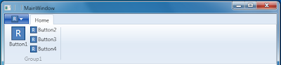
Group Ribbon Tabs: A Ribbon control can have multiple RibbonTabs. So you can group the set of Commands into individual Tabs.
Demonstrate Tabs and Groups in Ribbon
Contextual Ribbon Tab: You can also have Contextual Ribbon Tab, a special Tab that will display dynamic content based on User interaction.
Ribbon Combobox Gallery Items: Gallery are special items that have special features, like hover zoom effect, dropdown effect, etc.
So, with never ending new features with Ribbon, let's define each of the features by implementing the same.
Why Use RibbonWindow than Window?
A RibbonWindow is a class derived from Window in WPF. The class RibbonWindow has the capability to draw Quick Access toolbar buttons and Contextual TabGroup into it. So if you want to support these features, you must use RibbonWindow rather than a normal Window. To add a new RibbonWindow, just use Ribbon.
After you select RibbonWindow, the template will produce a default Window as:
<ribbon:RibbonWindow x:Class="RibbonTestApplication.MainWindow"
        xmlns="http://schemas.microsoft.com/winfx/2006/xaml/presentation"
        xmlns:x="http://schemas.microsoft.com/winfx/2006/xaml">
</ribbon:RibbonWindow>
We are going to use this window to implement our RibbonControl.
Implementation
So let's build our application with most of the components one by one:
RibbonApplicationMenu
The Application menu contains main Menuitems at the left side, the AuxilaryPane in the right side and the FooterPane in the bottom of the MainMenu.
RibbonApplicationMenu is a control that creates the Application Menu for the RibbonWindow. Each window can have only one Application Menu. The application menu can have RibbonApplicationMenuItem, RibbonApplicationSplitMenuItem, RibbonSeparator, etc. You can nest RibbonApplicationMenuItem to have Submenu for an item.
Let's look at how to build this menu:
<ribbon:Ribbon.ApplicationMenu>
    <ribbon:RibbonApplicationMenu SmallImageSource="Images\MyComputer.ico">
        <ribbon:RibbonApplicationMenuItem Header="Desktop"
        ImageSource="Images\Desktop.ico" KeyTip="D"
        Click="RibbonApplicationMenuItem_Click"/>

        <ribbon:RibbonApplicationMenuItem Header="Floppy"
        ImageSource="Images\HardDrive.ico" KeyTip="F">
            <ribbon:RibbonApplicationMenuItem Header="Primary Floppy"
            ImageSource="Images\FloppyDrive3.ico" KeyTip="P"
            Click="RibbonApplicationMenuItem_Click" />
            <ribbon:RibbonApplicationMenuItem Header="Secondary Floppy"
            ImageSource="Images\FloppyDrive5.ico"
            KeyTip="S" Click="RibbonApplicationMenuItem_Click" />
        </ribbon:RibbonApplicationMenuItem>

        <ribbon:RibbonApplicationMenuItem Header="My Pictures"
        ImageSource="Images\MyPictures.ico" KeyTip="M"
        Click="RibbonApplicationMenuItem_Click"/>
        <ribbon:RibbonApplicationMenuItem Header="My Videos"
        ImageSource="Images\MyVideos.ico" KeyTip="V"
        Click="RibbonApplicationMenuItem_Click"/>
        <ribbon:RibbonSeparator />
        <ribbon:RibbonApplicationSplitMenuItem Header="Search Program"
        ImageSource="Images\Search.ico">
            <ribbon:RibbonApplicationMenuItem Header="BMP Images"
            ImageSource="Images\BMPImage.ico" Click="RibbonApplicationMenuItem_Click"/>
            <ribbon:RibbonApplicationMenuItem Header="JPEG Images"
            ImageSource="Images\JPEGImage.ico" Click="RibbonApplicationMenuItem_Click"/>
            <ribbon:RibbonApplicationMenuItem Header="GIF Images"
            ImageSource="Images\GIFImage.ico" Click="RibbonApplicationMenuItem_Click"/>
            <ribbon:RibbonApplicationMenuItem Header="PNG Images"
            ImageSource="Images\PNGImage.ico" Click="RibbonApplicationMenuItem_Click"/>
        </ribbon:RibbonApplicationSplitMenuItem>

        <ribbon:RibbonApplicationMenu.FooterPaneContent>
            <Grid>
                <Grid.ColumnDefinitions>
                    <ColumnDefinition Width="Auto" />
                    <ColumnDefinition Width="*"/>
                    <ColumnDefinition Width="Auto" />
                </Grid.ColumnDefinitions>
                <StackPanel Orientation="Horizontal"
                HorizontalAlignment="Left" Grid.Column="0">
                    <ribbon:RibbonButton Content="My Music"
                    SmallImageSource="Images\MyMusic.ico" Click="RibbonButton_Click"/>
                    <ribbon:RibbonButton Content="Web Folders"
                    SmallImageSource="Images\WebFolders.ico" Click="RibbonButton_Click"/>
                    <ribbon:RibbonButton Content="Settings"
                    SmallImageSource="Images\Settings.ico" Click="RibbonButton_Click"/>
                </StackPanel>
                <ribbon:RibbonButton SmallImageSource="Images\AudioCD.ico"
                Label="Exit" HorizontalAlignment="Right"
                Grid.Column="2" Command="ApplicationCommands.Close" />
            </Grid>
        </ribbon:RibbonApplicationMenu.FooterPaneContent>

        <ribbon:RibbonApplicationMenu.AuxiliaryPaneContent>
            <TextBlock Text="This is the Auxiliary Pane.
            You can also add RibbonGallery to AuxiliaryPane." />
        </ribbon:RibbonApplicationMenu.AuxiliaryPaneContent>
    </ribbon:RibbonApplicationMenu>

</ribbon:Ribbon.ApplicationMenu>
In the above code, I have declared a few RibbonApplicationMenuItem for Desktop, MyPicture, My Video, etc. You can click on each of them to invoke the Click EventHandler. We specify the Image path directly to the ImageSource of the Menu Item.
RibbonApplicationMenuItem
To define Submenu, you can create as many RibbonApplicationMenuItem inside an individual MenuItem as you wish. Just in the above code, I have nested Primary Floppy and Secondary Floppy inside the Floppy MenuItem. The KeyTip defines the hot key which you can access by pressing Alt Key from the keyboard.
Normal MenuItem with submenu
RibbonApplicationSplitMenuItem
The RibbonApplicationSplitMenuItem on the other hand, has slight difference from the normal RibbonApplicationMenuItem. If you see the second Submenu that I have provided in the sample application, you will discover that it is actually a Menu Item which will have split button with a separator.
Split MenuItem
In case of SplitMenuItem, you can either use the item as MenuItem or you can use it to select its SubMenuItems.
RibbonSeparator
RibbonSeparator allows you to produce a separation between two sets of items. You can use it either in MenuItems or in RibbonGroups.
RibbonApplicationMenu.AuxiliaryPaneContent
AuxilaryPane is generally used to list GalleryItems of all the Recent items accessed by the application. The Right hand blank area of the RibbonMenu is called AuxillaryPane. In the sample application, I have put a TextBlock to write few lines in the AuxillaryPane.
RibbonApplicationMenu.FotterPaneContent
The FooterPaneContent on the other hand, allows to access the footer of the Menu. I have added few RibbonButtons on the FooterPane.
RibbonTab
The main part of a Ribbon is RibbonTab. Each RibbonTab contains a set of RibbonGroup, each of which contains individual controls. A Ribbon can have multiple RibbonTabs associated with it.
<ribbon:RibbonTab ContextualTabGroupHeader="ContextualHeader" Header="Selected">
    <ribbon:RibbonGroup>
        <ribbon:RibbonButton LargeImageSource="Images\HelpFile.ico"
                                Label="Help" />
    </ribbon:RibbonGroup>
</ribbon:RibbonTab>
<ribbon:RibbonTab Header="View">

</ribbon:RibbonTab>
<ribbon:RibbonTab Header="Insert">

</ribbon:RibbonTab>
<ribbon:RibbonTab Header="Format">

</ribbon:RibbonTab>
Thus it will define few RibbonTabs namely View, Insert, Format and Selected. You must notice the first RibbonTab contains a RibbonGroup. The RibbonGroup will produce a Button Help.
ContextualTab
You must also notice, if you specify ContextualTabGroupHeader for a RibbonTab, it will produce the Contextual Tab from the TitleBar of the RibbonWindow. The ContextualRibbonTab is generally not visible, but appears whenever some action is taken by the user to show the individual contextual Ribbon.
<ribbon:Ribbon.ContextualTabGroups>
    <ribbon:RibbonContextualTabGroup Header="ContextualHeader"
                                        Visibility="Visible"
                                    Background="Orange" />

</ribbon:Ribbon.ContextualTabGroups>
Ribbon control has a property called ContextualTabGroups which you can use to Group each RibbonContextualTabGroup and alter its Visibility. The Ribbon ContextualTabGroup allows you to access each ContextualTabs during runtime. In my sample application, I have specified the Visibility=Visible for the ContextualHeader ContextualTab. So it will appear whenever you start the application.
RibbonGroup
Each RibbonGroup has a GroupHeader, which is placed at the bottom of the Group, the Items can be of Large Button Type or a Small Button type. The size of the Button is identified automatically based on the image we pass.
<ribbon:RibbonGroup Header="Control Panel">
    <ribbon:RibbonButton LargeImageSource="Images\ControlPanel.ico"
                            Label="Settings Folder"
                            ToolTipTitle="Settings Folder"
                            ToolTipDescription="Helps you change settings of
                            the folder and also allows you to change certain system settings"
                            ToolTipImageSource="Images\MyDocuments.ico"/>

    <ribbon:RibbonButton SmallImageSource="Images\ConfigurationSettings.ico"
                            Label="Config"
                            ToolTipTitle="Configuration Settings"
                            ToolTipDescription="Allows you to change
                            Configuration settings for the current selection"
                            ToolTipImageSource="Images\MyBriefcase.ico"/>
    <ribbon:RibbonButton SmallImageSource="Images\NetworkConnections.ico"
                            Label="Network"
                            ToolTipTitle="Network Settings"
                            ToolTipDescription="Allows you to change
                            Network settings for the current selection"
                            ToolTipImageSource="Images\Helpandsupport.ico"/>
    <ribbon:RibbonButton SmallImageSource="Images\ProgramGroup.ico"
                            Label="Programs"
                            ToolTipTitle="Program Settings"
                            ToolTipDescription="You can change the Program settings"
                            ToolTipImageSource="Images\TextDocument.ico"/>

</ribbon:RibbonGroup>
Here, we mentioned LargeImageSource for the first button while others have defined SmallImageSource. You can see instead of RibbonButton content, we use Label to show the label text. RibbonButton exposes the Label Text to the interface.
Super ToolTip
RibbonButton has three properties to show Super tooltip. Each super Tooltip can have Title which you can specify using ToolTipTitle. The ToolTipDescription is used for description text and ToolTipImageSource is used to show the Image on the left of the Description.
When the Settings Folder is hovered, the Super ToolTip appears just below the RibbonTab.
RibbonSplitButton
Just like RibbonSplitMenuItem, RibbonSplitButton has a Button and a menu associated with it. Each RibbonSplitButton is a group of normal RibbonButton and a Menu. You can individually access the Button, or you can use it to get an item from the menu.
<ribbon:RibbonSplitButton Label="WorkGroup"
LargeImageSource="Images\Workgroup.ico">
    <ribbon:RibbonMenuItem Header="Folder Options"
    ImageSource="Images\FolderOptions.ico" />
    <ribbon:RibbonMenuItem Header="Printers and Fax"
    ImageSource="Images\printersFaxes.ico"/>
    <ribbon:RibbonMenuItem Header="Network Service"
    ImageSource="Images\NetworkService.ico"/>
</ribbon:RibbonSplitButton>
The RibbonSplitButton can have RibbonMenu in its content. The menuitems will be listed when the button is clicked.
Other Ribbon UI Controls
The Ribbon can have many other UI elements as well. RibbonTextBox, RibbonToggleButton, RibbonCheckBox are some of the instances. You can use each of them as you normally do.
<ribbon:RibbonCheckBox Label="Single Check" />
 <ribbon:RibbonToggleButton Label="Entire Network"
 SmallImageSource="Images\EntireNetwork.ico"  />
 <ribbon:RibbonTextBox Label="Run"
 SmallImageSource="Images\RUN.ico" />
 <ribbon:RibbonComboBox Label="Folders"
 SmallImageSource="Images\SharingOverlay.ico"
 ItemsSource="{Binding Path=FolderItems}" />
<ribbon:RibbonTwoLineText LineStackingStrategy="BlockLineHeight"
Text="Two lines of Text"/>
The Label is used to display text in the Ribbon and SmallImageSource/LargeImageSource is used to display the associated image.
The RibbonTwoLineText is used to display Text in Ribbon.
RibbonGallery
RibbonGallery can be associated with a ComboBox. A RibbonGallery is a special component of a Ribbon bar, that has a very rich visual interface.
<ribbon:RibbonComboBox Label="1"
      SmallImageSource="Images/DVDDrive.ico"
      IsEditable="True" >
    <ribbon:RibbonGallery SelectedValue="Green"
                          SelectedValuePath="Content"
                          MaxColumnCount="1">
        <ribbon:RibbonGalleryCategory>
           <ribbon:RibbonGalleryItem Content="Green"
           Foreground="Green" />
            <ribbon:RibbonGalleryItem Content="Blue"
            Foreground="Blue" />
           <ribbon:RibbonGalleryItem Content="Orange"
           Foreground="Orange" />
       </ribbon:RibbonGalleryCategory>
    </ribbon:RibbonGallery>
 </ribbon:RibbonComboBox>
The RibbonComboBox hosts a RibbonGallery with three RibbonGalleryItems.
Gallery Item
The comboBox lists the Gallery items in it. This is the most simple use of Gallery items.
QuickAccessToolBar
Another important feature is the QuickAccessToolBar feature with Ribbon control. Each of the RibbonWindow can have a Quick Access Toolbar which lists itself in the title bar of the window. To define the QuickAccessToolBar, we use QuickAccessToolBar property of Ribbon. The RibbonQuickAccessToolBar control helps to list the controls in the QuickAccess toolbar.
<ribbon:Ribbon.QuickAccessToolBar>
    <ribbon:RibbonQuickAccessToolBar HorizontalAlignment="Right">
        <ribbon:RibbonButton SmallImageSource="Images\RAMDrive.ico" KeyTip="R" />
        <ribbon:RibbonButton SmallImageSource="Images\OpenFolder.ico" KeyTip="O"/>
        <ribbon:RibbonButton SmallImageSource="Images\MyRecentDocuments.ico" KeyTip="R"/>
    </ribbon:RibbonQuickAccessToolBar>
</ribbon:Ribbon.QuickAccessToolBar>
The QuickAccessToolbar automatically produces a Menu when the space is constrained.
ContextMenu
Similar to normal ContextMenu, Ribbon contextMenu can also be altered to create your own custom ContextMenu. The RibbonContextMenu is used instead of normal ContextMenu to list each individual RibbonMenuItems.
<ribbon:Ribbon.ContextMenu>
    <ribbon:RibbonContextMenu>
        <ribbon:RibbonMenuButton SmallImageSource="Images\RecycleBinf.ico"
        Label="Special ContextMenu Option" />
        <ribbon:RibbonMenuButton SmallImageSource="Images\RecycleBine.ico"
        Label="Normal ContextMenu Option" />
        <ribbon:RibbonMenuButton SmallImageSource="Images\RemovableDrive.ico"
        Label="Extra ContextMenu Option" />
    </ribbon:RibbonContextMenu>
</ribbon:Ribbon.ContextMenu>
Minimizing a RibbonBar
A RibbonBar automatically holds few properties. One of such is minimizing the RibbonBar. When you minimize a RibbonBar, the RibbonBar will appear like a menu, which lets you use the full space of the window for other controls.
To minimize a Ribbon, just right click on any RibbonTab and select Minimize. The window will appear just like above.
Note
Ribbon control supports ICommand interface, so you can build applications using Command Bindings. In the sample application, I did'nt used Command interfaces for simplicity. You may use it just the same way as you do with WPF Buttons.
Conclusion
RibbonUIControls are introduced recently to enable the WPF application to use RibbonWindow. In this article, I have demonstrated each of the features introduced with the library so that it helps any developer to grab the feature easily.
It is nice to try this cool rich controlset introduced recently. I hope you would like the article, and the article will help you in the long run.
Thanks for reading. I look forward to getting your valuable feedback.


 General
  News
News  Suggestion
  Question
  Bug
Bug  Answer
  Joke
Joke  Praise
  Rant
Rant  Admin
Admin 


 Submit an article or tip


