Introduction
The goal of this article is to create image buttons that fulfill the following conditions:
- Buttons are flat, with no text
- Images are defined entirely in XAML
- Images can be set easily and dynamically by resource key (bindable)
- Images have bindable properties such as
Foreground, Background, Opacity, Fill color, etc. - The look of buttons when pressed or when
IsMouseOver="True" can be styled without too much extra code
Notes
Icon used in this example: https://commons.wikimedia.org/wiki/File:Speaker_Icon.svg (license: Public Domain)
In this solution, nuget package PropertyChanged.Fody is used.
It has been developed using Visual Studio 2015 Community, .NET Framework 4.5.2. Also tested on Visual Studio 2010 .NET Framework 4.0.
SVG file edited using Inkscape 0.91.
Microsoft XPS Document Writer used to convert SVG file.
The Idea
Set Canvas with a vector image as Visual of VisualBrush, then set that brush as Background of the Button and make all of it bindable using Attached Properties.
Implementation Details & Using the Code
1. Buttons Are Flat, With No Text
This one is easy. Just override the default style:
<Style x:Key="StyleButtonTransparent" TargetType="{x:Type Button}">
  <Setter Property ="FocusVisualStyle" Value="{x:Null}"/>
  <Setter Property ="Template">
    <Setter.Value>
      <ControlTemplate TargetType="Button">
        <Border CornerRadius="5" Background="{TemplateBinding Background}" />
      </ControlTemplate>
    </Setter.Value>
  </Setter>
</Style>
It has to be further styled, although that's the basic idea. Notice that there is no ContentPresenter here, as the look of our Button will be set using only its Background property.
2. Images Are Defined Entirely in XAML
First, in WPF, it is possible to paint using VisualBrush. Such brush can be set as Background of controls. The Visual of the VisualBrush can be a lot of objects. In our case, the simplest solution is to use Canvas with some vector image that will be defined in XAML.
Getting such a definition is easier than you think, although it requires a workaround or two.
If you already have a vector image, save it as SVG. If you have a raster image, it can be converted to SVG using for example some online converter (e.g., Google "convert png to svg") or you can do it using Inkscape's Path/Trace Bitmap.
In this example, we will be using an icon that is already in SVG format, although I modified it a little in Inkscape to standardize the sizes and add some background (file attached). Basically, I added a square white background, grouped the objects, changed the unit in Document Properties to inches, then set document width and height to 1 and resized the group of objects to fit the document. This way, my image is 1x1 inch, which will cause the resulting image to be 96x96 px (because of my screen dpi) after it is printed (Inkscape/File/Print) on Microsoft XPS Document Writer, without annoying fraction digits.
Why print it? It turns out that the "regular" SVG format is a little different than the syntax used in XAML. Instead of manually converting it, we can use Microsoft XPS Document Writer to print it. Then, rename the resulting XPS file to ZIP, and extract the file in \Documents\1\Pages\1.fpage. After that, change the extension of FPAGE file to XML (or open it with a text editor). Inside, you will have a pretty, XAML-compatible definition of your image. The (almost) last thing you'll have to do is replace the FixedPage tag with Canvas.
Since our Canvas and geometries will have bound properties, they won't be able to freeze anyway, so setting PresentationOptions:Freeze="True" won't do a thing. On the other hand, we have to set x:Shared="False" so we can use our Canvas multiple times in our application.
The resulting XAML:
<Canvas x:Key="Canvas_Speaker" x:Shared="False" Width="96" Height="96" >
    <Path Data="F1 M 0,0 L 96,0 96,96 0,96 z"  Fill="#ffffffff" />
    <Path Data="F1 M 7.68,60.96 L 28,60.96 50.4,80.32 50.4,17.6 28.32,36.48 7.68,36.48 z"
    Fill="#ff111111" />
    <Path Data="F1 M 7.68,60.96 L 28,60.96 50.4,80.32 50.4,17.6 28.32,36.48 7.68,36.48 z"
    Stroke="#ff111111" StrokeThickness="6.4" StrokeLineJoin="Round" />
    <Path Data="F1 M 61.6,62.72 C 64,58.72 65.44,54.08 65.44,49.12 65.44,44 64,39.2 61.44,35.2"
    Stroke="#ff111111" StrokeThickness="6.4" StrokeLineJoin="Miter"
    StrokeStartLineCap="Round" StrokeEndLineCap="Round" StrokeMiterLimit="4" />
    <Path Data="F1 M 70.4,26.24 C 75.2,32.64 77.92,40.48 77.92,
                49.12 77.92,57.44 75.2,65.28 70.56,71.68"
    Stroke="#ff111111" StrokeThickness="6.4" StrokeLineJoin="Miter"
    StrokeStartLineCap="Round" StrokeEndLineCap="Round" StrokeMiterLimit="4" />
    <Path Data="F1 M 78.88,80 C 85.6,71.52 89.76,60.8 89.76,49.12 89.76,
                37.28 85.6,26.4 78.72,17.92"
    Stroke="#ff111111" StrokeThickness="6.4" StrokeLineJoin="Miter"
    StrokeStartLineCap="Round" StrokeEndLineCap="Round" StrokeMiterLimit="4"
    Clip="M 65.28,4.48 L 96,4.48 96,93.6 65.28,93.6 z"  />
</Canvas>
3. Images Can Be Set Easily and Dynamically by Key & 4. Images Have Bindable Properties Such as Foreground, Background, Opacity, Fill Color, Etc.
This can be done using Attached Properties. Let's define a class VisBg:
public class VisBg: DependencyObject
It will have 5 properties that will be used to set visual properties of the image: ResourceKey, Foreground, Background, Opacity and Fill. It will also have one property that will expose the resulting VisualBrush, called BrushValue. Then, there will be a private property that will hold the data to which our image (Canvas) will be bound: BrushData.
Let's start with the last one.
private static readonly DependencyProperty BrushDataProperty =
  DependencyProperty.RegisterAttached(
      "BrushData", typeof(VisualBackgroundData), typeof(VisBg),
      new FrameworkPropertyMetadata(null, FrameworkPropertyMetadataOptions.NotDataBindable |
      FrameworkPropertyMetadataOptions.Inherits));

  private static VisualBackgroundData GetBrushData(DependencyObject d)
  {
    return (VisualBackgroundData)d.GetValue(BrushDataProperty);
  }

  private static void SetBrushData(DependencyObject d, VisualBackgroundData value)
  {
    d.SetValue(BrushDataProperty, value);
  }
VisualBackgroundData is a class that is used to get the correct resource and set DataContext of Canvas. For better readability of resource keys and to avoid repetition, the Canvas is declared in the ResourceDictionaries with Key starting with "Canvas_", and while searching for the resource, this header is added by default.
The VisualBackgroundData class also holds the reference to the source FrameworkElement for which it was instantiated. It is used to find resource defined for this element. Application.TryFindResource(key) can be used too, without the source reference, but that will force you to always import all of the resources at the application level, in the App.xaml file.
In VisualBackgroundData class, when the Key changes, the application searches for the appropriate Canvas, and if it is found, it is set as the Visual for the VisualBrush that will later be used to manage backgrounds for controls.
private void OnKeyChanged()
{
  if (string.IsNullOrEmpty(this.Key))
  {
    this.Value = Brushes.Transparent;
    return;
  }
  string key = this.Key;

  object res = this.GetResource(key);
  if (res == null || !(res is Canvas))
  {
    key = cHeader + key;
    res = this.GetResource(key);
    if (res == null || !(res is Canvas))
    {
      this.Value = Brushes.Transparent;
      return;
    }
  }

  if (!(res is Canvas))
  {
    this.Value = Brushes.Transparent;
    return;
  }
  Canvas c = (Canvas)res;
  c.DataContext = this;
  c.SnapsToDevicePixels = true;
  c.UseLayoutRounding = true;

  if (this.Value == null || !(this.Value is VisualBrush))
  {
    VisualBrush b = new VisualBrush(c);
    b.TileMode = TileMode.None;
    b.Stretch = Stretch.Fill;

    this.Value = b;
  }
  else
  {
    ((VisualBrush)this.Value).Visual = c;
  }
}
The rest of the attached properties (ResourceKey, Foreground, Background, Opacity, Fill and BrushValue) have PropertyChangedCallback method defined. In those methods, the private attached property BrushData that holds the data is instantiated if necessary, and the appropriate property in that instance is set.
Now, let's return to the XAML definition of our image. The Brushes used in the Canvas and its Opacity property:
<Canvas x:Key="Canvas_Speaker" x:Shared="False"
Width="96" Height="96" Opacity="{Binding Opacity}">
  <Path Data="F1 M 0,0 L 96,0 96,96 0,96 z" Fill="{Binding Background}" />
  <Path Data="F1 M 7.68,60.96 L 28,60.96 50.4,80.32 50.4,17.6 28.32,36.48 7.68,36.48 z"
  Fill="{Binding FillBrush}"/>
  <Path Data="F1 M 7.68,60.96 L 28,60.96 50.4,80.32 50.4,17.6 28.32,36.48 7.68,36.48 z"
  Stroke="{Binding Foreground}" StrokeThickness="6.4" StrokeLineJoin="Round" />
  <Path Data="F1 M 61.6,62.72 C 64,58.72 65.44,54.08 65.44,49.12 65.44,44 64,39.2 61.44,35.2"
  Stroke="{Binding Foreground}" StrokeThickness="6.4" StrokeLineJoin="Miter"
  StrokeStartLineCap="Round" StrokeEndLineCap="Round" StrokeMiterLimit="4" />
  <Path Data="F1 M 70.4,26.24 C 75.2,32.64 77.92,40.48 77.92,
              49.12 77.92,57.44 75.2,65.28 70.56,71.68"
  Stroke="{Binding Foreground}" StrokeThickness="6.4" StrokeLineJoin="Miter"
  StrokeStartLineCap="Round" StrokeEndLineCap="Round" StrokeMiterLimit="4" />
  <Path Data="F1 M 78.88,80 C 85.6,71.52 89.76,60.8 89.76,49.12 89.76,
              37.28 85.6,26.4 78.72,17.92"
  Stroke="{Binding Foreground}" StrokeThickness="6.4" StrokeLineJoin="Miter"
  StrokeStartLineCap="Round" StrokeEndLineCap="Round" StrokeMiterLimit="4"
  Clip="M 65.28,4.48 L 96,4.48 96,93.6 65.28,93.6 z" />
</Canvas>
5. the Look of Buttons When Pressed or When IsMouseOver="true" Can Be Styled Without Too Much Extra Code
The attached properties defined in the manner described above are bindable and can be used in multiple ways.
(Our classes are defined in the library project, so we have to define the namespace xmlns:lib="clr-namespace:VisExtLib;assembly=VisExtLib", and the test project is VisExtTest).
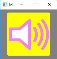
For example, let's define a button which image has:
- yellow
Background - black
Fill - red
Foreground

<Button Background="{Binding Path=(lib:VisBg.BrushValue),
Mode=OneWay, RelativeSource={RelativeSource Self}}"
  Style="{StaticResource StyleButtonTransparent}"
  Margin="10"
  Width="{Binding Path=ActualHeight,
  RelativeSource={RelativeSource Self}}" VerticalAlignment="Stretch"
  lib:VisBg.ResourceKey="Speaker"
  lib:VisBg.Background="Yellow"
  lib:VisBg.Foreground="Red"
  lib:VisBg.Fill="Black" />
(Notice the brackets around a Path to the attached property in Binding.)
Now, let's define a style, where the Foreground and Fill colors of the image (not the button itself!) change when the button is pressed. Since we do not use the actual Foreground and BorderBrush properties of the Button, we can utilize those too (Button.Foreground for pressedCanvasImage.Fill, and Button.BorderBrush for pressedCanvasImage.Foreground). This way, our Yellow-Black-Red button can change to Yellow-Violet-White when pressed:
<Style x:Key="StyleButtonTransparentPressed" TargetType="{x:Type Button}">
  <Setter Property ="FocusVisualStyle" Value="{x:Null}"/>
  <Setter Property ="Template">
  <Setter.Value>
    <ControlTemplate TargetType="Button">
      <Border CornerRadius="5"
              BorderBrush="{TemplateBinding BorderBrush}"
              BorderThickness="{TemplateBinding BorderThickness}"
              Background="{Binding Path=(local:VisBg.BrushValue),
              Mode=OneWay, RelativeSource={RelativeSource TemplatedParent}}">
      <Border.Style>
      <Style TargetType="Border">
          <Setter Property="local:VisBg.Foreground"
          Value="{Binding RelativeSource={RelativeSource TemplatedParent},
          Path=(local:VisBg.Foreground)}"/>
          <Setter Property="local:VisBg.Fill"
          Value="{Binding RelativeSource={RelativeSource TemplatedParent},
          Path=(local:VisBg.Fill)}"/>
          <Setter Property="local:VisBg.Opacity"
          Value="{Binding RelativeSource={RelativeSource TemplatedParent},
          Path=(local:VisBg.Opacity)}"/>
          <Setter Property="local:VisBg.Background"
          Value="{Binding RelativeSource={RelativeSource TemplatedParent},
          Path=(local:VisBg.Background)}"/>
         <Style.Triggers>
          <DataTrigger Binding="{Binding Path=IsPressed,
          RelativeSource={RelativeSource TemplatedParent}}" Value="True">
            <Setter Property="local:VisBg.Foreground"
            Value="{Binding RelativeSource={RelativeSource TemplatedParent},
            Path=BorderBrush}" />
            <Setter Property="local:VisBg.Fill"
            Value="{Binding RelativeSource={RelativeSource TemplatedParent},
            Path=Foreground}" />
          </DataTrigger>
         </Style.Triggers>
       </Style>
       </Border.Style>
     </Border>
    </ControlTemplate>
  </Setter.Value>
  </Setter>
</Style>
<Button Background="{Binding Path=(lib:VisBg.BrushValue),
Mode=OneWay, RelativeSource={RelativeSource Self}}"
  Style="{StaticResource StyleButtonTransparentPressed}"
  Margin="10"
  Width="{Binding Path=ActualHeight,
  RelativeSource={RelativeSource Self}}" VerticalAlignment="Stretch"
  Foreground="White"
  BorderBrush="Violet"
  BorderThickness="0"
  lib:VisBg.ResourceKey="Speaker"
  lib:VisBg.Background="Yellow"
  lib:VisBg.Foreground="Red"
  lib:VisBg.Fill="Black" />
Now, let's also make it so the image's Background will change to its Fill color when mouse is over the button. When we are doing that, why not add an Opacity animation too that starts when the Button is pressed?

<Button Background="{Binding Path=(lib:VisBg.BrushValue),
Mode=OneWay, RelativeSource={RelativeSource Self}}"
  Width="{Binding Path=ActualHeight,
  RelativeSource={RelativeSource Self}}" VerticalAlignment="Stretch"
  Foreground="White"
  BorderBrush="Violet"
  BorderThickness="0"
  Margin="10"
  lib:VisBg.ResourceKey="Speaker"
  lib:VisBg.Foreground="Red"
  lib:VisBg.Fill="Black" >
  <Button.Style>
  <Style TargetType="Button"
  BasedOn="{StaticResource StyleButtonTransparentPressed}" >
  <Setter Property="lib:VisBg.Background" Value="Yellow"/>
  <Style.Triggers>
  <Trigger Property="IsMouseOver"
  Value="True">
  <Setter Property="lib:VisBg.Background"
  Value="{Binding Path=(lib:VisBg.Fill), RelativeSource={RelativeSource Self}}"/>
  </Trigger>
  </Style.Triggers>
  </Style>
  </Button.Style>
  <Button.Triggers>
  <EventTrigger RoutedEvent="Button.Click">
  <BeginStoryboard>
  <Storyboard>
  <DoubleAnimation Storyboard.TargetProperty="(lib:VisBg.Opacity)"
  From="1"
  To="0.3"
  Duration="0:0:2"
  AutoReverse="True"
  RepeatBehavior="2x"/>
  </Storyboard>
  </BeginStoryboard>
  </EventTrigger>
  </Button.Triggers>
  </Button>
... and we can modify the Canvas so only the image proper changes Opacity and not its Background:
<Canvas x:Key="Canvas_Speaker" x:Shared="False"
Width="96" Height="96">
  <Path Data="F1 M 0,0 L 96,0 96,96 0,96 z" Fill="{Binding Background}" />
  <Path Data="F1 M 7.68,60.96 L 28,60.96 50.4,80.32 50.4,17.6 28.32,36.48 7.68,36.48 z"
  Fill="{Binding FillBrush}" Opacity="{Binding Opacity}"/>
  <Path Data="F1 M 7.68,60.96 L 28,60.96 50.4,80.32 50.4,17.6 28.32,36.48 7.68,36.48 z"
  Opacity="{Binding Opacity}"
  Stroke="{Binding Foreground}" StrokeThickness="6.4" StrokeLineJoin="Round" />
  <Path Data="F1 M 61.6,62.72 C 64,58.72 65.44,54.08 65.44,49.12 65.44,44 64,39.2 61.44,35.2"
  Stroke="{Binding Foreground}" StrokeThickness="6.4" StrokeLineJoin="Miter"

  Opacity="{Binding Opacity}"
  StrokeStartLineCap="Round" StrokeEndLineCap="Round" StrokeMiterLimit="4" />
  <Path Data="F1 M 70.4,26.24 C 75.2,32.64 77.92,40.48 77.92,49.12 77.92,
              57.44 75.2,65.28 70.56,71.68"
  Opacity="{Binding Opacity}"
  Stroke="{Binding Foreground}" StrokeThickness="6.4"
  StrokeLineJoin="Miter" StrokeStartLineCap="Round"
  StrokeEndLineCap="Round" StrokeMiterLimit="4" />
  <Path Data="F1 M 78.88,80 C 85.6,71.52 89.76,60.8 89.76,49.12 89.76,
              37.28 85.6,26.4 78.72,17.92"
  Opacity="{Binding Opacity}"
  Stroke="{Binding Foreground}" StrokeThickness="6.4"
  StrokeLineJoin="Miter" StrokeStartLineCap="Round"
  StrokeEndLineCap="Round" StrokeMiterLimit="4"
  Clip="M 65.28,4.48 L 96,4.48 96,93.6 65.28,93.6 z" />
</Canvas>
Points of Interest
You can set SnapsToDevicePixels and UseLayoutRounding for Canvas to "True", then the image will be crisper, but it will sometimes cause the parts of geometry to move strangely when resized. It is especially visible for smaller sizes, where one path moving 1 pixel away from another in the image makes a noticeable difference. I guess it depends on the image and if you'll want it to be resizable at runtime. It depends on what you can stomach better: blurry or not entirely accurate.
While Borders and Buttons defined and styled in the above manner show in the designer in Visual Studio 2010 .NET Framework 4.0, they do not in Visual Studio 2015 Community .NET Framework 4.5.2. The application runs without problems though and there are no warnings whatsoever. If someone has any idea as to why it is so and is willing to share, I would be grateful.
This member has not yet provided a Biography. Assume it's interesting and varied, and probably something to do with programming.


 General
  News
News  Suggestion
  Question
  Bug
Bug  Answer
  Joke
Joke  Praise
  Rant
Rant  Admin
Admin 


 Submit an article or tip

