Introduction
I'll try to explain how to build this simple panel control with styled and region-based editing, with ASP.NET 2.0 using existing controls. We will call it shSimplePanel.
.NET Framework 2.0 provided us with new controls and base classes for building custom controls. System.Web.UI.WebControls.CompositeControl provides the base class for building custom controls that implement INamingContainer and WebControl. System.Web.UI.WebControls.CompositeControlDesigner provides the base class for building a custom design-time editor with regions-based editing. When I wanted to build a custom control like this panel control, I didn't inherit from Panel because the behavior and look would be the same at the design-time: just a squared control. I wanted a custom control that enables drag and drop from the ToolBox and adding title text, title image, and content image.
shSimplePanel performs these tasks at design-time. Also, I have implemented a class for "Image On the Fly" to allow shSimplePanel to stretch the control image at run-time only. Although this class isn't complete, it is a good tool. At the end of this article, I have provided some references.
Background
When I decided to make this control, I searched the web for documents and code that might help me. Mohammed Mahmoud has written a WebTabControl with editable regions. It was a foundation for this simple control. I also got a little help from MSDN, it is an excellent reference about how to use regions at design-time. Also, this control is based on the techniques of Styled type, written in the book "Developing Microsoft ASP.NET Server Controls and Components." This is a control built from the Panel Web Control that implements title text, title image, content-background image, styles for title, and content and regions editing at design-time. The composite of shSimplePanel is built with three panels.

Using the code
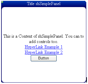
This custom control implements properties that IntelliSense of VS.NET 2005 uses at design-time. It is easy to use this control; just drag and drop it on the ASPX page.
<cc1:shSimplePanel ID="ShSimplePanel1" runat="server" Height="269px"
    TitleText="Title shSimplePanel">
    <ContentTemplate>
        This is a Content of shSimplePanel. You can to add controls too.<br />
        <asp:HyperLink ID="HyperLink1" runat="server"
            NavigateUrl="HypExample1.aspx" Width="225px">
            HyperLink Example 1</asp:HyperLink><br/>
        <asp:HyperLink ID="HyperLink2" runat="server"
            NavigateUrl="HypeExample2.aspx" Width="223px">
            HyperLink Example 2</asp:HyperLink><br/>
        <asp:Button ID="Button1" runat="server" Text="Button"
            Width="93px" OnClick="Button1_Click"/>
    </ContentTemplate>
</cc1:shSimplePanel>
Building the code
First, you need to create a WebControlLibrary Project from the Wizard of VS.NET 2005. After that, implement these references:
Next, implement this skeleton for shSimplePanel:
using System;
using System.Collections.Generic;
using System.ComponentModel;
using System.Text;
using System.Web;
using System.Web.UI;
using System.Web.UI.WebControls;
using System.Drawing;
using System.Collections;
using System.Web.UI.Design;
using System.Web.UI.Design.WebControls;
using System.Drawing.Design;
using System.ComponentModel.Design;

namespace shSimplePanel
{
    [ParseChildren(true)]
    [Designer(typeof(shSimplePanelControlDesigner))]
    [ToolboxData("<{0}:shSimplePanel runat="server"
        width=300px height=100px >")]
    [ToolboxBitmap(@"Please Put here some path of your
        ToolboxBitmap 16x16 pixeles")]
    public class shSimplePanel : CompositeControl
    {..the code..}
All composite custom controls implement similar skeletons. We will define the Designer metadata later. ParseChildren(true) indicates that all of the child controls will parse as properties. ToolboxBitmap allows addition of some bitmaps to our custom control. Now, we will implement our Panel control and the variables used in the control:
internal List<IAttributeAccessor> regions;
private csImageOnFly IOFTitle = new csImageOnFly();
private csImageOnFly IOFContent = new csImageOnFly();
private ITemplate _contentTemplate;
private Style _StyleTitle;
private Style _StyleContent;
private Panel cPanelMain;
private Panel cPanelTitle;
private Panel cPanelContent;
private Label cLabelTitle;
In this code, we define our Panel Web Control and our Label as LabelTitle. The internal List<IAttributeAccessor> regions variable defines our regions component. It is declared as internal because we will use it in the shSimplePanelControlDesigner class. This variable has an attribute IAttributeAccessor because it will indicate that we'll add the control to that List. Also defined is the csImageOnFly class, to enable stretching of the image for the title and content, both. The private ITemplate _contentTemplate is declared to enable a template to define an editable region. And finally, the Style for the title and content panels. Next, we will define the properties of this custom control:
#region Properties of shSimplePanel

        .... for see all properties see the code please

        #region public ITemplate ContentTemplate
        <Browsable(false)>
        [MergableProperty(false)]
        [DefaultValue(null)]
        [PersistenceMode(PersistenceMode.InnerProperty)]
        [TemplateContainer(typeof(shSimplePanel))]
        [TemplateInstance(TemplateInstance.Single)]
        public ITemplate ContentTemplate
        {
            get{return _contentTemplate;}
            set{_contentTemplate = value;}
        }
        #endregion

        .... for see all properties see the code please

#endregion Properties of shSimplePanel
These properties may be familiar to you; the only special one is ContentTemplate. I declared Browsable(false) so it doesn't show in the properties explorer of VS.NET. I defined a TemplateContainer(typeof(shSimplePanel)) attribute as the principal container of the child controls. Finally, TemplateInstance(TemplateInstance.Single) enables access to the child controls as-is. For example, a Button web control will be accessed as its NameID. Now, we override the protected CreateChildControls method to create our control and set the region as editable:
protected override void CreateChildControls()
{
  cLabelTitle = new Label();
  cPanelTitle = new Panel();
  cLabelContent = new Label();
  cPanelContent = new Panel();
  cPanelMain = new Panel();

  if (_contentTemplate != null)
  {
    _contentTemplate.InstantiateIn(cPanelContent);
  }

  cPanelMain.Controls.Add(cPanelTitle);
  cPanelMain.Controls.Add(cPanelContent);

  regions = new List<IAttributeAccessor>();
  regions.Add(cPanelContent);
  Controls.Add(cPanelMain);
}
Here, I built the skeleton of shSimplePanel, instanced the ContentTemplate with the editable panel, and finally added the regions at List<IAttributeAccessor>. The protected Render method will render the control on the page. Here is the code:
protected override void Render(HtmlTextWriter writer)
{
try
{
if (cPanelMain == null)
CreateChildControls();
cLabelTitle.Width = Width;
cLabelTitle.Text = TitleText;
cPanelTitle.Width = Width;
cPanelTitle.Height = TitleHeight;
cPanelTitle.Wrap = true;
if ((ImageTitle != null) && (ImageTitle.Length > 0))
{
string resStretch;
if (StretchImageTitle)
{
if (DesignMode)
{
cPanelTitle.BackImageUrl = ResolveClientUrl(ImageTitle);
}
else
{
IOFTitle.SourceFileName =
HttpContext.Current.Server.MapPath(ImageTitle);
resStretch =
IOFTitle.StartConvertTo(
Convert.ToInt32(cPanelTitle.Width.Value),
Convert.ToInt32(cPanelTitle.Height.Value), "_tempTitle");
if (resStretch != null)
cPanelTitle.BackImageUrl = "~/" +
resStretch.Substring(Page.Server.MapPath(
HttpContext.Request.ApplicationPath).Length+1);
else
{
cPanelTitle.BackImageUrl = ResolveClientUrl(ImageTitle);
writer.Write("IOFTitle Error: " + IOFTitle.ErrorDescription +
"<br >");
}
}
}
else
cPanelTitle.BackImageUrl = ResolveClientUrl(ImageTitle);
}
else
{
cPanelTitle.BackImageUrl = String.Empty;
}
cPanelTitle.Controls.Add(cLabelTitle);
if (_StyleTitle != null)
cPanelTitle.ApplyStyle(StyleTitle);
cPanelTitle.HorizontalAlign = HorizontalAlignTitle;
... The same technics is applied at Content Panel. See the code
}
catch (Exception e)
{
writer.Write("Render Error: <br >" + e.Message);
}
}
This code is simple and easy. First, ensure that all child controls are created with the CreateChildControls() method. Later, establish the same width at the panels. We ensure that an image is set and, if required, stretched. csImageOnFly is a simple class that creates a copy of the original image on the same path, but resized. To create the resized image, it needs the final width and height values, the original full path, and a text as postfix for the image created.
To get the full path of an image, I used the HttpContext.Current.Server.MapPath method. The problem with this class is that it always creates the image resized and does not permit auto-deletion. :-( Finally, this method returns the path of the new image created, or null if an error occurred. Afterwards, apply some properties and styles for the panel. The same techniques apply for the content panel. For this class, I used styles for the content and title panels. These are the properties:
#region Custom Styles
[
Category("Appearance"),
DefaultValue(null),
PersistenceMode(PersistenceMode.InnerProperty),
Description("PanelTitle Style"),
]
public virtual Style StyleTitle
{
    get
    {
        if (_StyleTitle == null)
        {
            _StyleTitle = new Style();
            if (IsTrackingViewState)
                ((IStateManager)_StyleTitle).TrackViewState();
        }
        return _StyleTitle;
    }
}
... for the title style see the code
#endregion
These properties are declarations for the user only. The jobs for the style are managed for the protected methods LoadViewState, SaveViewState, and TrackViewState. I will show how to do this:
#region Custom state management
protected override void LoadViewState(object savedState)
{
if (savedState == null)
{
base.LoadViewState(null);
return;
}
else
{
object[] myState = (object[])savedState;
if (myState.Length != 3)
{
throw new ArgumentException("Invalid view state");
}
base.LoadViewState(myState[0]);
((IStateManager)StyleTitle).LoadViewState(myState[1]);
((IStateManager)StyleContent).LoadViewState(myState[2]);
}
}
protected override object SaveViewState()
{
object[] myState = new object[3];
myState[0] = base.SaveViewState();
if (_StyleTitle != null)
myState[1] = ((IStateManager)_StyleTitle).SaveViewState();
if (_StyleContent != null)
myState[2] = ((IStateManager)_StyleContent).SaveViewState();
return myState;
}
protected override void TrackViewState()
{
base.TrackViewState();
if (_StyleTitle != null)
((IStateManager)_StyleTitle).TrackViewState();
if (_StyleContent != null)
((IStateManager)_StyleContent).TrackViewState();
}
#endregion
These techniques are implemented in the book "Developing Microsoft ASP.NET Server Controls and Components." Only save and load the styles that are saved in the State Manager. Check that it always saves in the position zero in base.SaveViewState().
The shSimplePanelControlDesigner class inherits CompositeControlDesigner to enable editable regions. First, we override the Initialize method:
public class shSimplePanelControlDesigner : CompositeControlDesigner
{
  private shSimplePanel _shSimplePanel;
  private int _currentRegion = -1;
  private int _nbRegions = 0;

  public override void Initialize(IComponent component)
  {
    _shSimplePanel = (shSimplePanel)component;
    base.Initialize(component);
    SetViewFlags(ViewFlags.DesignTimeHtmlRequiresLoadComplete, true);
    SetViewFlags(ViewFlags.TemplateEditing, true);
  }
...
}
Here, we get the component shSimplePanel and enables the design-time mode with SetViewFlags(ViewFlags.TemplateEditing, true);. Then, the CreateChildControls method is overridden to set the name properties of the regions:
protected override void CreateChildControls()
{
  base.CreateChildControls();
  if (_shSimplePanel.regions != null)
  {
    _nbRegions = _shSimplePanel.regions.Count;
    for (int i = 0; i < _nbRegions; i++)
    {
      _shSimplePanel.regions[i].SetAttribute(
          DesignerRegion.DesignerRegionAttributeName, i.ToString());
    }
  }
}
In this code, we get the regions of internal List of the shSimplePanel class and set the names. Then, we override the OnClick event to get the current selected region:
protected override void OnClick(DesignerRegionMouseEventArgs e)
{
  base.OnClick(e);
  _currentRegion = -1;
  if (e.Region != null)
  {
    for (int i = 0; i < _nbRegions; i++)
    {
      if (e.Region.Name == i.ToString())
      {
        _currentRegion = i;
        break;
      }
    }
    UpdateDesignTimeHtml();
  }
}
When the user makes a click on the content panel, OnClick is fired. Here, we will get the current region and update the design-time HTML. For that, we override the GetDesignTimeHtml method:
public override string GetDesignTimeHtml(DesignerRegionCollection regions)
{
  this.CreateChildControls();
  for (int i = 0; i < _nbRegions; i++)
  {
    DesignerRegion r;
    if (_currentRegion == i)
      r = new EditableDesignerRegion(this, i.ToString());
    else
      r = new DesignerRegion(this, i.ToString());
    regions.Add(r);
  }

  if ((_currentRegion >= 0) && (_currentRegion < _nbRegions))
    regions[_currentRegion].Highlight = true;
  return base.GetDesignTimeHtml(regions);
}
In this code, we set the designer editable region for the current region selected, and later, we only make a highlight at that region. When you override the property TemplateGroups...
public override TemplateGroupCollection TemplateGroups
{
  get
  {
    TemplateGroupCollection collection = new TemplateGroupCollection();
    TemplateGroup group = new TemplateGroup("ContentTemplate");
    TemplateDefinition definition = new TemplateDefinition(this,
        "ContentTemplate",  _shSimplePanel, "ContentTemplate", false);
    group.AddTemplateDefinition(definition);
    collection.Add(group);
    return collection;
  }
}
...you get a collection of region groups for editing at design-time, like the image shown:
Finally, override the GetEditableDesignerRegionContent and SetEditableDesignerRegionContent:
public override string GetEditableDesignerRegionContent(
    EditableDesignerRegion region)
{
  IDesignerHost host = (IDesignerHost)Component.Site.GetService(
      typeof(IDesignerHost));
  if (host != null)
  {
    ITemplate contentTemplate;
    if (_currentRegion == 0)
    {
      contentTemplate = _shSimplePanel.ContentTemplate;
      return ControlPersister.PersistTemplate(contentTemplate, host);
    }
  }
  return String.Empty;
}

public override void SetEditableDesignerRegionContent(
    EditableDesignerRegion region, string content)
{
  if (content == null)
    return;
  IDesignerHost host = (IDesignerHost)Component.Site.GetService(
      typeof(IDesignerHost));
  if (host != null)
  {
    ITemplate template = ControlParser.ParseTemplate(host, content);
    if (template != null)
    {
      if (_currentRegion == 0)
      {
        _shSimplePanel.ContentTemplate = template;
      }
    }
  }
}
With this method, we get the current template for editing at design-time, within ControlParser and ControlPersister.
Conclusion
There are so many documents that will help us in this topic. The book referred to and other articles are excellent for beginners in developing custom controls.
I hope this will be useful for you. If I have errors in my language or code, please accept my apologies, and please notify me. Thanks for this space and time.
History
- 22/05/2007 - Article edited and posted to the CodeProject.com article base.
- 09/11/2006 - ViewState in properties.
- At run time, the properties lose values because ViewState is not implemented. The private variables used in properties have been deleted.
I'm an electronics engineer since 2003 by ITTG from Chiapas, Mexico. I love programming with C++, C#, ASP.NET, VB, JAVA MIDLET and Microcontrollers, FPGA.


 General
  News
News  Suggestion
  Question
  Bug
Bug  Answer
  Joke
Joke  Praise
  Rant
Rant  Admin
Admin 


 Submit an article or tip


