Introduction
Before I begin, I just want to say that I do not consider myself to be an expert in usability testing, user interface design or just about any other area. I do, however, have some experience with these areas (both positive and negative), and I decided to write this article to share my experience with others. The concepts and ideas I discuss in this article are not earth-shattering and many of you will already know all of this information.
Also, I want to acknowledge my boss (that sounds very odd I know). I have learned from him a great deal concerning usability and "efficiency". Much of the information I cover in this article is knowledge I gained by working with him and watching how he works with users. I have managed to benefit from his help and knowledge and hopefully build on that knowledge.
If you ask just about any software developer how they define efficiency, they will tell you that it is a measure of how fast a function/algorithm/program performs and how few resources it uses. If you ask the average user what it means, they will tell you that it is a measure of how quickly they can do their jobs. These two definitions are not always compatible.
I titled this article "the myth of efficiency" because I feel that as a software developer I have been mislead. Just about all the books, programming journals, web sites, etc. that I have read have focused on efficiency from the programmer's perspective. I am not saying that this perspective is not important or even the right perspective for many problems, just that very often it is counter-productive and should not be the main focus.
Let me just say that I am a big fan of efficient algorithms and I like to see my code perform well. It is difficult to predict how a particular function/algorithm will be used in the future, and making the code efficient often expedites things in the future. Unfortunately, this has often been my primary focus. I have neglected the need the user has to get their job done in the most efficient manner possible. This has resulted in me optimizing the wrong algorithms. The key is not to be concerned with making all or a particular algorithm efficient, the key is to make the right algorithms efficient.
Where to Start
As I said in the introduction, the key to efficiency is making the right algorithms efficient. To do this, we need to understand how an application needs to be used by the user. (I say "needs to be" instead of "will be" because "will be" assumes we are going to decide for the user.) The only way I know to do this is to work with users before development begins and while development is in progress. The key to this is understanding the user's workflow.
User workflow is how the user performs their jobs in the absence of software. Most people have a basic job description which involves a certain number of responsibilities. They also may have a set of requirements related to accounting for their work. They usually have a set of tasks that they perform in repetitive fashion along with a few tasks they perform highly sporadically. In addition, there are typically a set of tasks that they only perform on a very rare occasion.
Many software applications fail to recognize that users already have a defined workflow process before the software was available, and basically try and force the user to alter their workflow to conform to the software. This may work when the software is a critical part of their jobs, but will probably result in decreased workflow efficiency and user dissatisfaction.
To develop a truly "efficient" application, it is necessary to speak with potential users about what they do and how they do it. This discussion is probably best done in the absence of software, prototypes, or screen shots. The user may be confused or misunderstand the software, and fail to provide the most valuable information. One place where software can help, though, is when there is an existing system in place you are going to replace. The user may be able to point out "what they like and dislike."
The goal is not to have the user develop the software for you, just to have them explain how they work. It is the developer's responsibility to convert this into software. With this information, it is possible to better design the application to meet the user's needs. It is also easier to decide what parts of the application need the most optimization and which ones are less important.
Case Studies
The best way I can think of to illustrate the problem and its solution is by using real-world examples.
Workshop management
A recent project I worked on involved replacing an MS Access database with an updated UI and reporting system. The old system had many "features" (I now refer to them as warts). One of the "warts" was a "workshop management system". I hesitate to call it "management system", but that was its intended purpose.
The system had three basic objects. These were workshops, members and registration records. There were basically just three forms in the system. One form was used for member data, one for workshop data, and the other form was used for registration records. Pretty simple and uncomplicated (technically). To navigate among the workshops, the user could use record navigation (i.e., First, Last, Next, Previous, Add, Delete) or a combo box located in the upper right-hand corner. From this screen, they could print a registration list, attendance roster, etc. Navigating members was basically the same, but instead of a combo box, there was a box where the user could enter a member ID and go to that record.
The next step was to ask the user how they did their job before they had the MS Access database. The user informed me that each time a new workshop was created, they would create a document in Word and make multiple copies of it for each date it occurred on. Then they would tack those sheets to a wall. When a person called or came by to register for a workshop, all they had to do was look at the wall to see what workshops were available and what the dates were. Then they just wrote the user's name, phone number and other info on the sheet and re-tacked it to the wall. A week before the workshop, they would take down the sheet and call each registered person to remind them of the workshop. On the day of the workshop, they took down the workshop and gave it to the presenter of that workshop to record attendance.
From this, it was obvious what their "natural workflow" was. It was also obvious that the MS Access database forced them to work differently. With the "sheets on the wall system", all of the needed information was right before their eyes and they did not need to know the person's member ID. The MS Access database forced the user to work in an unnatural workflow. To determine what workshops were available for a certain date/time, they had to navigate through multiple records on the workshop data form. Then once they found the workshop the person wanted to register for, they had to close the workshop form, search for the member ID (usually the person does not know their ID), and finally they had to open the registration form, find the right workshop, and register the user.
I have not attempted to scientifically calculate how much time was lost by using the MS Access database, but I believe it is clear that the cost was high. (In my work, I usually don't get concerned about statistical validity as much as user acceptance.)
My next step was to look around at off-the-shelf applications which were used to perform similar tasks. Many of them worked the same or worse than the one they already had. Some were better but not great. Then I looked at QuickBooks Pro 2000. Although the problems are different, the solutions cross over well. QuickBooks uses an HTML style interface with a few obvious components. (I just want to say that I think QuickBooks implementation is a little overwhelming. There is too much info on many of the screens.)
After playing with the design a little bit, I was able to come up with what I thought was a good start for a workflow solution. My UI solution was to provide the user with an HTML style interface broken down into four areas. (See the screen shot below:)
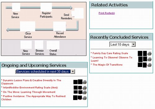
This UI was similar to the old "stick it on the wall" system because all of the information the user had to look for was placed right before their eyes, not hidden in multiple forms, and record navigation. The user can click on any upcoming workshop to access its data form (and from there they can register also). They can click on one of the icons beside the name to either register people for the workshop, cancel the workshop, or print a roster, reminders, etc.
This UI improved on the "stick it on the wall" system because the user could easily filter the information on the screen by the most important criteria (when it occurs). The graphic in the upper-left assists less experienced users by visually representing the workflow process and providing one-click access to the most commonly used functions. (The icons have been whitened out because they do not belong to me, sorry. It looks better with the icons.)
In the end, the users are pleased with this system and feel more productive because of its design. As you can see from this problem and its solution, the efficiency the system needed was not improved performance in the record navigators, improved search criteria, etc. By developing the system to work with the user's workflow, user efficiency is maximized.
Searching
In my first article, I discussed the "quick search" feature I developed for this project. I am now going to elaborate a little on this feature.
In this same database, the user often needed to search for a member in the database. (The database is fairly small, about 3000-4000 members.) Also, there are < 1000 organization names in this database. Users need to search for these also. Sometimes, the user needs to search by name (first, last), phone number, address, member ID, organization name, etc.
In the MS Access database, there were multiple forms for the various "types" of searches users performed. There was a form for searching for a member by name, another form for searching for facilities by name, and another for searching by name/address (1 each for members/facilities). Searching by phone number was not available even though the user often needed to do this.
One common approach to dealing with this problem is to present the user with one search form containing all the possible search fields. There would be two forms, one for members and one for organizations. The user could then enter the name, address, ID and phone number, and perform their search against one or all of the available criteria. From what I have seen, this is a pretty common user interface.
The problem with this approach is that most of the time the user does not have all of the information and is unsure, when first approaching the form, whether all of the fields are required to fulfill the search. Also, usually with this type of form, it is unclear to the user whether pressing ENTER on a search field will activate the search or if they need to click a "Search" button. Users tend to attempt to enter as much information as they know and this usually results in very poor search results due to misspellings, missing, incorrect or out-of-data data, etc. This can quickly result in users adding new members/organizations to the database even though they are already present. This is exactly what had happened in the MS Access database. Users could not find people in the DB so they just added them back into the system.
The other problem with this approach is that it forces the user to make a decision about what type of object they want to search for. Although this seems simple enough, this can reduce efficiency because the user just wants to find some record in the database, not navigate through the application's user interface.
The solution I devised for this problem was to provide a single search edit box located on a navigation bar docked to the left side of the screen. The edit box can also be placed on the toolbar when the navigation bar is not present. This search incorporated the "quick search" methodology I discussed in my first article. Basically, this one search control could be used to search for members or organizations and could search by name, address, phone number, ID #, etc. The control has some basic logic to determine what type of info the user enters (i.e., is this a phone number, ID #, text, etc.).
Then the control searches all reasonable columns and tables in the database for matches. The control also has some basic logic to deal with situations like "Mount Saint Hellens", "Mt. St. Hellens", "MT saint hellens", "MT st helens", etc. It also has logic to improve address searches by expanding or removing directional and numeric portions of addresses, street type indicators, etc.
Because the control is located on the navigation bar (and the app uses almost no modal dialogs), the user can perform a search from anywhere in the application quickly and easily. They do not have to decide what they are searching for, they don't have to worry about providing too much info or too little, and it does not interfere with what they currently have on the screen.
Also to deal with more advanced search requirements, two forms exist which the users can use to search members/facilities as described above. These forms are not used very much.
The result of this implementation is that most searches are fulfilled on the first attempt. This reduces database hits, user confusion, and duplicate data being put into the database. Users can do their jobs more efficiently and with less intrusions forced upon them by the software.
What to Expect
When designing software for user efficiency instead of computer efficiency, your skills of user experience design will be tested. You will need to look at other peoples' attempts at solutions, and you will need to experiment with different methods. You will also need to make a concerted effort to understand the user's natural workflow.
I expect failures and problems. The searching algorithm I described above took many iterations to get to where it is. I spent a tremendous amount of time optimizing this algorithm (not for speed) but for user experience. I played with numerous algorithms for expanding and reducing names, addresses, etc. It took me many iterations to achieve a workable algorithm and even now I am still tweaking it a bit.
The rewards of developing software which produces efficient users instead of efficient algorithms are many. These are just a few.
- Efficient users - Efficient users are usually happier users. They make better references and are easier to work with. They provide better feedback to management and this can lead to more work, pay raises, etc.
- Better applications - No one cares if the XYZ function of an app works amazingly quickly if the XYZ function only gets used once a year. I have spent countless hours optimizing code that barely ever gets used. This can be very frustrating when you reach the end of a project only to find that the user is struggling with the user-interface instead of waiting on XYZ function.
- Fewer bugs - Often, optimizing code introduces subtle bugs. Had a particular search been done as a simple linear search instead of a binary search, a serious bug could have been avoided. I am not saying not to optimize code, just optimize the most important ones the most.
- Reduced technical support calls - Because the software works the way the user works, users have an easier time learning how it works and what to do. They also tend to remember how to use it better also.
- Pride in your work - I find that making applications that are efficient for the users is just as rewarding as making a particular function/algorithm efficient.
- Competitive advantage - If your application is easier to use and works better with user's natural work-flow than your competitors', that is a great selling point. If your competition is already doing this, you are at least as good as they are.
This member has not yet provided a Biography. Assume it's interesting and varied, and probably something to do with programming.


 General
  News
News  Suggestion
  Question
  Bug
Bug  Answer
  Joke
Joke  Praise
  Rant
Rant  Admin
Admin 


