In this post, I will show you how you can extend the TileList and AlternatingCellRenderer QNX components to change the UI and add additional functionality.
Introduction
After I tried the available list components from QNX UI library for PlayBook development, my fist question was: how can I customize both the look and feel, and the functionality of these components?
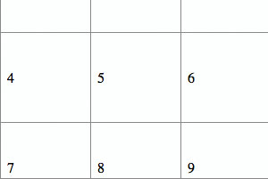
By default, a TileList looks like this:
You use the dataProvider property to set the data, and its default renderer (CellRenderer) expects the data to be an object that has a String property called label. And this property will be used to display the text for each tile. Your control can control the number of tiles by using the columnCount property, and you can set the width and the height of the tiles by using columnWidth and rowHeight properties. You use the cellPadding property to control the space between the tiles.
This is pretty cool. But what if you want to display more complex data? Let’s say you want to have a picture, label, and some graphic? Obviously, you’ll have to extend the default renderer to do this. Here is what I have in my mind:

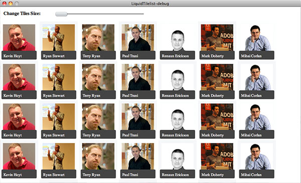
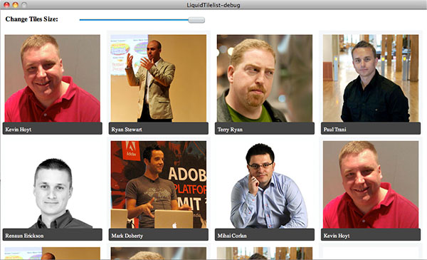
Second, I wanted the TileList to be able to calculate dynamically the number of columns that can be layout, depending on three input data: the width of the TileList, the cellPadding value, and the size of a tile. So, instead of hard coding the columnCount property when creating the component, I just set the size of the tiles (columnWidth and rowHeight) and the width of the TileList and based on these, the TileList will calculate how many columns can fit in the given width and sets the columnCount property accordingly. Here is an example (in the first picture, the tiles size is set to 130pixels, in the second one to 250pixels):
This means that I have to extend the TileList component to add this behavior. But, the first step is to create a custom CellRenderer so I can display the picture, label, and gray rounded square. Luckily, fellow evangelist, Renaun Erickson, created an example that was pretty close to what I needed.
Creating a Custom CellRenderer for the TileList
Renaun’s example is pretty closed to what I want to achieve. The reason I needed to modify it, was that I want a different arrangement of the components and, more importantly, I want to push the width and the height of the tiles from the TileList – I don’t want to have these values hard coded in the CellRenderer class.
Now, let’s step back and talk about the lifecycle of a CellRenderer component. The lists components use virtualization; this means that the list will create a limited number of CellRenderer components and reuse them as you scroll down and up the list. Every time an instance of the CellRenderer is reused, the TileList component will push the new data that needs to be displayed by that cell using the data property of the CellRenderer.
Next, every time you change the columnWidth/rowHeight properties, the TileList will loop through all the instances of the CellRender and call the setSize() method to push the new values.
Knowing this, it became quite clear what I need to do in order to create my custom CellRenderer: override the set data() and setSize() methods, and add the parts I needed (image, rectangle, label). Here is some of the code (for the complete code, go do Download section and get the project source):
public class PictureCellRenderer extends AlternatingCellRenderer {
protected var img:Image;
protected var lbl:Label;
protected var bg:Sprite;
protected var format:TextFormat;
public function PictureCellRenderer() {
super();
label.visible = false;
createUI();
}
override public function setSize(w:Number, h:Number):void {
super.setSize(w, h);
if (stage) {
layout();
}
}
override public function set data(value:Object):void {
super.data = value;
if (value) {
img.setImage(value.img);
lbl.text = value.label;
}
}
private function createUI():void {
img = new Image();
bg = new Sprite();
lbl = new Label();
addChild(img);
addChild(bg);
addChild(lbl);
}
private function drawBg():void {
}
private function layout():void {
lbl.y = height - 20;
lbl.width = width - 10;
drawBg();
onComplete(new Event(Event.COMPLETE));
}
private function onComplete(e:Event):void {
img.setSize(width - 20, height - 20);
}
}
Few notes on the code above:
- The components used to display the data (
Image, Sprite, and Label) are created inside the createUI() method called from the constructor – they are created only once. - When you load an image, you have to listen to the
Event.COMPLETE event if you want to set width and height to something different than the size of the image. - Every time the
setSize() method is called, the layout() function is executed; thus the Image, Sprite, and Label components are repositioned or resized to use the new width and height available. - In the constructor, I turn invisible the built-in label component of parent class. I tried to reuse it instead of creating a new label but I couldn’t find a method to change its position nor the format. I’m not sure if this is a bug or there is something wrong with my approach.
- I extended the
AlternatingCellRenderer instead of CellRender just to get different backgrounds for adjacent cells. The code should work as well if you extend the latter. - The data you pass to this render must be an object that has a
label property for the text and an img property for the Image URL (both must be Strings) - This renderer uses ImageCache in order to cache the images. Depending on your application, you must see how many images you should cache so you don’t use too much system memory.
Extending the TileList Component to Support Liquid Layout
With the custom CellRenderer in place, more than half of the work was done – or at least this is what I thought first :). So what was left to be implemented was the ability of the TileList to decide automatically how many columns fit in the given width and every time the width of the component or width of the tiles was changed, to recalculate the number of columns and update its layout. Having this behavior incorporated in my custom TileList means that:
- I don’t have to do anything when the display orientation changes – the
TileList will automatically change the number of columns to fit the new width and height - I can control the size of the tiles at runtime; for example, the user can zoom in or out using a slider
I had two options to get this behavior:
- Create a method that does all the math to determine the new
columnCount - Or to extend the
TileList component and build this behavior in the component itself
I chose the second option and before explaining how I did it, here is the LiquidTileList component code:
public class LiquidTileList extends TileList {
public var keepVisibleItem:Boolean;
public function LiquidTileList() {
super();
setSkin(PictureCellRenderer);
}
override protected function draw():void {
var i:int;
if (keepVisibleItem && firstVisibleItem)
i = firstVisibleItem.index;
scrollIndexVisible(0, 0);
calculateColumns();
super.draw();
if (keepVisibleItem && i)
scrollIndexVisible(i, 0);
}
private function calculateColumns():void {
var columnNumber:int = Math.floor( (width - (cellPadding * columnCount -1) )
/ columnWidth);
if (columnNumber != columnCount)
columnCount = columnNumber;
}
}
In the constructor, I set the PictureCellRenderer as the default skin. Next, I over wrote the draw() method. This method is called every time the width and height of the list is changed, or you change the tiles size (columnWidth, rowHeight); first I calculate the number of columns using the new sizes (by calling the calculateColumns() method) and then I call the parent draw() method to redo the layout using the new columnCount value.
If you wonder what’s the deal with the scrollIndexVisible() calls, well this was the hard part. I think there is a bug in the virtualization engine of the TileList because when I changed the size of the tiles, sometimes you end up with items missing or you can’t scroll anymore. So this is the only way I found to get around this issue. Second, I wanted to be keep in the view the first visible element. For example, suppose you have a large list and you scrolled a bit and then you decide to increase the size of the tiles three times. I think that the user would expect to see the first items of the previous view. So this is why I added a public property called keepVisibleItem.
In my tests, the component works fine after applying the scrollIndexVisible fix. However, if you want to change the tiles size using a slider and you apply the new values live (you apply the new values listening for SliderEvent.MOVE event), then it is better to set the keepVisibleItem to false.
And here is a snippet of code of how you can use this custom component:
peopleList = new LiquidTileList();
peopleList.keepVisibleItem = true;
peopleList.dataProvider = getPeople();
peopleList.scrollDirection = ScrollDirection.VERTICAL;
peopleList.size = 100;
peopleList.sizeUnit = SizeUnit.PERCENT;
peopleList.sizeMode = SizeMode.BOTH;
peopleList.columnCount = 5;
peopleList.columnWidth = 150;
peopleList.rowHeight = 150;
peopleList.cellPadding = 5;
peopleList.selectionMode = ListSelectionMode.SINGLE;
slider = new Slider();
slider.minimum = 130;
slider.maximum = 250;
slider.value = 150;
slider.addEventListener(SliderEvent.END, onSliderMove);
slider.addEventListener(SliderEvent.MOVE, onSliderMove);
...
private function onSliderMove(e:SliderEvent):void {
peopleList.columnWidth = e.value;
peopleList.rowHeight = e.value;
}
Download the Code
You can download the entire project from . Have a look at it, and drop a comment if you find bugs or you have a better idea. :)
History
- 18th April, 2011: Initial version
This member has not yet provided a Biography. Assume it's interesting and varied, and probably something to do with programming.


 General
  News
News  Suggestion
  Question
  Bug
Bug  Answer
  Joke
Joke  Praise
  Rant
Rant  Admin
Admin 


 Submit an article or tip

