Contents
Introduction
Controls in the Ribbon are grouped first into tabs, then into groups within each tab. In the first article,
we used the simplest kind of group, a group that holds just one button. This time, we'll look at more-complex groups
with varying numbers of controls. We'll also see how you control what happens to groups when the Ribbon's parent
window is resized.
The system requirements for building the sample code are Visual Studio 2008, WTL
8.0, and the Windows
7 SDK. If you are running Windows 7 or Server 2008 R2, you have everything you need. If you are using Vista
or Server 2008, you must install service pack 2 and the platform
update for your operating system to use the Ribbon.
This article assumes that you have knowledge of COM, and are familiar with the basics of using the Ribbon. See
my intro to the Ribbon article if you need a refresher on
how to use the Ribbon in your applications. (This article is Part 1.5 because the introductory Ribbon article was
a Win 7 Goodies article. I'm making Ribbon articles a separate series, but this isn't exactly part 1 or 2. Therefore,
part 1.5!)
Group Size Definitions
In the first article, we saw the SizeDefinition="OneButton" attribute in the <Group>
tag. I glossed over that attribute at the time, but now we'll look into what that attribute does.
Although there is separation between the contents and presentation of a group, the Ribbon still needs to know
how to lay out a group's controls. Buttons can be arranged in various ways and shown at different sizes. There
can also be several ways of laying out a group, based on the amount of available space. The set of rules that control
how a group is laid out at a given size is called a size definition.
There are many pre-defined size definitions for different numbers of buttons and sizes. Each size definition
has a name, such as "OneButton". MSDN has a list
of the pre-defined size definitions. In this article, we'll take a look at some of the pre-defined size definitions
for groups that contain only buttons. Other kinds of controls (such as galleries) will not be covered here.
Pre-Defined Group Sizes
Most of the pre-defined size definitions have multiple sizes. Some have Large and Medium
sizes, while others also have Small. The group's controls are laid out and resized according to the
rules in the size defintion.
Here is how a group with the FourButtons size defintion looks in all three sizes:
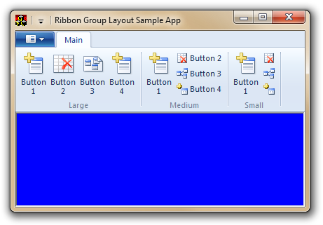
Notice that button labels can be hidden in some cases. This makes it important to have a good icon and tooltip
for each button, so the user can still tell what the button will do.
Controlling Group Sizes
Setting a Group's Ideal Size
Each group has an ideal size, which is the layout that you prefer the group to be in. As long as there
is enough space, all groups will appear at their ideal sizes. If the groups require more space, and the Ribbon
has not hidden itself due to the main window being too small, the Ribbon will show the current tab within a pager
control so the user can still access all the controls in the tab:

A group's ideal size defaults to the largest size in its size definition, but you can change that by specifying
a different size in the Ribbon XML. Group sizes are controlled through various tags contained in the <Tab.ScalingPolicy>
tag. Ideal sizes for groups are listed in a <ScalingPolicy.IdealSizes> tag. For example, here
is how to create the tab pictured above, with three groups that all use the FourButtons size definition,
but with different ideal sizes:
<Tab CommandName='tabMain'>
<Tab.ScalingPolicy>
<ScalingPolicy>
<ScalingPolicy.IdealSizes>
<Scale Group='group1' Size='Large' />
<Scale Group='group2' Size='Medium' />
<Scale Group='group3' Size='Small' />
<ScalingPolicy.IdealSizes>
</ScalingPolicy>
</Tab.ScalingPolicy>
</Tab>
Note that each tab has its own list of ideal sizes, so it's possible to have one group in two tabs and use different
ideal sizes for each instance of the group.
Resizing Groups
The Ribbon also supports resizing groups as the available space becomes smaller. A scaling policy is
a set of rules that the Ribbon will apply when there is insufficient space to show all groups at their ideal sizes.
A tab's scaling policy is written using <Scale> tags that are children of <ScalingPolicy>.
The order of these <Scale> tags is important; scaling rules are applied in the order that they
are written. The Ribbon will keep applying scaling rules until one of the following happens:
- There is enough space to show all groups using the scaling rules applied so far.
- All scaling rules have been applied, and there still isn't enough space to show all groups. When this happens,
the Ribbon shows the tab within a pager control.
- The Ribbon's parent window is so small that the Ribbon hides itself.
For example, here's a scaling policy that makes group1 change to Medium size, and
then Small size:
<Tab CommandName='tabMain'>
<Tab.ScalingPolicy>
<ScalingPolicy>
<ScalingPolicy.IdealSizes>
<ScalingPolicy.IdealSizes>
<Scale Group='group1' Size='Medium' />
<Scale Group='group1' Size='Small' />
</ScalingPolicy>
</Tab.ScalingPolicy>
</Tab>
And here's how the tab looks when it applies these rules:
Note that with this policy, group2 and group3 will not resize; the Ribbon does not
create any sizing rules on its own.
Within the set of scaling rules, there's a special Size value: Popup. This size reduces
the entire group to a button. When you click the button, the group is shown in a popup window:
Microsoft recommends that all groups have at least one scaling rule that shows the group as a popup, to avoid
scrolling.
Here's a full scaling policy definition for our sample tab:
<Tab CommandName='tabMain'>
<Tab.ScalingPolicy>
<ScalingPolicy>
<ScalingPolicy.IdealSizes>
<Scale Group='group1' Size='Large' />
<Scale Group='group2' Size='Medium' />
<Scale Group='group3' Size='Small' />
<ScalingPolicy.IdealSizes>
<Scale Group='group1' Size='Medium' />
<Scale Group='group1' Size='Small' />
<Scale Group='group2' Size='Small' />
<Scale Group='group3' Size='Popup' />
<Scale Group='group1' Size='Popup' />
<Scale Group='group2' Size='Popup' />
</ScalingPolicy>
</Tab.ScalingPolicy>
</Tab>
And here are the rules that the Ribbon applies as it decides how to lay out the groups:
group1 starts at Large size.
group2 starts at Medium size.
group3 starts at Small size.
group1 resizes to Medium.
group1 resizes to Small.
group2 resizes to Small.
group3 resizes to a Popup.
group1 resizes to a Popup.
group2 resizes to a Popup.
In general, large groups should resize first, and groups to the right of the tab should resize first. That will
keep the largest amount of controls visible, while avoiding scrolling. These are only guidelines, however; there's
nothing preventing you from resizing groups in a different order. (Indeed, in the example above, group1
resizes to a Popup before group2 does.) uicc does check that your resizing rules always
go from a larger size to a smaller size. If you don't follow that order, uicc will issue an error.
ControlGroups and Optional Controls
When you use a group that contains a large number of controls, you will sometimes need to use <ControlGroup>
tags in the group definition. <ControlGroup> serves two purposes: It tells the Ribbon which
controls should be grouped together, and it separates a block of required controls from a block of optional controls.
For example, the pre-defined size definition BigButtonsAndSmallButtonsOrInputs has a group of two
controls (both optional), followed by a group of three controls (with one optional). Here is how you would define
such a group, using all available controls:
<Group CommandName="grpBigAndSmallBtns"
       SizeDefinition="BigButtonsAndSmallButtonsOrInputs">
  <ControlGroup>
    <Button CommandName="cmdBtn1" />
    <Button CommandName="cmdBtn2" />
  </ControlGroup>
  <ControlGroup>
    <Button CommandName="cmdBtn3" />
    <Button CommandName="cmdBtn4" />
    <Button CommandName="cmdBtn5" />
  </ControlGroup>
</Group>
But if you wanted to use only the required controls, you would define it like this:
<Group CommandName="grpBigAndSmallBtns"
       SizeDefinition="BigButtonsAndSmallButtonsOrInputs">
  <ControlGroup />
  <ControlGroup>
    <Button CommandName="cmdBtn1" />
    <Button CommandName="cmdBtn2" />
  </ControlGroup>
</Group>
Notice that when a group contains no controls, you still need to write an empty <ControlGroup>
tag.
Here's how the group looks in both configurations:
<img
src="/KB/vista/NativeRibbon1point5/bigsmallbuttons2.png"="" width="354" height="321" align="BOTTOM" border="0">
It's not always clear from the docs which size definitions require <ControlGroup>. In fact,
as of this writing, the MSDN page doesn't say that <ControlGroup> tags are required when using
the BigButtonsAndSmallButtonsOrInputs size definition. If the group definition is missing a required
<ControlGroup>, or a <ControlGroup> tag contains the wrong number of controls,
uicc will issue an error. The error will indicate which tag is violating the schema, although sometimes it won't
give the exact rule, so you may need to experiment a bit with the XML until you find something that uicc will accept.
Other Factoids about Groups
A group is a command, and you can specify a tooltip and a small image in its <Command> tag.
Those attributes are used in two cases:
- When the group is added to the QAT. You can right-click the group's label and choose Add to Quick Access
Toolbar on the context menu to add the group to the QAT.
- When the group is reduced to a
Popup.
Icons that represent a group are drawn with an extra border. In the screen shot below, a group has been added
to the QAT. If a group doesn't have an icon, the result will be an empty square. This is another reason why it's
important to assign images to groups.
Even though you can specify a Keytip attribute in a group's <Command> tag, the
keytip is ignored. Groups that have been reduced to popups have keytips, but they are assigned by the Ribbon, as
shown here:
The Sample App
This article's sample app has three tabs that demonstrate various aspects of groups that were covered in the
article:
- No Resizing: This tab has three FourButtons groups, as described earlier. The groups do not resize.
- Resizable: This tab has the same groups, but also has a scaling policy that demonstrates how a real-world
app could handle group resizing.
- Larger Groups: This tab has four groups, with a larger number of controls, and a scaling policy. This
tab demonstrates how various kinds of groups look in all the sizes defined by their size definitions, and also
demonstrates a couple uses of the
<ControlGroup> tag.
You can experiment with the XML, using various size definitions and scaling policies, to get a better understanding
of how those properties affect the appearance of the Ribbon.
Conclusion
Now that we've seen how to set up controls and groups, we've covered the basics of getting an app up and running
with a Ribbon. Next time, we'll look at how to set Ribbon properties at runtime, which is essential to several
other features of the Ribbon.
Revision History
April 18, 2011: Article first published


 General
  News
News  Suggestion
  Question
  Bug
Bug  Answer
  Joke
Joke  Praise
  Rant
Rant  Admin
Admin 


 Submit an article or tip


