Introduction
For a WPF program I'm writing, I needed a simple control to select a SolidColorBrush from a collection. In fact, I needed multiple instances accessing different collections. The desired format was a ComboBox with the colours displayed as a grid when expanded. Given the requirements, I knew that some form of common control was required. As such, I decided to try both a Style and a UserControl. This article is a description of both approaches and a couple of usable implementations.
Using the Code
There are 4 relevant files:
- MainWindow.xaml - Contains the Style based approach and overall UI
- BrushSelUserControl.xaml - XAML element of the User Control
- BrushSelUserControl.xaml.cs - C# element of the User Control
- BrushesToList.cs - Converts
System.Windows.Media.Brushes to a collection of SolidColorBrush
Let's dive into MainWindow.xaml:
<Window x:Class="BrushSelector.MainWindow"
        xmlns="http://schemas.microsoft.com/winfx/2006/xaml/presentation"
        xmlns:x="http://schemas.microsoft.com/winfx/2006/xaml"
		xmlns:src="clr-namespace:BrushSelector"
        Title="MainWindow" Height="350" Width="525">
	<Window.Resources>
		<Style TargetType="ComboBox" x:Key="BrushSelector">
			<Setter Property="ItemsPanel">
				<Setter.Value>
					<ItemsPanelTemplate>
						<UniformGrid/>
					</ItemsPanelTemplate>
				</Setter.Value>
			</Setter>

			<Setter Property="ItemTemplate">
				<Setter.Value>
					<DataTemplate DataType=
						"{x:Type SolidColorBrush}">
						<Rectangle Width="18"
						Height="{Binding RelativeSource=
						{RelativeSource Mode=Self},
						Path=Width}" Margin="2"
						Fill="{Binding}"/>
					</DataTemplate>
				</Setter.Value>
			</Setter>
		</Style>

		<Style TargetType="ComboBox" x:Key="BrushesSelector"
			BasedOn="{StaticResource BrushSelector}">
			<Setter Property="ItemsSource"
			Value="{x:Static src:BrushesToList.Brushes}"/>
		</Style>

		<x:Array x:Key="SomeBrushes" Type="{x:Type SolidColorBrush}">
			<SolidColorBrush>Red</SolidColorBrush>
			<SolidColorBrush>Green</SolidColorBrush>
			<SolidColorBrush>Blue</SolidColorBrush>
		</x:Array>

	</Window.Resources>

	<Grid>
		<Grid.RowDefinitions>
			<RowDefinition Height="Auto"/>
			<RowDefinition Height="Auto"/>
			<RowDefinition Height="Auto"/>
		</Grid.RowDefinitions>
		<Grid.ColumnDefinitions>
			<ColumnDefinition Width="Auto"/>
			<ColumnDefinition Width="Auto"/>
			<ColumnDefinition Width="*"/>
		</Grid.ColumnDefinitions>
		<Label Grid.Column="0" Grid.Row="0"
		VerticalAlignment="Center">Any Brush Selector</Label>
		<ComboBox Grid.Column="1" Grid.Row="0" Name="RGBBrushSel"
		VerticalAlignment="Center" Style="{StaticResource BrushSelector}"
		ItemsSource="{StaticResource SomeBrushes}"  SelectedIndex="0"/>
		<Ellipse Grid.Column="2" Grid.Row="0" Width="120" Height="60"
		Fill="{Binding ElementName=RGBBrushSel, Path=SelectedItem}"/>

		<Label Grid.Column="0" Grid.Row="1"
		VerticalAlignment="Center">Brushes Selector</Label>
		<ComboBox Grid.Column="1" Grid.Row="1" Name="BrushSel"
		VerticalAlignment="Center" Style="{StaticResource BrushesSelector}"
		SelectedIndex="0"/>
		<Ellipse Grid.Column="2" Grid.Row="1" Margin="5" Width="120"
		Height="60" VerticalAlignment="Center"
		Fill="{Binding ElementName=BrushSel, Path=SelectedItem}"/>

		<Label Grid.Column="0" Grid.Row="2" VerticalAlignment="Center">
		User Control</Label>
		<src:BrushSelUserControl Grid.Column="1" Grid.Row="2"
		x:Name="UserCtrl" VerticalAlignment="Center" SelectedIndex="77"/>
		<Ellipse Grid.Column="2" Grid.Row="2" Margin="5" Width="120"
		Height="60" VerticalAlignment="Center"
		Fill="{Binding ElementName=UserCtrl, Path=SelectedItem}"/>
	</Grid>
</Window>
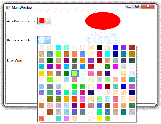
Firstly, skip to the end where the Grid is defined. This is a simple 3x3 grid. Each row contains a label describing the type of control being shown followed by the Brush Selector control itself finally followed by a 120x60 ellipse. The colour (well, the Brush to fill it with) is bound to the SelectedItem of the Brush Selector control.
Now didn't the Introduction mention a couple of mechanisms? It did, in which case why are there three controls? The answer is that the first two are style based with the second building on the first whereas the third is the actual User Control.
Style
The first approach was to create a Style. This is defined in the Windows.Resources section. It is a Style named (via the resource key) BrushSelector. As it has a name, it will not be applied automatically to the type it targets which is a ComboBox as specified by TargetType attribute. As such, it is hard to accidentally use this Style. Instead, it can only be used against a ComboBox and then only when the key is referenced directly. This can be seen by looking for the first ComboBox that is called RGBBrushSel. Unless the intention is to apply a Style generally then I think it's a good idea to design it so it can only be used explicitly.
As the need was to customize the display of the ComboBox the Style consists of two setters. One to change the Panel that the items are displayed in and secondly one to change the appearance of the actual items.
The former requires setting the ItemsPanelTemplate. This was simply set to a UniformGrid. The neat thing about this type of Panel is that it allocates rows and columns as appropriate in a manner that as its name suggests keeps the layout uniform. This is shown in the picture at the top.
Having specified the grid, the desire was for each colour to be shown as a small rectangle. This is achieved by creating a DataTemplate which is applied to the ItemTemplate attribute. This simply draws an 18x18 Rectangle. The neat thing here is that the Rectangle is filled with the currently selected brush. This is easily achieved by (data) binding to itself. The reason the binding declaration is so succinct, i.e.
Fill="{Binding}"
is that as the DataTemplate is typed to that of a SolidColorBrush this amounts to its data context and no path is specified because the data is a SolidColorBrush which is exactly the type that the FillProperty of the Rectangle requires. There is more to this magic though: this template is used both to display the items in the UniformGrid and also the SelectedItem, i.e. when the ComboBox is in its collapsed state.
In addition to specifying the Style in the definition of RGBBrushSel the ItemsSource property is also specified. This is the collection of SolidColorBrush that the control should display. As such, the Style is not tied to any particular collection of SolidColorBrush. This is important in order to allow multiple instances of ComboBoxes with this Style but showing different collections. In this case, the example makes use of an Array of SolidColorBrushes defined in Window's resource section that contains brushes for red, green & blue.
Style with a Set Collection
The early stages of development of the program that uses this control didn't yet contain the code that creates and manages the different collections of SolidColorBrush and as an interim measure just creating a collection out of the named brushes in System.Windows.Media.Brushes sufficed. Unfortunately, this class provides the brushes via individual static properties which return the appropriate instance of SolidColorBrush rather than a collection. This means it cannot be used with the ItemsSource parameter as in the previous example. The solution is to create a new class that just does that.
public static class BrushesToList
{
	public static IEnumerable<SolidColorBrush> Brushes { get; private set; }

	static BrushesToList()
	{
		List<SolidColorBrush> brushes = new List<SolidColorBrush>();

		foreach (PropertyInfo propInfo in typeof(System.Windows.Media.Brushes).
			GetProperties(BindingFlags.Public | BindingFlags.Static))
			if (propInfo.PropertyType == typeof(SolidColorBrush))
				brushes.Add((SolidColorBrush)propInfo.GetValue
				(null, null));

		Brushes = brushes;
	}
}
Reflection is used to find all the static and public property methods. It is then checked that these properties do in fact return an instance of SolidColorBrush. This being the case, they're added to a local list. So this only needs to be done once it's performed within the class's static constructor. The list is then assigned to a property that can only be accessed via an IEnunerable<SolidColorBrush></solidcolorbrush /> property so that any consumers can't modify the contents meaning it can be safely shared by any other code that requires this collection. The static constructor is invoked when the Brushes property is first referred too.
This is where this style differs from the first in that rather than having the ItemsSource attribute specified where the control is used, this Style pre-defines it. This is the only real difference. Rather than copy and paste the BrushSelector style XAML, the second example style named BrushesSelector builds on top the original style. This is akin to C++/C# inheritance. This is easily achieved with the pleasing simple XAML.
<Style TargetType="ComboBox" x:Key="BrushesSelector"
	BasedOn="{StaticResource BrushSelector}">
	<Setter Property="ItemsSource" Value="{x:Static src:BrushesToList.Brushes}"/>
</Style>
The BasedOn attribute basically states copy this existing Style and everything else is just additions and modifications to this. In this case, there's an additional Setter for ItemsSource which refers to the static property on the helper class. It is this that causes the static constructor to be run and the collection created and populated.
An example of this Style is shown in the middle control named BrushSel. Whereas the first example just showed red, green and blue rectangles in a simple 2x2 grid, this shows many more brushes in a 12x12 grid. This shows how useful the UniformGrid control is and that without any additional code, it scales to its contents - neat!
At this point, you might ask the question "What would happen if like in the first example the ItemsSource attribute were set on BrushSel?". It appears to override the value set by the Style. Interestingly, the behaviour varies slightly depending on whether the SelectedIndex attribute comes before or after it. If after, the ComboBox shows a red rectangle but if before no selected colour rectangle is displayed. When ordered this way, I suspect that initially the SelectedItem is applied to the value coming from the style but when this is replaced by that specified inline then the value of SelectedItem is reset to its default of -1.
User Control
The other approach tried was creating a User Control. Firstly let's take a look at the associated XAML. This amounts to nothing more than the same code that constituted the BrushSelector style but instead used as the content of the User Control. More than likely if the Style had been defined in the application's resource dictionary all that would have been required is to specify the ComboBox along with the Style key.
<UserControl x:Class="BrushSelector.BrushSelUserControl"
             xmlns="http://schemas.microsoft.com/winfx/2006/xaml/presentation"
             xmlns:x="http://schemas.microsoft.com/winfx/2006/xaml"
             xmlns:mc="http://schemas.openxmlformats.org/markup-compatibility/2006"
             xmlns:d="http://schemas.microsoft.com/expression/blend/2008"
			 xmlns:src="clr-namespace:BrushSelector"
             mc:Ignorable="d"
             d:DesignHeight="300" d:DesignWidth="300">
	<ComboBox ItemsSource="{x:Static src:BrushesToList.Brushes}">
		<ComboBox.ItemsPanel>
			<ItemsPanelTemplate>
				<UniformGrid/>
			</ItemsPanelTemplate>
		</ComboBox.ItemsPanel>
		<ComboBox.ItemTemplate>
			<DataTemplate DataType="{x:Type SolidColorBrush}">
				<Rectangle Width="18" Height="
				{Binding RelativeSource={RelativeSource Mode=Self},
				Path=Width}" Margin="2" Fill="{Binding}"/>
			</DataTemplate>
		</ComboBox.ItemTemplate>
	</ComboBox>
</UserControl>
The main difference is that this is actually defining a new class as shown in the excerpt below which is the definition of the class BrushSelUserControl in the BrushSelector namespace.
<UserControl x:Class="BrushSelector.BrushSelUserControl"
This takes us nicely to the code behind. This is a partial class as it's a continuation of the class defined in the XAML. The main aspects that this code deals with are enabling access to the SelectedIndex and SelectedItem properties of the ComboBox that are embedded as the content of the User Control. This is needed so that other controls can bind to the SelectedItem and set the initial value as in the example.
public partial class BrushSelUserControl : UserControl
{
public static readonly DependencyProperty SelectedIndexProperty;
public static readonly DependencyProperty SelectedItemProperty;

static BrushSelUserControl()
{
	SelectedIndexProperty = DependencyProperty.Register
		("SelectedIndex", typeof(int), typeof(BrushSelUserControl));
	SelectedItemProperty = DependencyProperty.Register
		("SelectedItem", typeof(SolidColorBrush), typeof(BrushSelUserControl));
}

public int SelectedIndex
{
	get { return (int)GetValue(SelectedIndexProperty);	}
	set { SetValue(SelectedIndexProperty, value);		}
}

public object SelectedItem
{
	get
	{
		return GetValue(SelectedItemProperty) as SolidColorBrush;
	}
	set { SetValue(SelectedItemProperty, value); }
}

public BrushSelUserControl()
{
	InitializeComponent();

	Binding selectedIndexBinding = new Binding("SelectedIndex");
	selectedIndexBinding.Source = Content;
	selectedIndexBinding.Mode = BindingMode.TwoWay;

	this.SetBinding(BrushSelUserControl.SelectedIndexProperty, selectedIndexBinding);

	Binding selectedItemBinding = new Binding("SelectedItem");
	selectedItemBinding.Source = Content;
	selectedItemBinding.Mode = BindingMode.TwoWay;

	this.SetBinding(BrushSelUserControl.SelectedItemProperty, selectedItemBinding);
}
This is achieved by defining two new Dependency Properties which have the same name and type as the properties in the ComboBox. They could have different names but that seems to make little sense given the intent of the properties. If the User Control was more specific, then this would be a better option. In order to keep them synchronized with the underlying Dependency Properties on the ComboBox, two-way bindings are established between each set of Dependency Properties. Without this, changes made to the ComboBox would not take effect in the Ellipse as the binding created by it targets the Dependency Property on the User Control not the ComobBox. The binding means when the underlying SelectedItem property changes this is synchronized to the same Dependency Property in the User Control which then notifies the Ellipse.
This may appear to be a lot of effort to go to in order to expose the properties of the underlying ComboBox (and I can't help agreeing that it is) and begs the question "Why not just use dotted notation from the main XAML to access them?". Firstly, it breaks encapsulation in that a consumer of a User Control shouldn't have to know what it's composed of and accessing the Content attribute is just plain messy. Secondly, it doesn't work completely:
<src:BrushSelUserControl Grid.Column="1" Grid.Row="2"
x:Name="UserCtrl" VerticalAlignment="Center" Content.SelectedIndex="77"/>
<Ellipse Grid.Column="2" Grid.Row="2" Margin="5" Width="120" Height="60"
VerticalAlignment="Center" Fill="{Binding ElementName=UserCtrl,
		Path=Content.SelectedItem}"/>
The binding on the second line is ok as when specifying a binding path this is not checked until runtime (I assume via reflection) where in the first line the use of Content.SelectedIndex="77" (the underlined section above) fails to compile. This is because only Dependency Properties can be set and even though this maps to a Dependency Property, it is not known at compile time. I suspect that this could be replaced by a binding to a static instance of int set to 77 and it would work. For a more indepth look at Dependency Properties and how to access them from User Controls, please take a look at this article that I wrote as an investigation into this very issue.
Conclusion
The first thing I learnt is don't use User Controls for simple customization especially if Dependency Properties are involved. Given that WPF programming is heavily data-binding based especially when using MVVM, this is inevitable. If the control being created is truly unique with its own set of Dependency Properties (even if some are mirrored) then using a User Control is probably correct but if it's simple customization that's required then styling is far simpler. Whilst a User Control would seem the perfect vehicle when multiple instances are required, the styling support in WPF makes this a doddle too.
References
History
- 17th July, 2011: Initial version


 Submit an article or tip