In the conclusion to our series on building a scrollable and zoomable image viewer, we'll add support for zooming, auto centering, size to fit and some display optimizations and enhancements.

Getting Started
Unlike parts 2 and 3, we're actually adding quite a lot of new functionality, some of it more complicated than others.
First, we're going to remove the ShowGrid property. This originally was a simple on/off flag, but we want more control this time.
We've also got a number of new properties and backing events to add:
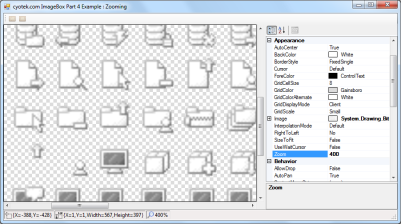
AutoCenter - Controls if the image is automatically centered in the display area if the image isn't scrolled.SizeToFit - if this property is set, the image will automatically zoom to the maximum size for displaying the entire image.GridDisplayMode - This property, which replaces ShowGrid will determine how the background grid is to be drawn.InterpolationMode - Determines how the zoomed image will be rendered.Zoom - Allows you to specify the zoom level.ZoomIncrement - Specifies how much the zoom is increased or decreased using the scroll wheel.ZoomFactor - This protected property returns the current zoom as used internally for scalling.ScaledImageWidth and ScaledImageHeight - These protected properties return the size of the image adjusted for the current zoom.
Usually the properties are simple assignments, which compare the values before assignment and raise an event. The zoom property is slightly different as it will ensure that the new value fits within a given range before setting it.
private static readonly int MinZoom = 10;
private static readonly int MaxZoom = 3500;

[DefaultValue(100), Category("Appearance")]
public int Zoom
{
  get { return _zoom; }
  set
  {
    if (value < ImageBox.MinZoom)
      value = ImageBox.MinZoom;
    else if (value > ImageBox.MaxZoom)
      value = ImageBox.MaxZoom;

    if (_zoom != value)
    {
      _zoom = value;
      this.OnZoomChanged(EventArgs.Empty);
    }
  }
}
Using the MinZoom and MaxZoom constants, we are specifying a minimum value of 10% and a maximum of 3500%. The values you assign are more or less down to your own personal preferences - I don't have any indications of what a "best" maximum value would be.
Setting the SizeToFit property should disable the AutoPan property and vice versa.
Layout Updates
Several parts of the component work from the image size, however as these now need to account for any zoom level, all such calls now use the ScaledImageWidth and ScaledImageHeight properties.
protected virtual int ScaledImageHeight
{ get { return this.Image != null ? (int)(this.Image.Size.Height * this.ZoomFactor) : 0; } }

protected virtual int ScaledImageWidth
{ get { return this.Image != null ? (int)(this.Image.Size.Width * this.ZoomFactor) : 0; } }

protected virtual double ZoomFactor
{ get { return (double)this.Zoom / 100; } }
The AdjustLayout method which determines the appropriate course of action when certain properties are changed has been updated to support the size to fit functionality by calling the new ZoomToFit method.
protected virtual void AdjustLayout()
{
  if (this.AutoSize)
    this.AdjustSize();
  else if (this.SizeToFit)
    this.ZoomToFit();
  else if (this.AutoScroll)
    this.AdjustViewPort();
  this.Invalidate();
}

public virtual void ZoomToFit()
{
  if (this.Image != null)
  {
    Rectangle innerRectangle;
    double zoom;
    double aspectRatio;

    this.AutoScrollMinSize = Size.Empty;

    innerRectangle = this.GetInsideViewPort(true);

    if (this.Image.Width > this.Image.Height)
    {
      aspectRatio = ((double)innerRectangle.Width) / ((double)this.Image.Width);
      zoom = aspectRatio * 100.0;

      if (innerRectangle.Height < ((this.Image.Height * zoom) / 100.0))
      {
        aspectRatio = ((double)innerRectangle.Height) / ((double)this.Image.Height);
        zoom = aspectRatio * 100.0;
      }
    }
    else
    {
      aspectRatio = ((double)innerRectangle.Height) / ((double)this.Image.Height);
      zoom = aspectRatio * 100.0;

      if (innerRectangle.Width < ((this.Image.Width * zoom) / 100.0))
      {
        aspectRatio = ((double)innerRectangle.Width) / ((double)this.Image.Width);
        zoom = aspectRatio * 100.0;
      }
    }

    this.Zoom = (int)Math.Round(Math.Floor(zoom));
  }
}
Due to the additional complexity in positioning and sizing, we're also adding functions to return the different regions in use by the control.
GetImageViewPort - Returns a rectangle representing the size of the drawn image.GetInsideViewPort - Returns a rectangle representing the client area of the control, offset by the current border style, and optionally padding.GetSourceImageRegion - Returns a rectangle representing the area of the source image that will be drawn onto the control.
The sample project has been updated to be able to display the results of the GetImageViewPort and GetSourceImageRegion functions.
public virtual Rectangle GetImageViewPort()
{
  Rectangle viewPort;

  if (this.Image != null)
  {
    Rectangle innerRectangle;
    Point offset;

    innerRectangle = this.GetInsideViewPort();

    if (this.AutoCenter)
    {
      int x;
      int y;

      x = !this.HScroll ? (innerRectangle.Width -
                          (this.ScaledImageWidth + this.Padding.Horizontal)) / 2 : 0;
      y = !this.VScroll ? (innerRectangle.Height - (this.ScaledImageHeight +
                           this.Padding.Vertical)) / 2 : 0;

      offset = new Point(x, y);
    }
    else
      offset = Point.Empty;

      viewPort = new Rectangle(offset.X + innerRectangle.Left + this.Padding.Left, offset.Y +
                 innerRectangle.Top + this.Padding.Top, innerRectangle.Width -
                 (this.Padding.Horizontal + (offset.X * 2)), innerRectangle.Height -
                 (this.Padding.Vertical + (offset.Y * 2)));
  }
  else
    viewPort = Rectangle.Empty;

  return viewPort;
}

public Rectangle GetInsideViewPort()
{
  return this.GetInsideViewPort(false);
}

public virtual Rectangle GetInsideViewPort(bool includePadding)
{
  int left;
  int top;
  int width;
  int height;
  int borderOffset;

  borderOffset = this.GetBorderOffset();
  left = borderOffset;
  top = borderOffset;
  width = this.ClientSize.Width - (borderOffset * 2);
  height = this.ClientSize.Height - (borderOffset * 2);

  if (includePadding)
  {
    left += this.Padding.Left;
    top += this.Padding.Top;
    width -= this.Padding.Horizontal;
    height -= this.Padding.Vertical;
  }

  return new Rectangle(left, top, width, height);
}

public virtual Rectangle GetSourceImageRegion()
{
  int sourceLeft;
  int sourceTop;
  int sourceWidth;
  int sourceHeight;
  Rectangle viewPort;
  Rectangle region;

  if (this.Image != null)
  {
    viewPort = this.GetImageViewPort();
    sourceLeft = (int)(-this.AutoScrollPosition.X / this.ZoomFactor);
    sourceTop = (int)(-this.AutoScrollPosition.Y / this.ZoomFactor);
    sourceWidth = (int)(viewPort.Width / this.ZoomFactor);
    sourceHeight = (int)(viewPort.Height / this.ZoomFactor);

    region = new Rectangle(sourceLeft, sourceTop, sourceWidth, sourceHeight);
  }
  else
    region = Rectangle.Empty;

  return region;
}
Drawing the Control
As with the previous versions, the control is drawn by overriding OnPaint, this time we are not using clip regions or drawing the entire image even if only a portion of it is visible.
switch (this.BorderStyle)
{
case BorderStyle.FixedSingle:
ControlPaint.DrawBorder
(e.Graphics, this.ClientRectangle, this.ForeColor, ButtonBorderStyle.Solid);
break;
case BorderStyle.Fixed3D:
ControlPaint.DrawBorder3D(e.Graphics, this.ClientRectangle, Border3DStyle.Sunken);
break;
}
Depending on the value of the GridDisplayMode property, the background tile grid will either not be displayed, will be displayed to fill the client area of the control, or new for this update, to only fill the area behind the image. The remainder of the control is filled with the background color.
Rectangle innerRectangle;
innerRectangle = this.GetInsideViewPort();
using (SolidBrush brush = new SolidBrush(this.BackColor))
e.Graphics.FillRectangle(brush, innerRectangle);
if (_texture != null && this.GridDisplayMode != ImageBoxGridDisplayMode.None)
{
switch (this.GridDisplayMode)
{
case ImageBoxGridDisplayMode.Image:
Rectangle fillRectangle;
fillRectangle = this.GetImageViewPort();
e.Graphics.FillRectangle(_texture, fillRectangle);
if (!fillRectangle.Equals(innerRectangle))
{
fillRectangle.Inflate(1, 1);
ControlPaint.DrawBorder(e.Graphics, fillRectangle, this.ForeColor, ButtonBorderStyle.Solid);
}
break;
case ImageBoxGridDisplayMode.Client:
e.Graphics.FillRectangle(_texture, innerRectangle);
break;
}
}
Previous versions of the control drew the entire image using the DrawImageUnscaled method of the Graphics object. In this final version, we're going to be a little more intelligent and only draw the visible area, removing the need for the previous clip region. The InterpolationMode is used to determine how the image is drawn when it is zoomed in or out.
g.InterpolationMode = this.InterpolationMode;
g.DrawImage(this.Image, this.GetImageViewPort(), this.GetSourceImageRegion(), GraphicsUnit.Pixel);
Zooming Support
With the control now all set up and fully supporting zoom, it's time to allow the end user to be able to change the zoom.
The first step is to disable the ability to double click the control, by modifying the control styles in the constructor.
this.SetStyle(ControlStyles.StandardDoubleClick, false);
We're going to allow the zoom to be changed two ways - by either scrolling the mouse wheel, or left/right clicking the control.
By overriding OnMouseWheel, we can be notified when the user spins the wheel, and in which direction. We then adjust the zoom using the value of the ZoomIncrement property. If a modifier key such as Shift or Control is pressed, then we'll modify the zoom by five times the increment.
protected override void OnMouseWheel(MouseEventArgs e)
{
  if (!this.SizeToFit)
  {
    int increment;

    if (Control.ModifierKeys == Keys.None)
      increment = this.ZoomIncrement;
    else
      increment = this.ZoomIncrement * 5;

    if (e.Delta < 0)
      increment = -increment;

    this.Zoom += increment;
  }
}
Normally, whenever we override a method, we always call its base implementation. However, in this case, we will not; the ScrollbableControl that we inherit from uses the mouse wheel to scroll the viewport and there doesn't seem to be a way to disable this undesirable behaviour.
As we also want to allow the user to be able to click the control with the left mouse button to zoom in, and either the right mouse button or left button holding a modifier key to zoom out, we'll also override OnMouseClick.
protected override void OnMouseClick(MouseEventArgs e)
{
  if (!this.IsPanning && !this.SizeToFit)
  {
    if (e.Button == MouseButtons.Left && Control.ModifierKeys == Keys.None)
    {
      if (this.Zoom >= 100)
        this.Zoom = (int)Math.Round((double)(this.Zoom + 100) / 100) * 100;
      else if (this.Zoom >= 75)
        this.Zoom = 100;
      else
        this.Zoom = (int)(this.Zoom / 0.75F);
    }
    else if (e.Button == MouseButtons.Right ||
            (e.Button == MouseButtons.Left && Control.ModifierKeys != Keys.None))
    {
      if (this.Zoom > 100 && this.Zoom <= 125)
        this.Zoom = 100;
      else if (this.Zoom > 100)
        this.Zoom = (int)Math.Round((double)(this.Zoom - 100) / 100) * 100;
      else
        this.Zoom = (int)(this.Zoom * 0.75F);
    }
  }

  base.OnMouseClick(e);
}
Unlike with the mouse wheel and its fixed increment, we want to use a different approach with clicking. If zooming out and the percentage is more than 100, then the zoom level will be set to the current zoom level + 100, but rounded to the nearest 100, and the same in reserve for zooming in.
If the current zoom is less than 100, then the new value will +- 75% of the current zoom, or reset to 100 if the new value falls between 75 and 125.
This results in a nicer zoom experience than just using a fixed value.
Sample Project
You can download the final sample project from the link at the top of this post.
What's Next?
One of the really annoying issues with this control that has plagued me during writing this series is scrolling the component. During scrolling, there is an annoying flicker as the original contents are moved, then the new contents are drawn. At present, I don't have a solution for this, I've tried overriding various WM_* messages but without success. A future update to this component will either fix this issue, or do its own scrollbar support without inheriting from ScrollableControl, although I'd like to avoid this latter solution.
If anyone knows of a solution, please let us know!
Another enhancement would be intelligent use of the interpolation mode. Currently, the control uses a fixed value, but some values are better when zoomed in, and some better when zoomed out. The ability for the control to automatically select the most appropriate mode would be useful.
Other Articles in this Series
This member has not yet provided a Biography. Assume it's interesting and varied, and probably something to do with programming.


 Submit an article or tip