Introduction
In this article, we will discuss a common problem for people using SSRS 2005. The software doesn't explicitly allow users to define the starting angle for their pie charts, which, in the opinion of many charting experts, has a hard-coded default that is not optimal. In this article, I will show you how you can use some simple functionality provided in the UI to solve this problem.
Background
This article will be useful for people familiar with how to build a report in SSRS manually. So, if you do not have experience working with SSRS, this article is not for you.
Pie charts are ubiquitous in reporting applications because they are easily understood, and give an extra bit of flair to any report. While I do not advocate going overboard and using pie charts for every report you make, they can be useful and make your report more pleasing to the eye. The book 'Say it with Charts' by Gene Zelazny recommends putting the most significant pie slice first, and to start the slices of the pie at 12:00. The default setting for pie charts in SSRS 2005 is to start at 3:00, which makes for pie charts that are unusual in appearance and difficult to read.
Using the code
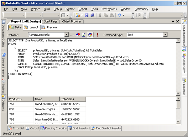
The first thing you want to do is to create a new SSRS reporting project, and add a new report to it without using the wizard. Next, create a data set and set up a connection to the AdventureWorks sample database that is available from CodePlex. Set the command type to 'text' because you will be writing a query in SQL and not using a Stored Procedure. Copy the following code into the query window, as shown below:
SELECT TOP 10 a.ProductID, a.Name, a.TotalSales
FROM
    (
        SELECT p.ProductID, p.Name, SUM(soh.TotalDue) AS TotalSales
        FROM Production.Product p WITH(NOLOCK)
        JOIN Sales.SalesOrderDetail sod WITH(NOLOCK) ON
             sod.ProductID = p.ProductID
        JOIN Sales.SalesOrderHeader soh WITH(NOLOCK) ON
             soh.SalesOrderID = sod.SalesOrderID
        WHERE CONVERT(DATETIME, CONVERT(VARCHAR, soh.OrderDate, 101))
              BETWEEN @StartDate AND @EndDate
        GROUP BY p.ProductID, p.Name
    ) a
ORDER BY NewID()
Next, go to the 'Layout' tab and drag on a chart from the Toolbox sidebar. Right click the chart and go to Properties. Select 'Pie chart' from the 'Chart Type' list. Your dialog should look like this:

Now, select 'Pastel' from the 'Palette' drop down box (this will make it so that you can read the values that are in each slice of the pie). Click OK.
From the Datasets sidebar, drag the TotalSales value over the chart, and drop it onto the area that says 'Drop data fields here'. Next, drag the Name value from the Datasets sidebar into the area on the chart that says 'Drop category fields here'.
Once that is finished, right click on the chart and click Properties. Go to the 'Data' tab in the 'Chart Properties' dialog and click 'Edit' next to the 'Values' listing. Once that dialog loads up, click on 'Point Labels', and fill it in so that it looks like this:
This will make it so that we show the percentages of each wedge in the pie chart within the slice (rounding to the nearest whole number). Click OK.
On the Chart Properties dialog, go to the 3D Effect tab, and set it up to look like this:
Basically, we are telling SSRS to make a chart that looks flat, but has been rotated 90 degrees counter-clockwise, which makes our pie chart start at 12:00 instead of 3:00. As long as you tell it to not use any shading tricks and make it orthographic, it should look like a normal pie chart (not a 3D one).
A Few Final Touches
Go to the Legend tab and make it look like this:
And, go to the Data tab, and click Edit next to the Category fields. Now, go to the Sorting tab, click the first box in the grid, and select 'Fields!TotalSales.Value' from the drop down. Next, change the sorting order to descending on the same row in the grid. This will ensure that your chart starts with the most significant slice at 12:00.
Points of Interest
It's kind of funny that they decided to start the pie chart at 3:00, but my guess is that it was just a simple oversight, not something that was intentionally done. That said, I am glad there is a way, however inelegant, to adjust it.
History
- Initial revision of article submitted.
This member has not yet provided a Biography. Assume it's interesting and varied, and probably something to do with programming.


 General
  News
News  Suggestion
  Question
  Bug
Bug  Answer
  Joke
Joke  Praise
  Rant
Rant  Admin
Admin 


