Introduction
The dropdown window, as a lightweight alternative of dialog box, is widely used in many kinds of software applications. The Popup class is a UI container that can hold any UI elements and can be popped up in another UI container. This article shows you how to use the Popup class to create your own dropdown window.
Background
Functionally, the Popup is a lightweight alternative of the modal or modeless dialog box. Probably the most well-known example of the Popup is the ComboBox, aka dropdown. If you use the Expression Blend to examine the ComboBox, you can find it consists of a ToggleButton and a Popup hosting an ItemsPresenter. You can certainly replace the ItemsPresenter to something else so that you can customize the ComboBox. And you can create your own dropdown-like Popup to host any UI elements.
Using the Code
This article shows you:
- How to toggle the open/close of the
Popup; - How to position the container window;
- How to host a User Control;
- How to bind the data.
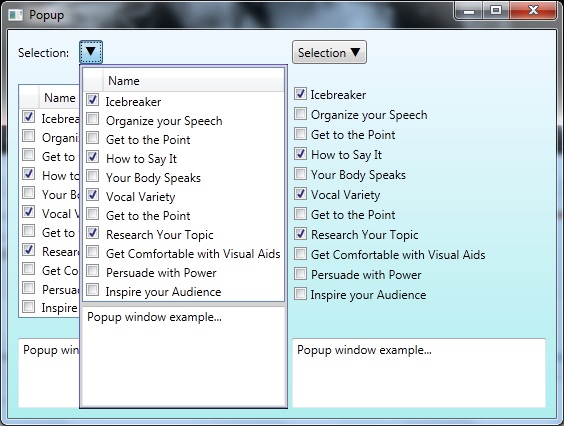
The included example demonstrates with different approaches. In general, the left side of the screen shows the lightweight approach; and the right side screen shows the approach suitable for complicated cases. In the following, we are going to use the ToggleButton and Popup classes to build the dropdown; and please pay attention to the integration between them.
The Open/Close Toggling
The opening or closing of the Popup is handled by Popup.IsOpen property. Therefore, you need to bind it to a Boolean property in your code. The easiest way to control the open/close is to use a ToggleButton. Thus, the property values of Popup.IsOpen and ToggleButton.IsChecked should be in sync. For a simple case, you can use element binding as following:
<ToggleButton x:Name="dgDropdown" Content="q" FontFamily="Wingdings 3" />
…
<Popup IsOpen="{Binding IsChecked, Mode=TwoWay, ElementName=dgDropdown}" StaysOpen="False"
       PlacementTarget="{Binding ElementName=dgDropdown}" Placement="Bottom" >
If you need more control, you can bind both properties to a Boolean property declared in the ViewModel, which implements the INotifyPropertyChanged interface to refresh the property change.
<ToggleButton x:Name="icDropdown" Content="q" FontFamily="Wingdings 3"
              IsChecked="{Binding IsItemsControlOpen, Mode=TwoWay}" />
…
<Popup IsOpen="{Binding IsItemsControlOpen, Mode=TwoWay}" StaysOpen="False"
       PlacementTarget="{Binding ElementName=icDropdown}" Placement="Bottom" PopupAnimation="Slide">
Position
To achieve the dropdown look-and-feel, you need to specify the relative position of the Popup and the ToggleButton. You can bind the Popup.PlacementTarget property to the element name of the ToggleButton. The Popup.Placement property specifies the orientation and behavior of the Popup when it opens. Since you need to open the Popup beneath the ToggleButton, you need set this property to Bottom.
As a second way, you can also treat the Popup as a part of the content of the ToggleButton, and nest the Popup in the ToggleButton. In this way, the Popup.PlacementTarget is automatically associated to the ToggleButton. Note that since I set the ToggleButton.Padding, I need to adjust Popup.HorizontalOffset and Popup.VerticalOffset to make two controls properly aligned. The offset values should include the border thickness of the ToggleButton.
<ToggleButton IsChecked="{Binding IsItemsControlOpen, Mode=TwoWay}"
              HorizontalAlignment="Left" Padding="4, 2" Margin="10">
    <ToggleButton.Content>
        <StackPanel>
        <TextBlock>
            <Run Text="Selection" />
            <Run Text="q" FontFamily="Wingdings 3" />
        </TextBlock>
            <Popup IsOpen="{Binding IsItemsControlOpen, Mode=TwoWay}" StaysOpen="False"
                   Placement="Bottom" PopupAnimation="Slide"
                   HorizontalOffset="-5" VerticalOffset="3">
                <Border BorderBrush="SlateBlue" BorderThickness="1"  CornerRadius="2" >
                    <local:MyUserControl />
                </Border>
            </Popup>
        </StackPanel>
    </ToggleButton.Content>
</ToggleButton>
The Lightweight Way Hosting
The Popup can host many different UI elements. If your case is simple and just need to host a couple of controls, you can do it in the XAML as shown in left side screen of the example. Here is the XAML code:
<Popup IsOpen="{Binding IsChecked, Mode=TwoWay, ElementName=dgDropdown}" StaysOpen="False"
        PlacementTarget="{Binding ElementName=dgDropdown}" Placement="Bottom" PopupAnimation="Slide">
    <Border BorderBrush="SlateBlue" BorderThickness="1"  CornerRadius="2" >
        <Grid Background="LightGray">
            <Grid.RowDefinitions>
                <RowDefinition Height="Auto" />
                <RowDefinition Height="Auto" />
            </Grid.RowDefinitions>
            <DataGrid ItemsSource="{Binding Data}" CanUserAddRows="False" IsReadOnly="True"
                        RowHeaderWidth="0" HorizontalGridLinesBrush="Transparent"
                        VerticalGridLinesBrush="Transparent" Margin="2">
                <i:Interaction.Behaviors>
                    <local:ColumnHeaderBehavior />
                </i:Interaction.Behaviors>
            </DataGrid>
            <TextBox Grid.Row="1"
                     Text="{Binding Text, Mode=TwoWay, UpdateSourceTrigger=PropertyChanged}"
                     Height="100" Margin="2"/>
        </Grid>
    </Border>
</Popup>
Please refer to A Smart Behavior for DataGrid.AutoGenerateColumns for how to use the Behavior and Attribute for column header display.
Hosting a User Control
If you need to host a lot of things in the Popup and possibly have complicated logic, you can wrap up everything in a UserControl and host it in the Popup as demonstrated on the right side screen of the example.
<Popup IsOpen="{Binding IsItemsControlOpen, Mode=TwoWay}" StaysOpen="False"
       PlacementTarget="{Binding ElementName=icDropdown}" Placement="Bottom" PopupAnimation="Slide">
    <Border BorderBrush="SlateBlue" BorderThickness="1" CornerRadius="2" >
        <local:MyUserControl />
    </Border>
</Popup>
Points of Interest
By sync the open/close of the Popup with a ToggleButton, you can effectively create your own Popup window. Aligning the relative position of the two controls will make the dropdown look-and-feel. You can further customize the Border of the Popup to enhance the User Experience.
This member has not yet provided a Biography. Assume it's interesting and varied, and probably something to do with programming.


 General
  News
News  Suggestion
  Question
  Bug
Bug  Answer
  Joke
Joke  Praise
  Rant
Rant  Admin
Admin 


 Submit an article or tip


 )
)