Introduction
This is probably the most unusual series of articles I'm ever going to be
involved with. In this series, I'm teaming up with one of the founders of Code
Project to go through the process of redesigning a well known site using the
Metro Design Language (more on what this is very shorly). It has often seemed to
me that articles miss out on some of the interesting bits in the development
process are missing, and I want to address this by actually dealing with what
goes on before we start coding. I decided that it would be interesting, also, to
address the issue of what Metro Design actually means, so I came up with the
idea of doing a redesign of a site using the principals in Metro. When I pitched
this idea to Chris Maunder, I was over the moon that he agreed to help me with
this series and that he would agree to temporarily loan me the Code Project
brand.
So what, exactly, are we going to be covering here? Well, the first part of
this series is going to deal with the typical to and fros that goes on between
client and agency when a site is being redesigned. We're going to go through the
review cycles, arguments and compromises that typically happen, aiming to end up
with a redesign that we're helpfully calling The Fake Project. Please bear with
me, because we aren't going to be putting a lot of code in here; but we hope
that this will be of interest. This first article is going to compress what
normally happens over a week or so into two days - and we'll produce the first
in a series of mockups.
Okay, we aren't going to go right through the process of finding and hiring a
design company. Let's pretend that Chris has already been through that process
and he's been lumbered with me (the other bids were from a stuffed cat and a
piece of string). And finally, we have reached the point where we are going to
start coming up with designs. But before we actually start coming up with any
designs any design agency worth their salt will try and actually get an
understading of what the client wants. They should try to assess what the brand
means, what the message is that the client is trying to get across, and in the
process they should start to get a feel as to what the limits and boundaries
actually are. So, let's kick off the design with this meeting.
A quick note in advance
Typically, when mocking up a site, it's a good idea to make sure that the
client can tell that you are producing a mock up. Ways of doing this include
using an exagerrated font, or using sketchy style images. This serves two
purposes; the first part being that we want to pull the mock ups together
quickly and we don't want to get hung up on polishing end details. A word of
warning though - sometimes clients get hung up on the mock up and quibble about
fonts, etc, so please bear this in mind as we go through the series. I've been
lucky dealing with Chris because he sees the big picture straight away, and has
a clear vision of how he wants to take the Fake Project forwards.
Background
Designer:
"Okay Chris. Could you give us a bit of background to the brand? How did it
come about?"
Chris:
The Code Project was initially designed by a guy named Glen Price back in
November of 1999. The initial design was a shocking orange, but it immediately
gave us a strong, vibrant branding and we loved it. It’s the best design
decision we’ve ever made.
Over the years, however, the design has needed to evolve to suit new
services, new form factors and screen sizes, and also a new century. We had a
major redesign a few years back that brought the design forward a few years, but
again the need to evolve became pressing which resulted in the latest redesign
last year.
It’s time to rethink the entire design in order to focus on what we do best –
which is allowing our members to share their enthusiasm and knowledge of code by
sharing their articles and projects.
We often throw around websites that we love, and also those that are awful,
in order to keep the concept of design importance alive in our conversations.
That being said, the cleaner the design, the more we (usually) like them, but
one point with many of the clean designs is that they are clean because they
have very little content. We’re not a brochure for a sports car. We’re a
newspaper. Limiting information for the sake of design is counter to our goal,
and we most certainly don’t need to use 32px font to fill up the whitespace.
Designer:
Okay, so that's where you've come from but where are you going with your
brand? What are you trying to achieve with a rebrand exercise? After all, this
could be a real culture shock to your user base, so how can we help you freshen
up the brand, and give you the ability to provide the maximum reach to the
different form factors your readers have available?
Chris:
In reviewing the design languages and styles out there Apple’s website is on
one end of the spectrum for us and Google’s is on the other. Microsoft, to throw
in the other major name usually mentioned with these two names, has always been
a “meh” player in terms of design. The constant redesigning of MSDN became so
painful to me that I found I simply never used it anymore. There are dozens of
websites that sit along this spectrum that we’ve tossed around, but the gist of
it all came down to
- Making the content the most important thing on the page
- Giving everything enough space.
Take two seconds to think about this and compare it to the design goals of
Microsoft’s Metro design language. It’s fundamental principles are
- Content over Chrome
-
The use of negative space
The Metro designs we’d seen were often centred around tiles, or pushed the
stereotyped “large, ultra-thin font and dim text” pattern that is already
overused, and inappropriately used. We think the underlying philosophy of the
Metro language is obvious and sensible and that it can be applied to content
rich sites perfectly well since that is the entire point of Metro: Promote the
content.
So, ignoring the design language we use, I have a number of goals with the
CodeProject design.
- The site must be obvious in what it does and obvious in how it can be
used
- The content that is most important should grab the most attention
- The site must be overwhelmingly recognisable as CodeProject. MY standard
test is a developer, from 10 feet away, looking at a page for no more than a
second, must know that the reader is on CodeProject.
- We are still advertiser supported so advertising must be present and
must be sympathetic to the layout as a whole.
- The design must be flexible to allow us to add new services and features
in an obvious and sensible manner.
This comes down to a few specifics:
- Do not mess with the orange.
- Do not mess with our logo. The text on the logo can change, however.
- Do not mess around too much with the ads. While it’s possible to
renegotiate current advertising contracts and move things around, it is
easier if we don’t have to. Besides, the units we have are the ones that are
being requested. Except for full-page interstitials and fly-out ads. They
are also requested, but repeating my answer to those requests would not be
polite
- Article content width can be assumed to be at least 640px.
- The site must work on a touch device
- I’m a tranditionalist and think that links should be blue, and that the
only text that should be blue are links. Visited links should be purple.
The next step is now for us to define what the site should do, identify the
hierarchy of information, and decide what stays, what goes, and what can be done
with some of our design challenges.
Next steps
Well, we have the brief in place, so it's time for us to start throwing some
ideas around. There are a few points that we can take from the initial meeting.
First and foremost, we have to leave certain key visual elements in place; Bob
has to be present but we can change the logo if we want, the Orange must be
#FF9900, and we have to provide space for the adverts. Beyond that, there's
plenty of scope to play with the site element, so we can make play around and
see what elements really stand out.
The big question as far as we are concerned is how do you visually identify
CodeProject as CodeProject from 10 feet away? What makes it stand out and
instantly identifiable? By identifying that, we go a long way to identifying the
cornerstone that we hange the design on. Whatever this ident is, it needs to be
present right from the first screen that we see and it needs to be consistent.
Okay, let's step back 10 feet and see what makes CodeProject, well, CodeProject.
Let's start with the home page. Open it up and what do we see?
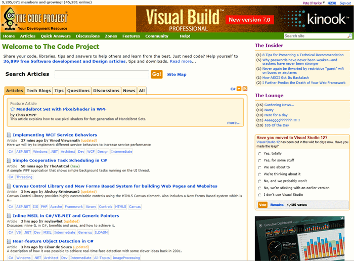
Okay, an initial view would seem to indicate that there are three clear
visual hooks.

So, 1 is obviously the site header, 2 represents the main body and 3 is the
side bar providing widgets and advertising. It's obvious looking at this site
that the orange really does have a strong presence, so we may want to cue this
in for action elements such as buttons. Now Chris has said that he likes to use
blue for links with the defaults for visited links, but looking at this page,
it's pretty obvious that this isn't a hard and fast rule because there's one set
of links in there that don't correspond to this: the menus. This should give us
some leeway to provide a stronger visual, so I think we may want to consider
incorporating either the CodeProject green (#488E00) or the orange as menu
colours.
Okay, there's no footer present in that screen, so it's obvious that the
footer doesn't play a strong part in establishing the visual identity.
Let's take a look and see how well the current design carries through to
other areas of the site. We should be able to get the commonality here. As Chris
has intimated that he sees the articles as the main focus of the site, let's
start with those.
Excellent, this corresponds to roughly the same layout as the home page. The
widgets have changed, but we have the same header in place and the main body
bears a strong resemblance to the home page, including a strong use of tabs. The
iconography isn't immediately apparent, and could be tricky to use in smaller
form factor devices so we'll want to focus some attention on those to see how we
can represent them.
We're definitely seeing a consistency with the use of main advertising in the
header banner. Looks to be 725 by 90 pixels, so that sets a hard limit for that
area - we cannot offer any less than 95 pixels as the header. The sidebar width
is set to 230 pixels, leaving the main content area to be resizable. Chris
mentioned that CodeProject could either operate fixed of fluid layout. I think
we should offer a fixed layout; the width of the sidebar will help us to
determine just how wide our main content area is going to be.
*Note. Need to find out from Chris whether or not we can constrain the
site to fixed. He may have strong feelings on this, so we may need to find some
middle ground. We'll clarify this before we go much further with the wireframes.
Now, the other two main areas of the site are the forums and the Q&A
sections. Let's check those to see how the branding carries across. First of
all, let's see what the forums look like.
Okay, we have some inconsistencies from the first two parts that we have
looked at. While we can still see a side bar, it has swapped sides to the left
hand side, and the whole look and feel of it has changed. There's no white space
in there, and it's much more in your face, despite being a smaller width at
170px. The tabs have dropped away in the main body as well, plus we can see that
the rules surrounding the link colours have been relaxed here somewhat. Chris
tells me that the grey text indicates low votes on a link, reinforcing the idea
that the link colour rule is a guideline rather than an absolute. We may be able
to do something with that.
Note*: I'd like to get Chris' opinion on making the sidebar consistent
across the site, so it would have to move to the right hand side on this page,
and it would have to make more use of white space.
On a positive note, the header is still there and is still consistent. That
has to be the visual cue that we hang the brand off - if we keep that relatively
consistent with what it is now, people should still be able to tell at a glance
that the new site is CodeProject.
Finally, let's take a look at the Q&A section.
Well, we are back to the layout that we are used to, but again there's that
deviation in the link text colour scheme. This time, green has been introduced
and at first glance it would seem that it relates to the colours in the box at
the far left, but that's not the case - if we look at those boxes, we can see
that they can be green when the link text is grey. One of the first tasks we
will have to undertake is to lay out the rules for colours in the design. With
those rules in place, we can start to block out the main areas of the site
before we start to refine them.
One thing I do have a concern about is that use of white space at the top of
the header. It's a jarring scheme for a header - the two just don't go together.
We will take a look at that area, to see if we can remove the white altogether.
So, it looks like we know what the key elements are to make the site
instantly recognisable:
- The header area will be Orange #FF9900 and will feature the alien logo
(aka 'Bob'), and the main advert. The header will be a minimum height of
90px.
- A sidebar will be present, 230px wide - this sidebar will be situated at
the right and will consist of "widgets" and a smaller advert
- The main content will be situated in the main body. This will be to the
left of the sidebar.
A point to consider. What strapline should we use for the site? "Your
Development Resource" isn't a strong hook.
Day 2
Okay, I've had a chat with Chris and he's come back with the following
feedback:
"Thank you for also pointing out that I'm inconsistent with link colours.
I can't believe I didn't realise this myself.
The columns being on the right, then the left, then the right - yeah,
inconsistent, and the whitespace in Q&A. All good comments.
The sidebar needs to be consistent for pages where it makes sense. Having
more whitespace is a tricky balance since we want to allow 640px wide articles
and a min width of 960 (give or take - these are just rough guidelines). If by
whitespace you mean extra padding: definitely.
Not all pages should have a sidebar, and some pages may make sense to
have a left hand bar. The homepage, for instance, probably needs a right hand
sidebar, but the page for setting member settings may want to have a left hand
sidebar. I'm using Chrome right now and like the way they have links in a left
hand sidebar instead of the usual tabs for choose different settings pages. I'd
like to experiment with that approach to see if it makes sense.
Now, about the fixed/fluid question. I have no problem with this, though
I think it's really easy to make it fluid while keeping the basic design
elements of a fixed layout. I tend to shy away from fixed due to the history of
screens getting larger and large. I think we may have hit a point similar to CPU
speeds hitting a ceiling and the move being to multi-core: screen sizes may not
get much bigger, but resolutions will double, and maybe triple. I can buy a 23"
screen for my PC, and have a 24" on my iMac, but I still prefer 3 x 19" monitors
so that I can maximise documents without them being stupidly large. The Windows
7 feature of docking docs to the sdes of the monitors is fantastic in this
regard.
On the flip side, fixed widths do cause problems if the browser is
shrunk. I often make a browser window a third of the screen space simply because
I'm trying to fit so many windows on at once. Having the design accomodate this
is a nice to have feature, and means that when the site is viewed on new form
factors (mini-iPad?) it will adapt."
This is good stuff, and starts to flesh some things out for us. If we do the
maths, we see that taking a sidebar of 230px and adding it to the minimum
article width of 640px is just 870px, well short of the 960px rough guesstimate
that Chris supplied. We have two options here; we can either make the 230px
bigger, giving us 320px, or we make the minimum article width 730px. We'll rough
out both sizes to get a feel for which is more appropriate.
In the rough draught, let's try the side bar out on both sides and see which
feels right. While Chris has said the sidebar consistency should be applied
where it makes sense - let's trial it so that he can get a better idea. We can
always fix this at a later stage if we find that we need to change things around
a bit. Also, while we haven't discussed the use of the footer, let's include
that in the wireframe so that we have the whole picture in place.
As we want this site to be easy to use on touch devices, and at various
sizes, I'm going to go with Chris' idea and we'll make it a fluid reactive
layout, and we'll move away from menu based interaction as much as possible; it
just ends up being really fiddly to have to navigate via menus on a phone.
The first thing we need to do is actually identify what satisfies Chris'
requirements for the site being instantly identifiable as Code Project from 10
foot away. At first glance, it would appear that the solid Orange bar and alien
logo are prime candidates for this. So, we'll set up a basic template page that
uses this identity - and as this is the focal point for advertising, we'll
position the advertising there as well; keeping Chris' criteria for advertising
satisfied.
As I mentioned, we can use this to try and change from a pure menu based
approach to navigation to something that is more suitable for touch interaction.
This will help open up the site to tablet/phone users as the current menu system
does not represent an ideal choice in these environments. As we are changing the
menus around, we have the opportunity to organise the interaction based on the
key elements of the site. As Chris has mentioned, before, that the key element
of the site (indeed, this is one of the main differentiators of CodeProject from
other sites) are the articles, we will put that first in our "menus".
As an initial pass, I would suggest that this represents a potential default
layout for the other pages in the site.
Now that we have a simple page layout, we need to see how this fits together
with the site. The obvious place to start is with the home page, so we will
restyle it and take the opportunity to apply some rules to the design.
- As we have already ascertained that the link colour rule is flexible, we
will choose to use the CodeProject orange for link text.
- Site based link text, menu text and headings will be lower case.
- Headings will use the CodeProject green as a visual cue.
- The layout system will be grid based.
An initial styling of the home page, borrowing heavily from the current home
page, suggests that the following design would satisfy some of the criteria for
the home page.
After an internal review of this design, we have found that it is not
suitable for presentation as a design to the client as it does not satisfy some
of our criteria for creating a Metro design. While some of the rules do seem to
be acceptable, the overall design feels cramped and does not make effective use
of white space. Retaining the tabs makes for a curious mish mash of styles here,
so we will revisit this styling and provide more space.
First of all, we have to have a mechanism in place to cover the different
tabs. While we could keep the tabs in place, and remove the borders from them, I
feel that a better mechanism would be to convert the tabs into combo boxes.
I've added the language in there as well, to flesh this out. As you can see,
there's more room to play with space here, so this is starting to feel less
cluttered. I am concerned, though, that we have repeating content here (we have
articles in two locations). We may need to revisit that soon. For the moment,
let's see investigate this screen further.
In this shot, we can see the articles selection in operation. Clicking an
item in that list will change the article selection. So, for example, clicking
tips will show the latest tips and the latest best tips.
Again, a tab that looked cluttered in the initial design was the approvals
tab. Showing that as a drop down selection feels much neater.
Hmmmm. At this point, the design still doesn't feel quite right. I'm not 100%
happy with the duplication, so let's revisit this.
That seems to be a more cohesive design, and we've instated some more colour
there, but we've lost something there. Thinking about what we are trying to
achieve with this navigation, something that we have to remember is that the
home page articles link is not the same thing as the articles list in the main
menu. We can use the style of the drop down to indicate the difference between
the two. Let's reinstante that combo and present this to Chris to get his
feedback on the home page. Before we take this any further, we need to make sure
that Chris is happy with where we're at.
A developer for over 30 years, I've been lucky enough to write articles and applications for Code Project as well as the Intel Ultimate Coder - Going Perceptual challenge. I live in the North East of England with 2 wonderful daughters and a wonderful wife.
I am not the Stig, but I do wish I had Lotus Tuned Suspension.


 General
  News
News  Suggestion
  Question
  Bug
Bug  Answer
  Joke
Joke  Praise
  Rant
Rant  Admin
Admin 


 Submit an article or tip


