Introduction
This article describes the different ways a WPF TextBox Caret can be customized. It provides information on how to change the color, as well as a technique that will allow you to create your own custom Caret - providing you freedom with shape and size.
Background
What is a Caret?
A Caret is the vertical 'blinking' line that represents the current cursor position of a control that accepts text input.
Example:
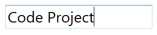
By default, the Window's Caret is only 1-pixel wide and the shape is currently not modifiable using .NET. Even-though the thickness can be changed through the Windows Accessibility settings, it is an OS wide change, and not always desired if you want it to be application dependent.
Changing the Caret color
Starting in .NET 4.0, Microsoft has provided the capability to customize the Caret's color by providing the CaretBrush property of a TextBox control. The CaretBrush allows for easy color customization.
Using a style, the CaretBrush property can be set to specify the color (in this case blue).
 <Grid>
    <Grid.Resources>
        <Style TargetType="{x:Type TextBox}" x:Key="TextBoxWithColoredCaretStyle">
            <Setter Property="CaretBrush">
                <Setter.Value>
                    <SolidColorBrush Color="Blue"/>
                </Setter.Value>
            </Setter>
        </Style>
    </Grid.Resources>
    <TextBox Height="47" FontSize="30" Name="textBox1" Width="289" Text="Code Project"
         Style="{StaticResource TextBoxWithColoredCaretStyle}"/>
</Grid>
It can also be set simply through the TextBox property itself.
<Grid>
    <TextBox Height="47" FontSize="30" Name="textBox1" Width="289" Text="Code Project"
             Style="{StaticResource TextBoxWithColoredCaretStyle}" CaretBrush="Blue"/>
</Grid>
Result:

The CaretBrush property can be used with a gradient brush as well.
 <Grid>
    <TextBox Height="47" FontSize="30" Name="textBox1" Width="289" Text="Code Project">
        <TextBox.CaretBrush>
            <LinearGradientBrush MappingMode="RelativeToBoundingBox"
                                    StartPoint="0,0"
                                    EndPoint="0,1">
                <LinearGradientBrush.GradientStops>
                    <GradientStop Color="Blue"    Offset="0" />
                    <GradientStop Color="Magenta" Offset="0.5" />
                    <GradientStop Color="Green"   Offset="1" />
                </LinearGradientBrush.GradientStops>
            </LinearGradientBrush>
        </TextBox.CaretBrush>
    </TextBox>
</Grid>
Result:

Creating your own Custom Caret
In order to create our own custom Caret, we'll need to know two main things; the current position of the TextBox's built in Caret, and when the custom Caret needs to be moved/updated. Luckily, this information is available using the built in properties and events of the WPF TextBox.
First, lets take a look at the XAML.
<UserControl x:Class="CustomCaret.CustomCaretTextBox"
             xmlns="http://schemas.microsoft.com/winfx/2006/xaml/presentation"
             xmlns:x="http://schemas.microsoft.com/winfx/2006/xaml"
             xmlns:mc="http://schemas.openxmlformats.org/markup-compatibility/2006"
             xmlns:d="http://schemas.microsoft.com/expression/blend/2008"
             mc:Ignorable="d"
             d:DesignHeight="300" d:DesignWidth="300">
    <Grid>
        <TextBox x:Name="CustomTextBox"
                FontFamily="Gesta"
                FontSize="28"
                AcceptsReturn="True"
                TextWrapping="Wrap"
                CaretBrush="Transparent"
                Padding="0"
                Margin="0"/>
        <Canvas>
            <Border x:Name="Caret"
                Visibility="Collapsed"
                Canvas.Left="0"
                Canvas.Top="0"
                Width="5"
                Height="30"
                Background="Red">
                <Border.Triggers>
                    <EventTrigger RoutedEvent="Border.Loaded">
                        <BeginStoryboard>
                            <Storyboard  x:Name="CaretStoryBoard"
                                         RepeatBehavior="Forever">
                                <ColorAnimationUsingKeyFrames
                                        Storyboard.TargetProperty="Background.Color"
                                        Duration="0:0:0:1"
                                        FillBehavior="HoldEnd">
                                    <ColorAnimationUsingKeyFrames.KeyFrames >
                                        <DiscreteColorKeyFrame KeyTime="0:0:0.750"
                        Value="Transparent" />
                                        <DiscreteColorKeyFrame KeyTime="0:0:0.000"
                        Value="red"/>
                                    </ColorAnimationUsingKeyFrames.KeyFrames>
                                </ColorAnimationUsingKeyFrames>
                            </Storyboard>
                        </BeginStoryboard>
                    </EventTrigger>
                </Border.Triggers>
            </Border>
        </Canvas>
    </Grid>
</UserControl>
As you can see, I've added the following 4 controls to a UserControl.
Grid - This is the parent "container" of the TextBox and the other controls. A Grid is used so that the TextBox, Canvas, and Border overlap seamlessly. This is important because we want our custom Caret to appear as if it was part of the actual TextBox. TextBox - The TextBox where the 'built-in' Caret lives. We'll be referencing this TextBox to get notified when the 'built-in' Caret moves so that the position of our custom Caret can move as well. The TextBox will also provide us with the 'built-in' Caret's position. Notice the 'CaretBrush' of the TextBox is set to Transparent. This is required so that the 'built-in' Caret is not displayed and distracting the user from the custom Caret. Canvas - The Canvas is the area that the custom Caret will move on. Since it lives inside a Grid that is overlapping the actual TextBox, the custom Caret will appear as if it was part of the TextBox itself. Border - The Border is the actual custom Caret. This is what will be moving/updating across the Canvas. I've also added a Storyboard to the Border to simulate the blinking effect of a 'built-in' Caret. Even though this can be achieved in various ways, I felt a Storyboard was a bit easier as it can be implemented in pure XAML.
Now, lets look at the code behind,
public CustomCaretTextBox()
{
InitializeComponent();
this.CustomTextBox.SelectionChanged += (sender, e) => MoveCustomCaret();
this.CustomTextBox.LostFocus += (sender, e) => Caret.Visibility = Visibility.Collapsed;
this.CustomTextBox.GotFocus += (sender, e) => Caret.Visibility = Visibility.Visible;
}Inside the UserControl's constructor, I subscribe to three TextBox events (SelectionChanged, LostFocus, and GotFous).
The SelectionChanged event is important as it is responsible for notification of when the CaretIndex has changed. For example, when the user types, selects text, or uses the left and right arrow keys, the SelectionChanged event will get fired. Because of this, we'll also be notified of when the 'built-in' Caret has moved, which indicates that our custom Caret should be moved as well.
The next two events (LostFocus and GotFocus) are used simply for visual purposes of our custom Caret. We want to 'hide' the custom Caret when the TextBox is not focused and only show it when it is.
Lastly, the MoveCustomCaret method.
private void MoveCustomCaret()
{
var caretLocation = CustomTextBox.GetRectFromCharacterIndex(CustomTextBox.CaretIndex).Location;
if (!double.IsInfinity(caretLocation.X))
{
Canvas.SetLeft(Caret, caretLocation.X);
}
if (!double.IsInfinity(caretLocation.Y))
{
Canvas.SetTop(Caret, caretLocation.Y);
}
}This method is hooked up to the SelectionChanged TextBox event and is responsible for moving the custom Caret (the Border control) to a Point on the canvas. The Point is obtained using the Location of the 'built-in' Caret. By using GetRectFromCharacterIndex, we can get the Rectangle of the leading edge for the character that's at the index of the 'built-in' Caret. Calling Location on the Rectangle, we get the x and y-coordinates which are then used to move the custom Caret to that location on the canvas.
Result:

The Caret can also be made using an image by simply replacing the Border control with an Image control.
 <Grid>
    <TextBox x:Name="CustomTextBox"
            FontFamily="Gesta"
            FontSize="35"
            AcceptsReturn="True"
            TextWrapping="Wrap"
            CaretBrush="Transparent"
            Padding="0"
            Margin="0"/>
    <Canvas>
        <Image x:Name="Caret"
            Visibility="Collapsed"
            Height="40"
            Width="10"
            Canvas.Left="0"
            Canvas.Top="0" Source="/CustomCaret;component/Carrot.png"/>
    </Canvas>
</Grid>
Result:

History
- 2013, August 18 - Initial publication.


 General
  News
News  Suggestion
  Question
  Bug
Bug  Answer
  Joke
Joke  Praise
  Rant
Rant  Admin
Admin 


 Submit an article or tip


