Introduction
This is part 2 of this mini series. In Part 1 I was explaining knockout and gave example of little proof of concept web page (js, html, css only). Now we're going to SharePoint part
Using the code
SharePoint Part
As I said I will assume that you have some experience with SharePoint
development so I will not explain how to create the project and add project
items. Project type is standard Visual Studio 2010 SharePoint Empty Project
template.
SharePoint part consists of following items:
- Web part item – KnockoutWp. Standard SharePoint
Visual Web part project Item
- Assets module. SharePoint module project item.
We are going to use it for deploying of images and css files (0.png – empty container
for images and controls.css – css file for our projects).
- Layouts mapped folder. We’ll put here editor
page for template.
And here is the solution explorer for project:
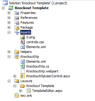
Assets
We are going to deploy 2 files:
- 0.png – 1x1 pixel transparent image aka
placeholder
- Controls.css – css file for our template
Both of these items are going to be deployed to Style Library of the SharePoint site collection, so content editors may change it later without need of solution redeployment.
Here is the elements.xml file:
So our assets will end to http://oursitecollectionurl/Style Library/wp folder.
KnockoutWp
This is Visual Studio 2010 Visual Web part.
It is consisted
of 4 items:
- KnockoutWp.cs – web part class
- KnockoutWpUserControl – User control of our web
part
- KnockoutWp.webpart – web part xml file
- Elements.xml – manifest file
KnockoutWP.cs
This is the class of the web part itself. It is auto
generated by Visual Studio and inherits
System.Web.UI.WebControls.WebParts.WebPart . Here we define properties and
methods of our web part. One property is auto generated (others would be added
later): _ascxpath, string that locates UserControl that would be used for
presentation of this web part. CreateChildControls method is also here and it’s pretty basic.
We're going to change it later.
Properties
Web part has following properties:
- ListUrl (string, required) – url of the list we
are displaying.
- TitleField (string, optional) – display name of
the field that would be displayed as Title. If it’s blank Title field would be
used.
- DateField (string, optional) – display name of
the field that would be displayed as date. If it’s blank Created field would be
used.
- DescriptionField (string, optional) – display
name of the field that would be displayed as Description. If it’s blank it
would be omitted.
- ImageField (string, optional) - display name of
the field that would be displayed as Thumbnail picture. If it’s blank it would
be omitted.
- NoOfItems
(int) – how many items from the list would be displayed
- ItemTemplate (string) – html template of the web
part. Defines the look of our web part.
- WpPosition (enum) – Used for a three column
layouts. Web part has styles for three zones: right, central and left.
Difference is in width, padding and margin. Everything is set in css so you can
accommodate it to your environment.
On picture below you can see mapping between Field
properties of web part and list item fields.

EditorPart
I've added one more thing to this web part it’s EditorPart
class GenericListPartEditorPart. I’m not going into deep with editor parts, but
here is quick info. When you create public property for a web part it is
automatically displayed in web part edit panel. And it is great concept when
you need simple properties as strings, numbers and short lists. If you want
more complicated scenario (as we want here for our web part) it’s not enough.
What I wanted here is template editor. It could be reasonably large so idea was
to have a button in web part edit panel that would open large dialog window
with editor. User would work with our template, click Apply and change
ItemTemplate web part property.
These two pictures above explain concept. Next step would be
implementing code highlighting framework as CodeMirror.
Adding EditorPart is easy. First you create class that
inherits EditorPart. In CreateChildControls override you create controls for
custom editor. In ApplyChanges and SyncChanges overrides you sync editorpart
with web part. When the editor part is finished, our main web part class
had to implement IWebEditable interface and to map EditorPart object with web
part itself. Check picture below.
More on this subject
http://msdn.microsoft.com/en-us/library/hh228018(v=office.14).aspx.
Template editor KnockoutWpUserControl
This is user control created by Visual Studio, when we added
Visual web part project item to the project. It consists of markup ascx file
and code behind .ascx.cs file. We will put our markup and our c# code here.
Markup
Here is the complete markup:
<script type='text/javascript' src="http://knockoutjs.com/downloads/knockout-3.0.0.js">
</script>
<style type="text/css"> @import url("/Style
Library/wp/controls.css"); </style>
<div class="glwp glwp-<%=PositionClass %>" id="k<%=WpId %>">
<div class="glwpLine"></div>
<h5><img src="<%=Icon %>" width="28"
height="28" align="absmiddle"><%=Title %></h5>
<div class="glwpLineGrey"></div>
<asp:Literal ID="LitLayout" runat="server"></asp:Literal>
</div>
<script type="text/javascript">
function OpenDialog(Url) {
var options = SP.UI.$create_DialogOptions();
options.resizable = 1;
options.scroll = 1;
options.url = Url;
SP.UI.ModalDialog.showModalDialog(options);
}
var Item = function (id, title, datecreated,url,description,thumbnail) {
this.id = id;
this.title = title;
this.datecreated = datecreated;
this.url=url;
this.description=description;
this.thumbnail=thumbnail;
}
<asp:Literal runat="server" ID="LitItems"></asp:Literal>
function portal_openTemplateEditor(wpid) {
var val="";
var options = SP.UI.$create_DialogOptions();
options.width = 600;
options.height = 500;
options.url = "/_layouts/KnockoutTemplate/TemplateEditor.aspx?c="+wpid;
options.dialogReturnValueCallback =
Function.createDelegate(null,portal_openTemplateEditorClosedCallback);
SP.UI.ModalDialog.showModalDialog(options);
}
</script>First Section, of the markup (picture below) has script
(knockout, on the remote server) and style references (controls.css in local Document
library). Below is html markup that defines the container of the web part (top
and bottom borders, width, icon and title). Markup is not the cleanest because
I was little lazy and left some public properties in it. Note
<%=PositionClass%>, <%=WpId%> and so on.
There are all public
properties of the user control and they are used for presentation:
- PositionClass – depending on WpPosition web part
property (right, central or left) adds appropriate css class to markup and that
way defines width, padding and margin of web part WpId is guid of the web part. It is used to
uniquely identify the web part, because we can put several web parts of the
same type and everything would crush without this identificator.
- Icon – is a url to icon that would be displayed
on web part.
Web part property Title Icon Image URL is used here (this is OOB
property)
- Title –title text of the web part. Text that was entered in the title area of
the web part. Web part property Title is used here (this is OOB property)
Last interesting thing here is Literal control LitLayout.
This control would hold our ItemTemplate property (html template of our web
part).
Second section, is a java script function that opens list
item in a dialog window. It is used when underlying list is not document
library.
Third section consists of knockout view model (java script).
Item class definition is self-explanatory (defines 6 properties only). The rest
of the model is created on the server side so now there is only LitItems
Literal control there.
Fourth section is just a java script function that is used
when editing web part properties. This function opens template editor in dialog
window.
Code
Properties:
- Properties from web part
- Icon – url to the icon
- Title – title of the web part
- ListUrl – url to the list
- TitleField – Title field in the list
- DateField – Date field in the list
- ImageField – Image field in the list
- DescriptionField – Description field in the list
- NoOfItems – number of items to return
- Position – position of the web part (right, left
or central)
- ItemTemplate -
html template of the web part
- WpId – guid id of the web part
·
- UC’s properties
- PositionClass – css class based on position
- ColumnMap – dictionary that holds internal names
of the list item fields.
Methods:
File has only one method Page_Load. Code is executing with elevated privileges.
In that method we:
- Resolve
list by the supplied URL (ListUrl property)
SPList annList =
annWeb.GetList(ListUrl);
- Get
internal names of the list columns by their Display names
SpHelper.GetFieldsInternals(annWeb,
annList.Title, TitleField, DateField, DescriptionField, ImageField, columnMap
);
- Create CAML Query
SpHelper.GetGenericQuery(annList,
q, NoOfItems);
- Execute
it
- Iterate
over
SPListItemCollection (coll) and create required JavaScript
Helper class
SPHelper is helper class and you can find it in Helpers
directory.
It has 3 responsibilities:
- To retrieve List Columns Internal names based on supplied
List Columns display names (WP properties -
TitleField – Title field, DateField,
ImageField , DescriptionField ) - GetFieldsInternals method - To create Caml query for retrieving list items –
GetGenericQuery method - To retrieve values from
SharePoint columns based
on their types –
GetFieldValue method
Download files
Summary
So, that's it. I tried to help you to create more flexible views. In Sharepoint 2013 you can use same techniques but you don't need to use web parts you may customize views. Although Knockout is a great framework, for displaying purposes you should
check Handlebars as well. Maybe mustaches suits you better :-).
This member has not yet provided a Biography. Assume it's interesting and varied, and probably something to do with programming.


 General
  News
News  Suggestion
  Question
  Bug
Bug  Answer
  Joke
Joke  Praise
  Rant
Rant  Admin
Admin 


 Submit an article or tip


