Introduction
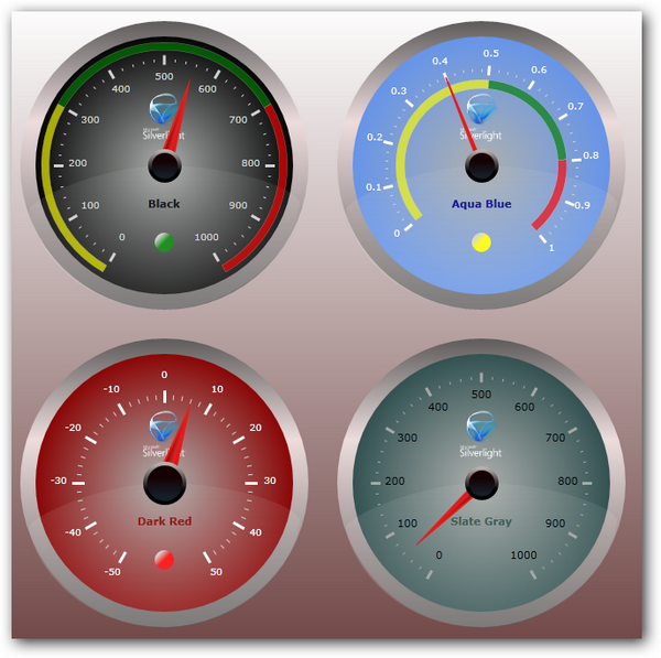
The Silverlight 3 SDK and toolkit includes more than a hundred controls but is missing a circular gauge control, so I decided to create one. My goal was to create a customizable gauge that is easy to use and also looks professional. You can see a live demo here.
Using the Code
In this section, I will explain how you can use the gauge control in your application. The easiest way to get started would be to copy this template code snippet in your project after referencing CircularGauge.dll and the CircularGauge namespace.
<gauge:CircularGaugeControl x:Name="myGauge1"
Grid.Column="0" Grid.Row="0"
Radius="150"
ScaleRadius="110"
ScaleStartAngle="120"
ScaleSweepAngle="300"
PointerLength="85"
PointerCapRadius="35"
MinValue="0"
MaxValue="1000"
MajorDivisionsCount="10"
MinorDivisionsCount="5"
CurrentValue="{Binding Score}"
ImageSource="silverlightlogo.png"
ImageSize="60,50"
RangeIndicatorThickness="8"
RangeIndicatorRadius="120"
RangeIndicatorLightRadius="10"
RangeIndicatorLightOffset="80"
ScaleLabelRadius="90"
ScaleLabelSize="40,20"
ScaleLabelFontSize="10"
ScaleLabelForeground="LightGray"
MajorTickSize="10,3"
MinorTickSize="3,1"
MajorTickColor="LightGray"
MinorTickColor="LightGray"
ImageOffset="-50"
GaugeBackgroundColor="Black"
PointerThickness ="16"
OptimalRangeStartValue="300"
OptimalRangeEndValue="700"
DialTextOffset="40"
DialText="Black"
DialTextColor="Black">
</gauge:CircularGaugeControl>
The CircularGauge control has several options to completely customize all its elements. Most of the property settings are intuitive to use, so I will only discuss a few here.
| Properties | Comments |
Background | Setting the background color would automatically create a gradient and glass effect using the set color as the base. This makes it very easy to drastically change the look. |
ScaleRadius, ScaleLabelRadius, RangeIndicatorRadius | These properties provide options to place the scale, range indicator, and scale labels anywhere within the gauge. |
CurrentValue | The CurrentValue property is a dependency property so you can data bind to it. |
ImageOffset, DialTextOffset, RangeIndicatorLightOffset | These properties control the placement of the image, dial text, and the range indicator light along the Y-axis with respect to the center of the gauge. |
OptimalRangeStartValue, OptimalRangeEndValue | These properties help define the recommended range of values. The range indicators are drawn based on these values. In addition to the range indicators, the RangeIndicatorLight also provides visual feedback using the same information. The colors representing these value zones can be customized using the BelowOptimalRangeColor, AboveOptimalRangeColor, and OptimalRangeColor values. |
Creating a Custom Template
This is a look-less control, so all the details of appearance is described in the default style specified in generic.xaml. In case you would like to create a new control template, the gauge control expects the following elements in its control template:
| Element Name | Element Type |
|---|
LayoutRoot | Grid |
Pointer | Path |
RangeIndicatorLight | Ellipse |
PointerCap | Ellipse |
You can find the complete markup for the default style in the generic.xaml file included in the source code.
Points of interest
This section outlines the main steps in creating this control. Most parts of the visual representation of the gauge control were drawn using Expression Blend. The container that contains all the elements of the gauge is a Grid. The gauge/rim, pointer cap, pointer, range indicator light, and the glass effect which is another ellipse with reduced opacity, were all drawn using Expression Blend 3. I drew the shapes and then template bound the height, width, and other attributes. Here is the markup for the pointer:
<Path x:Name="Pointer" Stroke="#FFE91C1C" StrokeThickness="2"
Width="{TemplateBinding PointerLength}"
Height="{TemplateBinding PointerThickness}" HorizontalAlignment="Center"
Data="M1,1 L1,10 L156,6 z" Stretch="Fill" RenderTransformOrigin="0,0.5"
RenderTransform="{Binding RelativeSource={RelativeSource TemplatedParent},
Path=PointerLength, Converter={StaticResource pointerCenterConverter}}">
<Path.Fill>
<LinearGradientBrush EndPoint="0.5,1" StartPoint="0.5,0">
<GradientStop Color="#FF890A0A" Offset="0.197"/>
<GradientStop Color="#FFC40808" Offset="1"/>
<GradientStop Color="#FFE32323" Offset="0.61"/>
</LinearGradientBrush>
</Path.Fill>
</Path>
All the items in the template that you would like to access in code would need to be named appropriately. This is the way to establish binding between the user interface and the control. We then override the OnApplyTemplate method to get access to the named elements in the UI.
Drawing the Scale and Range Indicator
The elements which cannot be defined in the generic.xaml file are the scale and the range indicator which need to be drawn in code. The Major and Minor tick marks are just rectangles that have been rotated and moved using render transforms. Similar to the tick marks, the scale labels are text blocks that have been rotated and moved. In order to draw the scale, we need to compute the location of the points on the circumference of the scale circle. This can be computed using this formula:

Formula to find a point on the circumference, given an angle and a radius:
x = a + r * cos(θ)
y = b + r * sin(θ)
where:
r is the radius of the circle(a,b) is the center of the circle(x,y) is the point on the circumferenceθ is the angle in degrees- radian = degree * π/180
Similar to drawing the scale, we use the same formula to compute the four points that comprise the range segment.
Animating the Pointer
Finally, animating the pointer only involves creating a double animation and setting its target to the pointer's rotate transform angle.
void AnimatePointer(double oldcurrentvalueAngle, double newcurrentvalueAngle)
{
    if (pointer != null)
    {
        DoubleAnimation da = new DoubleAnimation();
        da.From = oldcurrentvalueAngle;
        da.To = newcurrentvalueAngle;

        double animDuration = Math.Abs(oldcurrentvalueAngle - newcurrentvalueAngle) *
                                       animatingSpeedFactor;
        da.Duration = new Duration(TimeSpan.FromMilliseconds(animDuration));

        Storyboard sb = new Storyboard();
        sb.Completed += new EventHandler(sb_Completed);
        sb.Children.Add(da);
        Storyboard.SetTarget(da, pointer);
        Storyboard.SetTargetProperty(da, new PropertyPath(
          "(Path.RenderTransform).(TransformGroup.Children)[0].(RotateTransform.Angle)"));

        if (newcurrentvalueAngle != oldcurrentvalueAngle)
        {
            sb.Begin();
        }
    }
}
WPF Version
Porting to WPF was very easy, all I had to do was create a WPF custom control project and move the code from the Silverlight version, and everything worked without any changes.
Conclusion
This code is licensed under the Free BSD license, so feel free to use in commercial applications. I hope this gauge is useful, and would really appreciate any comments/feedback.
History
- Version 1.0 - 07/22/2009
- WPF version updated - 07/28/2009
I have worked mainly with ASP.NET but also have exposure to Windows forms, WPF and Silverlight. I also enjoy developing user interfaces using Expression Blend.


 General
  News
News  Suggestion
  Question
  Bug
Bug  Answer
  Joke
Joke  Praise
  Rant
Rant  Admin
Admin 


 Submit an article or tip


