Introduction
Part of the recommended Windows Mobile UI design document from Microsoft states that each form within a Windows Mobile application must have the same name. An example of this is as follows:
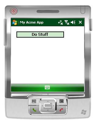
Let's say, Form1 is titled My Acme App.
Form1
Clicking the button “Do Stuff” loads another form, Form2:

Form2
Notice how the name of the form now shows “Do Stuff”. This is bad - and against Microsoft’s UI design recommendations for many reasons, one of which is this:
Task Manager
Have you noticed the problem yet? I bet you have! We have a separate reference in the Task Manager (Task Manager - a new feature in Windows Mobile 6.1). This is a real pain – although a little more forgiving on WM 6.1. If a user selects My Acme App from the list (a child form, in this case), the OS will actually bring the top level window to the top of the Z-order, which is, in this case, the window “Do Stuff” – quite clever. This is not the case on pre WM 6.0, so bear this in mind.
So, should we simply name each window the same throughout the entire application? Well, you can do this, but a simple and easy way is to set the window's owner property to the parent (a new feature in the .NET Compact Framework 2.0). So, in our Form1 button click event handler where we show Form2, we do this:
private void button1_Click(object sender, EventArgs e)
{
   using (Form2 form2 = new Form2())
   {
       form2.Owner = this;
       form2.ShowDialog();
   }
}
Now, if we look at the results:
Form1
Form1 looks as it did before the change, so nothing is new here. But now, if we load Form2 by clicking the “Do Stuff” button, we get the following:
Form2
Notice how the title is now the same as Form1 even though the Text property of Form2 is still set to “Do Stuff”.
Also, if we now inspect the Task Manager, we get the following:
Task Manager
As you can see, there is only one application named “My Acme App”. This is really neat. But, this can lead to confusion in terms of which forms do what, as now, each form you load doesn’t have a name. If you look at standard Microsoft applications, you’ll notice they have a “header panel” control which usually describes the form's function:
An example Microsoft Windows Mobile application
There is no control out-of-the box that offers this, so this is what this article will talk about. We will talk about how to create one, and offer the source code at the bottom of this article. We will show how to add help support, and also an optional icon to represent the form. We will also talk about designer support, so it can easily be dragged from the toolbox onto your form in Visual Studio.
Prerequisites
The code example that accompanies this article requires Visual Studio 2008 with the Smart Device extensions installed along with the Windows Mobile Professional 6.1 Professional emulators.
Creating Our Custom Property Header Control
We will talk about each step sequentially. In terms of the files required, we only need three. The XMTA control designer file, and two C# classes: one of which is the source (not including the resource files) and the other is a resources class to handle the loading of icons.
We choose to use GDI because we can then support a multitude of devices, and GDI is fairly lightweight and easy to program.
1. Creating the Property Header Class and Deriving from UserControl
Of course, you’ll need to create a “Class Library” project to host the control. I’m assuming you know how to do this in Visual Studio already. I have decided to use C# in this article. I’ve called mine Microsoft.Windows.Mobile.UI.
First of all, we will start off with the PropertyHeader class that derives from UserControl (new support from CF 2.0):
namespace Microsoft.Windows.Mobile.UI
{
    public partial class PropertyHeader : UserControl
    {
       private string _title = "<Title goes here>";
       private string _desc = "<Description goes here>";
       const int DESIGNPOINTSPERINCH = 96;
    }
}
We can leave the class defined as partial just in-case we want to implement other stuff in the future.
2. Implementing the Control's Textual Properties
As we want to display a title and a description, we expose these as public properties:
private string _title = "<Title goes here>";
private string _desc = "<Description goes here>";
const int DESIGNPOINTSPERINCH = 96;
public string Title
{
get
{
return _title;
}
set
{
_title = value;
Invalidate();
}
}
public string Description
{
get
{
return _desc;
}
set
{
_desc = value;
Invalidate();
}
}
Notice how we make a call to Invalidate in each setter. We do this so the control is redrawn when the value changes.
3. Implementing the Control's Private Help Properties
As we mentioned, we want to give the developer using the control an option as to whether a help icon is displayed or not. So, if the HelpRequested event has been registered, we will raise that event when the user clicks the help icon. This type of functionality is quite common throughout the platform.
Usually, a developer would load PegHelp via the System.Windows.Forms.Help class when this event occurs. So, we need to create a couple of private properties to help us do this:
private Icon HelpIcon
{
get;
set;
}
private Point HelpIconPoint
{
get;
set;
}
The HelpIcon property is private, and set at object construction time to support multiple resolution devices. We will talk about this in more detail later. If we do draw the help icon, as it is the right most one, the location will change during screen mode changes. When we draw the help icon, we store the location in the HelpIconPoint property as a Point object; we do this so on a MouseDown event, we know whether the user placed the stylus within the bounds of the help icon. We’ll talk about this in more detail later.
4. Implementing the Control's Remaining Properties
So, we have a few more properties to implement which will allow visual customization.
public Icon Icon
{
get;
set;
}
public bool ShowHelpIcon
{
get;
set;
}
public bool ShowLineSeparator
{
get;
set;
}
The Icon property contains a reference to the icon if the developer chooses to set one, as this is optional. You will see later how we cater for this in the paint event. If there is no icon, then the Title and Description properties are drawn further to the left of the control.
As we mentioned, the ShowHelpIcon allows the developer to display the help icon or not. It is worth mentioning that in the current implementation of the control, it is not possible to change the help icon as the loading of it is internal. Of course, this can be easily changed if required. By default, this property is true.
The ShowLineSeparator property does just that! If set to true, it draws a line at the base of the control.
5. Implementing the Control's Constructor
The control's constructor looks like this:
public PropertyHeader()
{
    InitializeComponent();
    HelpIcon = CurrentAutoScaleDimensions.Height <= 96 ?
       Resources.GetIcon("help.ico", 16, 16) :
       Resources.GetIcon("help.ico", 32, 32);
    ShowLineSeparator = true;
    ShowHelpIcon = true;
}
The InitializeComponent method does the required designer logic as we are deriving from the UserControl class. Next, we are loading the HelpIcon property from the Resources class. We talk about the Resources class later.
The next two lines set the defaults, line separator, and display the help icon by default.
6. Implementing the Event Handlers
The last part of the control class is to implement the two event handlers for the OnPaint and the OnMouseDown events. The OnPaint looks like this:
protected override void OnPaint(PaintEventArgs e)
{
var graphics = e.Graphics;
var bitmap = new Bitmap(ClientSize.Width,
ClientSize.Height);
var graphicsOffScreen = Graphics.FromImage(bitmap);
var solidBlackBrush = new SolidBrush(Color.Black);
var blackPen = new Pen(Color.Black,
1 * graphicsOffScreen.DpiY / DESIGNPOINTSPERINCH);
var solidBackColorBrush = new SolidBrush(BackColor);
graphicsOffScreen.FillRectangle(solidBackColorBrush, ClientRectangle);
var x = 0;
x = Icon != null ? Convert.ToInt32((5 * graphicsOffScreen.DpiY /
DESIGNPOINTSPERINCH) * 2) + Icon.Width : Convert.ToInt32(5 *
graphicsOffScreen.DpiY / DESIGNPOINTSPERINCH);
graphicsOffScreen.DrawString(Title, new Font(Font.Name, 9F, FontStyle.Bold),
solidBlackBrush, x, 4 * graphicsOffScreen.DpiY /
DESIGNPOINTSPERINCH);
if (Description.Length > 0)
graphicsOffScreen.DrawString(Description, new Font(Font.Name, 8.5F,
FontStyle.Regular), solidBlackBrush, x, 19 * graphicsOffScreen.DpiY /
DESIGNPOINTSPERINCH);
var cy = 0;
var cx = 0;
if (Icon != null)
{
cy = (Height - Icon.Height) / 2;
cx = (x - Icon.Width) / 2;
graphicsOffScreen.DrawIcon(Icon, cx, cy);
}
if (ShowHelpIcon && HelpIcon != null)
{
if (Height > HelpIcon.Height)
{
cy = (Height - HelpIcon.Height) / 2;
x = Convert.ToInt32(5 * graphicsOffScreen.DpiX / DESIGNPOINTSPERINCH);
cx = (Width - x - HelpIcon.Width);
graphicsOffScreen.DrawIcon(HelpIcon, cx, cy);
HelpIconPoint = new Point(cx, cy);
}
}
if (ShowLineSeparator)
{
graphicsOffScreen.DrawLine(blackPen,
0, Convert.ToInt32(Height - (2 * graphicsOffScreen.DpiY /
DESIGNPOINTSPERINCH) / 2), Width,
Convert.ToInt32(Height - (2 * graphicsOffScreen.DpiY /
DESIGNPOINTSPERINCH) / 2));
}
graphics.DrawImage(bitmap, 0, 0);
solidBlackBrush.Dispose();
blackPen.Dispose();
bitmap.Dispose();
solidBackColorBrush.Dispose();
graphicsOffScreen.Dispose();
}
One thing to note from the above is the use of double-buffering. This is a simple technique of simply drawing to an off screen image (bitmap object), and then when done, writing the image to the interface. This prevents flicker, and will generally improve performance.
7.Implementing the Resources Class
From the .NET Compact Framework version 2.0, we’ve had the luxury of a strongly typed resx resources file that allows easy retrieving of resources. There is one issue with this when using icons, and that is no support for multiple icon size selection within the same icon. You can, of course, strip out each icon and add them separately to your project. But, you might as well write your own resources class. This is the reason we have implemented a separate resources class rather than use the built-in support. The resources class simply looks like this:
class Resources
{
    private static readonly Assembly _assembly = Assembly.GetExecutingAssembly();

    internal static Icon GetIcon(string name, int width, int height)
    {
       if (string.IsNullOrEmpty(name))
           throw new ArgumentNullException("name", "Icon name cannot be null");

       if (width <= 0)
           throw new ArgumentException("The width of the icon must" +
                     " be greater than 0", "width");

       if (height <= 0)
          throw new ArgumentException("The height of the icon must" +
                    " be greater than 0", "height");

       var myIcon = string.Format("Microsoft.Windows.Mobile.UI.Resources.{0}", name);

       var stream = _assembly.GetManifestResourceStream(myIcon);
       if (stream == null)
           throw new NullReferenceException(string.Format(
                     "The Icon {0}could not be loaded, " +
                     "check that it exists and is of the correct name.",
                     myIcon));

       return new Icon(stream, width, height);
   }
}
Notice that it only supports embedded icon resources at the moment by the use of Reflection. You can simply request the size of the icon to retrieve from the assembly, and it will return an object of type Icon. Note: the Resources class is not coupled to the PropertyClass at all. It is simply a helper class. If we went ahead and used full designer support – which we will do later - we will not be able to use the Resources class. In addition, if we went ahead and used full-designer support (setting icons etc.), we would not be able to support multiple resolution devices with the same code base.
8. Visual Studio Design-Time Support
The control wouldn’t be complete without designer support. This is so we can drag icons, set the control's look and feel etc. Although, since Compact Framework v2.0 – where the UserControl support was introduced - we do get designer support for free. That said, you can clean it up by categorizing the functionality and adding help support to give the developer a better user experience. To add an XMTA file, simply right click the project and choose Design-Time Attribute File:
Rename the file to DesignTimeAttrributes.xmta
Note, you can add these attributes to code, but I think it is a better practice to abstract it from the code into an XML file. The full XML file looks like this:
="1.0"="utf-16"
<Classes xmlns="http://schemas.microsoft.com/VisualStudio/2004/03/SmartDevices/XMTA.xsd">
<Class Name="Microsoft.Windows.Mobile.UI.PropertyHeader">
<DesktopCompatible>true</DesktopCompatible>
<Property Name="Description">
<Description>Displays the description of the control.</Description>
<Category>Appearance</Category>
<Browsable>true</Browsable>
</Property>
<Property Name="Title">
<Description>Displays the title of the control (in bold font).</Description>
<Category>Appearance</Category>
<Browsable>true</Browsable>
</Property>
<Property Name="Icon">
<Description>Indicates the icon for the control. The icon is displayed to the left
of both the Title and the Description properties.
Ensure when running on hi-res devices you factor in
the size of the icon.</Description>
<Browsable>true</Browsable>
<Category>Appearance</Category>
</Property>
<Property Name="ShowHelpIcon">
<Description>Determines whether the help icon is shown.
If shown then event HelpRequested will be raised when clicked.</Description>
<Category>Appearance</Category>
<Browsable>true</Browsable>
</Property>
<Property Name="ShowLineSeparator">
<Description>Determines whether a line separator
will be drawn at the base of the control.</Description>
<Category>Appearance</Category>
<Browsable>true</Browsable>
</Property>
</Class>
</Classes>
The schema is relatively simple, and can be added manually within Visual Studio. You have a top node named Classes; then, for each control, you have a block named Class, like so:
<Classes xmlns="http://schemas.microsoft.com/VisualStudio/2004/03/SmartDevices/XMTA.xsd">
    <Class Name="Microsoft.Windows.Mobile.UI.PropertyHeader"/>
</Classes>
As you can see, the Name attribute of the Class node must contain the full namespace of the control. Within each Class, you list each property with their respective elements. Notice how we set the Category of each property, this is to group the property in Visual Studio like so:
Control properties dialog
Notice from the properties window the help text at the bottom of the window. Of course, when we add more controls to the Microsoft.Windows.Mobile.UI namespace, we add the corresponding class to the XMTA file. A class diagram of the control looks like the following:
Class diagram
9. Programming Against the Control
Now we have a control, how do we use it? You can simply add it to the Visual Studio toolbox by right clicking the toolbox and clicking Choose Items then browsing for the binary. Once selected, click OK:
Adding a control to Visual Studio
Notice there are now two controls listed. This is because since VS2005, Visual Studio adds the .obj to the toolbox when compiling controls in VS. It doesn’t matter which one you drag onto the form, the dependency is what matters. You can simply drag and drop the control onto the form, then set its properties:
Control in the designer
Notice that we haven’t set an icon using the designer. We do this for good practice so that we can support multiple resolution devices. Remember though from the code, even if we display the same size icon on multiple resolution devices, the control will automatically calculate the relative positioning of the text and the icon. So, the control is resolution aware. We can demonstrate this with the following:
240x400 QVGA screen with a 32x32 pixel icon
Running the same code with the same icon on a VGA device 640x480:
Control running on a 800x640 res emulator
As you can see, running on a hi-resolution device looks good. Notice how the help icon appears larger. We achieve this within the control using this line of code:
HelpIcon = CurrentAutoScaleDimensions.Height <= 96 ?
    Resources.GetIcon("help.ico", 16, 16) : Resources.GetIcon("help.ico", 32, 32);
The code to populate the control looks like the following:
var _assembly = Assembly.GetExecutingAssembly();

var stream = _assembly.GetManifestResourceStream(
    string.Format("Client.{0}", "globe.ico"));
propertyHeader.Icon = new Icon(stream, 32, 32);

propertyHeader.Description = "This is a description";
propertyHeader.Title = "This is a title";
propertyHeader.HelpRequested += OnHelpRequested;

private void OnHelpRequested(object sender, HelpEventArgs hlpevent)
{
    MessageBox.Show("User requested help");
}
As you can see, we have hard coded the icon width and height values. You wouldn’t normally do this in a real application, but this just demonstrates how to write a resolution aware control, and is a demonstration of the control rendering it in both hi and low resolution devices, which isn’t really that painful. Getting it wrong or not coding for multi-resolution devices is very painful for users. Notice, we have also implemented the help event handler. We get this for free as we have hooked into the UserControl event for this bit of functionality. Clicking the Help button on the control then displays this message box:
User requesting help
Note: You can call System.Windows.Forms.ContainerControl.CurrentAutoScaleDimensions.Width to get the resolution of the device. As we mentioned, the control is quite customizable using properties. So, we could, for example, remove the icon to give us more screen real estate:
Property control without icon property set
Now, we can use more screen space for longer text, if we wish. Notice how the text is aligned left most when there is no icon present. Likewise, we can remove the help icon – although doing so will, of course, remove help support:
Control without help support and icon
We can achieve the above by setting the property ShowHelpIcon to false. If we wanted to preserve more screen space for the form's controls, we could resize the property control to just one line (not have a description). We can use the designer to do this:
Control with one line
You can also add the help icon to the above one line view. Note also that many standard Windows Mobile applications use the above view.
Single line with the help icon shown
We can also turn off the line separator:
Control without the line separator
So, there is the complete control. This code has been uploaded onto the MSDN Code Gallery for you to enjoy. Maybe a future enhancement would be to include GDI+ with a gradient background.
I work as an Architect on the World Wide Windows Azure Centre Of Excellence (CoE) team at Microsoft Corporation but live in the UK.
Prior to joining Microsoft I worked for a number of consultancies specialising in the Microsoft technology stack to help large enterprise customers deliver business benefits through the use of technology. Before that I worked for an ISV for many years developing various software products using technologies such as; C++, C, COBOL 85 and Object Oriented COBOL. I worked with Micro Focus for a while while they were rolling out their Micro Focus Net Express product for .NET which allows COBOL developers to write managed code to run on the .NET CLR.
I have been active within the developer community for a number of years where I was awarded Microsoft MVP 4 years running in mobility. I enjoy speaking at popular conferences including; Tech Ed, Microsoft Architect Insight and local user groups.
I enjoy writing and I've written articles for MSDN, case studies and white papers for other software companies on subjects not limited to: best practise, developer tools, ALM, SDLC delivery processes, software design patterns and cloud computing.
I have 2 lovely children; Oscar and Esme and a wonderful wife Polly. When time permits, I enjoy jumping out of planes in the form of Skydiving and shooting.
I am a regular blogger and can be reached at: blog <at> simonrhart.com or sihart <at> microsoft.com.


 General
  News
News  Suggestion
  Question
  Bug
Bug  Answer
  Joke
Joke  Praise
  Rant
Rant  Admin
Admin 


 Submit an article or tip


