Introduction
Is very common to see members of this site with very basic questions. So, I decided to post some articles (we’ll have a set of them) about How to do some useful tasks in Silverlight Application.
In this post, we will learn about Templates and Localization. All of these topics in two versions: XAML & Code behind. You can download the source code of 5 Silverlight’s projects in a solution with explanation (comments). At the end of this article, I embedded the demo which will show you how work each of topics.
Topics
In this post we are going to learn these points of interest:
- Implement Templates inside controls and through Resources via XAML.
- Implement Templates inside controls and through Resources via code behind.
- Implement Localization via XAML and code behind.
So, let get started with this.
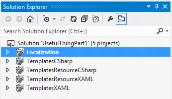
Project's structure
We need 5 projects in a solution. In this case the solution will call UsefulThingPart1. The structure of the project will be the following:
General steps
After we created our Silverlight project we must enable out of the browser functionality. For do it we must right-click on our created project and search for the option that I show you in the following screenshot:

In every button you will see the following Event Handler:
private void Button_Click(object sender, RoutedEventArgs e)
{
     MessageBox.Show("You Clicked Me!");
}
Every time that we click on button we will see the following MessageBox:
Templates inside Button and ComboBox with XAML
Inside our solution (UsefulThingPart1.sln) we must add a new project called TemplatesXAML, where we will add two controls. First, drag and drop a Button inside your MainPage.xaml page from Toolbox. The generated XAML code is the following:
<Button Content="Click Me!" HorizontalAlignment="Left" VerticalAlignment="Top" Click="Button_Click"/>
If we run the project (F5) we will see a Button with the text “Click Me!”, and if we click on that button we will see the MessageBox.
It’s time to create the template for this button. The idea is to add an icon, followed by a text aligned to the left and center. In this case we must add the follow tags inside the button. Also, you must delete the Content property in your button declaration.
The XAML code is the following:
<Button HorizontalAlignment="Left" VerticalAlignment="Top" Click="Button_Click" Margin="0 30 0 0">
            <Button.Content>
                <StackPanel Orientation="Horizontal">
                    <Image Source="Images/Click.png" Width="32" Height="32"
                           Stretch="Uniform" VerticalAlignment="Center" HorizontalAlignment="Left" />
                    <TextBlock Text="Click Me!" HorizontalAlignment="Left" VerticalAlignment="Center"  />
                </StackPanel>
            </Button.Content>
</Button>
Again, we run the project (F5) and we will see the two buttons with and without the template.
Now we try to add a ComboBox where we’ll show some options inside it, just write the following XAML code:
<ComboBox HorizontalAlignment="Left" Margin="0,80,0,0" VerticalAlignment="Top" >
      <ComboBoxItem Content="Item 1" />
      <ComboBoxItem Content="Item 2" />
      <ComboBoxItem Content="Item 3" />
      <ComboBoxItem Content="Item 4" />
      <ComboBoxItem Content="Item 5" />
</ComboBox>
After add the ComboBox, we can add templates inside each ComboBoxItem:
<ComboBox HorizontalAlignment="Left" Margin="-1,110,0,0" VerticalAlignment="Top" >
            <ComboBoxItem >
                <ComboBoxItem.Content>
                    <StackPanel Orientation="Horizontal">
                        <Image Source="Images/ComboItem.png" />
                        <TextBlock Text="Item 1" Margin="5 0 0 0" />
                    </StackPanel>
                </ComboBoxItem.Content>
            </ComboBoxItem>
            <ComboBoxItem >
                <ComboBoxItem.Content>
                    <StackPanel Orientation="Horizontal">
                        <Image Source="Images/ComboItem.png" />
                        <TextBlock Text="Item 2" Margin="5 0 0 0" />
                    </StackPanel>
                </ComboBoxItem.Content>
            </ComboBoxItem>
            <ComboBoxItem >
                <ComboBoxItem.Content>
                    <StackPanel Orientation="Horizontal">
                        <Image Source="Images/ComboItem.png" />
                        <TextBlock Text="Item 3" Margin="5 0 0 0" />
                    </StackPanel>
                </ComboBoxItem.Content>
            </ComboBoxItem>
            <ComboBoxItem >
                <ComboBoxItem.Content>
                    <StackPanel Orientation="Horizontal">
                        <Image Source="Images/ComboItem.png" />
                        <TextBlock Text="Item 4" Margin="5 0 0 0" />
                    </StackPanel>
                </ComboBoxItem.Content>
            </ComboBoxItem>
            <ComboBoxItem >
                <ComboBoxItem.Content>
                    <StackPanel Orientation="Horizontal">
                        <Image Source="Images/ComboItem.png" />
                        <TextBlock Text="Item 5" Margin="5 0 0 0" />
                    </StackPanel>
                </ComboBoxItem.Content>
            </ComboBoxItem>
        </ComboBox>
On this topic we learned how to implement templates inside the same control. Just you can see it’s easy to implement templates inside each control, but is very tedious to do this because we must to write this type of code of any controls that we need.
Templates inside Resources with XAML
Inside our solution (UsefulThingPart1.sln) we must add a new project called TemplatesResourcesXAML, where we will add two controls. First, drag and drop a Button inside your MainPage.xaml page from Toolbox. The generated XAML code is the following:
<Button Content="Click Me!" HorizontalAlignment="Left" VerticalAlignment="Top" Click="Button_Click"/>
If we run the project (F5) we will see a Button with the text “Click Me!”, and if we click on that button we will see the MessageBox.
At this point, we need to add two separated lines of XAML. The first one corresponds to the Resources of the User Control (or Page if we use it). So, just add this line of code:
<UserControl.Resources>
<DataTemplate x:Key="buttonTemplate">
<StackPanel Orientation="Horizontal">
<Image Source="Images/Click.png" Width="32" Height="32"
Stretch="Uniform" VerticalAlignment="Center" HorizontalAlignment="Left" />
<TextBlock Text="{Binding}" HorizontalAlignment="Left" VerticalAlignment="Center" />
</StackPanel>
</DataTemplate>
<DataTemplate x:Key="comboTemplate">
<StackPanel Orientation="Horizontal">
<Image Source="Images/ComboItem.png" />
<TextBlock Text="{Binding}" Margin="5 0 0 0" />
</StackPanel>
</DataTemplate>
</UserControl.Resources> So, we must add the xaml for Button and ComboBox. Let’s see the following code:
<Button Content="Click Me!" ContentTemplate="{StaticResource buttonTemplate}" Margin="0 30 0 0"
                HorizontalAlignment="Left" VerticalAlignment="Top" Click="Button_Click"/>

        <ComboBox HorizontalAlignment="Left" Margin="0,130,0,0" VerticalAlignment="Top" >
            <ComboBoxItem Content="Item 1" ContentTemplate="{StaticResource comboTemplate}" />
            <ComboBoxItem Content="Item 2" ContentTemplate="{StaticResource comboTemplate}" />
            <ComboBoxItem Content="Item 3" ContentTemplate="{StaticResource comboTemplate}" />
            <ComboBoxItem Content="Item 4" ContentTemplate="{StaticResource comboTemplate}" />
            <ComboBoxItem Content="Item 5" ContentTemplate="{StaticResource comboTemplate}" />
        </ComboBox>
For the example showed above, I use ContentTemplate because I explicity add the ComboBoxItem, but if we get data from Database we can add an ItemTemplate in the ComboBox element directly binding to the DataTemplate from resource.
Templates inside Button and ComboBox in code behind
Inside our solution (UsefulThingPart1.sln) we must add a new project called TemplatesCSharp, where we will add two controls. First, drag and drop a Button inside your MainPage.xaml page from Toolbox. The generated XAML code is the following:
<Button Content="Click Me!" HorizontalAlignment="Left" VerticalAlignment="Top" Click="Button_Click" Margin="0"/>
If we run the project (F5) we will see a button with the text “Click Me!”, and if we click on that button we will see the MessageBox.
It’s time to create another button. The idea is to add an icon, followed by a text aligned to the left and center. In this case we must add some lines of code in our C# file (MainPage.xaml.cs).
The XAML code is the following:
<Button x:Name="buttonTemplate" HorizontalAlignment="Left" VerticalAlignment="Top" Click="Button_Click" Margin="0 30 0 0"/>
And its c# code private method for apply DataTemplate is:
private DataTemplate SetButtonContent()
       {
           StringBuilder sb = new StringBuilder();

           sb.Append("<DataTemplate ");
           sb.Append("xmlns='http://schemas.microsoft.com/winfx/");
           sb.Append("2006/xaml/presentation' ");
           sb.Append("xmlns:x='http://schemas.microsoft.com/winfx/2006/xaml' >");
           sb.Append("<StackPanel Orientation='Horizontal'> ");
           sb.Append("<Image Source='Images/Click.png' Width='32' Height='32' ");
           sb.Append("Stretch='Uniform' VerticalAlignment='Center' HorizontalAlignment='Left' /> ");
           sb.Append("<TextBlock Text='Click Me!' HorizontalAlignment='Left' VerticalAlignment='Center'  />");
           sb.Append("</StackPanel> </DataTemplate>");

           DataTemplate dt = XamlReader.Load(sb.ToString()) as DataTemplate;
           return dt;
       }
So, the private method can be called by the constructor class. Let me show you:
this.buttonTemplate.ContentTemplate = this.SetButtonContent();
Again, we run the project (F5) and we will see the two buttons with and without the template.
Now we try to add a ComboBox where we’ll show some options inside it, just write the following XAML code:
 <ComboBox HorizontalAlignment="Left" Margin="0,80,0,0" VerticalAlignment="Top" >
      <ComboBoxItem Content="Item 1" />
      <ComboBoxItem Content="Item 2" />
      <ComboBoxItem Content="Item 3" />
      <ComboBoxItem Content="Item 4" />
      <ComboBoxItem Content="Item 5" />
</ComboBox>
After add the ComboBox, we can add templates inside each ComboBoxItem, but here we will fill the ComboBox by code behind:
<ComboBox x:Name="comboTemplate" HorizontalAlignment="Left" VerticalAlignment="Top" Margin="0 100 0 0" />
And its c# code private method for apply DataTemplate is:
private DataTemplate SetComboBoxContentTemplate()
       {
           StringBuilder sb = new StringBuilder();

           sb.Append("<DataTemplate ");
           sb.Append("xmlns='http://schemas.microsoft.com/winfx/");
           sb.Append("2006/xaml/presentation' ");
           sb.Append("xmlns:x='http://schemas.microsoft.com/winfx/2006/xaml' >");
           sb.Append("<StackPanel Orientation='Horizontal'> ");
           sb.Append("<Image Source='Images/ComboItem.png' /> ");
           sb.Append("<TextBlock Text='{Binding}' Margin='5 0 0 0' /> ");
           sb.Append("</StackPanel> </DataTemplate>");

           DataTemplate dt = XamlReader.Load(sb.ToString()) as DataTemplate;
           return dt;
       }
So, the private method can be called by the constructor class (in the source code you will see another private method just for call to this lines of code to be more organized). Let me show you:
this.comboTemplate.Items.Add(new ComboBoxItem() { Content = "Item 1", ContentTemplate = this.SetComboBoxContentTemplate() });
this.comboTemplate.Items.Add(new ComboBoxItem() { Content = "Item 2", ContentTemplate = this.SetComboBoxContentTemplate() });
this.comboTemplate.Items.Add(new ComboBoxItem() { Content = "Item 3", ContentTemplate = this.SetComboBoxContentTemplate() });
this.comboTemplate.Items.Add(new ComboBoxItem() { Content = "Item 4", ContentTemplate = this.SetComboBoxContentTemplate() });
this.comboTemplate.Items.Add(new ComboBoxItem() { Content = "Item 5", ContentTemplate = this.SetComboBoxContentTemplate() });
This implementation may be very useful when you need to change Template at runtime or just if you want to write some lines of code like me.
Templates inside Resources with XAML
Inside our solution (UsefulThingPart1.sln) we must add a new project called TemplatesResourcesCSharp, where we will add two controls. First, drag and drop a button inside your MainPage.xaml page from Toolbox. The generated XAML code is the following:
<Button<span style="white-space: pre-wrap; "> </span>Content="Click Me!"<span style="white-space: pre-wrap; "> </span>HorizontalAlignment="Left"<span style="white-space: pre-wrap; "> </span>VerticalAlignment="Top"<span style="white-space: pre-wrap; "> </span>Click="Button_Click"/>
If we run the project (F5) we will see a Button with the text “Click Me!”, and if we click on that button we will see the MessageBox.
At this point, we need to add two separated lines of XAML. The first one corresponds to the Resources of the User Control (or Page if we use it). So, just add this line of code:
<UserControl.Resources>
<DataTemplate x:Key="buttonTemplate">
<StackPanel Orientation="Horizontal">
<Image Source="Images/Click.png" Width="32" Height="32"
Stretch="Uniform" VerticalAlignment="Center" HorizontalAlignment="Left" />
<TextBlock Text="{Binding}" HorizontalAlignment="Left" VerticalAlignment="Center" />
</StackPanel>
</DataTemplate>
<DataTemplate x:Key="comboTemplate">
<StackPanel Orientation="Horizontal">
<Image Source="Images/ComboItem.png" />
<TextBlock Text="{Binding}" Margin="5 0 0 0" />
</StackPanel>
</DataTemplate>
</UserControl.Resources>
So, we must add the C# code in code behind to apply this resources for Button and ComboBox. Let’s see the following code:
this.btnTemplate.ContentTemplate = this.Resources["buttonTemplate"] as DataTemplate;
this.comboTemplate.Items.Add(new ComboBoxItem() { Content = "Item 1", ContentTemplate = this.Resources["comboTemplate"] as DataTemplate });
            this.comboTemplate.Items.Add(new ComboBoxItem() { Content = "Item 2", ContentTemplate = this.Resources["comboTemplate"] as DataTemplate });
            this.comboTemplate.Items.Add(new ComboBoxItem() { Content = "Item 3", ContentTemplate = this.Resources["comboTemplate"] as DataTemplate });
            this.comboTemplate.Items.Add(new ComboBoxItem() { Content = "Item 4", ContentTemplate = this.Resources["comboTemplate"] as DataTemplate });
            this.comboTemplate.Items.Add(new ComboBoxItem() { Content = "Item 5", ContentTemplate = this.Resources["comboTemplate"] as DataTemplate });
Implement Localization via XAML and code behind
The first step is to define the culture of our Assembly, this going to be our default language for the project. So, we must right-click over Properties of the project, and then in the Silverlight tab we search the button Assembly Information… just click on it. After that, do the following (in my case I selected English - USA):
At this point, we need to add a new file of type Resource. For do that we need to right-click on the project and select Add -> New Item… And then we put a name to the file. The following screenshot shows the step explained here:
Now we add some resources in the generated file. Don’t forget to set Access Modifier to Public on this file because .NET needs to generate the respective code for the resource. So, on the default resource file (English in this case) .NET generates the properties for each entry on the resource file.
So, in our MainPage.xaml.cs we set the Text property of our first TextBlock with the TextBlockCSharp property of the resource. See how here:
this.textCSharp.Text = MainPage.TextBlockCSharp;
Create a class called ResourceStrings that we going to use for our resource in XAML files. This way we will always have a property available for a determinate string. So, this is the content of the file:
namespace Localization
{
public class ResourceStrings
{
public ResourceStrings() { }
private static MainPageResource mainPageResource = new MainPageResource();
public MainPageResource MainPageResource { get { return mainPageResource; } }
}
}
Now, in our XAML file (any) we can access to the resource just through the following syntax:
<TextBlock Margin="0 30 0 0" Text="{Binding Path=MainPageResource.TextBlockXAML, Source={StaticResource ResourceStrings}}" />
At this point, we going to receive and error because we not set the Resource to the Application.Resources, for do that open the App.xaml file:
<local:ResourceStrings xmlns:local="clr-namespace:Localization"
                           x:Key="ResourceStrings" />
In the code behind we must add the following lines of code (in Application_Startup event), for localization works:
Thread.CurrentThread.CurrentCulture = Thread.CurrentThread.CurrentUICulture =
             new System.Globalization.CultureInfo("es-PY");
In the code above we need to replace the string inside constructor of CultureInfo. In the example we can put es-PY (if we want to see in Spanish – Paraguay on our text blocks) or any other language to show us the default language (English)
Points of Interest
Hope, this tutorial was helpful for you to understand some useful things that you can do with Silverlight.
Did you like the tutorial? Don’t forget to share it to others, rate, comment and Bookmark it =)
What's Next?
You can find more useful things on Silverlight in future articles on this site. Stay tuned!
You can also visit my Spanish Blog here for Spanish version of this article.
hristian Amado is a professional software engineer, professional developer and trainer with over 18 years of experience building applications for Windows Desktop and the Web. Located in Asuncion, Paraguay, He's well involved in many Microsoft's technologies including XAML, C#, X++, WCF, ADO.NET and ASP.NET.
He holds a several Microsoft certifications including Microsoft Certified Professional Developer (MCPD), Microsoft Certified IT Professional, Microsoft Certified Technology Specialist and Microsoft Office Specialist.


 General
  News
News  Suggestion
  Question
  Bug
Bug  Answer
  Joke
Joke  Praise
  Rant
Rant  Admin
Admin 


 Submit an article or tip


