Anatomy of a Button
Rather than throw some boring code at you (and nobody reads that anyways...), I thought I'd lend some insight into how I constructed the visual styles used in this control..
The first thing I do, and I mean the very first step in the process, is to get a good idea of what you need from the usercontrol, and some idea of what you want the completed control to look like. I often browse wincustomize.com or professional control makers websites to get a feel for possible features and UI cues, also, look at windows/mac, and try to imagine how they created those graphics, and even how they might be improved upon.
The next step is to get the framework of the control up and running. Create the usercontrol, add all the basic functionality to it, and try to create a simple and problem free framework to work with. This is how I started with this slider, it wasn't until I had all of the basic functionality working that I started to write the graphics code. Throughout this process, it is important to keep everything as well organized as possible. One of the features I like best about .NET is the #region directive. It allows you to compartmentalize and organize large classes and methods into manageable chunks. Also I'd recommend using private properties or constants for internal measurements, as the code grows more complex, the likelihood that hard coded numbers will need to change becomes increasingly more likely. This is something I ran into when writing the Autosize feature of this control; because some numbers were coded in a method, a mistake caused me to waste an hour tracking down a problem.
Drawing a Glossy Button..
The first step is to fill the button with a solid backcolor. This is to ensure that if using transparent colors, the button will remain solid. Use white if you are using semi transparent colors and want a glow effect, otherwise use the button base color:
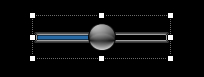
You can see from the above image that the button is out of scale. I do this so that subtleties of the gradient shadings are obvious. You can also see this is just a plain black border with a white fill, this is just the canvas before the addition of three gradients:
The first gradient is a vertical linear gradient with a blend factor using a translucent white at 180 alpha, fading into the button base color at the center. This gives the appearance of shape, that the button is protruding from a flat surface.
using (GraphicsPath gp = new GraphicsPath())
{
gp.AddEllipse(buttonRect);
using (Brush br = new SolidBrush(Color.FromArgb(255, this.ButtonColor)))
g.FillPath(br, gp);
using (LinearGradientBrush fillBrush = new LinearGradientBrush(
buttonRect,
Color.FromArgb(180, Color.White),
this.ButtonColor,
LinearGradientMode.Vertical))
{
Blend blnd = new Blend();
blnd.Positions = new float[] { 0f, .1f, .2f, .3f, .6f, 1f };
blnd.Factors = new float[] { .2f, .3f, .4f, .5f, 1f, 1f };
fillBrush.Blend = blnd;
g.FillPath(fillBrush, gp);
}

I also wanted a glow coming from underneath using an accent color, similar to the MediaPlayer buttons. The accent color is user definable, meaning that you can go from a subtle to a very pronounced effect. Though these images show you the property colors for the button on a white background, while designing them, I used the colors red and white on a black background. This gives you a much better sense of how the gradients are interacting. The bottom glow was made by adding a new ellipse to the graphics path, and pushing it to the bottom of the button and drawing it with a PathGradientBrush:
using (PathGradientBrush borderBrush = new PathGradientBrush(gp))
{
using (GraphicsPath ga = new GraphicsPath())
{
accentRect.Inflate(0, (int)-(accentRect.Height * .2f));
accentRect.Offset(0, (int)(ButtonSize.Width * .2f));
ga.AddEllipse(accentRect);
fx = accentRect.Width * .5f;
fy = accentRect.Height * 1f;
borderBrush.CenterColor = this.ButtonColor;
borderBrush.SurroundColors = new Color[] { this.ButtonAccentColor };
borderBrush.FocusScales = new PointF(1f, 0f);
borderBrush.CenterPoint = new PointF(fx, fy);
g.FillPath(borderBrush, ga);
}
This last gradient adds a spotilght effect at about 300 degrees to the top of the button, making it seem like the light source is to the top left of the button image.
fx = buttonRect.Width * .2f;
fy = buttonRect.Height * .05f;
borderBrush.CenterColor = Color.FromArgb(120, Color.White);
borderBrush.SurroundColors = new Color[] { Color.FromArgb(5, Color.Silver) };
borderBrush.FocusScales = new PointF(.2f, .2f);
borderBrush.CenterPoint = new PointF(fx, fy);
g.FillPath(borderBrush, gp);
This might all seem like a lot of effort for such a small button, but I think the details are important, and if anything, the button graphics could be made even more intricate. Also note that all of the button styles are actually rendered onto a Bitmap, created once, and require only a single DrawImage command to render. Otherwise this would not be flicker free..
Properties
I wanted most aspects of this to be modifiable, so left many of the properties open to customization:
Animated Run the animation effect when focused AnimationSpeed Animation cycle speed [Fast Normal Slow] AnimationSize Percentage of size of sprite width to track width [min .05 - max .2] BackGroundImage Use an image for the slider background ButtonAccentColor Modify button accent color ButtonBorderColor Modify button border color ButtonColor Modify button base color ButtonCornerRadius Adjusts the slider buttons corner radius ButtonSize Modify slider button size ButtonStyle Set the button style [Round RoundedRectOverlap RoundedRectInline Hybrid PointerUpLeft PointerDownRight GlassInline GlassOverlap] IsInited Returns the control's initialized state LargeChange The number of clicks the slider moves in response to mouse clicks or pageup/pagedown Maximum The maximum value for the position of the slider MaxSize The maximum Size value for the control [private set] Minimum The minimum value for the position of the slider MinSize The minimum Size value for the control [private set] Orientation The orientation of the control PrecisionValue Returns the slider position to a floating point, requires SmoothScrolling set to true SmallChange The number of positions the slider movers in response to arrow keys SmoothScrolling Enable smooth scrolling style Value The position of the slider ShowButtonOnHover Show the slider button only when control is focused or mouse is hovering SliderFlyOut Enable the flyout caption window [None OnFocus Persistant] TickColor Modify slider tick color TickStyle Select the tickstyle TickType Select the tick drawing style TrackBorderColor Modify slider border color TrackDepth Adjust the slider track depth TrackFillColor Set the track backcolor TrackProgressColor Set the track backcolor TrackShadow Enable track shadow TrackShadowColor Modify track shadow color TrackStyle The display style of track [Progress Value]
Styles
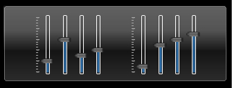
Some of the hilites:
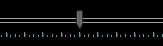
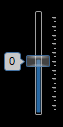
Precision Style
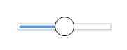
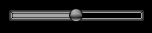
Round
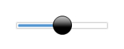
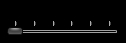
RoundedRect
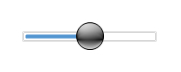
Glass
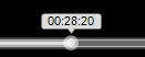
WMC Clone with Flyout Caption
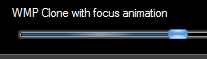
WMP Clone with Focused Animation
Caption Toolbar
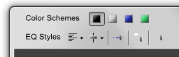
If you're running Aero, the toolbars in the caption area probably caught your notice... It's a good example of how to use this (why clutter up the demo form?).
It's all portable, just copy the ExtendFrame region's contents, update your directives and call the ExtendMargin method as in the example, or see my article on the subject.
Network and programming specialist. Started in C, and have learned about 14 languages since then. Cisco programmer, and lately writing a lot of C# and WPF code, (learning Java too). If I can dream it up, I can probably put it to code. My software company, (VTDev), is on the verge of releasing a couple of very cool things.. keep you posted.


 General
  News
News  Suggestion
  Question
  Bug
Bug  Answer
  Joke
Joke  Praise
  Rant
Rant  Admin
Admin 


 Submit an article or tip


