First Words
Usually when someone is working on Windows Phone 8.1 and usually if he's the guy who just came from Windows Phone 8 development, the first thing he misses is all the toolkits lying around like the Windows Phone Toolkit or Coding4Fun Toolkits. Thus, missing a rating control is not new. So, let's get our hands dirty and make a little 5 starred rating control fast enough to solve our problem at least to a minimum extent.
Design First!
Okay, to do this thing fast, we might need to make at least a little bit of groundwork in design, I'm going to use Microsoft Expression Design for it. You guys can get the free version from here. It's pretty lightweight and we can practically export stuff straight to Blend for Visual Studio!
So, let's go over Microsoft Expression Blend and create a new document. Take a size to your preference as you need it. Let's draw some stars! To get started, look on the left toolbar and select Polygons.
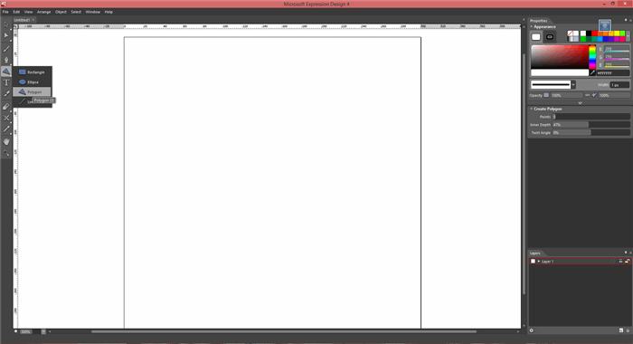
After you select polygons, drag your mouse pointer in the artboard to draw anything that pops off. Now, it might be any kind of polygon, starting from a triangle, like the following came up with too much of points.

To rectify this, we need to make sure it has 5 points and an inner depth above 40% and close to 50% so it looks like a star, you can modify the existing one you made or set the proper settings and make a new one. To do that, look on the right on Edit Polygon dialog and change the points to 5 and move the innder depth to 47%. If you want to create a new one you will see the dialog name is Create Polygon. You can go for anything in between 45% tp 50%, I used 47% in this case.
Now, with the proper settings set with the polygon give it a yellowish shade and no borders please. And copy the stars and set them side by side so you can have 5 stars in a line that resembles a regular rating control. So, in the artboard it might look pretty close to the one following:
Now, what we want to do is put these together on a gradient so it resembles more to the rating control. But before we go do that, we need to make the stars act as a compound path together. So, lets go ahead and select all of them and select Object -> Compound Path -> Make so all the stars can work as a compound path.
Now, it's time to put a gradient over it. Select a yellow to white gradient and put it on your rating control from left to right. Now, there comes a trick, at first you will see the color melted down in the middle, in a rating control we need a clear difference of color to make sure that it looks like one.
Now, click on the gradient bar in the middle to put a gradient stop in there.
Now, drag the midpoints (the dots over the gradient bar) and put them together to make the color difference more prominent.
Now, if we move the Gradient Stop now, we will see the color changes are more prominent and the starts look a lot like rating control now.
Now let's go over Visual Studio and create a Windows Phone 8.1 Project. Let's put a Right Click on the solution name and add a user control.
Now, lets select the user control and open it on blend. Let's select all the stars, copy it and just paste it on the grid of the user control. To your surprise, this thing will just get copied to blend just fine. And let's make the height of the user control to 40 and the width to 200 just to get the user control to appropriate proportion. I copied a set of stars and put the background to a very light gray color and put it behind the ones we copied at first so it looks a bit more prominent even in a white background.
Now, the xaml for the usercontrol will look somewhat like the following:
<UserControl
    x:Class="RatingControlTest.usercontrol"
    xmlns="http://schemas.microsoft.com/winfx/2006/xaml/presentation"
    xmlns:x="http://schemas.microsoft.com/winfx/2006/xaml"
    xmlns:d="http://schemas.microsoft.com/expression/blend/2008"
    xmlns:mc="http://schemas.openxmlformats.org/markup-compatibility/2006"
    mc:Ignorable="d"

    d:DesignHeight="40"
    d:DesignWidth="200">

    <Grid>
        <Path Stretch="Fill"
              Data="M -1346.6,-259.247L -1358.76,-305.451L -1321.61,-335.489L -1369.31,-338.197L -1386.39,-382.816L -1403.71,-338.285L -1451.43,-335.823L -1414.43,-305.594L -1426.83,-259.454L -1386.65,-285.302L -1346.6,-259.247 Z M -1067.9,-259.247L -1080.07,-305.451L -1042.91,-335.489L -1090.61,-338.197L -1107.7,-382.816L -1125.01,-338.285L -1172.73,-335.823L -1135.73,-305.594L -1148.13,-259.453L -1107.95,-285.301L -1067.9,-259.247 Z M -1207.25,-259.247L -1219.41,-305.451L -1182.26,-335.489L -1229.96,-338.197L -1247.05,-382.816L -1264.36,-338.285L -1312.08,-335.823L -1275.08,-305.594L -1287.48,-259.453L -1247.3,-285.301L -1207.25,-259.247 Z M -928.552,-259.247L -940.718,-305.451L -903.562,-335.489L -951.264,-338.197L -968.35,-382.816L -985.666,-338.285L -1033.38,-335.823L -996.382,-305.594L -1008.79,-259.453L -968.602,-285.301L -928.552,-259.247 Z M -789.204,-259.247L -801.369,-305.451L -764.214,-335.489L -811.916,-338.197L -829.002,-382.816L -846.318,-338.285L -894.034,-335.823L -857.033,-305.594L -869.437,-259.453L -829.254,-285.301L -789.204,-259.247 Z "
              UseLayoutRounding="False"
              HorizontalAlignment="Left"
              VerticalAlignment="Top"
              Height="Auto" Width="Auto" Fill="#FFDEDEDE"/>
        <Path Stretch="Fill"
              Data="M -1346.6,-259.247L -1358.76,-305.451L -1321.61,-335.489L -1369.31,-338.197L -1386.39,-382.816L -1403.71,-338.285L -1451.43,-335.823L -1414.43,-305.594L -1426.83,-259.454L -1386.65,-285.302L -1346.6,-259.247 Z M -1067.9,-259.247L -1080.07,-305.451L -1042.91,-335.489L -1090.61,-338.197L -1107.7,-382.816L -1125.01,-338.285L -1172.73,-335.823L -1135.73,-305.594L -1148.13,-259.453L -1107.95,-285.301L -1067.9,-259.247 Z M -1207.25,-259.247L -1219.41,-305.451L -1182.26,-335.489L -1229.96,-338.197L -1247.05,-382.816L -1264.36,-338.285L -1312.08,-335.823L -1275.08,-305.594L -1287.48,-259.453L -1247.3,-285.301L -1207.25,-259.247 Z M -928.552,-259.247L -940.718,-305.451L -903.562,-335.489L -951.264,-338.197L -968.35,-382.816L -985.666,-338.285L -1033.38,-335.823L -996.382,-305.594L -1008.79,-259.453L -968.602,-285.301L -928.552,-259.247 Z M -789.204,-259.247L -801.369,-305.451L -764.214,-335.489L -811.916,-338.197L -829.002,-382.816L -846.318,-338.285L -894.034,-335.823L -857.033,-305.594L -869.437,-259.453L -829.254,-285.301L -789.204,-259.247 Z "
              UseLayoutRounding="False"
              HorizontalAlignment="Left"
              VerticalAlignment="Top"
              Height="Auto" Width="Auto">
            <Path.Fill>
                <LinearGradientBrush StartPoint="3.55262e-007,0.500002" EndPoint="1,0.500001">
                    <GradientStop Color="#FFFFCC00" Offset="0.6"/>
                    <GradientStop Color="#06FCFCFC" Offset="0.6"/>
                </LinearGradientBrush>
            </Path.Fill>
        </Path>

    </Grid>
</UserControl>
Code Comes Along
Now if we remember stuff clearly, when we moved the gradient stop in blend it looked like the rating bar value is changing. We just need to emulate that in code, that's it. So, all we need to is change the Offset of <GradientStop> 's in LinearGradientBrush entry inside <Path.Fill>. So, we have to databind the offset from backend so we can access it from the usercontrol. And please remember this have to be 0.0 to 1 of course as thats the range for the offset value.
I renamed my user control to RatingControl and let's move back to the code backend of RatingControl.xaml
public partial class RatingControl : UserControl
    {
        public RatingControl()
        {
            this.InitializeComponent();
        }

        DependencyProperty RateValueProperty = DependencyProperty.Register("RateValue", typeof(double), typeof(RatingControl), new PropertyMetadata(0.1, UpdateValue));

        private static void UpdateValue(DependencyObject d, DependencyPropertyChangedEventArgs e)
        {
            RatingControl control = d as RatingControl;
            control.Value = (double)e.NewValue;
        }

        private double Value
        {
            get { return (double)GetValue(ValueProperty); }
            set { SetValue(ValueProperty, value); }
        }

        private static readonly DependencyProperty ValueProperty =
            DependencyProperty.Register("Value", typeof(double), typeof(RatingControl), new PropertyMetadata(0.1));

        public double RateValue
        {
            get
            {
                return (double)GetValue(RateValueProperty);
            }
            set
            {
                SetValue(RateValueProperty, value);
            }
        }

    }
Now, our job was to hook up the Value provided from backend. Now I used two DependencyProperty here instead of one because we are going to attach the value in the xaml using a element binding. The first DependencyProperty RateValueProperty has a PropertyMetadata of 0.1 and a function is attached to update the value in the xaml control (update the offset from the xaml).
And Value is the actual DependencyProperty Attached to the control and as it's private it's accessible only from inside. So we are exposing it using the RateValueProperty and update it with the Value Dependency Property. You can only use Value and expose it if you want.
Now all we have to do is hook it up in the xaml:
Let's add a name to the Rating Control. Lets just add x:Name="UserControl" in the UserControl Tag. And let's tag the GradientStop property Offset on the ElementName "UserControl". So, let's modify the GradientStop tags as following:
<Path.Fill>
     <LinearGradientBrush StartPoint="3.55262e-007,0.500002" EndPoint="1,0.500001">
          <GradientStop Color="#FFFFCC00" Offset="{Binding Value, ElementName=UserControl}"/>
          <GradientStop Color="#06FCFCFC" Offset="{Binding Value, ElementName=UserControl}"/>
      </LinearGradientBrush>
</Path.Fill>
And voila! We are done!
Using the control
Using the control is pretty easy, add xmlns:local="using:RatingControlTest" in the page tag and use it just like the following:
<Page
    x:Class="RatingControlTest.MainPage"
    xmlns="http://schemas.microsoft.com/winfx/2006/xaml/presentation"
    xmlns:x="http://schemas.microsoft.com/winfx/2006/xaml"
    xmlns:local="using:RatingControlTest"
    xmlns:d="http://schemas.microsoft.com/expression/blend/2008"
    xmlns:mc="http://schemas.openxmlformats.org/markup-compatibility/2006"
    mc:Ignorable="d"

    Background="{ThemeResource ApplicationPageBackgroundThemeBrush}">

    <Grid>
        <local:RatingControl Width="200" Height="40" RateValue="0.5"></local:RatingControl>
    </Grid>
</Page>
And it will look like the following:
Hope this helps! ;)
Microsoft MVP, Ex Microsoft Student Partner, Windows Phone Enthusiast, Creepy Follower of .net resources.


 General
  News
News  Suggestion
  Question
  Bug
Bug  Answer
  Joke
Joke  Praise
  Rant
Rant  Admin
Admin 


 Submit an article or tip


