This article is going to mainly focus on sizing article-specific content. It will use a lot of Flexbox and will look at effective ways of making a website screen size adjustable by using some great things in HTML and CSS.
Introduction
You might wonder that some web sites are flexible enough to adjust to any screen resolution. This capability can be approached by many ways, by using many web technologies, such like Javascript, Css, Html.
Background
The article that I am going to write today is mainly focus on article specific content. There may be some points where I am not much considering since those are very basics on HTML and CSS.
Using the code
For some web developers are bit struggling to make their web site screen resolution adjusting. In order to give a unique experience to the user, this aspect is very critical. Since with the technology changes users are more into use different devices to browse internet. So it is very important that web site need to accommodate every resolution.
One of the easiest way is to make web site with percentage widths.
.WebContainer{
width: 100%;
height: auto;
}
.articles{
width:90%;
height: auto;
margin: auto;
}
But this approach is less effective. If user loads the web site from a mobile device. It takes the width from screens 100%, which is very small amount of space.
Another approach can be give minimum width with percentages.
.WebContainer{
    width:100%;
    min-width:1000px;
    height:auto;
}
In above scenario web site decreases its web site only upto 1000px.
So lets take a look at a effective way of make a web site screen size adjustable by using some great things in HTML and CSS.
Lets look at what we are going to do. In this case I demonstrate this with different devices (Iphone 5, Galaxy S4, Windows Phone 920 and ITab 2). Also I tested it from two browsers Chrome, FireFox and IE, but in IE media queries doesn't work. I found a solution for it but didn't work.
Actually the technique that I am going to use can use in many different ways, I have dome my demonstration coding which matches to my scenario. Your development can differ that this. But my ultimate goal is to show how use this.
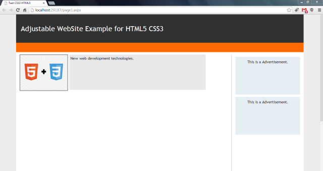
This is with full browser size.
Browser reduced so that Advertisement area is hidden.

Browser more reduced.
Firefox
Browser more reduced to make Image and Description align well.
The design layout for the above web site is
What need to be done;
First lets take a look at HTML
<!DOCTYPE html>
<html xmlns="http://www.w3.org/1999/xhtml">
<head>
<title>Test CSS3 HTML5</title>
<!--
<!--
<link href="StyleSheet.css" rel="stylesheet" type="text/css" media="only screen" />
<link href="MobileStyleSheet.css" rel="stylesheet" type="text/css" media="only screen and (max-device-width: 480px) , only screen and (-webkit-min-device-pixel-ratio: 2) , screen and (-webkit-device-pixel-ratio:1.5)" />
<!--
<!--
</head>
<body>
<div class="Container">
<header>
<span>Adjustable WebSite Example using HTML5 CSS3 </span>
</header>
<nav>
</nav>
<div class="content">
<section class="main_articles">
<article class="siteDescription">
<div class="desImage">
<img src="Images/css_image.jpg" />
</div>
<div class="des">
New web development technologies.
</div>
</article>
</section>
<aside class="side_article">
<div class="ads">
This is a Advertisement.
</div>
<div class="ads">
This is a Advertisement.
</div>
</aside>
</div>
<footer>
</footer>
</div>
</body>
</html>
For above HTML markup I have mostly used semantic HTML. Which is Header, Footer, Aside, Section tags. Those tags allow you to define better meaning to the browser which improves the search engine readability.
In first line I have define the tags that says or instructs to the web browser about what version of HTML the page is written in. <!DOCTYPE html> means HTML 5.
And then I declared an attribute which specifies the xml namespace for a document.
Then I have used conditional comments that if browser is Internet Explore use the mentioned script that defines HTML 5 tags, because some of old IE browsers cannot identify HTML5 tags. Also I have imported css3-mediaqueries.js script since IE 8 or later does not support media queries.
Then I have used another conditional comment if browser is Not IE. In this statement I first check whether browsing device is a computer (media="only screen"), if so I import styles specific to computer screens that adjust for screen resolution. Then in second I check whether browsing device is mobile device (media="only screen and (max-device-width: 480px) , only screen and (-webkit-min-device-pixel-ratio: 2) , screen and (-webkit-device-pixel-ratio:1.5)"). Here I have used many media conditions,
First for Iphones screen and (max-device-width: 480px) next for Android Devices screen and (-webkit-min-device-pixel-ratio: 2) next for Iphones with retina display screen and (-webkit-device-pixel-ratio:1.5)
Then again I use another conditional comment for IEMobile browsers.
But here I need to say that. Making media queries compatible with IE 8 or later didn't work with css3-mediaqueries.js script. In a forum I saw that there are waiting for a new release of script.
Rest of the tags are pretty normal; where I wrap all the elements from Container div tag. Then Header tag that includes the web site Heading, next the Nav tag that includes navigation links; which I kept blank cause I don’t have any page navigating.
Then I declared a div that wraps all the content of the web page. I declared this to give a clear separation from Header tag and Footer tag.
Content div includes two main elements, one is <section> tag and <aside> tag. <section> tag defines sections in a web page and <aside> tag defines contents aside from the main content. Here I use <section> tag to include all the page content, such like posts, descriptions and <article> tag to hold Advertisements.
Inside <section> tag I declared an <article> which specifies independent, self-contained content. In <article> tag there are two elements that holds an image and some text.
So where does the Magic happens, it is all with CSS. Here I am not going to do any explanation with basic CSS properties, but I’ll concentrate more on tutorial specific properties.
First things first, lets set the layout of the web page.
body, html {
margin: 0px;
padding: 0px;
background-color: #ededed;
font-family: 'Trebuchet MS';
}
.Container {
width: 90%;
min-width: 500px;
margin: auto;
}
header {
width: 100%;
height: 120px;
line-height: 120px;
background-color: #313131;
}
header span {
color: #fff;
font-size: 30px;
padding-left: 20px;
}
nav {
width: 100%;
height: 40px;
background-color: #ff6a00;
}
.content {
width: 100%;
height: 700px;
padding: 10px 0px;
background-color: #fff;
}
footer {
width: 100%;
height: 80px;
background-color: #808080;
margin-bottom: 20px;
}
.main_articles {
width: 70%;
float: left;
height: 650px;
margin-left: 10px;
}
.side_article {
width: 25%;
float: right;
height: 600px;
border-left: 1px dotted #6d6d6d;
}
.siteDescription {
display: -moz-box;
display: -webkit-box;
display: -ms-flexbox;
display: flexbox;
flex-direction: row;
flex-align:start;
width: 95%;
height: 150px;
}
.desImage {
-webkit-box-ordinal-group: 1;
-moz-box-ordinal-group: 1;
-ms-flex-order: 1;
-webkit-order: 1;
flex-order: 1;
width: 200px;
height: 150px;
}
.desImage img {
width: 200px;
height: 150px;
margin-left: 5px;
border: 2px solid #6d6d6d;
}
.des {
margin-left: 15px;
-webkit-box-ordinal-group: 2;
-moz-box-ordinal-group: 2;
-ms-flex-order: 2;
-webkit-order: 2;
flex-order: 2;
width: 70%;
height: 140px;
background-color: #e9e9e9;
padding: 5px;
}
.ads {
width: 90%;
margin: auto;
margin-top: 10px;
height: 150px;
text-align: center;
padding-top: 10px;
background-color: #e5eff3;
}
First I removed the browser’s default page margin and padding. And set the background color and font.
Then I set the width for main wrapper; the div which I wraps all the page elements. As I discuss in the beginning of the tutorial it is always better to use percentages for widths, cause the the web page is more flexible for what ever the resolution that it’s works on. In this scenario web page container always takes 90% width from browser width. And by setting margin auto, it aligns the element to center of the web page.
Next I set the header element width of 100%; now here you have to make sure that it doesn’t take 100% from browser instead it takes 100% width from Container div. Also I set the height of 120px.
Footer, Nav and Content would looks same as header.
Now comes for a bit tricky point. How to make main_articles <section> tag display in left and the side_articles <aside> tag display in right. Well you could do it by using tables, no fuss at all. But to be frank using tables for page layout alignment is bit out-dated and less maintainable. Using <div> or <section> are always better and safe side.
To main_articles section I set width of 70% from width of Content div, then I make the section float left and to the side_article I declare width of 25% from content width makes it float right.
Using float to adjust elements are now getting out-dated as well, so what’s the new thing?
Using flexbox is the new trend. Its improves the maintainability. First take a look at the layout that we use to display article description and image.
Lets start, first we have to make the wrapping <article> tag (siteDescription) a flexbox. For that I set display: flexbox. Then I set the flex-direction: row.
row (default): left to rightrow-reverse: right to leftcolumn: aligns the flex items top to bottomcolumn-reverse: aligns the flex items bottom to top
Then I set the desImage <div> and des <div> flexbox items by setting their flexbox-order. Finally I set styles for the Advertisement <div> with width 90% from <aside> width.
Well we have done with initial layout.
Lets do the magic; magic is all with CSS @media queries. By using @media queries, we can have a different layout for screen, print, mobile phone, tablet, etc.
There are many media types.
- all - Used for all media type devices
- aural - Used for speech and sound synthesizers
- braille - Used for braille tactile feedback devices
- embossed - Used for paged braille printers
- handheld - Used for small or handheld devices
- print - Used for printers
- projection - Used for projected presentations, like slides
- screen - Used for computer screens
- tty - Used for media using a fixed-pitch character grid, like teletypes and terminals
- tv - Used for television-type devices
You can refer more about @media queries at w3schools link: About Media Queries
Lets do some modification when screen comes to width of 900px;
@media all and (max-width: 900px) {
.side_article {
display: none;
visibility: hidden;
}
.siteDescription {
width: 100%;
}
.main_articles {
width: 90%;
}
}
When screen width comes to 900px width, I hide the <aside> advertisement section. After that I set the main_articles <section> element width of 90% to fill the space and siteDecription <article> element width of 100% to fill the space inside <article> element.
Then I want to do some space modification when the screen gets up to 700px, actually this is not much important but for my scenario it looks more cleaner.
@media all and (max-width: 700px) {
header {
height: 90px; * Earlier 120px*/
line-height: 90px; * Earlier 120px*/
}
header span {
font-size: 20px;
}
.des {
width: 50%;
background-color: #e9e9e9;
}
}
Here I have reduce the header height and font size once the screen width 700px. And reduce the width of description <div> to 50% so it looks more aligned.
Now I do the biggest part, do modifications when screen upto width of 500px; I want to display my page like this.
@media all and (max-width: 500px) {
    header {
        height: 70px;
        line-height: 70px;
    }

        header span {
            font-size: 16px;
        }

    .side_article {
        display: none;
        visibility: hidden;
    }

    .main_articles {
        width: 90%;
    }

    .siteDescription {
        width: 95%;
        height: auto;
        display: block;
    }

    .desImage {
        margin: auto;
        width: 90%;
        height: auto;
    }

        .desImage img {
            width: 95%;
            margin-left: 5px;
        }

    .des {
        margin: auto;
        margin-top: 10px;
        width: 90%;
        height: 300px;
        background-color: #d9d9d9;
    }
}
So now I don’t need all flexbox stuff. All I need is to do some basic adjustments. Where Image and Description <div> to take 90% width. As earlier I reduce the header height and font size. Then I hide the advertisement are. Then I set main_articles <section> to take width of 90% and siteDescription <article> to take width of 95% from main_articles width.
Also I remove the flexbox property from siteDescription <article> and make it as black view.
Finally I do make Image and Description <div> to take 90% width and remove flexbox-order property.
Now let's see styles for Mobile device.
iPhone
Android (Galaxy s4 )
Windows Phone (920)
These styles are not much differ from styles that I used for layout that screen upto width of 500px.
body, html {
    margin: 0px;
    padding: 0px;
    background-color: #ededed;
    font-family: 'Trebuchet MS';
}

@media only screen and (max-device-width: 480px), only screen and (-webkit-min-device-pixel-ratio: 2) , screen and (-webkit-device-pixel-ratio:1.5){
    .Container {
        width: 90%;
        min-width: 480px;
        margin: auto;
    }

    header {
        width: 100%;
        height: 150px;
        line-height: 150px;
        background-color: #313131;
    }

        header span {
            color: #fff;
            font-size: 35px;
            padding-left: 20px;
        }

    nav {
        width: 100%;
        height: 70px;
        background-color: #ff6a00;
    }

    .content {
        width: 100%;
        height: 900px;
        clear:both;
        padding: 10px 0px;
        background-color: #fff;
        font-size:35px;
    }

    footer {
        width: 100%;
        height: 80px;
        background-color: #808080;
        margin-bottom: 20px;
    }

    .main_articles {
        width: 95%;
        float: left;
        height: auto;
        margin:auto;
    }

    .side_article {
        display: none;
        visibility: hidden;
    }

    .siteDescription {
        width: 95%;
        height: auto;
        display: block;
        margin:auto;
    }

    .desImage {
        margin: auto;
        width: 100%;
        height: auto;
    }

        .desImage img {
            width: 100%;
            height: 100%;
            margin-left: 5px;
            border: 2px solid #6d6d6d;
        }

    .des {
        margin: auto;
        margin-top: 10px;
        width: 100%;
        height: 300px;
        background-color: #d9d9d9;
        padding: 5px;
    }
}
Points of Interest
The most tricky part is how to handle flexbox. Try this link: FlexBox.
And try to find out Media Queries as well. Media Queries.
I am a dedicated and innovative software developer that likes to research in Business and its Strategies.
Understanding Business, its Strategies and its Management is my own passion of career, but I add those to my career knowledge and experience in a different taste which is Information Technology and Computer Science. I am employed in IT field. Being in Software Development Industry added more knowledge in IT and its concepts and how to convert those technologies to business world and how to use those in effective and profitable manner.
I am Certified in;
Microsoft Specialist - Programming in HTML5 with JavaScript and CSS3


 General
  News
News  Suggestion
  Question
  Bug
Bug  Answer
  Joke
Joke  Praise
  Rant
Rant  Admin
Admin 


 Submit an article or tip


