Introduction
The Outlookbar is the third control included in Odyssey.dll, a WPF control library for free that is currently under development.
Background
Articles about the other two controls, the BreadcrumbBar and the ExplorerBar, with animated collapsible panels are already available here on CodeProject (see the History section for links).
Using the code
The Outlookbar is the third control included in Odyssey.dll, a WPF control library for free that is currently under development. Articles about the other two controls, the BreadcrumbBar and the ExplorerBar with animated collapsible panels are already available here on CodeProject.
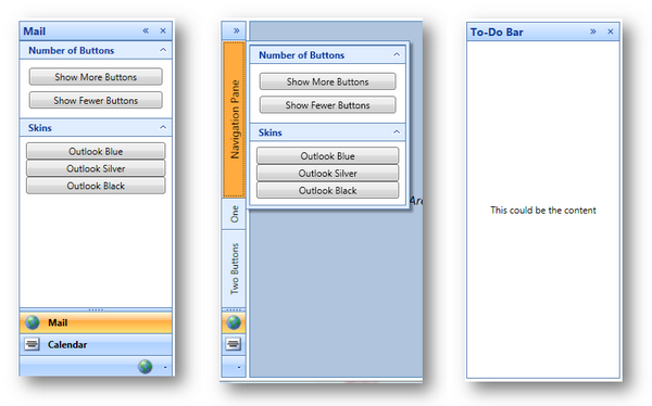
The OutlookBar is - as the name already indicates - a sidebar control that looks like the bar in Outlook. The OutlookBar is a container for OutlookSections to show each section as a button and the content of the selected section. The OutlookBar has a maximized and a minimized mode. While minimized, the content of the selected section is available as a popup; otherwise, it's always visible above the section buttons. The section buttons are either shown as a maximized button with image and content aligned vertically, or as a minimized button with the image only aligned horizontally. A splitter allows to customize the number of visible maximized buttons. It's also possible to use a splitter to resize the width of the sidebar and minimize or maximize it that way. Furthermore, you can specify the docking behaviour of the OutlookBar to be aligned either to the left or to the right; hence, the content popups either to the right or to the left, as well as it specifies the position of the width splitter. It's also possible to hide the section buttons; for instance, when there is only one section on it, like the To-Do Bar in Outlook at the right side.
The content of an Outlook Section can be any arbitrary control, but OdcExpanders (which was previously introduced) are preferred, and it will have a customized skin inside the OutlookBar.
In minimized mode, the OutlookBar can optionally offer additional buttons.
The OutlookBar has three possible skins: blue, silver, and black:

Interaction between template and code
Various dependency properties enable interaction with the template and the code. Usually, the XAML gets the information from the code using TemplateBinding. However, in some cases, the template needs to update the value of a dependency property. Therefore, it uses two-way binding, as in the following snippet:
<ToggleButton Style="{StaticResource buttonInSection}" Width="18"
      IsChecked="{Binding IsOverflowVisible,
      RelativeSource={RelativeSource TemplatedParent},Mode=TwoWay}" >
     <ToggleButton.Content>
        <Path VerticalAlignment="Center" HorizontalAlignment="Center"
           Fill="{DynamicResource ImageBrush}"
           Stroke="White" Data="M2,4 L5,7 8,4"/>
     </ToggleButton.Content>
     <ToggleButton.ContextMenu>
       <ContextMenu IsOpen="{Binding IsOverflowVisible,
        RelativeSource={RelativeSource TemplatedParent},Mode=TwoWay}"
          ItemsSource="{TemplateBinding OverflowMenuItems}">
       </ContextMenu>
     </ToggleButton.ContextMenu>
</ToggleButton>

<Style TargetType="{x:Type ButtonBase }" x:Key="buttonStyle">
    <Setter Property="Background" Value="Transparent"/>
    <Setter Property="BorderThickness" Value="0"/>
    <Setter Property="BorderBrush" Value="{DynamicResource BorderBrush}"/>
    <Setter Property="Template">
        <Setter.Value>
            <ControlTemplate TargetType="{x:Type ButtonBase}">
                <Border Background="{TemplateBinding Background}"
                        Width="{TemplateBinding Width}"
                        Height="{TemplateBinding Height}"
                        Focusable="False"
                        x:Name="border"
                        BorderThickness="{TemplateBinding BorderThickness}"
                        BorderBrush="{DynamicResource BorderBrush}" >
                    <ContentPresenter Focusable="False"
                                Content="{TemplateBinding Content}"
                                ContentTemplate="{TemplateBinding ContentTemplate}"
                                VerticalAlignment="Center" Horizontal
                                Alignment="Center"/>
                </Border>
                <ControlTemplate.Triggers>
                    <Trigger Property="IsMouseOver" Value="True">
                        <Setter Property="Background"
                            Value="{DynamicResource HighlightButtonGradientBrush}"
                            TargetName="border"/>
                    </Trigger>
                    <Trigger Property="IsPressed" Value="True">
                        <Setter Property="Background"
                            Value="{DynamicResource SelectedButtonGradientBrush}"
                            TargetName="border"/>
                    </Trigger>
                </ControlTemplate.Triggers>
            </ControlTemplate>
        </Setter.Value>
    </Setter>
</Style>
Here, the IsChecked property of the ToggleButton gets and also sets the IsOverflowVisible property of the OutlookBar. When the users clicks on the button, the property will be changed. So, there is no need to implement an EventHandler of the Click event.
In other cases, when a button click has to cause an action, for instance, when a splitter button is pressed, it will raise a command:
<Button x:Name="resizeButton" Width="4" DockPanel.Dock="Right"
     Visibility="{Binding CanResize,RelativeSource={RelativeSource TemplatedParent},
        Converter={StaticResource visibleConverter}}"
     Cursor="SizeWE"
     ClickMode="Press" Command="local:OutlookBar.ResizeCommand">
     <Button.Template>
        <ControlTemplate>
          <Border Background="Transparent"/>
        </ControlTemplate>
     </Button.Template>
</Button>
The command itself is defined as follows:
public static RoutedUICommand ResizeCommand
{
get { return resizeCommand; }
}
private static RoutedUICommand resizeCommand =
new RoutedUICommand("Resize",
"ResizeCommand", typeof(OutlookBar));
At the initializer, a method is associated to this command:
CommandBindings.Add(new CommandBinding(ResizeCommand, ResizeCommandExecuted));
Therefore, when the Resize button is clicked, it sends the ResizeCommand to the Outlookbar, which then will call the ResizeCommandExecuted method.
A third way to interact is to use a specific control that is defined in the XAML in the OnApplyTemplate method:
public override void OnApplyTemplate()
{
    minimizedButtonContainer =
        this.GetTemplateChild(partMinimizedButtonContainer)
        as FrameworkElement;
    base.OnApplyTemplate();
}
Although it works with any name, it is recommended that you use a name that begins with "PART_", and the name should be registered with the TemplatePart attribute as follows:
[TemplatePart(Name = partMinimizedButtonContainer)]
public class OutlookBar : HeaderedItemsControl
{
    const string partMinimizedButtonContainer = "PART_MinimizedContainer";
Note that although TemplatePart is not recognized in WPF, it is useful for external editors such as Blend.
Skins instead of themes, and how it works
Unlike the ExplorerBar that uses themes, OutlookBar uses skins that do not depend on the selected theme of XP or Vista. Therefore, the templates of the controls use DynamicResources instead of StaticResources to specify properties that depend on the skin, such as color brushes:
<Style TargetType="{x:Type ButtonBase }" x:Key="buttonStyle">
    <Setter Property="Background" Value="Transparent"/>
    <Setter Property="BorderThickness" Value="0"/>
    <Setter Property="BorderBrush" Value="{DynamicResource BorderBrush}"/>
    <Setter Property="Template">
        <Setter.Value>
            <ControlTemplate TargetType="{x:Type ButtonBase}">
                <Border Background="{TemplateBinding Background}"
                        Width="{TemplateBinding Width}"
                        Height="{TemplateBinding Height}"
                        Focusable="False"
                        x:Name="border"
                        BorderThickness="{TemplateBinding BorderThickness}"
                        BorderBrush="{DynamicResource BorderBrush}" >
                    <ContentPresenter Focusable="False"
                               Content="{TemplateBinding Content}"
                               ContentTemplate="{TemplateBinding ContentTemplate}"
                               VerticalAlignment="Center"
                               HorizontalAlignment="Center"/>
                </Border>
                <ControlTemplate.Triggers>
                    <Trigger Property="IsMouseOver" Value="True">
                        <Setter Property="Background"
                            Value="{DynamicResource HighlightButtonGradientBrush}"
                            TargetName="border"/>
                    </Trigger>
                    <Trigger Property="IsPressed" Value="True">
                        <Setter Property="Background"
                            Value="{DynamicResource SelectedButtonGradientBrush}"
                            TargetName="border"/>
                    </Trigger>
                </ControlTemplate.Triggers>
            </ControlTemplate>
        </Setter.Value>
    </Setter>
</Style>
The DynamicResources is applied to the ResourceDictionary of the OutlookBar at runtime, because other than a StaticResource, DynamicResources is not detected when it is specified as a resource in the same XAML with the template, so ApplySkin is always necessary when the OutlookBar is initialized:
protected void ApplySkin()
{
    string skinName;
    switch (Skin)
    {
       case OdysseySkin.OutllookBlue: skinName = "OutlookBlueSkin"; break;
       case OdysseySkin.OutlookSilver: skinName = "OutlookSilverSkin"; break;
       case OdysseySkin.OutlookBlack: skinName = "OutlookBlackSkin"; break;
       default: skinName = "OutlookBlueSkin"; break;
    }
    if (!string.IsNullOrEmpty(skinName))
    {
       skinName = string.Format
        ("pack://application:,,,/Odyssey;Component/Skins/OutlookBar/{0}.xaml",
                                skinName);
       Uri uri = new Uri(skinName, UriKind.Absolute);
       ResourceDictionary skin = new ResourceDictionary();
       skin.Source = uri;
       this.Resources = skin;
    }
}
A skin is a ResourceDictionary applied to the binary as resource, that looks like this:
<ResourceDictionary xmlns=
    "xmlns:x=http://schemas.microsoft.com/winfx/2006/xaml/presentation"
           xmlns:x="http://schemas.microsoft.com/winfx/2006/xaml">
    <SolidColorBrush Color="#FFC7CBD1" x:Key="BorderBrush"/>
    <SolidColorBrush Color="#FF313431" x:Key="ImageBrush"/>
    <SolidColorBrush Color="#FFD8DBDF" x:Key="LightBackgroundBrush"/>
    <SolidColorBrush Color="#FF000000" x:Key="ForegroundBrush"/>
    <LinearGradientBrush StartPoint="0,0" EndPoint="1,0"
              x:Key="HighlightedExpanderHeaderBrush">
        <LinearGradientBrush.GradientStops>
            <GradientStop Color="#FFDADFE6" Offset="0"/>
            <GradientStop Color="White" Offset="0.5"/>
            <GradientStop Color="#FFDADFE6" Offset="1"/>
        </LinearGradientBrush.GradientStops>
    </LinearGradientBrush>
    <LinearGradientBrush StartPoint="0,0" EndPoint="0,1"
                x:Key="OutlookbarHeaderBrush">
        <LinearGradientBrush.GradientStops>
            <GradientStop Color="#FFF0F1F2" Offset="0"/>
            <GradientStop Color="#FFBDC1C8" Offset="1"/>
        </LinearGradientBrush.GradientStops>
    </LinearGradientBrush>
    <LinearGradientBrush StartPoint="0,0" EndPoint="0,1"
                x:Key="SectionButtonGradientBrush">
        <LinearGradientBrush.GradientStops>
            <GradientStop Color="#FFF8F8F9" Offset="0"/>
            <GradientStop Color="#FFDFE2E4" Offset="0.4"/>
            <GradientStop Color="#FFC7CBD1" Offset="0.4"/>
            <GradientStop Color="#FFDBDEE2" Offset="1"/>
        </LinearGradientBrush.GradientStops>
    </LinearGradientBrush>
    <SolidColorBrush Color="#FFFFAB3F" x:Key="SelectedButtonSolidBrush"/>
    <LinearGradientBrush StartPoint="0,0" EndPoint="0,1"
                x:Key="SelectedButtonGradientBrush">
        <LinearGradientBrush.GradientStops>
            <GradientStop Color="#FFFFFEE4" Offset="0"/>
            <GradientStop Color="#FFFFBB6E" Offset="0.4"/>
            <GradientStop Color="#FFFFAB3F" Offset="0.4"/>
            <GradientStop Color="#FFFEE17A"  Offset="1"/>
        </LinearGradientBrush.GradientStops>
    </LinearGradientBrush>
    <SolidColorBrush Color="#FFFFD76A" x:Key="HighlightButtonSolidBrush"/>
    <LinearGradientBrush StartPoint="0,0" EndPoint="0,1"
                x:Key="HighlightButtonGradientBrush">
        <LinearGradientBrush.GradientStops>
            <GradientStop Color="#FFFFFCDE" Offset="0"/>
            <GradientStop Color="#FFFFEAAD" Offset="0.4"/>
            <GradientStop Color="#FFFFD76A" Offset="0.4"/>
            <GradientStop Color="#FFFFE69E"  Offset="1"/>
        </LinearGradientBrush.GradientStops>
    </LinearGradientBrush>
</ResourceDictionary>
More details
If you're interested in more details, e.g., how the manual splitting works, or how the section buttons are separated between the maximized and minimized, you are free to look at the code to figure out how it works. I won't go into details, as it is hard to explain but easy to understand when you just see the code available here.
Where can I get updates?
Odyssey is an open source project available on CodePlex as source code.
What comes next?
The next control that I will possibly add to Odyssey is a RibbonBar.
History
See also:
for the other articles about the BreadcrumbBar and the ExplorerBar that are also included in the odyssey.dll (and which have been improved since the article was written, by the way...)


 General
  News
News  Suggestion
  Question
  Bug
Bug  Answer
  Joke
Joke  Praise
  Rant
Rant  Admin
Admin 


 Submit an article or tip


 PLEASE SOURCE CODE
 . You got my 5 and I can't understand the person who voted 1
  for such a wonderful control. Im already using your RibbonBar and searched an Outlook-Bar. It seems that i've found the best free Outlook-Bar control currently existing.
