Introduction
One of the worst Windows applications from the user experience perspective is the application that when clicking on something, it just hangs and "freezes" and becomes unresponsive for a certain period of time and then it just becomes alive again. This usually happens when a time-consuming task (lengthy calculations, database access, I/O access, etc.) was executed on the main thread, making the application unusable until the task has finished executing.
To avoid this scenario, all the processing should be executed on a separate thread, leaving the main thread to deal only with a UI specific stuff. We still should let the user know in some way (by displaying a progress bar, darkening the window, ...) that a task is being executed even though the task is still executed on a separate thread.
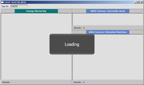
My personal favorite is darkening the main window and displaying a message in the middle of the screen, something like:
To achieve this, I place a user control on top of the window as an adorner, and then by using attached properties on the window, I display or hide the adorner accordingly.
To be able to use any user control as an adorner, first we need to create a class that inherits from Adorner class and override few methods. The class looks like:
public  class  ControlAdorner  : Adorner
{
    private  readonly  FrameworkElement  mAdorningElement;
    private  AdornerLayer  mLayer;

    public  ControlAdorner(FrameworkElement  adornedElement, FrameworkElement  adorningElement)
        : base (adornedElement)
    {
        mAdorningElement = adorningElement;

        if  (adorningElement != null )
            AddVisualChild(adorningElement);
    }

    protected  override  int  VisualChildrenCount
    {
        get  { return  mAdorningElement != null  ? 1 : 0; }
    }

    protected  override  System.Windows.Media.Visual  GetVisualChild(int  index)
    {
        if  (index == 0 && mAdorningElement != null )
            return  mAdorningElement;

        return  base .GetVisualChild(index);
    }

    protected  override  Size  ArrangeOverride(Size  finalSize)
    {
        if  (mAdorningElement != null )
            mAdorningElement.Arrange(new  Rect
            (new  Point (0, 0), AdornedElement.RenderSize));

        return  finalSize;
    }

    public  void  SetLayer(AdornerLayer  layer)
    {
        mLayer = layer;
        mLayer.Add(this );
    }

    public  void  RemoveLayer()
    {
        if  (mLayer != null )
        {
            mLayer.Remove(this );
            RemoveVisualChild(mAdorningElement);
        }
    }
}
The next step is to create the attached property that will display/hide the adorner. The attached property implementation looks like:
public  class  AdornerBehaviour
{
    public  static  readonly  DependencyProperty  ShowAdornerProperty =
    DependencyProperty .RegisterAttached("ShowAdorner" , typeof (bool ),
    typeof (AdornerBehaviour ), new  UIPropertyMetadata (false , OnShowAdornerChanged));
    public  static  readonly  DependencyProperty  ControlProperty =
    DependencyProperty .RegisterAttached("Control" , typeof (FrameworkElement ),
    typeof (AdornerBehaviour ), new  UIPropertyMetadata (null ));
    private  static  readonly  DependencyProperty  CtrlAdornerProperty =
    DependencyProperty .RegisterAttached("CtrlAdorner" , typeof (ControlAdorner ),
    typeof (AdornerBehaviour ), new  UIPropertyMetadata (null ));

    public  static  bool  GetShowAdorner(DependencyObject  obj)
    {
        return  (bool )obj.GetValue(ShowAdornerProperty);
    }

    public  static  void  SetShowAdorner(DependencyObject  obj, bool  value)
    {
        obj.SetValue(ShowAdornerProperty, value);
    }


    public  static  FrameworkElement  GetControl(DependencyObject  obj)
    {
        return  (FrameworkElement )obj.GetValue(ControlProperty);
    }

    public  static  void  SetControl(DependencyObject  obj, UIElement  value)
    {
        obj.SetValue(ControlProperty, value);
    }

    private  static  void  OnShowAdornerChanged
    (DependencyObject  d, DependencyPropertyChangedEventArgs  e)
    {
        if  (d is  FrameworkElement )
        {
            if  (e.NewValue != null )
            {
                FrameworkElement  adornedElement = d as  FrameworkElement ;
                bool  bValue = (bool )e.NewValue;
                FrameworkElement  adorningElement = GetControl(d);

                ControlAdorner  ctrlAdorner =
                   adornedElement.GetValue(CtrlAdornerProperty) as  ControlAdorner ;
                if  (ctrlAdorner != null )
                    ctrlAdorner.RemoveLayer();

                if  (bValue && adorningElement != null )
                {
                    ctrlAdorner = new  ControlAdorner (adornedElement, adorningElement);
                    var  adornerLayer = AdornerLayer .GetAdornerLayer(adornedElement);
                    ctrlAdorner.SetLayer(adornerLayer);
                    d.SetValue(CtrlAdornerProperty, ctrlAdorner);
                }
            }
        }
    }
}
The last step is to create the user control that will be used as an adorner. The XAML for the user control looks like:
<UserControl x:Class="CCRM.CurveMonitor.WPF.Views.BusyCtrl"
              xmlns="http://schemas.microsoft.com/winfx/2006/xaml/presentation"
              xmlns:x="http://schemas.microsoft.com/winfx/2006/xaml"
              xmlns:mc="http://schemas.openxmlformats.org/markup-compatibility/2006"
              xmlns:d="http://schemas.microsoft.com/expression/blend/2008"
              mc:Ignorable="d"
              d:DesignHeight="300"
              d:DesignWidth="300" Background="#20000000">

     <Border Width="260" Height="120"
     CornerRadius="12" HorizontalAlignment="Center"
     VerticalAlignment="Center">
             <Border.Background>
                 <LinearGradientBrush EndPoint="0.5,1" StartPoint="0.5,0" >
                     <GradientStop Color="#FF4B4B4B" Offset="0.897"/>
                     <GradientStop Color="#FF6E6E6E" Offset="1"/>
                     <GradientStop Color="#FF4B4B4B" Offset="0.103"/>
                     <GradientStop Color="#FF6E6E6E" Offset="0"/>
                 </LinearGradientBrush>
             </Border.Background>
             <TextBlock FontSize="24" Foreground="White"
             Text="Loading" HorizontalAlignment="Center"
             VerticalAlignment="Center"/>
         </Border>
 </UserControl>
As you can see, we have made the control semi-transparent by setting the background to the value of #20000000 (first 2 bytes are for alpha, then next 2 bytes for the red, next 2 bytes for green and last 2 bytes for blue). Now, to use the control adorner in our main window, on window's XAML, we add the following:
 <Window x:Class="Test.MainWindow"
        xmlns="http://schemas.microsoft.com/winfx/2006/xaml/presentation"
        xmlns:x="http://schemas.microsoft.com/winfx/2006/xaml"
        xmlns:b="clr-namespace:Test"
        Title="MainWindow" Height="350" Width="525">

    <Window.Resources>
        <BusyControl x:Key="BusyControl" />
    </Window.Resources>
    <Grid b:AdornerBehaviour.ShowAdorner="{Binding IsBusy}"
    b:AdornerBehaviour.Control="{StaticResource BusyControl}">
        ...
    </Grid>
</Window>
Now whenever we set the IsBusy boolean property to true in the ViewModel of the main window, the adorner will be displayed, and when the IsBusy property is set to false, the adorner will be hidden.
This member has not yet provided a Biography. Assume it's interesting and varied, and probably something to do with programming.


 General
  News
News  Suggestion
  Question
  Bug
Bug  Answer
  Joke
Joke  Praise
  Rant
Rant  Admin
Admin 


 Submit an article or tip


