Introduction
Perhaps you are like me and use HTML tables, but do not like how they behave on different media, particularly on mobile.
Background
After scouring the internet for solutions, I found a site called CSS-Tricks.com that had a roundup of various techniques to make tables more responsive. The technique I chose to work with I found at No-More-Tables, but it was originally developed by Chris Coyier (@chriscoyier) and is described in his post Responsive Data Tables at css-tricks.com.
That approach made use of the table ID as a selector for the CSS.
Using the Code
This article describes modifications I made to use a Class for a selector instead of an ID. That way, the CSS can be reused for multiple tables on a page. And I decided to use LESS to create the CSS.
One of the keys to making this approach work is utilizing HTML5 data attributes. The data-* attributes are used to store custom data to the page or application by embedding custom data attributes on HTML <td> elements. I used an attribute named “data-title” to store the name of the column heading.
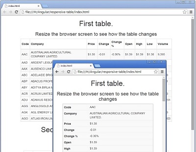
This approach transforms the grid layout of the table and makes each cell its own line or row. Each of those lines is labeled with the value of “data-title”. Although the table becomes much taller, it does not require shrinking or horizontal scrolling to be seen on mobile.
The CSS makes use of a media query to determine if it should transform the table.
If the condition is met, then the CSS takes the table header and it places it offscreen where it will not be visible but can still be read by automated readers.
thead {
position: absolute;
top: -9999px;
left: -9999px;
}
It also changes the table row border settings to help the user recognize the block of cells as being together like they were when they were on the same line.
tr {
   display: block;
   border: 1px solid #cccccc;
 }
It then treats each cell as a row and pads each cell to shift the contents to the right. I needed to use "!important" to override other CSS, but perhaps a reader can improve my approach so "!important" will not be needed.
td {
display: block;
border: none;
border-bottom: 1px solid #eeeeee;
position: relative;
padding-left: 30% !important;
white-space: normal;
text-align: left;
}
And lastly, it places the content of "data-title" in front of the cell and shifts the text to display the content in the cell on the left side.
td:before {
position: absolute;
top: 6px;
left: 6px;
white-space: normal;
font-weight: bold;
content: attr(data-title);
}
I made use of LESS to create variables. Those variables made it easier for me to tweak the settings and get the table to display the way I wanted.
@responsive-table-threshold-width: 800px;
@responsive-table-white-space: normal;
@responsive-table-left-heading-width: 30%;
@responsive-table-left-heading-font-weight: bold;
@responsive-table-left-heading-top-padding: 6px;
@responsive-table-left-heading-bottom-padding: 6px;
@responsive-table-cell-border-color: #eee;
@responsive-table-cell-border-style: solid;
@responsive-table-cell-border-width: 1px;
@responsive-table-row-border-color: #ccc;
@responsive-table-row-border-style: solid;
@responsive-table-row-border-width: 1px;
@responsive-table-data-alignment: left;
@responsive-table-left-heading-adjuster: 10;
table {
margin:auto;
}
@media only screen and (max-width: @responsive-table-threshold-width) {
.responsive-table {
thead {
position: absolute;
top: -9999px;
left: -9999px;
}
tbody {
tr {
display: block;
border: @responsive-table-row-border-width
@responsive-table-row-border-style @responsive-table-row-border-color;
td {
display: block;
border: none;
border-bottom: @responsive-table-cell-border-width
@responsive-table-cell-border-style @responsive-table-cell-border-color;
position: relative;
padding-left: @responsive-table-left-heading-width !important;
white-space: @responsive-table-white-space;
text-align: @responsive-table-data-alignment;
&:before {
/* Now like a table header */
position: absolute;
top: @responsive-table-left-heading-top-padding;
left: @responsive-table-left-heading-bottom-padding;
white-space: @responsive-table-white-space;
font-weight: @responsive-table-left-heading-font-weight;
content: attr(data-title);
}
}
}
}
}
.wider-headings {
tbody {
tr {
td {
padding-left: @responsive-table-left-heading-width +
@responsive-table-left-heading-adjuster !important;
}
}
}
}
}
And to allow me to have more than one table on a page and to format each a little differently, I create additional classes (e.g. wider-headings) and override the corresponding settings.
Points of Interest
I used this project to work on my CSS and LESS skills. And I have more to learn, so please feel free to make improvements.
History
- 17th September, 2014: Initial version
David Greene is an application developer in Southern California.


 General
  News
News  Suggestion
  Question
  Bug
Bug  Answer
  Joke
Joke  Praise
  Rant
Rant  Admin
Admin 


 Submit an article or tip


