Develop a Windows 8 app in 30 days
Each day the web becomes more rich and immersive, and we realized that for our business, moving beyond apps would be essential to extend our reach with customers. While our apps will continue to provide a great device experience, opening our amazing news platform to millions people around the world was a natural progression.
Like many companies who started by creating apps, we understood the opportunity of scaling an app on the web, but needed to ensure the web experience could support a rich, interactive and thoughtfully designed app like ours. When we started this project, we didn't think it was possible to provide such a rich experience on the web, and we quickly learned otherwise. To date, the touch experience on the web has been far from stellar, limited to basic swipe commands and constrained by an application development model that offered only basic UX features.
In researching our options, we quickly realized Internet Explorer 10 truly was the best and only option if we were going to do this right. We weren't sure whether this would really work, and honestly, we were a little skeptical. But after speaking with the team at IE and the developer team at Pixel Lab, we were blown away with what IE10 could bring to the table.
The future of the web really is apps plus web and we're proud of our first step toward that future. So, in the spirit of pushing the web forward, we're excited to share not just our story, but some helfpul bits of code we produced along the way.
Read Everywhere
Being Responsive
Pulse's mission? Make your news available wherever you happen to be. For the web, that means a great experience on any device and any screen and that's a lot of very different screens. Fortunately, emerging features in HTML5 and CSS3 make that audacious goal possible. We wanted single "responsive" codebase that adapts to where it gets used and, frankly, we were surprised by how easy this was!
What made the process so smooth? No doubt it's due largely to impressive features of the modern web, community-driven best practices and browsers that keep up with this quick pace of innovation. On the other hand, a handful of smart choices made a big difference. Here are some notes about what we did right up front and how we "hatched" a responsive site with minimal work:
Media Queries
Media queries are the magic sauce that make the responsive web work work. There are plenty of great overviews, so we'll keep this to a single line: media queries let you write CSS that only "activates" when certain conditions (like the width of or height of the screen) are met. For Pulse, we basically only needed a single media query rule. It looked like this:
@media screen and (max-width: 640px) {
}
We benefited from wanting to deliver the same basic functionality to every visitor, so the changes between the full and mobile versions of the site were primarily related to layout and size. That made the process simple. Once we had our media query in place we simply added the supplemental CSS that defined those changes. You can actually see this at work in any desktop browser by resizing the browser to less than 640px (or mouse over the image below for a preview).
Responsive Javascript
Media Queries did 95% of the work, but there were also a handful of new code-driven interactions that we only wanted to enable on a smaller screen. One of these, as an example, is a new interaction to show or hide the left hand sources menu. In the full version, the menu is always present. In the mobile version, you only see it after tapping anywhere in the header. We needed just a little Javascript to make that happen.
Unfortunately, media queries are a CSS concept and there's no direct equivalent in script. We had to invent our own. We first considered one of a handful of libraries that allow you to build media query-like functionality in Javascript (ensuire.js being a favorite), but ultimately we realized our needs were pretty meager and could be accomplished with a simple window size check.
$(window).resize(function () {
    isMobile = ( $(window).width() <= 640 );
});
Ems
Ems seem to fall in and out of favor with developers just about every other year. If that's a new term for you, here's the quick version: an "em" is a unit of measurement like a pixel or an inch. The interesting thing about ems is that they are always relative to the local text size. In fact, an "em" is called such because traditionally it was defined by the width of an uppercase M. Fortunately, in practice, it's a little more predictable. In CSS, one em is equivalent to the current point size. So, "1em" in a 16 point font would be 16 points.
Ems can be a little confusing and their "cascading" nature can make them a little hard to use. As a result, most of the time we (like many developers) stick with pixel values for defining font sizes, margins and distances. That was true for Pulse, but with one big exception: the article viewer. When you're reading in Pulse, you're looking at pure em-driven typography. All of the type, margins and other distances in that view are defined as relative em values.
We initially did that to make it easy to manage a user's font size preferences, but this turned out to be an important move for our responsive site as well. For both mobile devices and Xbox, we wanted adjust the relative size of the text. On mobile, people are used to close viewing and generally want more pixels on the screen. On the Xbox it's just the opposite. Em units gave us the flexibility to make those modifications by adjusting a single value, up or down, depending on the user's environment. High DPI
An easy-to-forget aspect of creating a responsive site is dealing with high resolution and high pixel density displays. There are many strategies for this and the problems they solve are equally varied, but here's the two step approach we used:
Step 1: Declare your coordinate system (Viewport)
As modern displays become more "pixel dense," you can no longer count on a 1:1 correlation between the pixels on the device and the pixels you specify in code. This used to just be a mobile consideration, but the newest desktop and tablet browsers are also becoming "high-DPI" aware.
If you're not picky, browsers will make some decisions on your behalf. Here's how it works: If you do nothing most browsers will assume you intended for your site to work on a desktop browser so they'll render the site at desktop sizes (say 1024px wide) and then scale it the device pixels (say 480px). That means that what you call "1px" the browser calls 480/1024 or about 0.46px. Confused? In this case, you don't need to be. You can just pretend that your site is being rendered at desktop sizes and the browser does the rest.
It's become more common (and this was certainly the case with Pulse) to want more control at small sizes. Many mobile browsers give you way to do this and you can specify your site's preferences with the viewport meta tag. Say, for example, that you intend for the site's content to always be rendered as though it were 320px wide. You could use a tag like this:
<meta name="viewport" content="width=320">
This is like the default behavior we described earlier, but instead of using the default size of 1024px we're instructing the browser to render the content at 320px. Another common practice is to instruct the browser to just use the device's actual pixels. For that, you would use a tag like this:
<meta name="viewport"
    content="width=device-width">
This instructs the browser to render the content at the native resolution of the device itself. In other words, use actual pixels! Well, sort of. In practice, most devices interpret this to mean use "natural" pixels. The pixels on high density screens may be much smaller than traditional pixels. By using "width=device-width" you're saying make 1px feel like 1px should (even if that 1px is physically made up of more).
This is what we do for Pulse. It's a nice way to go because 1px ends up meaning about 1px on every device. That takes care of a lot of guess work.
Step 2: Use High-DPI imagery
Once you've found your viewport, the next step is to use high DPI assets. On high resolution screens, traditional resolution imagery can appear pixellated or fuzzy.
There are several strategies for handling this and, frankly, it's still a pretty new problem (but becoming more important as new devices and operating systems begin to adopt high DPI). We lucked out with Pulse. Because of its simple look and feel, most of the UI imagery in the app comes in the form of single color icons. While we could have created high res images for each of those (and all of their states), we chose to take a different approach: icon fonts!
An icon font is just that: a font that contains icons instead of letters. We like this approach because it's super compact, has all of the advantages of vector imagery, benefits from many browsers refined text rendering and also has the amazing flexibility that comes from CSS styling. After all, from the browsers perspective it's just text. In the end, we have a single icon font with symbols for everything from arrows and social icons to logos. Scaling Up
At the same time that we were preparing Pulse for smaller screens, we also had the chance to preview the site on Internet Explorer for Xbox. The site just worked! In fact, it worked stunningly well. After some close evaluation, we found a handful of small adjustments but even those were just refinements: we made some color adjustments to account for television display and we made slight increases to some of the text to make it easier to read from further away. But that was it. Otherwise, the site just worked!
Edgy Layouts
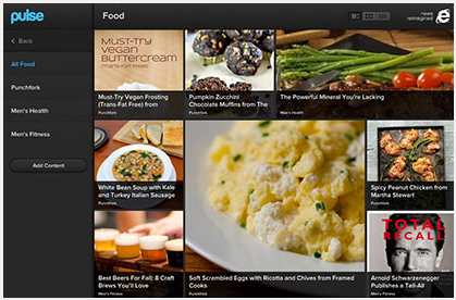
Building Pulse for the web brought plenty of technical and design challenges, but one of the most interesting was the layout on the main page. We've always had a 'content-first' approach to design--especially on the home screen--and we wanted to bring that to the web, to fill the screen with content and create a magazine-like browsing experience with big images and edge-to-edge content.
That might be a daunting design challenge anywhere, but it's particularly tricky on the web. We realized that we would need a layout engine that could intelligently handle a huge spectrum of devices and screens sizes: everything from the 4-inch screen on a mobile device to a full screen browser on a 30-inch monitor.
Beyond that, and adding yet another dimension to our layout challenge, was our desire for the Pulse home screen to stay smart and curated. We really wanted to maintain a 'human element' in the decisions about how content was placed on the screen.
Tiles.js
The crossroads of those requirements became Tiles.js. It's a template driven tile-based layout engine that we built just for Pulse. We use templates so that you have tight control over the details of the layout and then it's up to the layout engine to fine tune the sizing and ensure that we fill the screen edge-to-edge.

Defining Templates
Tiles.js is really easy (and even fun!) to use. One of the first things we needed was an easy way to define layouts. We went through several options. Our initial attempts were easy to parse but difficult to edit or read and we quickly realized that the templates would be a lot more useful if they could communicate the layout in a visual way.
We ended up with something that (we realized only after) isn't too far off from the syntax for the one of the CSS Grid Proposals. It looks something like this:
Here's how it works: A template is an array of strings where each string represents a row in the grid. We parse that array and form a 'tile' whenever the we detect repeated characters in adjacent cells.
So, in the example to the left the A's form a 2x2 tile, the B's for a 1x2 tile and the C's form a 2x1 tile. You can use just about any character you want but we tend to use capital letters as a convention.
Periods are special. they're reserved to always mean single cells. All white space is ignored (it turns out that these are a lot easier to read if you pad the characters a little).
HTML5 Video Resources
This member has not yet provided a Biography. Assume it's interesting and varied, and probably something to do with programming.


 Submit an article or tip