|
Are you still seeing this?
cheers
Chris Maunder
|
|
|
|
|
Whatever you did seems to have fixed it. The errors are gone, and the voting and reporting options are back. 
"These people looked deep within my soul and assigned me a number based on the order in which I joined."
- Homer
|
|
|
|
|
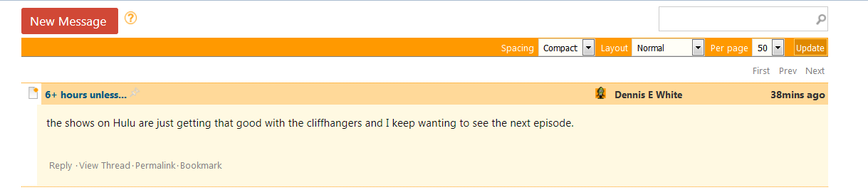
Here the screenshot (neat feature BTW). I included a bit more of the surroundings so you have some points of reference.
* CALL APOGEE, SAY AARDWOLF
* GCS d--- s-/++ a- C++++ U+++ P- L- E-- W++ N++ o+ K- w+++ O? M-- V? PS+ PE- Y+ PGP t++ 5? X R++ tv-- b+ DI+++ D++ G e++>+++ h--- ++>+++ y+++* Weapons extension: ma- k++ F+2 X
* Never pay more than 20 bucks for a computer game.
* I'm a puny punmaker.
|
|
|
|
|
Can you let me know if you see any change now?
cheers
Chris Maunder
|
|
|
|
|
Your spell worked, upvote and report magic has been restored in my Universe. Thank you oh greatest hamster of them all.
* CALL APOGEE, SAY AARDWOLF
* GCS d--- s-/++ a- C++++ U+++ P- L- E-- W++ N++ o+ K- w+++ O? M-- V? PS+ PE- Y+ PGP t++ 5? X R++ tv-- b+ DI+++ D++ G e++>+++ h--- ++>+++ y+++* Weapons extension: ma- k++ F+2 X
* Never pay more than 20 bucks for a computer game.
* I'm a puny punmaker.
|
|
|
|
|
Whenever you need someone to bang away randomly and futiely on a keyboard like a monkey while trying to fix bugs of his own making, I'm your man.
cheers
Chris Maunder
|
|
|
|
|
It is working for me now as well. Thanks.
|
|
|
|
|
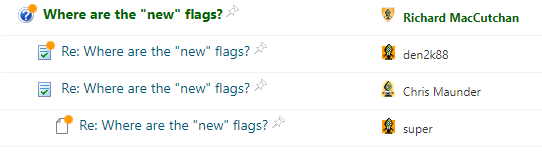
A little orange blob may look obvious to some people, but those of us with eyes of a certain age can hardly spot (excuse the pun) them. Can we have our new flags back please?
modified 17-Oct-17 6:26am.
|
|
|
|
|
Richard MacCutchan wrote: those of us with eyes of a certain age
My eyes are anagraphically young. I still can't see a damn thing.
* CALL APOGEE, SAY AARDWOLF
* GCS d--- s-/++ a- C++++ U+++ P- L- E-- W++ N++ o+ K- w+++ O? M-- V? PS+ PE- Y+ PGP t++ 5? X R++ tv-- b+ DI+++ D++ G e++>+++ h--- ++>+++ y+++* Weapons extension: ma- k++ F+2 X
* Never pay more than 20 bucks for a computer game.
* I'm a puny punmaker.
|
|
|
|
|
Really? You want to party like it's 1999?
I removed the images because
a) I couldn't stand them one moment longer
b) they are a space suck
I'm open to other ideas on marking posts as new, but not small gifs that say "new". Anything but that.
Update: Just saw this on Microsoft's site:
Sigh.
What's old is new. Next thing we know skinnyjeans and bears will be in style.
Oh, wait a minute...
cheers
Chris Maunder
modified 17-Oct-17 8:31am.
|
|
|
|
|
The small "orange Dot" is hard to notice with using Rant or Joke icon while posting.
Not sure how it looks with other icon. It would be much better by using the "Pin" icon to denote new post.
cheers,
Super
------------------------------------------
Too much of good is bad,mix some evil in it
|
|
|
|
|
The new icon is fine with me, for what that's worth. 
There are two kinds of people in the world: those who can extrapolate from incomplete data.
There are only 10 types of people in the world, those who understand binary and those who don't.
|
|
|
|
|
You get a hug.
cheers
Chris Maunder
|
|
|
|
|
Chris Maunder wrote:
You get a hug.
I see (or don't) that the blockquote tags are now invisible? And, yes the above was generated by pressing the "Quote Selected Text" button.
User error.
modified 17-Oct-17 11:16am.
|
|
|
|
|
Richard MacCutchan wrote: blockquote tags are now invisible?
Seems to be working here. What's the generated markup you're seeing in the message box?
"These people looked deep within my soul and assigned me a number based on the order in which I joined."
- Homer
|
|
|
|
|
Some idiot seems to have clicked the "Treat my content as plain text, not as HTML" box.
|
|
|
|
|
 
"These people looked deep within my soul and assigned me a number based on the order in which I joined."
- Homer
|
|
|
|
|
How about a larger orange dot next to the icon, to match the indicator in the menu?
Something like this:

Or maybe it's just a "who moved my cheese?" moment, and we'll all get used to the new "new" icon in a couple of weeks. 
"These people looked deep within my soul and assigned me a number based on the order in which I joined."
- Homer
|
|
|
|
|
Sorry Chris, but this is just another example of Hutber's Law; an improvement make things worse. You remove the new flags because you think they are out of date - OK that is reasonable. But you have replaced them with something that is almost impossible to see. Why do you feel that is better?
|
|
|
|
|
Richard MacCutchan wrote: replaced them with something that is almost impossible to see
They weren't meant to be impossible to see and I hope you understand I was truly looking to change it in a positive way.
So: what would look good, be effective, and not add too much extra space?
- have new messages in bold? (We used to do this, but we've reserved bold subjects for thread starts)
- Make the gleam bigger or brighter?
- Have the gleam be always on the far left?
- Change the icon entirely so it's brighter, bolder, yellower?
What would work?
cheers
Chris Maunder
|
|
|
|
|
Chris Maunder wrote: What would work?
Probably a bigger brighter blob. I'm not a graphic designer, so I don't really know what is best, but I'm sure someone on your team has some ideas. All I do know is that size is important, as is contrast. Maybe the entire message icon in a different colour?
|
|
|
|
|
As a quick and dirty, how about
cheers
Chris Maunder
|
|
|
|
|
Much better, and catches the eye (for me, at least).
|
|
|
|
|
Message Removed
modified 17-Oct-17 21:28pm.
|
|
|
|
|


 General
  News
News  Suggestion
  Question
  Bug
Bug  Answer
  Joke
Joke  Praise
  Rant
Rant  Admin
Admin 


