After getting a great response on Create Smart and Stylish Butto , now I have decided to post another Trick on Creating a Smart and Stylish Tooltip.
Let's Start
Step 1: Creating a HTML Document
<body>
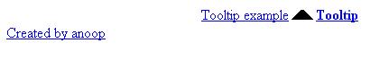
<a href="#" class="tooltip">Tooltip example<span>
<img src="arrow.gif" class="arrow"><strong>Tooltip
</strong><br>Created by Anoop</span></a>
</body>
Our HTML document will look like this after creating HTML document.
Preview:
Step 2: Creating Stylesheet /Style for the HTML Document
CSS
a.tooltip strong
{
line-height:30px;
}
We have set line height for Strong tag.
CSS
a.tooltip:hover
{
text-decoration:none;
}
We have set that on mouse hover the link , we don't need any Text-decoration (means on hover link - underlining of link removed).
CSS
a.tooltip span
{
z-index:10;
display:none;
padding:14px 20px;
margin-top:50px;
margin-left:-160px;
width:240px;
line-height:16px;
}
The thing we are trying to do to hide the content inside the span and when we take mouse pointer on link than we display our content.
Here we use
Z-index:The z-index property specifies the stack order of an element.
Preview:

CSS
a.tooltip:hover span
{
display:inline;
position:absolute;
border:2px solid #fff;
color:#eee;
background-color:black;
}
Here we have set the color, background-color, border and position of span on mouse hovering the link, i.e.,
a.tooltip:hover.
Preview:
CSS
.arrow
{
z-index:20;
position:absolute;
border:0;
top:-14px;
left:100px;
}
Here we move image arrow to upwards and slightly towards Left.
Preview:
CSS
a.tooltip span
{
border-radius:2px;
-webkit-border-radius:2px;
-ms-border-radius:2px;
-moz-border-radius:2px;
-o-border-radius:2px;
box-shadow:0px 0px 8px 4px #666;
opacity:0.8;
}Final thing to make Tooltip more stylish by using CSS3.
Making border corners round by using border-radius, giving shadow to box and opacity.
Now
here is the final look of Tooltip that we have created.
Previewew
Hope you like it. Thank you.


 General
  News
News  Suggestion
  Question
  Bug
Bug  Answer
  Joke
Joke  Praise
  Rant
Rant  Admin
Admin 


 Submit an article or tip


